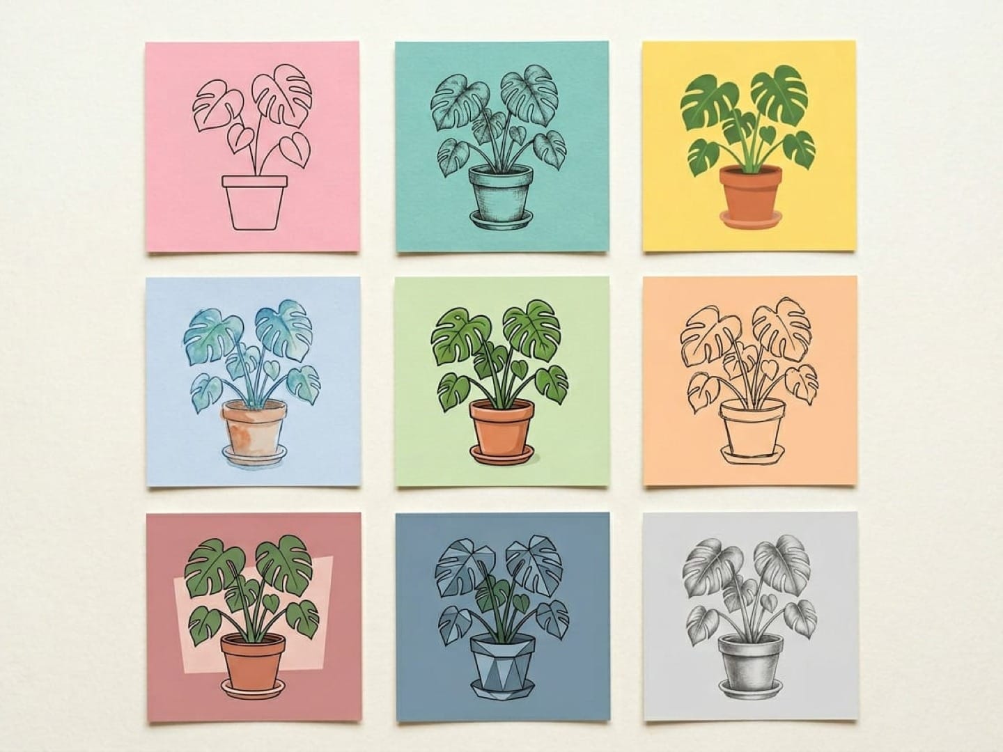
I don't use AI image generators in my creative process. Or at least, I didn't before writing this article. Every time I tried to think of a reason to generate an image, my brain went straight to photos.
And then I'd think: why wouldn't I just pick up my phone and take a picture of the thing? But it turns out, I was only considering one slice of what these tools can do.
I'm not particularly artistic. Here's the evidence:
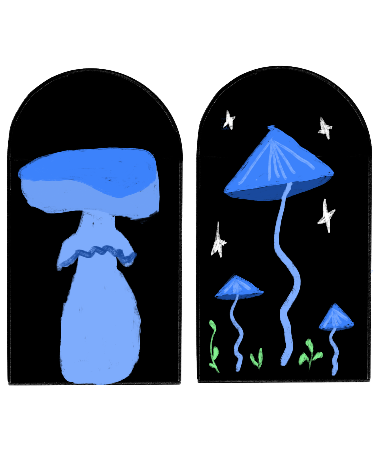
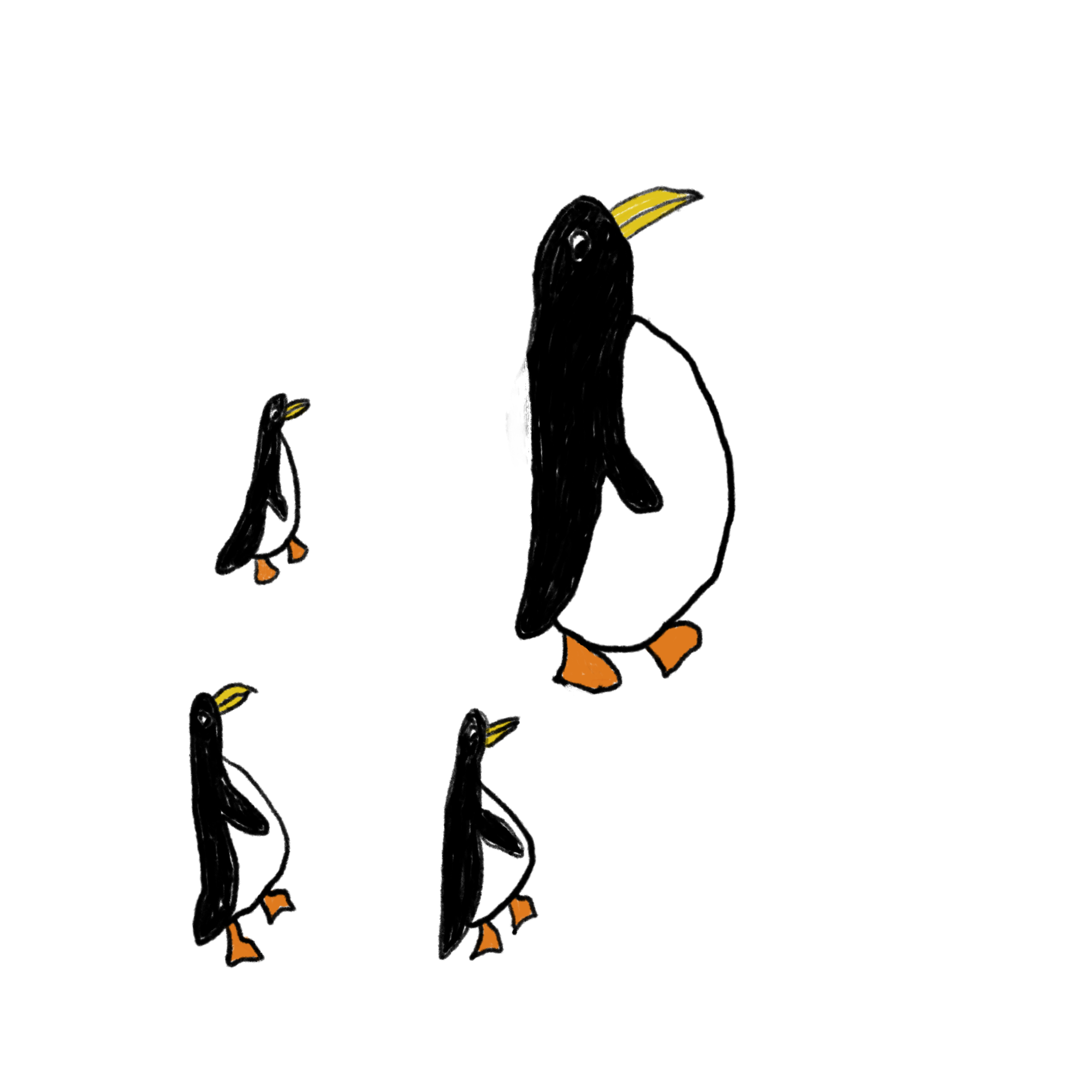
Can you see what I mean?
I can write. I can build a (pretty good, if I do say so myself) carousel in Canva or even Figma. But I can't draw, and I can't create the kind of illustrations I see other creators using across their content. That turned out to be exactly the gap where AI image generators are most useful — not replacing photography, but creating visuals I couldn't make on my own.
So I tested nine of them on three things I'd actually use for social media: an illustrated sticker sheet, a styled product shot, and a text-based graphic. If you just want the short answer, Nano Banana 2 was the most consistent across all three, and Seedream and Ideogram 3.0 were the most reliable with text. The rest of this article covers how I wrote the prompts, how each tool did, and which one fits the kind of graphics you make.
Key takeaways
- Nano Banana 2 (Google) was the most consistent performer overall. It handled illustration accuracy, came closest on the product shot, and handled typography well. If you only try one model, start there.
- Every tool struggled with the product shot in some way. None produced an image I'd confidently use as a real product photo without editing, especially when the prompt included brand names or device screens.
- Typography was the biggest divider. Seedream and Ideogram 3.0 were the most reliable at spelling and placing text. Others, like Midjourney and GPT Image, garbled words or skipped them entirely.
- For everything else, Recraft V4 Pro gave me the most control over style and color palettes, Midjourney had the most artistic, mood-driven results (as long as you don't need text), and Firefly 5 is worth trying if you already work in Photoshop or Illustrator.
- Prompt structure matters across every tool. Leading with the subject, using photography terms for product shots, and describing colors in plain words instead of hex codes improved results across much of my testing.
- Multi-model platforms where you can access several AI image generators in one place are increasingly common. I ran most of my tests inside Leonardo.ai because it integrates directly with Canva, which is where I do all my visual design work.
- Commercial-use rights vary by tool and plan. In the U.S., purely AI-generated material generally isn’t eligible for copyright protection without sufficient human authorship, though human-created elements of AI-assisted work may be protected.
Jump to a section:
What makes a good AI image prompt?
When I first sat down to test every tool in this article, I blanked completely. The generators have gotten remarkably good, especially in the past year. But I couldn't think of a single image I needed.
I think that's where most people get stuck. The tools aren't the bottleneck anymore. Knowing what to ask for is.
So I spent time researching before I started testing. I read through creator communities like r/midjourney on Reddit, studied prompt breakdowns on Instagram, and went through Envato's illustration prompt guide. Then I ran dozens of prompt variations across every tool on this list. A clear pattern emerged in what works and what doesn't.
Start with the subject, not the style
The first few words of your prompt carry the most weight. Every tool I tested responded better when I led with what's in the image before describing how it should look. "A ceramic mug on a wooden desk next to an open laptop" before "editorial lifestyle photography, warm natural light."
When I flipped the order and led with style, the results lost focus. The model seemed to treat the style as the priority and get vague about the actual content.
Use camera language for more realistic images
"Shallow depth of field." "Shot from a slight angle." "Soft golden hour lighting." "35mm film photography."
Photography terms can be especially effective because image-generation models often respond well to language commonly used to describe photographs, such as lighting, lenses, composition, and depth of field. I leaned on this most for the product shot prompt.
Vague descriptors like "beautiful" or "high quality" rarely move the needle; specificity is what actually shapes the output.
Describe colors in words, not codes
I tested the same prompt with hex codes and with plain descriptions ("light blue," "butter yellow"). The descriptive version was more accurate in the majority of tools I tested.
This one has some nuance, though. The Envato guide recommends hex codes for brand accuracy, and some tools (particularly ones built for designers, like Recraft) handle them better than others. If you're not sure, start with descriptive color names. If you're working with a specific brand palette and a design-focused tool, try the hex codes and see what you get.
Anchor your illustration style, or the tool will choose for you
This was the biggest lesson from the illustration tests. When I prompted for a product shot, the tools mostly knew what I meant. When I switched to illustration, the results fell apart until I got specific about what kind.
"Hand-drawn doodle, light blue ink, single color, simple line art with slightly wobbly quality, outlines only" gave me something usable. Without those anchors, most tools defaulted to either a photo-style image or a generic, flat illustration style that didn't reflect what I had in mind.
The Envato guide breaks illustration styles into specific technique language: "ink hatching, gouache blocks, flat vector shapes, stipple shading, gestural linework." The more precise you are about the medium and technique, the closer the output gets to what you actually pictured.
Tell the tool what you don't want
Negative prompts are underrated. Adding "no watermark" and "no text" to my illustration prompts cleaned up the outputs noticeably. But they only work when the core prompt is already solid. You can't subtract your way to a good image from a vague starting point.
Put your most important exclusions early in the negative prompt. Leading with "no watermarks, no text" performed better than burying those instructions at the end.
A prompt template worth bookmarking
Here's the structure that worked consistently across the tools I tested:
[Subject and what they're doing] + [setting or context] + [2 or more specific details] + [style]
And here are the prompts I came up with, one for each kind of graphic I make for social media.
For illustration:
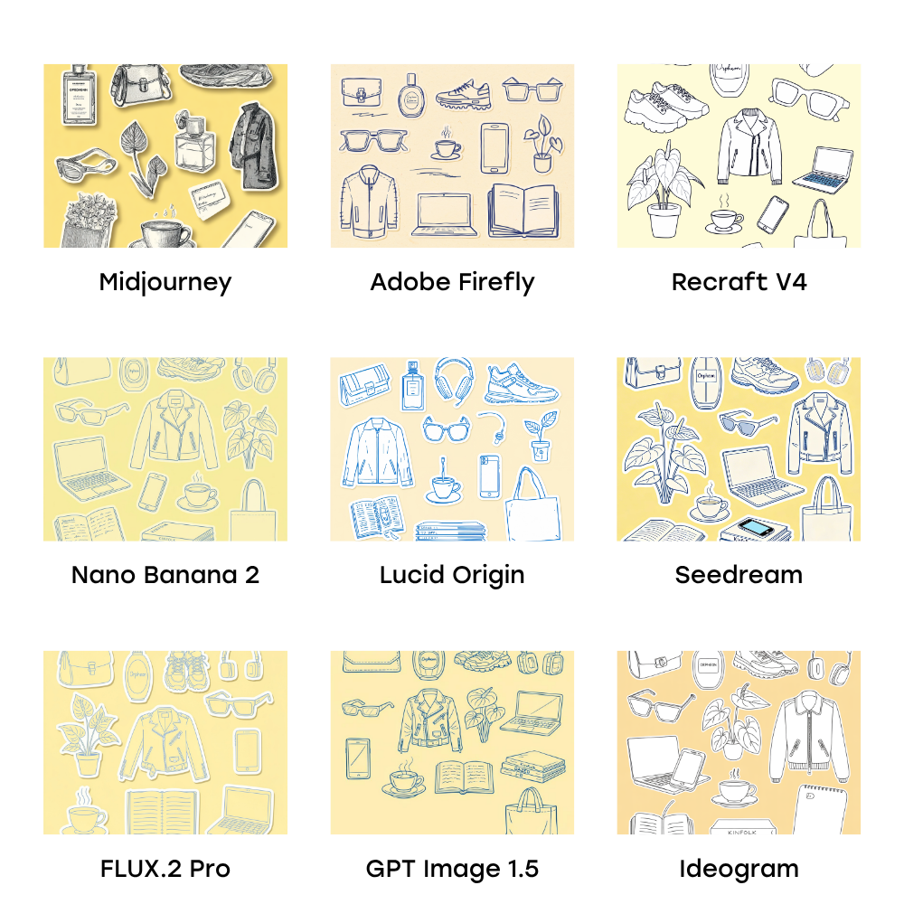
A sticker sheet of hand-drawn doodle illustrations on a butter yellow background, with generous spacing between every object so each can be cropped as an individual sticker. Exactly these objects and nothing else: 1) a structured clutch bag with clasp hardware, 2) a tall oval perfume bottle with a label reading "Orpheon", 3) chunky lace-up trail running sneakers, 4) wireless square transparent over-ear headphones with absolutely no wire and no earbud attached completely standalone, 5) angular rectangular sunglasses, 6) a leather zip-up moto biker jacket with zippered pockets, 7) an anthurium plant with large waxy leaves and a spadix, 8) an open laptop computer, 9) a smartphone with a screen, 10) a single hot steaming cup of tea in a teacup on a saucer no iced drinks, no straws, no second cup, 11) an open journal with handwritten lines on the pages, 12) a flat neat stack of magazines with spines reading Kinfolk, Dazed, i-D, 13) a plain simple canvas tote bag with handles not mesh, not net. Light blue line art on butter yellow background, single color, simple wobbly hand-drawn line art, outlines only, zero shading, zero fill, zero color blocks. Flat lay arrangement.
For product shots:
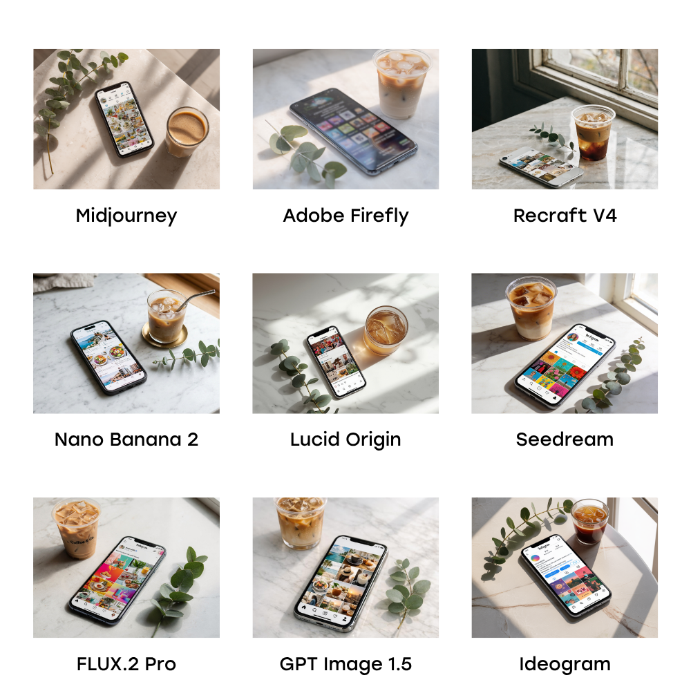
A realistic image of an iPhone resting on a light marble surface, screen facing up, showing a colorful Instagram feed. A small iced coffee in a clear cup and a sprig of eucalyptus beside it. Three-quarter overhead angle, soft natural window light from the right, gentle shadows. Clean, styled, editorial product photography. No people, no hands, no text overlays, no watermarks.
For typography as design:
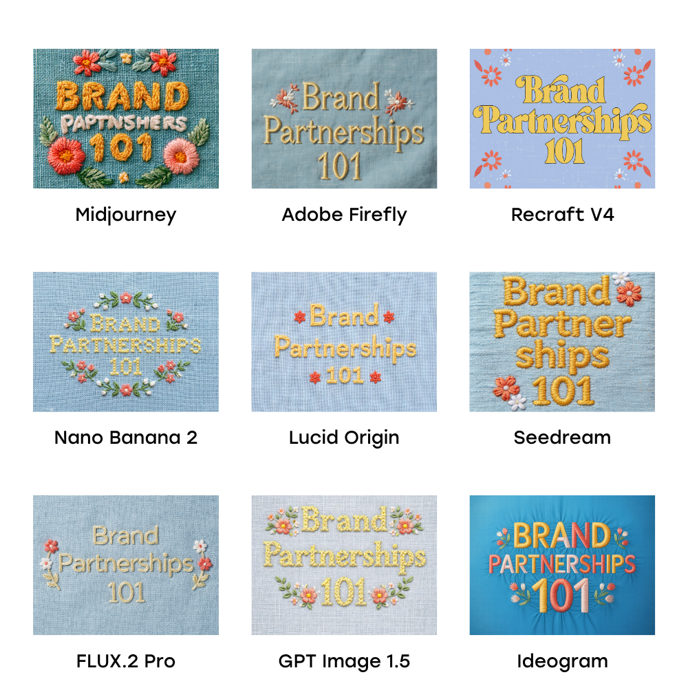
Square graphic. The phrase 'Brand Partnerships 101' rendered as colorful embroidery stitching on light blue linen fabric background. Letters in butter yellow thread with visible stitch texture, cross-stitch style. Small decorative floral embroidery accents in coral and white thread flanking the text. Fabric has subtle woven texture. Warm, tactile, handcrafted feel. No photographs of real objects, no watermarks.
You'll see how each model handled these prompts (and where they fell apart) in the reviews below.
The nine best AI image generators
I tested nine AI image generation models across three prompts: a hand-drawn doodle sticker sheet, a styled product flat lay, and an embroidered typography graphic.
| AI generator | Best for | Key strength |
| Nano Banana 2 | Overall accuracy | Most consistent rendering of real-world objects and styles. |
| Seedream | Typography & CapCut | Flawless text spelling and placement within images. |
| Recraft V4 Pro | Designers | Superior control over visual style and reference images. |
| Midjourney | Artistic visuals | High visual richness and mood-driven outputs. |
| Adobe Firefly 5 | Adobe users | Seamless integration with Photoshop and Illustrator. |
| FLUX.2 Pro | Creative liberty | Unique point of view and excellent shadow handling. |
| Ideogram 3.0 | Text precision | Reliable spelling for text-heavy graphics. |
| GPT Image 1.5 | ChatGPT users | Convenience for those already in the OpenAI ecosystem. |
| Lucid Origin | Dimensionality | Distinctive 3D quality and quick generation. |
Some of these are models (the AI that generates the image), and some are platforms (where you access the model). Think of it like this: Nano Banana 2 is a model made by Google, but you can use it inside platforms like Leonardo.ai without going to Google directly.
Rather than trying multiple tools across different websites, I used Leonardo.ai as my testing hub for the models available there, testing the most recent version of each. Then I tested Midjourney, Recraft, and Adobe Firefly as standalone tools.
Once you've made your graphics, you can schedule them with Buffer for free to Instagram, TikTok, LinkedIn, Threads, and more from one place.
Now, the results.
Nano Banana 2 (Google)
Best for: Creators who want the most accurate rendering of specific real-world objects and styles, particularly for illustration work.
Nano Banana 2 is a Google model, and part of a family that's actively evolving. When I asked for a "Diptyque Orphéon" perfume bottle or "chunky trail running sneakers from Salomon," Nano Banana seemed to actually know what those things look like. This one got the closest to reality.
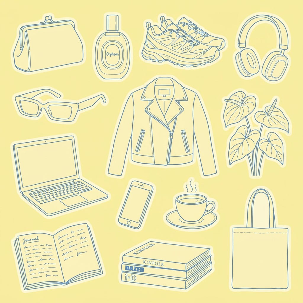
How it handled illustration: This was my top pick for the illustration prompt. The hand-drawn style landed, the proportions were correct, and nothing felt off. It got the style of the perfume bottle right and even rendered the magazine spines with fonts that felt close to the real publications.
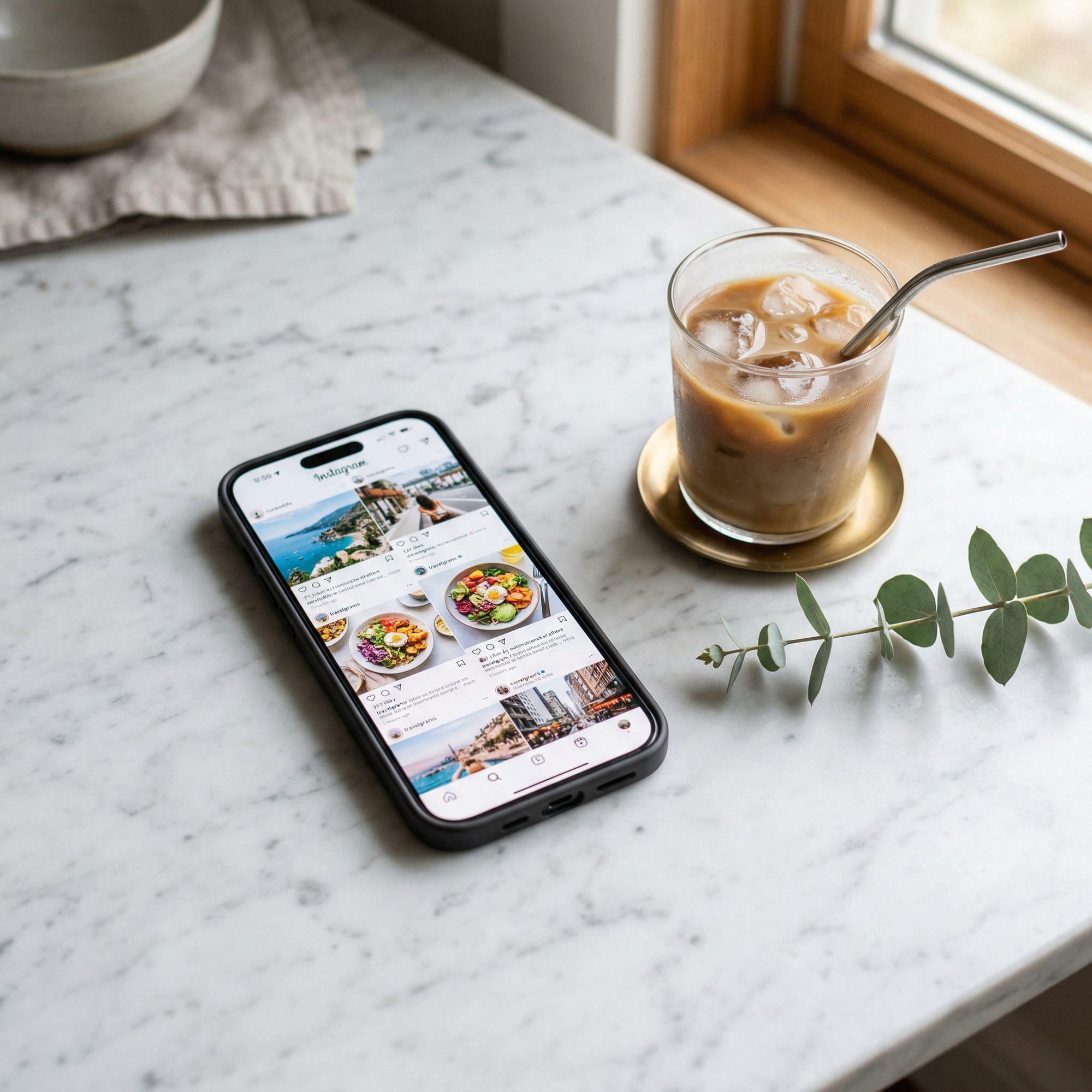
How it handled the product shot: Nano Banana came closest to generating a realistic Instagram feed, and the phone itself felt more believable. It added elements I hadn't asked for that made the scene feel lived-in.
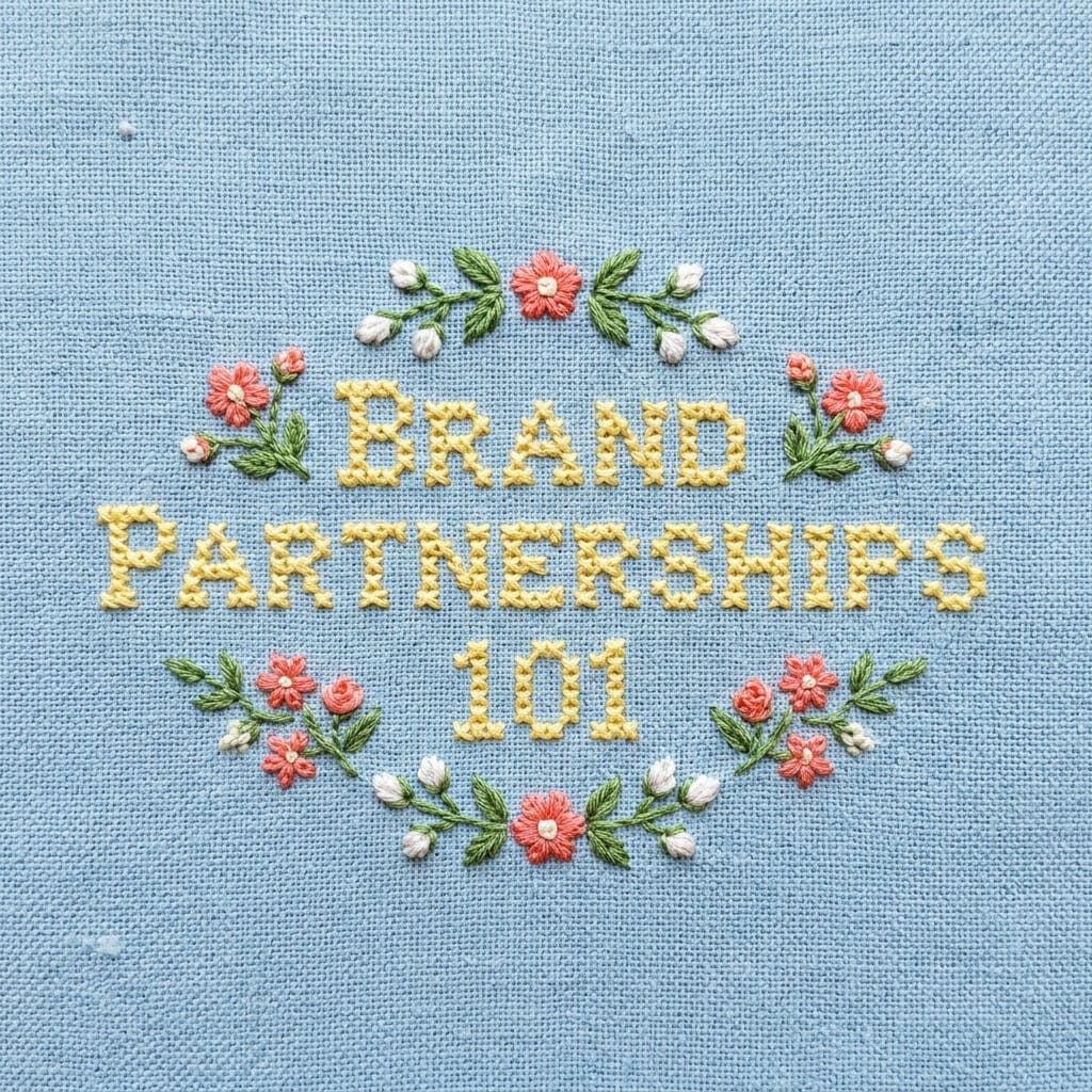
How it handled typography: The embroidery text came out whimsical and stylized, with visible texture on both the fabric and the stitching. The flowers and surrounding design elements had a cohesive quality.
Seedream (ByteDance)
Best for: Creators who need reliable text generation in their images and access within CapCut.
Seedream is ByteDance's image generation model. You can use it if you have CapCut Pro.
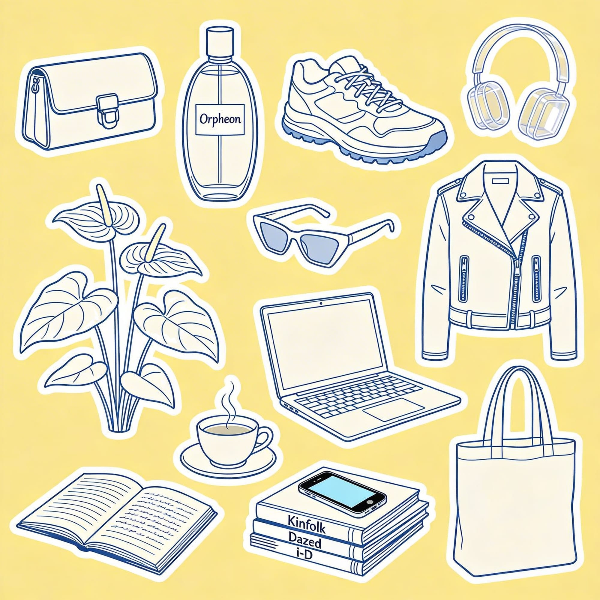
How it handled illustration: Seedream produced the most sticker-like effect. Text generation was spot-on. Every label, every spelling, every piece of text in the image was correct. It also correctly rendered an anthurium instead of defaulting to a monstera.
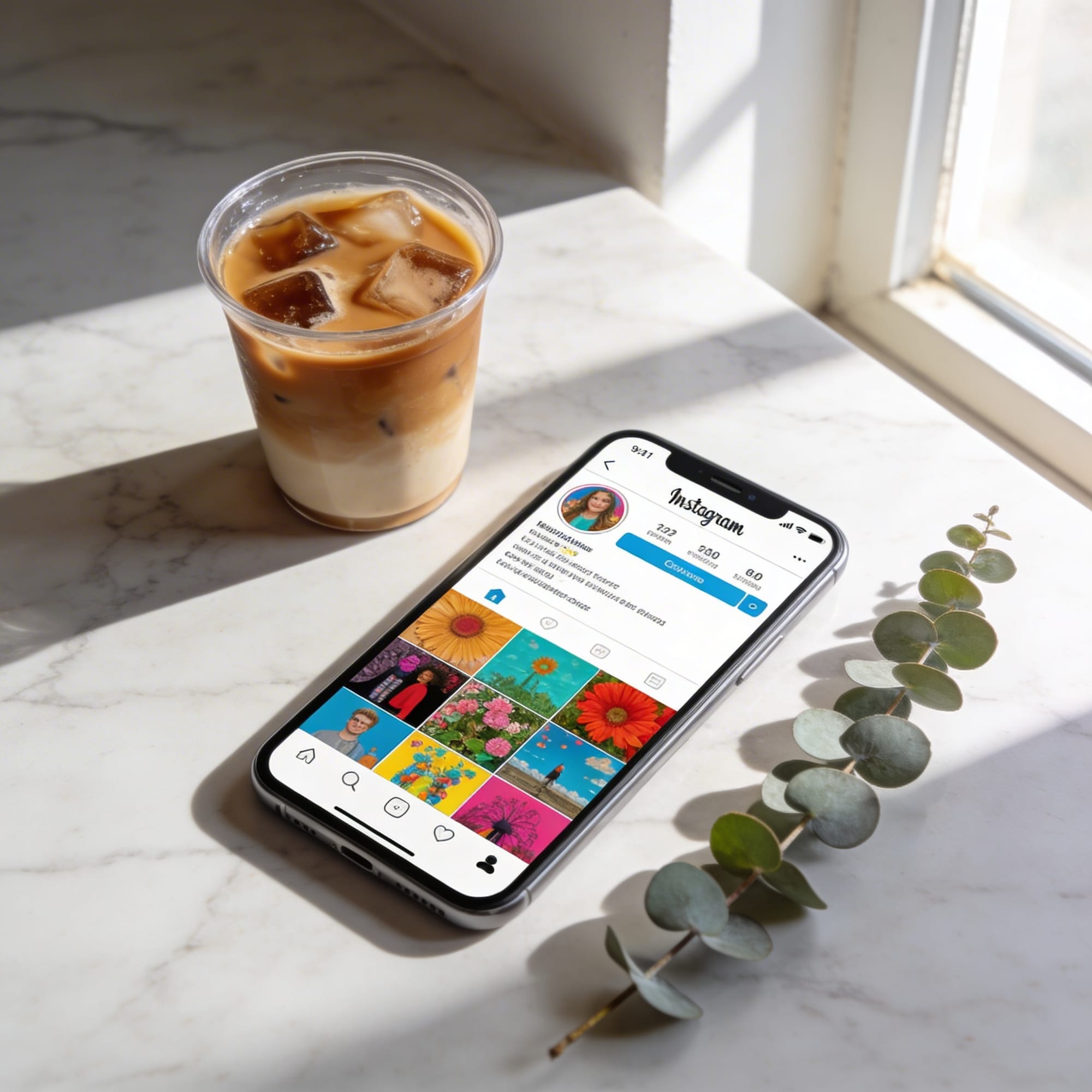
How it handled the product shot: The phone was the weak point: it was clearly not a real device. But the surrounding elements held up. The shadows were well-placed, and the coffee cup was good.
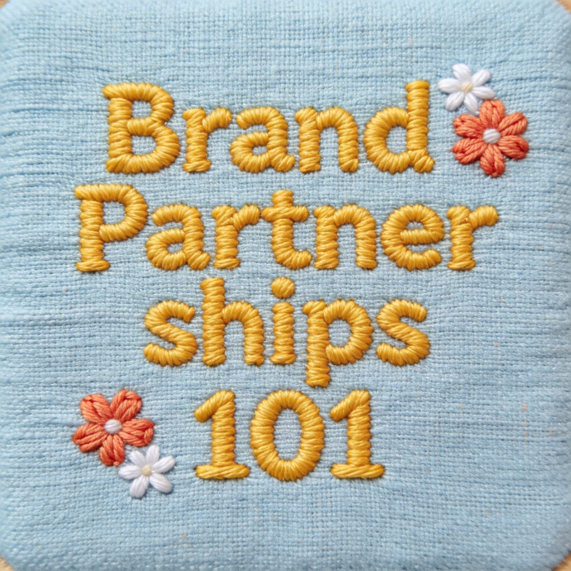
How it handled typography: Seedream did well here. The fabric texture behind the text looked realistic, and it got most of the prompt elements right. The font weight felt slightly cartoonish compared to the fabric realism.
Recraft V4 Pro
Best for: Creators and designers who want serious control over visual style and want access to Recraft's reference and refinement features.
Recraft has a massive library of existing designs from real designers that you can use as reference images. You can assign a color palette, select from a wide range of visual styles, and work with its agentic chat to refine your images through conversation.
It's also one of the tools that handles hex codes better than others, which helps if you're working from a brand palette.
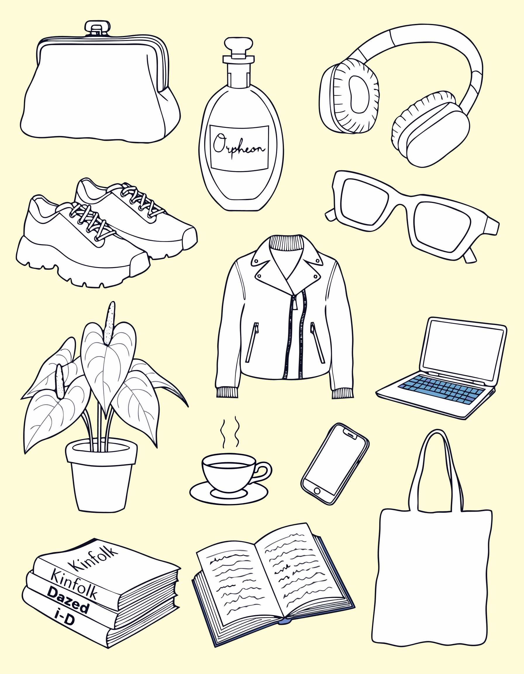
How it handled illustration (using the Vector Pro model): The images had that hand-drawn quality I was going for. Objects like the plant and the coffee cup looked right. But inconsistencies crept in: the sneakers felt generic, and the laptop suddenly introduced a color that nothing else in the image had.
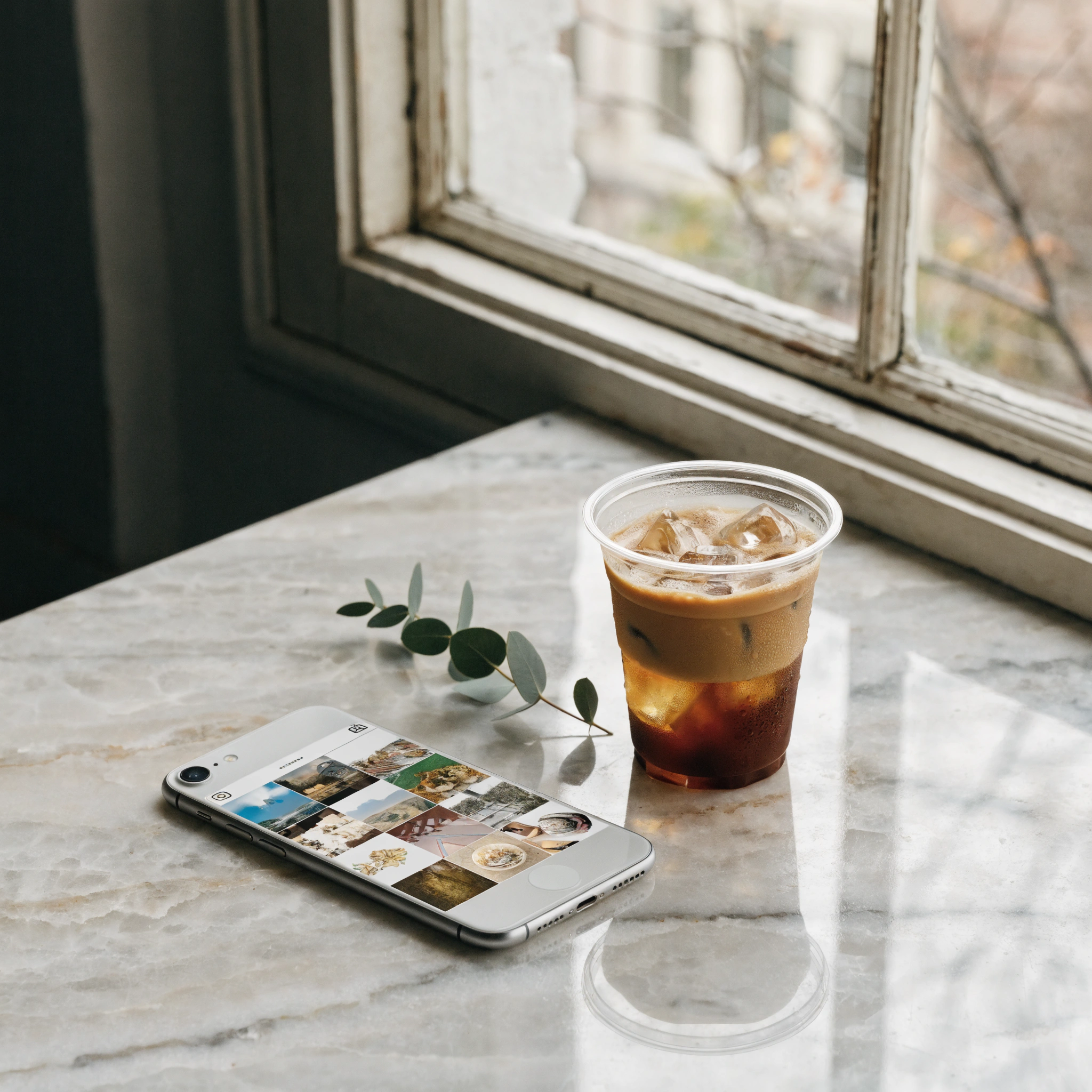
How it handled the product shot (using the V4 Pro model): At a glance, the image looked like a real product photo. The objects cast very realistic shadows and the condensation detail on the iced coffee caught my attention. But zooming in told a different story: the phone dimensions looked off, and the table was sinking into the wall.
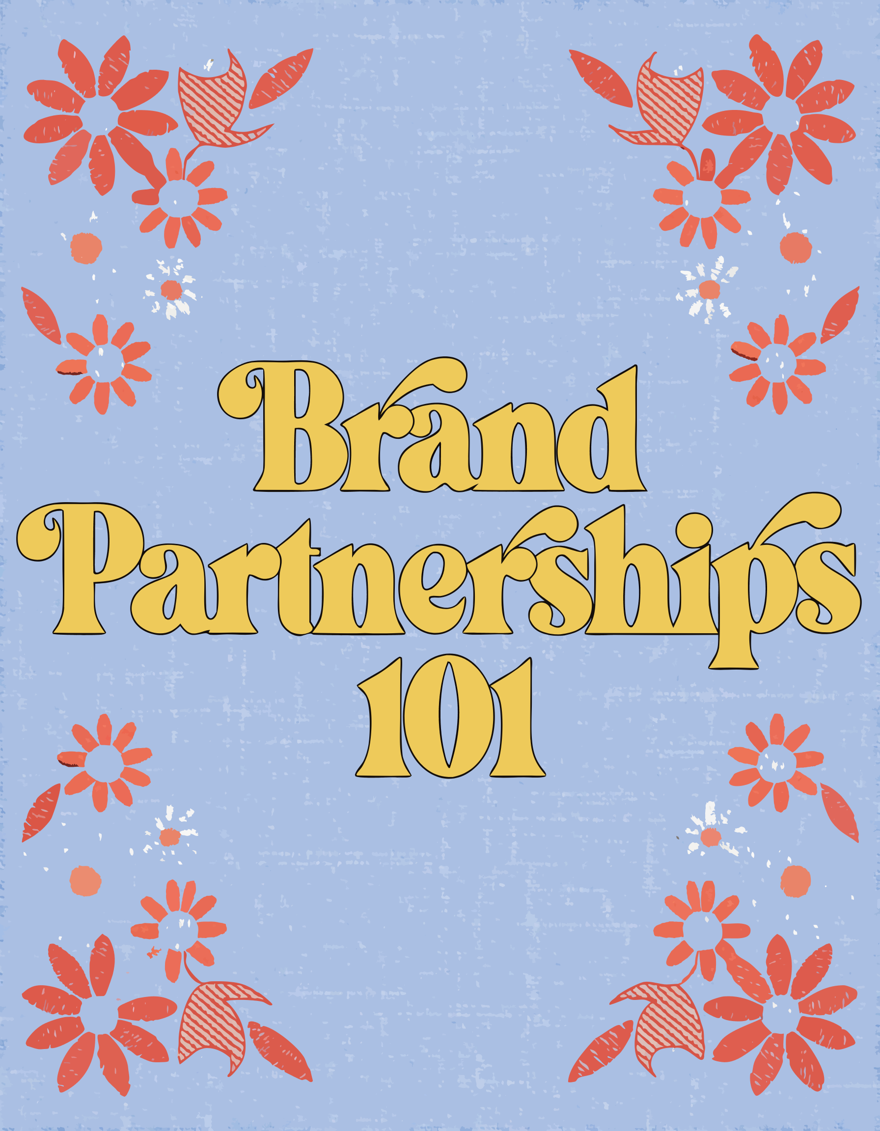
How it handled typography: Recraft went its own direction here. It didn't deliver the embroidery realism I asked for, but what it did produce had a clear aesthetic vision and a handcrafted feel that I could actually see myself using.
Midjourney
Best for: Creators who want artistic, mood-driven visuals and don't need precise text or highly specific object rendering.
Midjourney has a reputation as the "artistic" AI image generator, and the visual richness of its outputs backs that up. The editing experience is button-based: you can vary elements to be subtle or strong, lean more creative, and even animate your results without leaving the tool.
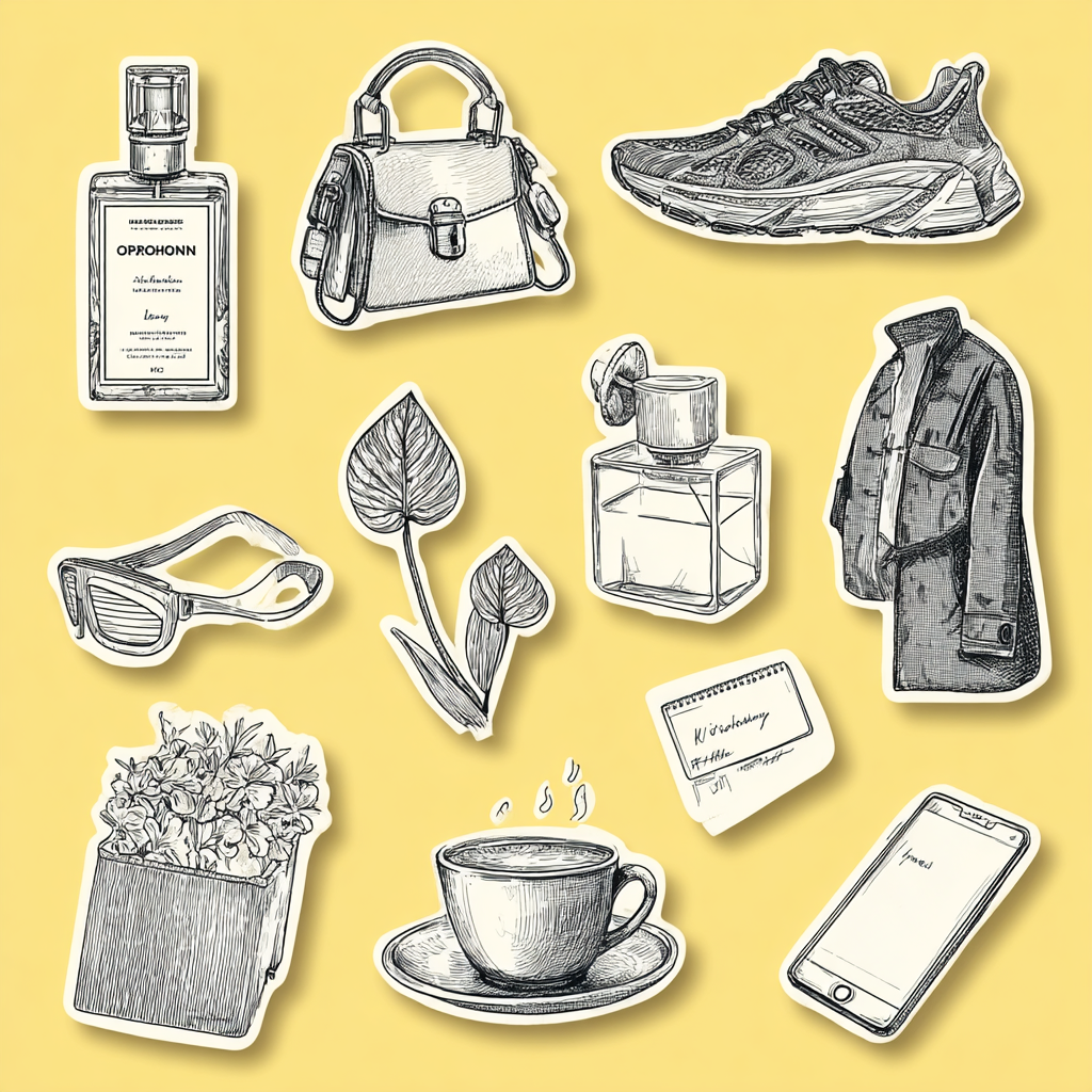
How it handled illustration: Of the four images Midjourney generated from my sticker sheet prompt, only one was close to usable. Midjourney struggles with this level of detail and specificity. When you're listing 13 distinct objects with particular characteristics (a clutch with clasp hardware, transparent over-ear headphones, magazines with specific spine text), it can't keep up. The objects it did render looked good individually, but it missed the brief.
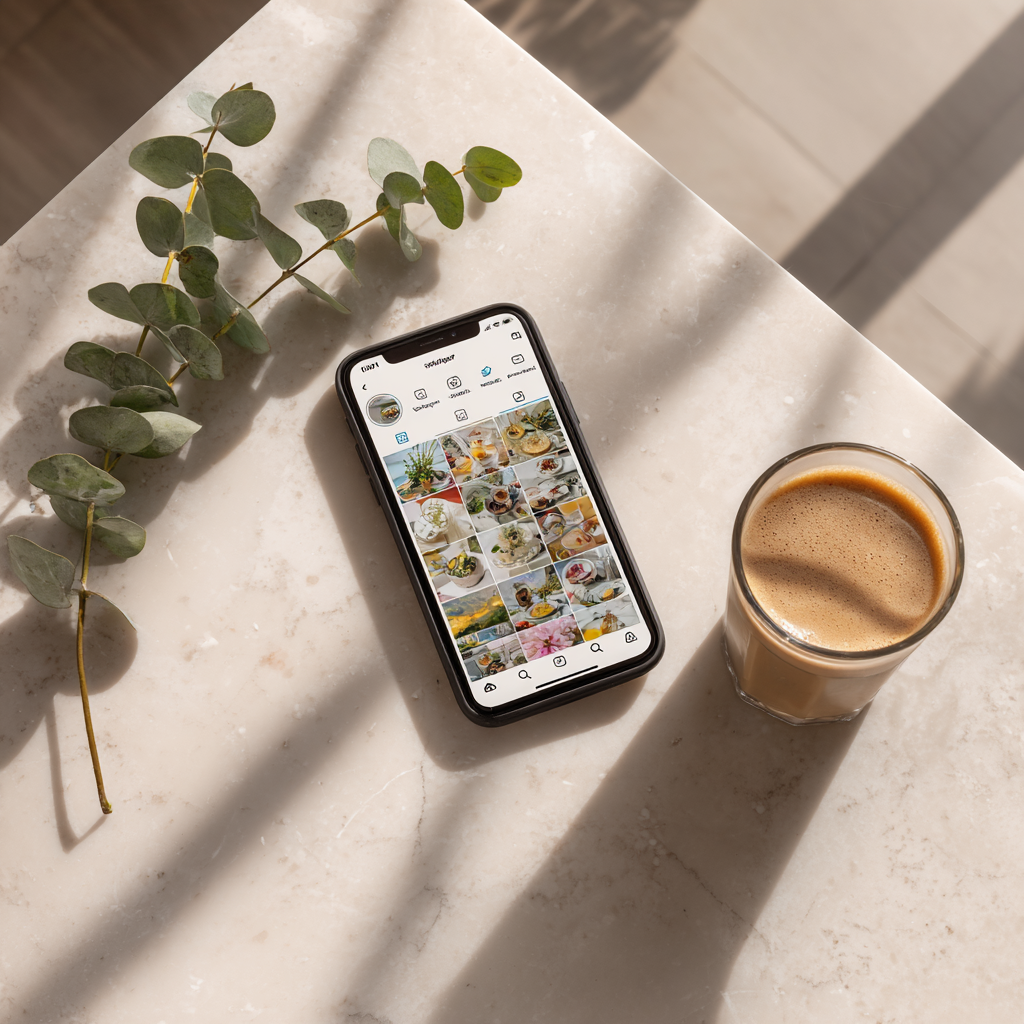
How it handled the product shot: The composition, lighting, and overall mood landed well. But the details fell apart: the "iced coffee" had no ice (just an ambiguous glass of something), and the Instagram feed on the phone screen was warped beyond recognition.
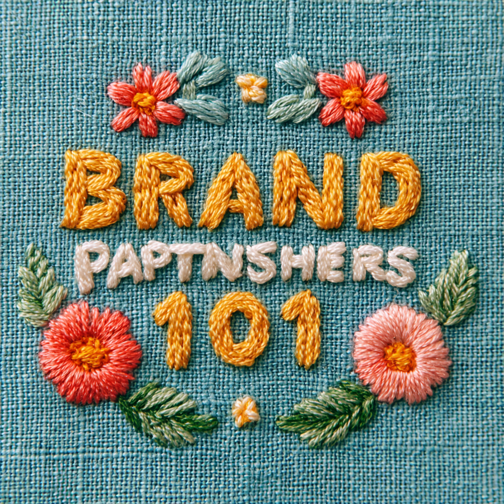
How it handled typography: This is where Midjourney hit a wall. It spelled "brand" correctly and got "101" right, but "partnerships" was garbled. The embroidery stitching itself looked genuinely handcrafted, maybe even the best texture of the bunch.
Adobe Firefly 5
Best for: Creators already in the Adobe ecosystem who want clean commercial licensing and don't mind working around brand-name restrictions.
Adobe Firefly 5 is the latest image-generation model from Adobe, and its biggest selling point is its workflow integration. If you're already in Photoshop or Illustrator, you can generate an image and move it straight into your editing workspace.
I don't use Photoshop or Illustrator in my day-to-day workflow, but if they're part of your workflow, the direct handoff alone might make Firefly worth trying.
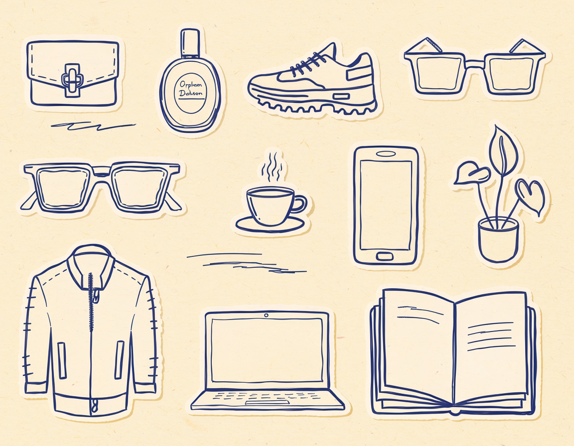
How it handled illustration: The hand-drawn illustrations had a whimsical quality to them and felt truly hand-drawn. There were some attempts at making things feel "human-generated," like scribbles on the page, which was a nice touch. But the accuracy wasn't there: the leather jacket had zipper placements at the collar and bottom that were visibly wrong.
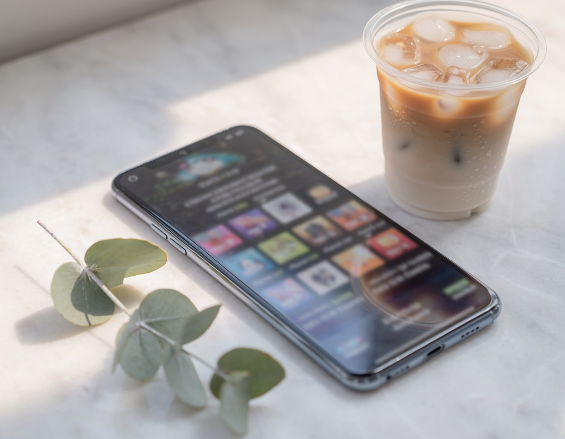
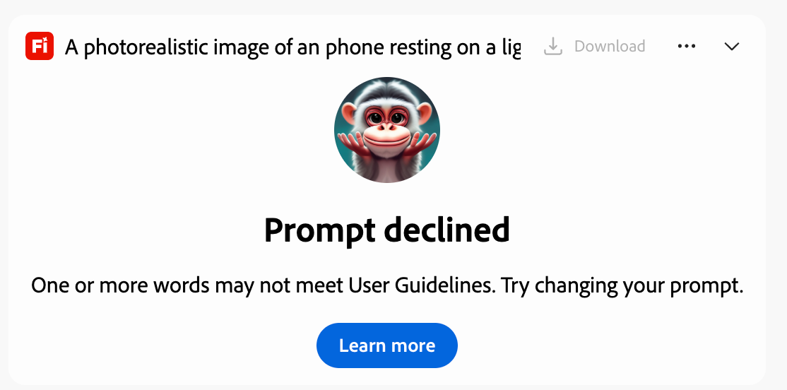
How it handled the product shot: This is where Firefly's copyright-conscious training showed up in a way I wasn't expecting. It declined the words "iPhone" and "Instagram" in the prompt, which aligns with how Adobe avoids potential trademark issues.
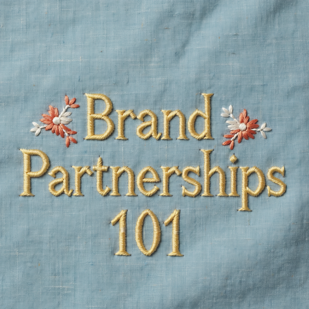
How it handled typography: The embroidery prompt was one of Firefly's better results. The fabric behind the text looked realistically aged and worn, the text itself was legible and well-generated, and there was genuine depth to the stitching.
FLUX.2 Pro
Best for: Creators who want a model that takes creative liberties with prompts and produces outputs with a distinct point of view.
FLUX.2 Pro is another model available inside Leonardo.ai. It's been gaining attention in the AI image generation space for its balance of quality and speed.
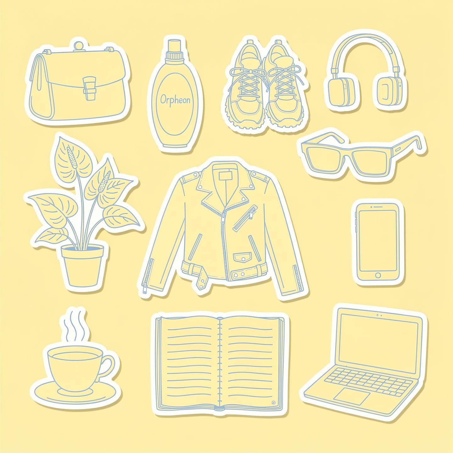
How it handled illustration: FLUX created what looked like printed-out stickers that had been physically laid on a surface. The model found its own middle ground between illustration and photography. The hand-drawn feel was there, but I wished the stickers sat flatter against the background.
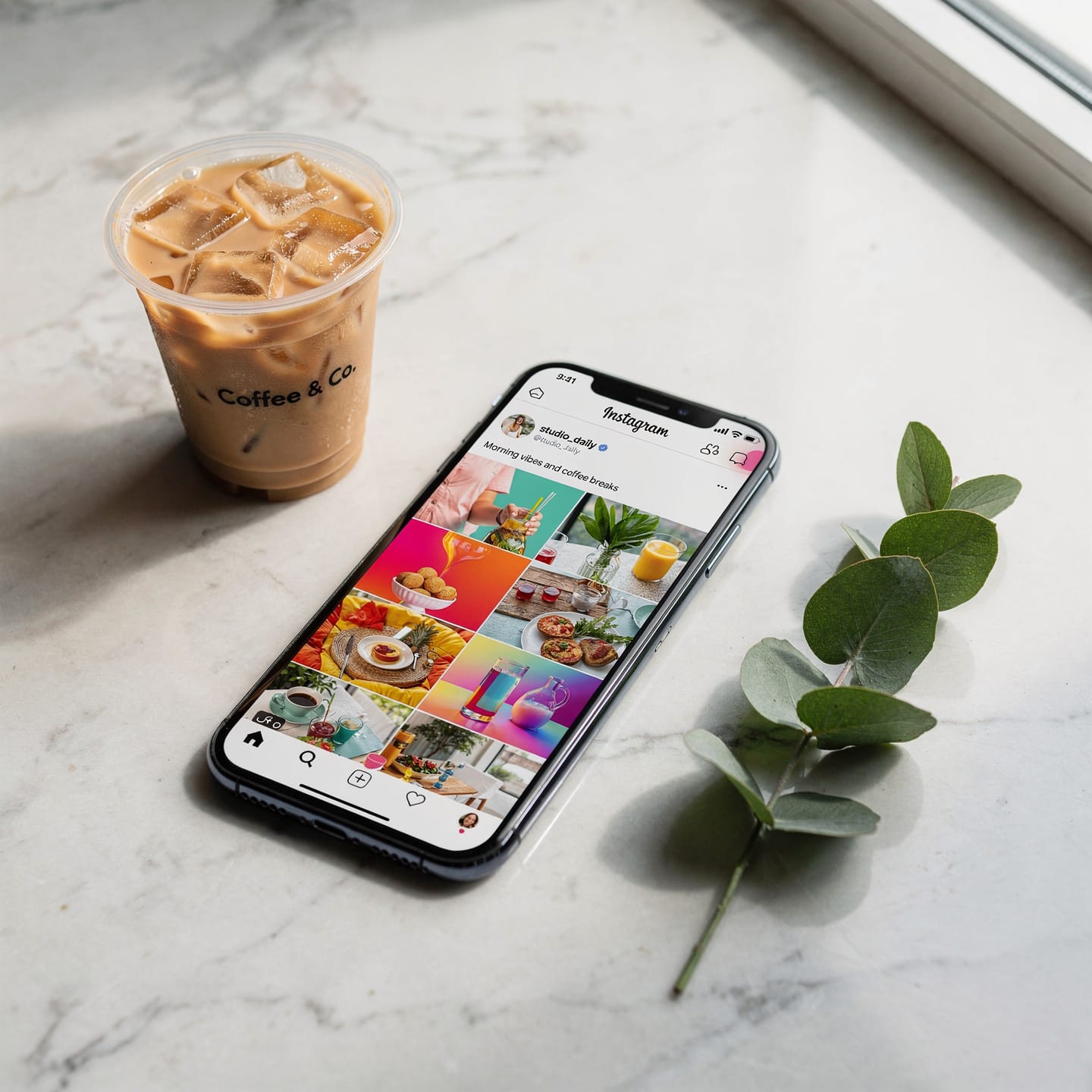
How it handled the product shot: FLUX handled shadows well and even added branding to the coffee cup. The phone was much closer to reality than the images from other models.
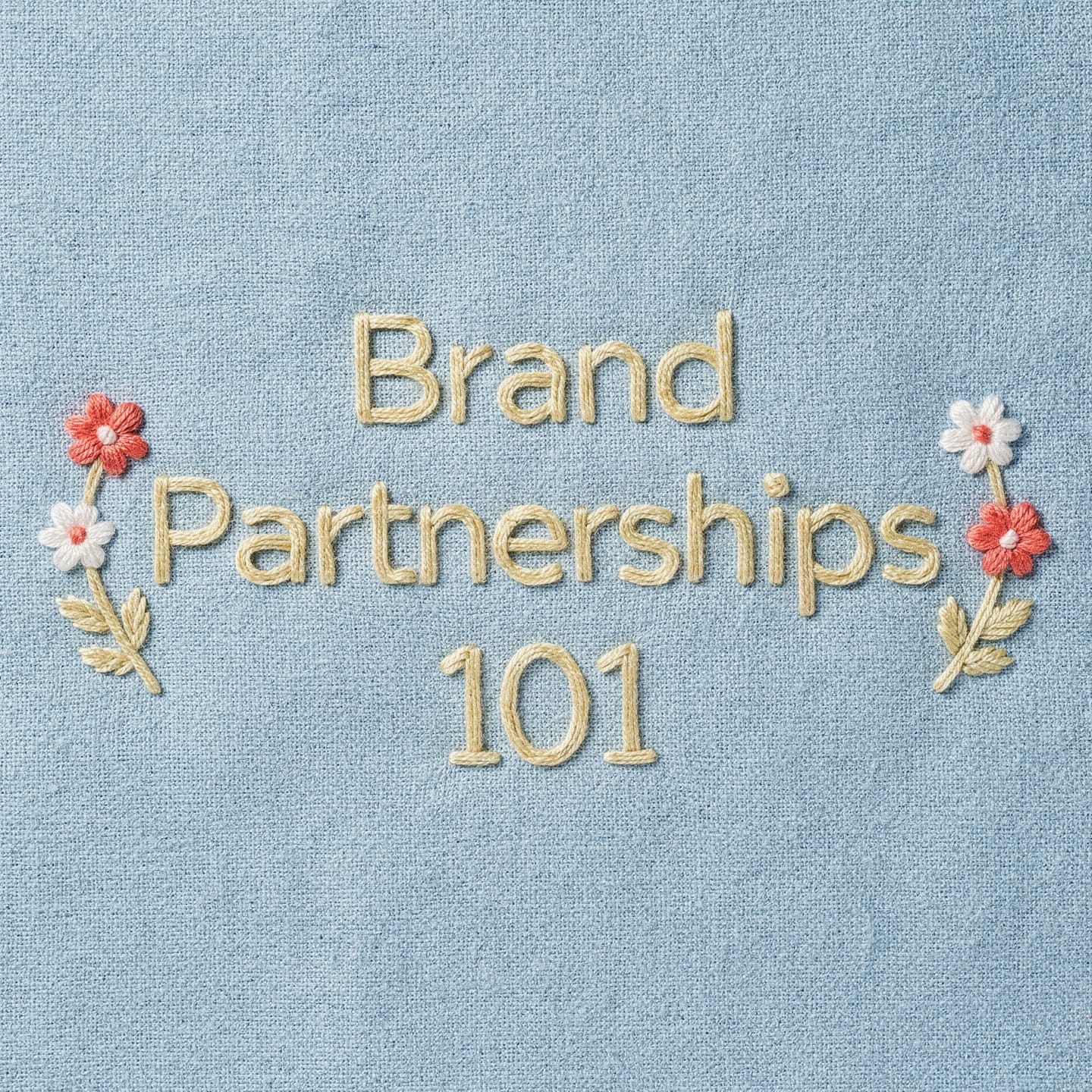
How it handled typography: The stitching texture is genuinely impressive. It looks like real thread. But the text itself looked slightly glued on rather than stitched into the fabric.
Ideogram 3.0
Best for: Creators who want accurate text in their generated images and are willing to trade visual personality for spelling precision.
Ideogram 3.0 is positioned as being great at generating images with text, but I found that it only got 75% of the way there in some of my requests.
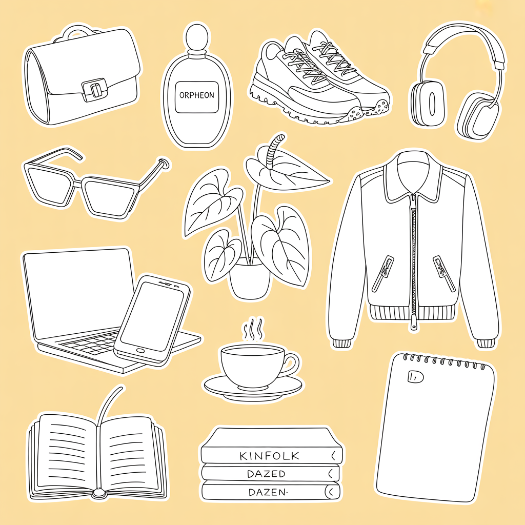
How it handled illustration: The colors were off: the yellow was deeper than requested and there was no blue. The illustrations themselves were generic. It gave me something closer to a monstera when I asked for an anthurium.
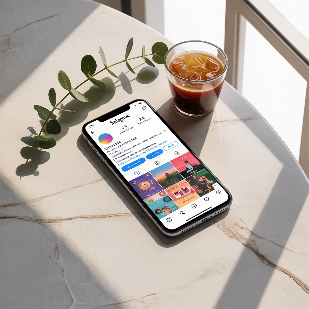
How it handled the product shot: The image had that slightly-off quality that's hard to name but easy to spot — close to real, but not quite there. The coffee looked slightly fake in a way that's easy to pinpoint as AI. The shadows and lighting were actually good.
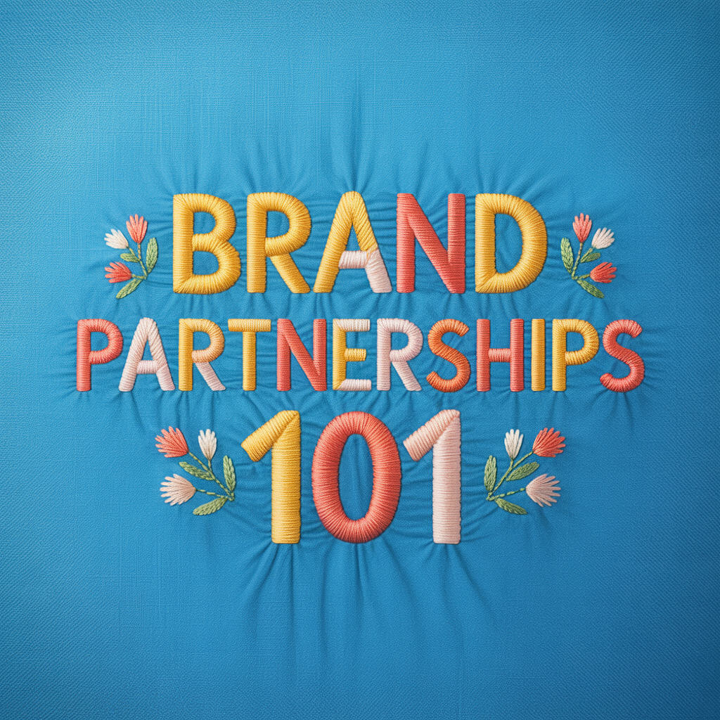
How it handled typography: Ideogram went for a cartoonish take on the embroidery. The effect didn't land for me. It felt tool-generated rather than handcrafted.
GPT Image 1.5 (OpenAI)
Best for: People already using ChatGPT who want quick image generation without switching tools.
I tested GPT Image 1.5 inside Leonardo.ai. You can dig deeper into style selection, adjust quality settings, and control image dimensions.
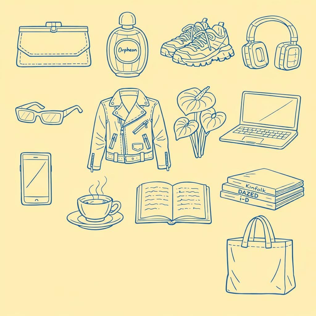
How it handled illustration: This was not GPT Image's strongest showing. The sticker images looked almost compressed, probably because the spacing I requested resulted in a lot of empty space that the model didn't know how to handle. The whole image also had that yellowish tinge.
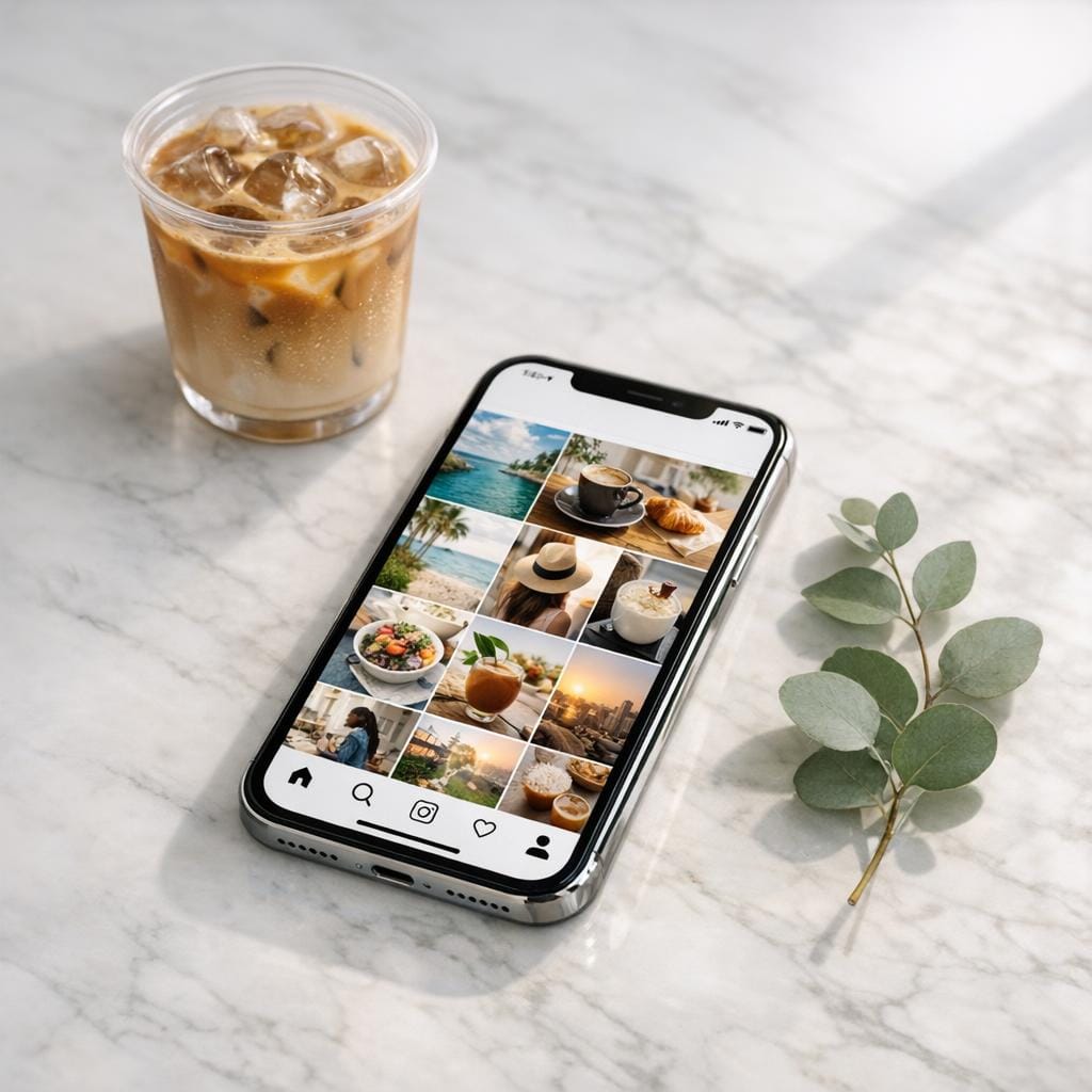
How it handled the product shot: It came closer than the illustration prompt, but the Instagram feed on the phone screen was missing the visible branding and layout cues.
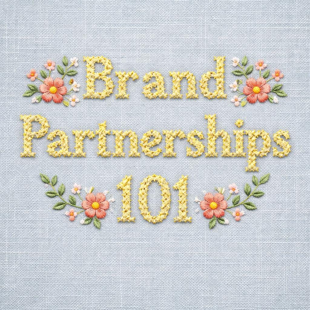
How it handled typography: GPT Image leaned hard into the cross-stitch texture, which was technically what I asked for. It followed the prompt more faithfully than several other tools.
Lucid Origin
Best for: Creators who want quick generation with a distinctive dimensional quality and don't need pixel-perfect prompt adherence.
Lucid Origin offers both fast and ultra generation modes, plus a more limited set of style options compared to some other models on the platform. The ultra mode adds more detail but takes longer.
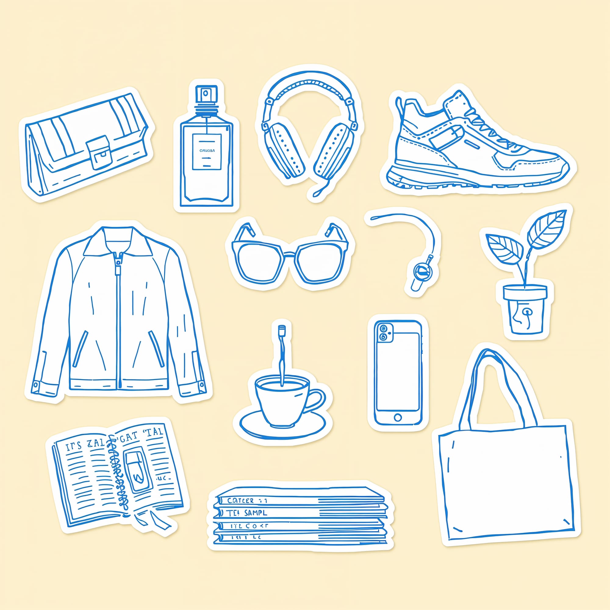
How it handled illustration: On closer inspection, the text generation was poor, and several requested objects didn't quite match the prompt. On the positive side, the stickers had an almost 3D quality that was visually interesting.
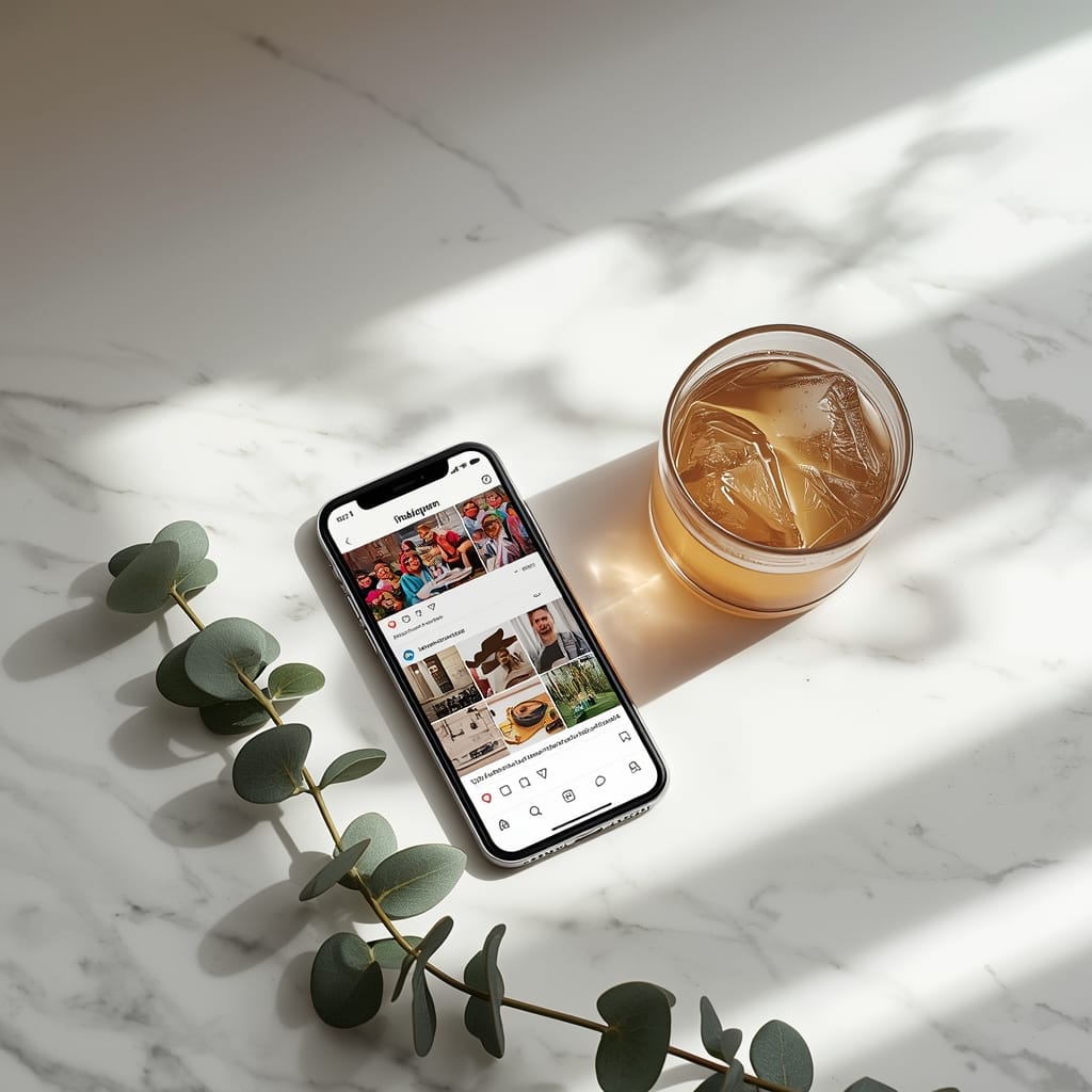
How it handled the product shot: This was one of the few tools that actually interpreted "flat lay" literally, going full top-down. But the ice in the cup and phone content looked deeply unrealistic.
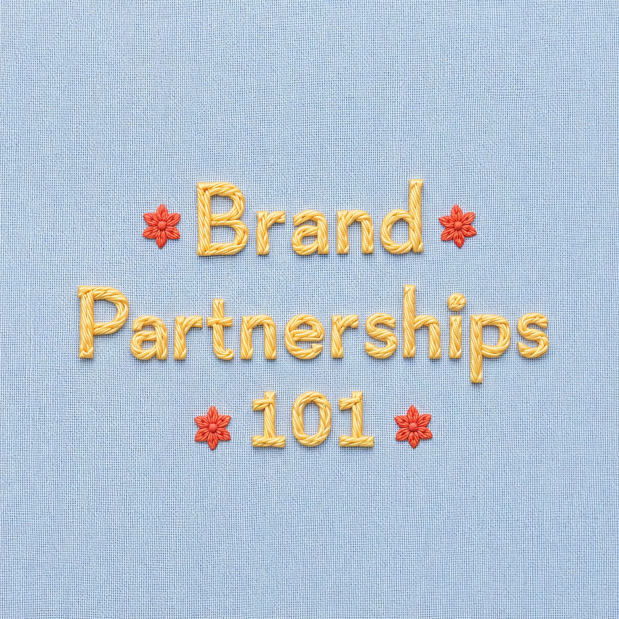
How it handled typography: I liked what Lucid Origin generated here. The colors were nice and the embroidery had a slightly raised quality. It didn't get every element right, but the overall aesthetic was appealing.
Ready to put your AI-generated visuals to work? Get started with Buffer for free and start scheduling your content today.
FAQs about AI image generators
What is the best AI image generator overall?
Nano Banana 2 (Google's model) was the most consistent performer across all three of my test prompts. It handled illustration, the product shot, and typography well.
I tested it inside Leonardo.ai, which I'd recommend as a starting point since it gives you access to multiple models in one platform. If you're already in the Adobe ecosystem, Firefly 5 is worth trying for the workflow integration and cleaner copyright positioning. And if you want the most artistic, visually rich outputs, Midjourney still has a distinct quality that other tools can't match, as long as you don't need accurate text.
What's the best AI image generator for social media graphics?
It depends on what kind of graphics you're making:
- For illustrated elements: Nano Banana 2 and Recraft were the strongest.
- For product shots: Nano Banana 2 and FLUX.2 Pro produced the most convincing results.
- For text-heavy graphics: Seedream and Ideogram 3.0 had the most reliable text generation.
Once you've generated your visuals, tools like Buffer can help you schedule and publish them across all your social channels so you can go from creation to posting without switching tabs.
Can AI image generators put text on images?
Some can, some can't. Seedream and Ideogram 3.0 were the most reliable at spelling and placing text in my tests. Adobe Firefly 5 handled it well. Midjourney struggled badly with anything beyond short, simple words.
How much do AI image generators cost?
Most have a free tier, but it comes with limits. You'll usually get a daily or weekly credit allowance rather than unlimited access, and on most free plans, everything you generate is public.
From the tools in this article: Leonardo.ai, Recraft, and Ideogram all have free plans, with credits that refresh daily (Leonardo.ai and Recraft) or weekly (Ideogram). Midjourney is the exception. It doesn't have a free plan, and its cheapest plan is $10 a month.
If you're making graphics for a business, I'd check the plan details before you start. Free plans often make your images public, and some (like Recraft's) don't allow commercial use at all, so a paid plan is usually the safer bet for brand work.
Can I use AI-generated images for my brand or business?
Yes, many AI image generators allow commercial use under certain plans or terms, but the rules vary by platform. Check the tool’s current terms before using generated images commercially.
But there's an important distinction: commercial use rights aren't the same as copyright ownership. The U.S. Copyright Office has ruled that typing a prompt doesn't make you the legal author of the output, which means someone else could theoretically use the same (or very similar) image without infringing on your work.
If your brand relies on original, distinctive visuals, that's worth factoring in. AI-generated images work great as supporting graphics, social media content, and inspiration, but for your core brand assets, you may still want human-created originals you can fully protect.
Can ChatGPT generate images?
Yes. ChatGPT can generate images using OpenAI's image generation model. You can type a description directly into ChatGPT, and it will produce an image for you.
In this article, that same model is tested as GPT Image 1.5 inside Leonardo.ai, which gives you more control over style settings and image dimensions. It's a solid option if you're already using ChatGPT and don't want to switch tools. Just know that complex, detail-heavy prompts (like a sticker sheet with 13 specific objects) can trip it up.
Do AI-generated images look obviously AI?
It depends on the type of image. For illustration and stylized graphics, most AI outputs are convincing enough to use as-is. For product shots, the cracks usually show on closer inspection — phone screens, text within the image, and small product details are the biggest giveaways.
Resolution matters, too. Some tools now generate at native 2K or even 4K, which helps images hold up in larger formats. If you're generating at lower resolutions and then scaling up, the AI-ness becomes much more visible.
How do AI image generators work?
Every AI image generator on this list works by turning text into pixels, but they don't all do it the same way. They use different model architectures to turn prompts into images. Some use diffusion-based techniques, while newer multimodal models integrate language understanding and image generation more closely. The technical approaches vary by model, and companies don’t always publish every architectural detail.
Diffusion models start with visual noise and gradually remove it until an image forms.
Autoregressive models work more like writing a sentence, generating the image piece by piece.
Some newer image models use more advanced reasoning capabilities to interpret complex prompts before generating an image, which can improve instruction-following, text rendering, and object accuracy.
One more thing worth knowing: these models learn from images and their descriptions. That's why photography terms work so well in prompts (the training data is full of photo captions) and why specific illustration vocabulary like "ink hatching" or "gouache blocks" gets better results than "make it look drawn." You're speaking the language the model was trained on.
How do I make social media graphics with an AI image generator?
Choose a tool from this list, then type a description (called a prompt) of the image you want. Most tools are free to start and don't require design experience.
The key is being specific. Lead with your subject ("a ceramic mug on a café table"), then add style and lighting details ("hand-drawn illustration, single color, line art only"). Vague prompts produce generic results. The prompting section above has a template you can follow for illustrations, product shots, and text-based graphics.
Once you have an image you like, I'd bring it into Canva (or whatever design tool you use) to add your branding, then schedule it in Buffer with the rest of your posts.
More AI resources
Try Buffer for free
200,000+ creators, small businesses, and marketers use Buffer to grow their audiences every month.