Without engagement, social media is just media.
If you've ever posted something you were really proud of and heard nothing back (or maybe just a ‘like’ from your mom, bless her), you already know what it’s like to feel like you’re shouting into a void. It can be demoralizing and make you question everything: your content, your timing, the algorithm, why you’re doing this in the first place.
The good news is, there are things you can do to improve your engagement and control it — to a degree. It's a practice, one that gets better when you understand what you're measuring, what "good" looks like on each platform, and how to create content that gives people a reason to interact.
This guide covers all of it: what social media engagement is, how to measure it, what the numbers actually mean, and 11 strategies that consistently move the needle. Whether you're starting from zero or trying to break through a plateau, there's likely something here worth adopting.
What is social media engagement?
Social media engagement measures how users interact with your content and brand across platforms — including likes, comments, shares, saves, and replies. Unlike reach or impressions, engagement reflects active participation, not just passive viewing.
Put more simply, it is any interaction someone has with your content. It's the signal that your post got someone to stop, even for 0.1 seconds, and take an action.
But engagement is actually a two-way street:
- How your audience interacts with you through likes, shares, comments, and saves
- How you interact with your audience by responding to comments, DMs, and mentions
That second part is where most strategies fall short — and where we found the biggest untapped opportunity in our data. (More on that in Tip 8.)
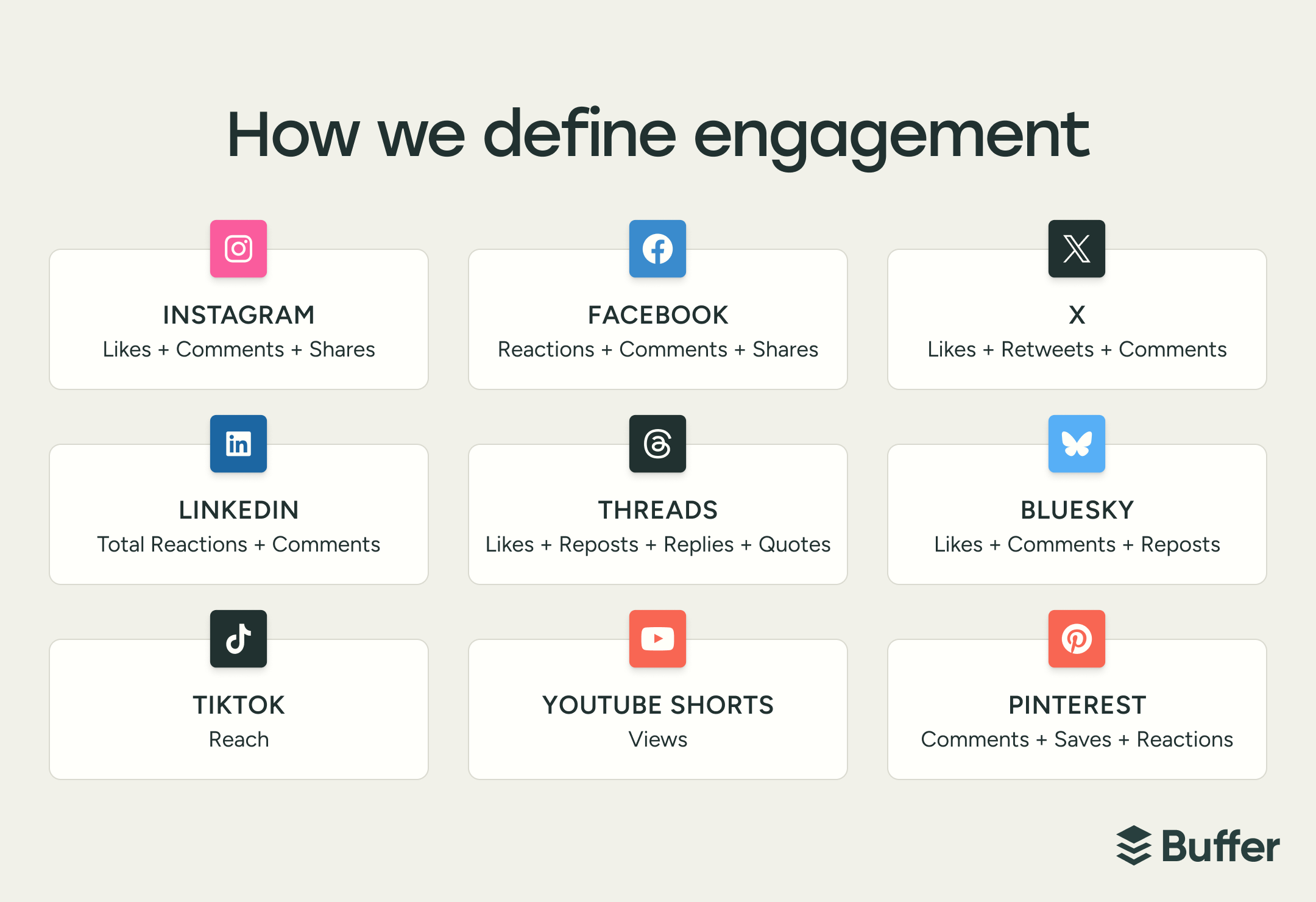
It's also worth understanding that engagement doesn't mean the same thing on every platform. LinkedIn includes clicks in its engagement rate. Instagram increasingly treats views as its primary success metric. TikTok measures engagement as a percentage of reach, while Bluesky and Mastodon rely on raw interaction counts. A "3% engagement rate" on LinkedIn and a "3% engagement rate" on X are measuring fundamentally different things.
When we dug into the data for our State of Social Media Engagement report, one of the first things that jumped out was how uneven the landscape is. Typical engagement rates range from ~6.2% on LinkedIn to ~2.5% on X — and comparing those numbers side by side without context might lead you to the wrong conclusions.
Those numbers only tell part of the story, though. A high engagement rate on a post that went mildly viral for the wrong reasons — a pile-on, a misread joke, a screenshot that traveled out of context — doesn't mean your content strategy is working. Neither does a strong like-to-comment ratio if nobody's actually talking, or an account that's racking up saves while the creator never responds to a single comment. Engagement is useful data. Engagement you're participating in is how you build something.
So before you try to "boost" your engagement, it helps to understand what you're actually measuring, what "good" looks like, and how your own participation fits into the equation. That's where we'll start.
Why social media engagement matters
Reach and follower count get a lot of attention, but engagement is the metric that actually tells you whether any of it is working.
Here's why it matters across the board:
- Algorithms use it as a ranking signal. Every platform covered in this article rewards engagement in some form. On X, conversations get weighted heavily in feed ranking. On Facebook, posts with meaningful interactions get pushed further. On Threads, replies count toward half of your views. When your content earns engagement, the platform amplifies it — driving more reach and creating more opportunities for engagement. It’s all compounding.
- It tells you what's actually resonating. Impressions tell you how many times your content appeared in front of someone. Engagement tells you whether they cared and gives a peek at why. A post with high saves is telling you something evergreen and useful landed. A post with high comments is telling you you've touched a nerve — either starting a conversation or sparking a reaction.
- It builds the kind of audience that sticks. Followers are easy(ish) to accumulate and even easier to lose. An engaged audience is harder to build and far more valuable — to your brand, to potential collaborators, and to any brand partnerships you're pursuing. Influencer marketers consistently prioritize engagement rate over follower count when evaluating creators, because engagement signals that an audience is active and responsive, not just passively consuming.
- It creates a direct line to your community. It's easy to dismiss the comments, DMs, and replies as just metrics. But engagement is so much more meaningful than that. It's your audience telling you what they need, what they're struggling with, and what they want more of. As we found in our research, the accounts that treat engagement as a two-way conversation, rather than just a performance indicator, consistently outperform those that don't.
Reach is the platform doing you a favor. Engagement is your audience choosing you.
How to measure your social media engagement
Before you can improve your engagement, you need to know what you're actually tracking — and what the numbers mean.
Engagement rate is usually the go-to metric. It's calculated by dividing your total engagements (likes + comments + shares + saves) by either your follower count or your total impressions, then multiplying by 100. Follower-based rates tell you how well you're activating your existing audience. Impression-based rates tell you how well your content is converting people who actually saw it. Neither is wrong — just make sure you're comparing apples to apples when benchmarking.
Not all engagements carry the same weight. A like takes one tap. A comment takes intention. A share or repost means someone put their name behind your content. A save means someone wants to come back to it. Platforms know this, and most algorithms weight these interactions accordingly — which is why a post with 20 thoughtful comments will often outperform one with 200 likes in terms of reach.
The four engagement signals worth paying close attention to:
- Comments — the highest-signal interaction; they indicate your content sparked a genuine reaction
- Shares and reposts — amplification; your audience is doing your distribution for you
- Saves — often overlooked, but a strong indicator of perceived value (especially on Instagram)
- Replies and DMs — the most intimate form of engagement; someone wanted to talk to you or had something to say about your content, for better or worse.
Reach vs. engagement is another thread worth pulling on.
- Reach measures how many people saw your content.
- Engagement measures how many did something because of it.
High reach with low engagement usually means your content is getting served but not landing. High engagement with low reach often means your content resonates deeply with a smaller audience — and that's actually a great foundation to build from.
If you want context on what your numbers mean relative to your platform's average, these platform-by-platform benchmarks are a good place to start.
11 ways to improve your social media engagement
Before we get into the section, know that not all of these will apply to where you are right now — and that's fine. Some are about understanding your baseline before you change anything. Some are about the content itself. And some are about the part most people skip: actually showing up in the conversation once the post is live.
Work through them in order, or jump to whatever your biggest gap is.
Understand where you are
Before you change anything about your content strategy, it helps to know where you stand. These first three tips are about building a clear picture of what's working, what "typical" looks like on each platform, and how the algorithms behind your feed actually decide what gets seen.
A lot of what feels like guesswork in social media stops feeling that way once you have the right baselines.
1. Use your analytics to find what's already working for you
Your analytics are the place to start in understanding content performance.
Set aside time each week to actually sit with your data. Which posts got the most comments this week? Did a particular topic spark more saves than usual? Are people sharing your content, or just liking it and moving on?
Those are all very different signals, and they point in different directions. A post with high shares but low comments is reaching new people. A post with lots of saves but modest reach is resonating deeply with your existing audience. Understanding which kind of engagement you're getting — not just how much — is what turns analytics from a vanity exercise into a strategy tool.
If you use Buffer, the Insights dashboard does a lot of this work for you — surfacing your best time to post, your top-performing content formats, and your ideal posting frequency so you can spot patterns without jumping around tools and spreadsheets.
💡 Pro tip: Don't stop at the quantitative data. Read your comments and DMs with the same attention you give your metrics. Are people consistently asking about a specific topic? Are certain posts sparking actual conversations while others get likes and only a few comments? The qualitative signals in your engagement are often even more insightful than the numbers.
2. Know what 'good' engagement looks like on each platform
One of the fastest ways to misread your social media performance is to compare your engagement rate across platforms as if the numbers mean the same thing. They don't.
When we analyzed engagement data across platforms for our State of Social Media Engagement report, typical engagement rates clustered into clear tiers:
- Higher engagement: LinkedIn (~6.2%), Facebook (~5.6%), Instagram (~5.5%)
- Mid-tier: TikTok (~4.6%), Pinterest (~4.0%), Threads (~3.6%)
- Lower engagement: X (~2.5%)
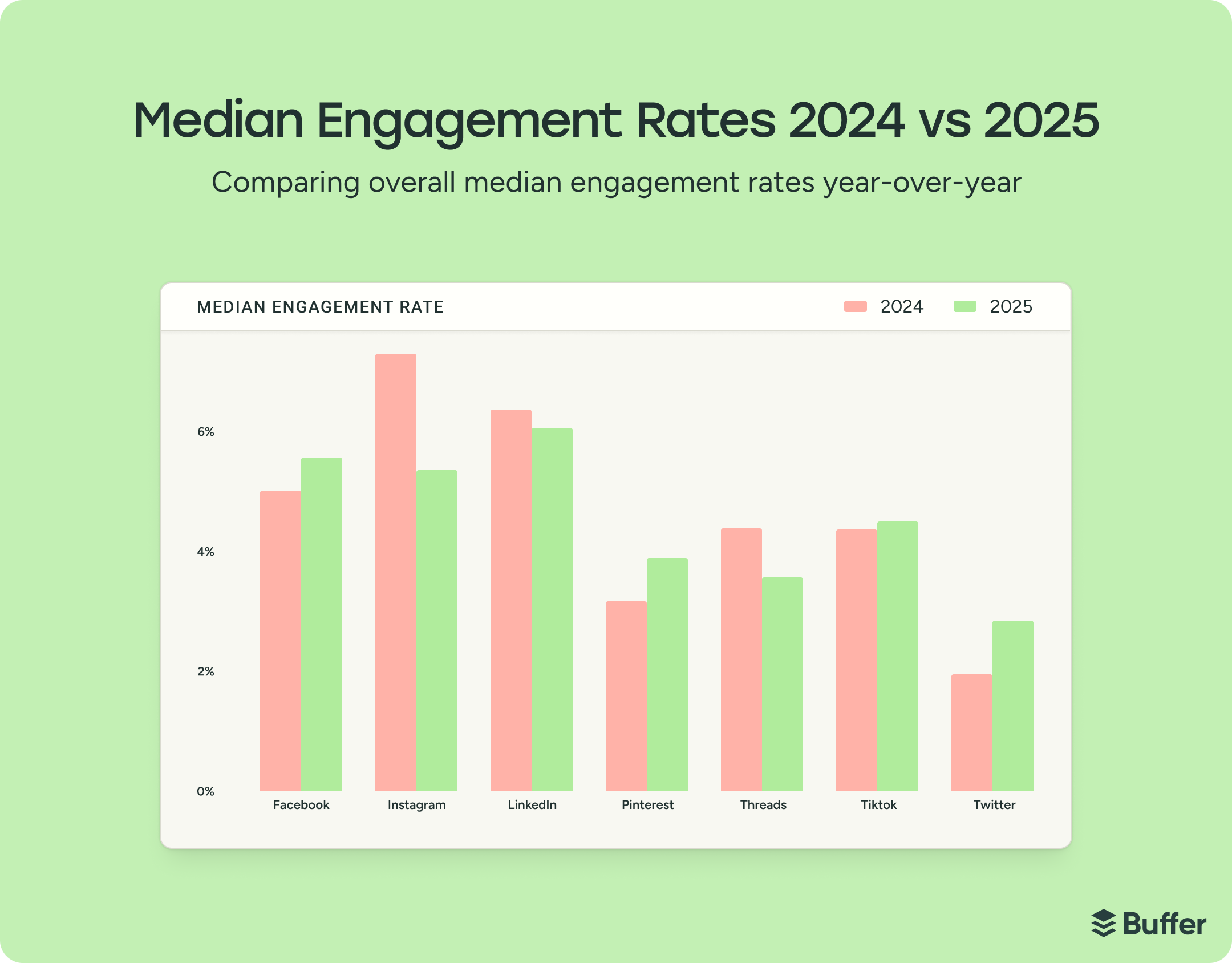
A post that generates a 4% engagement rate is underperforming on LinkedIn but outperforming on X. Without that context, you might double down on the wrong platform — or abandon one that's actually working because you looked at the wrong numbers.
These baselines are also shifting. Year over year, X jumped ~44%, Pinterest rose ~23%, and Facebook climbed ~11%. Meanwhile, Instagram dropped ~26%, Threads fell ~18%, and LinkedIn dipped ~5%.
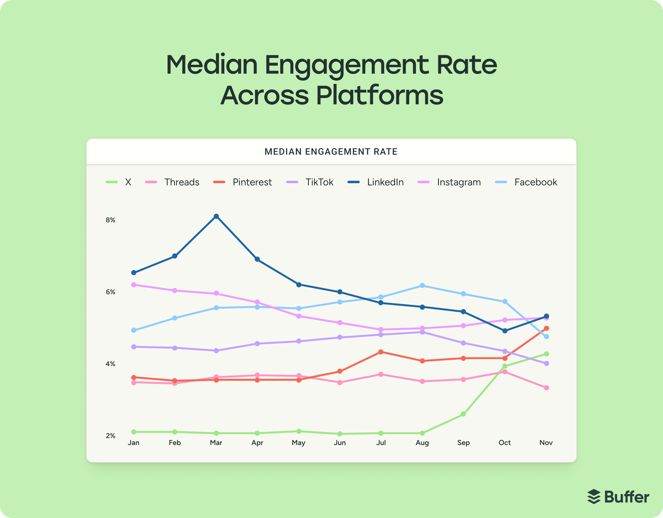
But those movements don't always mean what they seem. As Julian Winternheimer, Buffer's data lead, notes, “Dramatic swings often reflect changes in who's posting or how metrics are defined, not necessarily genuine performance shifts.” A big percentage gain from a low base (like X's) looks impressive on paper, but doesn't change its position overall.
The point is to have realistic expectations for the platforms you're active on, so you can measure your performance against the right baseline — not someone else's highlight reel on a completely different network.
💡 Pro tip: Bookmark these social media benchmarks for reference.
3. Learn what each platform's algorithm rewards
Every platform has its own definition of "good engagement" and this definition is almost always baked into the algorithm.
So knowing how each platform's feed works helps you determine which behaviors the platform is designed to amplify. This way, you can create content that aligns with those incentives rather than fighting against them.
A few examples of how differently these systems operate:
The Threads algorithm is built around conversation. It pushes value-driven content that sparks replies and uses tags to connect people with similar interests. If you're writing posts that invite discussion, you're working with the feed, not against it.
The YouTube algorithm works on a completely different axis. It recommends content based on what users have already watched and expressed interest in — engagement in comments matters less than watch time and viewer retention. You can grow on YouTube without ever replying to a comment, which is the opposite of how Threads works.
Instagram is in the middle of an identity shift. It's increasingly steering creators toward views as the primary success metric, which means the traditional engagement rate formula may be measuring less of what the platform actually optimizes for. That's part of why Instagram's engagement rate dropped ~26% year over year in our report data — it's not necessarily that content is performing worse, it's that the platform is redefining what "high performing" means.
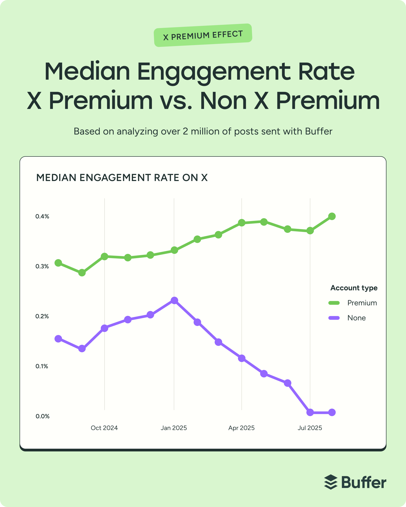
And then there's X, where the Premium tier has introduced a structural divide. After January 2025, Premium and regular accounts diverged sharply on engagement — Premium rates rose while regular account rates fell. In the most recent months of our dataset, the median engagement rate for non-Premium accounts hit 0%.
The takeaway here is that a strong social media strategy means understanding the culture and mechanics of each platform you're active on.
💡 Pro tip: Don't try to master every platform at once. Pick one or two where your audience is most active, get really good at them, and build your strategy around their incentives. You'll get better results going deep on a few platforms than spreading yourself thin across all of them.
Creating content that earns engagement
Once you understand the landscape, the question becomes: what do I actually make? The answer varies more than you'd think — what works on LinkedIn doesn't necessarily translate to TikTok, and a format that drives reach on one platform might do nothing for engagement on another. These four tips cover how to choose the right formats, stay relevant, and build a posting rhythm you can sustain.
4. Choose the right format for each platform
This is where a lot of creators waste energy: assuming the format that works on one platform will translate to another. Our report data says otherwise — and the differences are bigger than you'd expect.
Here's what the data showed, platform by platform:
- Instagram behaves like two platforms in one. Reels get ~36% more reach than carousels — but carousels earn ~12% more engagement. That's because reels are optimized for discovery (Instagram has a dedicated reels tab that pushes content to people who don't follow you), while carousels keep people on the post longer, creating more opportunities to save, share, and comment. If you're trying to reach new people, lean into reels. If you're trying to deepen relationships with your existing audience, carousels are your best bet.
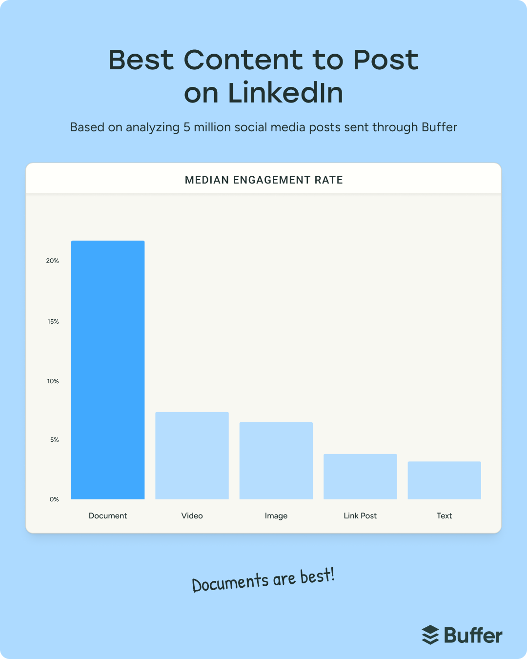
- LinkedIn is carousel-dominant. Carousels (document/PDF posts) earned a median engagement rate of 21.77% — roughly three times that of video and images. Even a below-average carousel performs about as well as a typical video or image post on LinkedIn. Video is getting more attention from the platform itself — LinkedIn's Head of Premium Content & Community Strategy, Callie Schweitzer, has emphasized it as a priority — but the engagement data hasn't caught up yet. Our theory: LinkedIn may be headed down a similar path as Instagram, where video drives reach but carousels drive engagement.
- Facebook's format gaps are tiny. Images led at 5.20%, video at 4.84%, text at 4.76%, links at 4.43%. That's less than one percentage point separating the top format from the third. On Facebook, what you post about probably matters more than whether it's a photo or a video.
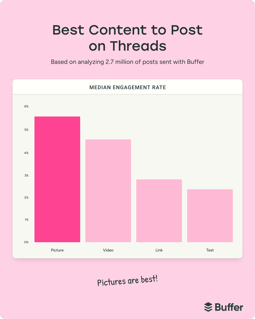
- Threads rewards visuals more than its "text-first" positioning suggests. Video led with a 5.55% median engagement rate, images at 4.55%, and text posts at 2.79%. But there's enough variation within each format that a strong text post can outperform a mediocre video. Format matters less here than the quality of the conversation you start.
- X is text-first. Text posts led at 3.56%, followed by images at 3.40%, video at 2.96%, and links at 2.25%. Text and images are close enough that both work well, but video doesn't carry the same default advantage it does elsewhere.
- TikTok's format story is evolving. Video still leads (3.39% vs. 1.92% for images), which isn't surprising on a platform built around video. But what's interesting is how competitive image posts and carousels have become — they're proving more viable than most people expect, especially for content that invites saves and swipes.
- Pinterest is the strongest case for video. Video earned a median engagement rate of 5.75% versus 3.15% for images — nearly double. If you're still treating Pinterest as an image-only platform, the data suggests it's time to reconsider.
The pattern across all of this is that there's no universal "best format." But there is a best format for what you're trying to do, on the platform you're doing it on. Let the data guide that decision instead of defaulting to whatever worked somewhere else.
💡 Pro tip: Test one format shift at a time. If you've been posting mostly images on LinkedIn, try a carousel series for a month and compare. If you've been all-in on Reels for Instagram, experiment with carousels and watch what happens to your saves and comments. Treat format as a variable you're testing, not a permanent decision.
5. Use trends strategically to reach new audiences
Trending content is content your audience is already primed to be interested in. When you tap into a trend, you're joining a conversation that's already happening, and algorithms love that.
There are two kinds of trends worth paying attention to:
Industry trends are the conversations and themes gaining traction in your specific niche. Think "glass skin" in the skincare space, "solo entrepreneurship" in the business world, or the ongoing discourse around AI tools. These tend to have a longer shelf life and attract people who are interested in what you do — not just passing through.
Platform trends are the memes, trending audios, challenges, and content formats unique to each app. These often cross-pollinate — like the "I met younger me for coffee" poem trend that swept across platforms in early 2025. They move faster and have a shorter window, but they can give you a significant short-term reach boost because platforms actively push trending content into discovery feeds.
⚡Bookmark these pages to get the trending sounds on Instagram and trending songs on TikTok each month
And you can have your cake and eat it with trends. Industry trends build your credibility with the right audience. Platform trends expand your reach to new people. And when you can combine the two — riding a trending format with a niche-relevant take — that's twice the chance for a post to break out.
One thing I've learned from watching what performs on Buffer's channels and my own: the creators who benefit most from trends add their own take instead of just replicating the format. A trending audio with a generic video is forgettable. A trending audio paired with a take your audience hasn't heard yet is shareable.
💡 Pro tip: Use trends as a complement to your core content, not a replacement for it. A feed that's all trends feels reactive and rootless. A feed that's mostly original content with the occasional well-timed trend feels intentional — like you're tuned in but not chasing virality. If you're building a content series, a trend can make a great "bonus episode" that brings new people into the series.
6. Start a content series
Speaking of series, stop thinking of every post as a standalone piece and start thinking in episodes.
A content series is a recurring format built around a single theme — posted on a consistent cadence, with clear naming so your audience knows it's part of something bigger. And it's one of the most underused engagement strategies I see, especially among solo creators who feel like they need a brand-new idea for every post.
Take Tiffany Yu's "Anti-Ableism Series" on TikTok. It amassed over 5 million views and led a literary agent to discover her content and offer a book deal. Or look at what my Buffer colleague Darcy Peters did to mark her 10-year Buffer anniversary — she turned it into five weekly posts, each unpacking a different lesson from a decade of remote work.
I'm trying this out with my own content, too. My approach is to put series into one of two buckets: learner content, where I’m talking about something I’m a beginner in and expert content, where I share hard-won lessons. Thinking of series as fitting into one of these two categories means that I can always pull from something in my life, since I’m always learning, but I have also built up some valuable knowledge.
Series work for engagement for a few specific reasons:
- They create anticipation. Your audience starts expecting the next installment — and that expectation alone drives return visits and engagement.
- They build recognition. A consistent format or naming convention makes your content instantly identifiable in a feed, even before someone reads the caption.
- They reduce creative friction. You don't have to come up with a brand-new concept for every post, because the framework already exists.
Here's how to start one:
- Pick a topic you can explore over multiple posts — something broad enough to sustain at least five to ten installments, but specific enough to feel focused.
- Name it clearly so people know it's a series. Numbering helps — "Part 1," "Episode 3," etc.
- Commit to a cadence. Weekly or biweekly works for most creators.
- Batch-produce when you're feeling creative. A single session can yield several installments' worth of content.
💡 Pro tip: Mine your top-performing standalone posts for series potential. If a post got high saves, lots of comments, or DMs asking you to "go deeper" — that's your pilot episode. Your analytics will tell you which topics have legs. And once you've committed to a cadence, you've also solved one of the biggest challenges in social media: showing up consistently.
7. Post consistently — and don't go quiet
You've probably heard some version of "consistency matters" a thousand times. Here's what the data actually says.
When we analyzed 4.8 million channel-week observations from roughly 161,000 profiles on Facebook, Instagram, and X, one pattern was unmistakable: accounts that didn't post in a given week consistently underperformed their own baseline growth rates. We call this the "no-post penalty" — and it held across every platform we studied.
Accounts posting 10+ times per week saw the largest gains, averaging 32 additional followers per week compared to silent weeks. But the most important threshold was the first one: any posting was substantially better than no posting at all.
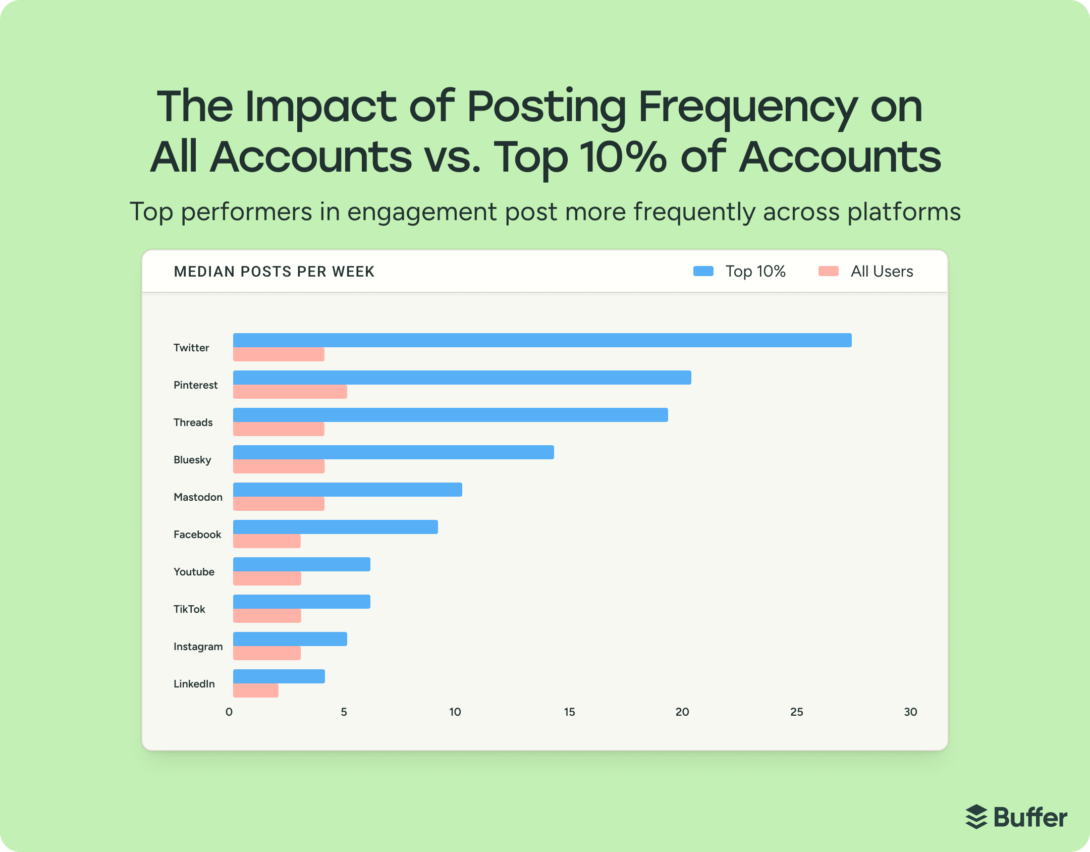
Top-performing accounts — the top 10% by weekly engagement — also posted more frequently and more consistently than the median account across platforms. The gap was widest on text-forward platforms like X, LinkedIn, and Threads, where it takes less production effort to publish. It was narrower on visual-heavy platforms like Instagram and TikTok, where each post requires more effort to create.
But there’s some nuance to the numbers: posting more helps you grow in aggregate, but each individual post may reach a smaller share of your audience. There's a point where frequency starts to dilute per-post performance. The goal isn't maximum volume at the expense of everything else — it's a cadence you can sustain while protecting quality.
And this is why you need something sustainable…like a series, yes. A series gives you a framework for staying consistent without burning out. You're not starting from zero every time you sit down to create — the structure already exists. Pair that with Buffer's scheduling tools and you can batch a week's worth of content in a single sitting, then let the calendar do the work.
💡 Pro tip: If you're struggling with consistency, start with the LWC or lowest viable cadence — not the aspirational one. Two posts a week, every week, will outperform five posts one week and silence the next. The data is clear: the biggest engagement penalty isn't posting too little. It's posting nothing.
Building relationships through participation
This is where engagement stops being about the metric and starts being about relationships. The strongest signal in our entire State of Engagement dataset wasn't a format trick or a timing hack — it was creators talking back to the people who showed up. These tips are about making that a consistent part of how you operate, not just something you do when you remember.
8. Reply to comments consistently — on every platform
The most vital way to boost engagement is actually pretty simple: reply to comments. Posts where creators consistently reply to comments outperform those where they don't.
We saw it across nearly 2 million posts from over 220,000 accounts on six platforms. The estimated engagement lift when replies are present:
- Threads: +42%
- LinkedIn: +30%
- Instagram: +21%
- Facebook: +9%
- X: +8%
- Bluesky: +5%
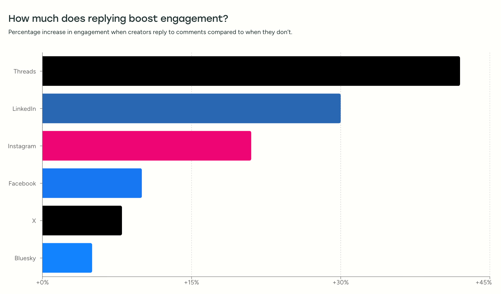
We can't say with absolute certainty that replying causes higher engagement — it's possible that posts that perform well naturally attract more comments, which creates more opportunities to reply. But the analysis compared each account against its own baseline over time, not against other accounts. And the same pattern held across all six platforms, which isn't something you see often in this kind of data.
What's interesting is where the effect is strongest. Threads and LinkedIn — the two platforms most explicitly built around conversation — showed the largest lifts. Their interfaces surface replies in ways most other platforms don't. The effect is still meaningful on Instagram and Facebook, just smaller. And it's weakest on X and Bluesky, where reply samples are smaller, and distribution is more unpredictable.
So, stop treating replies as an afterthought. Too often, we post and ghost (no shaming here, I’m guilty of it too). You might still get decent engagement that way, but you're missing the most valuable part.
Block 15–20 minutes after each post goes live to respond to the first wave of comments. That early activity signals to the algorithm that the post is generating conversation, which can extend its reach. But beyond the algorithmic benefit, there's a simpler reason: when someone takes the time to comment on your content, and you respond, they're more likely to come back and do it again. That's how you build a community, not just an audience.
As Suzanne Kelly, Operations Manager at Buffer, put it when we asked about her engagement strategy: her best-performing content almost always coincides with the posts where she's most active in the comments. And our data backs that up.
Buffer's Community feature makes this easier to sustain at scale. Instead of checking six different apps for comments, you get a unified inbox across all your connected channels — so you can respond to everything from one place. It also surfaces engagement patterns and tracks your most active commenters, which helps you prioritize the conversations that matter most.
💡 Pro tip: Not all replies need to be long or profound. A genuine "thank you," a quick answer to a question, or even just an emoji reaction to someone's comment signals that a human is on the other side of the account. The bar for "showing up" is lower than most people think — the data shows that showing up at all is what matters.
9. Create content that invites participation
The best engagement content I've created hasn't always been my most polished work — it's been the posts where I asked a genuine question and made it easy for people to respond. When I started posting open-ended questions on LinkedIn — things like "what's one piece of career advice you'd unlearn?" — I got weeks of content from a single post. The replies became ideas for articles, newsletter topics, and follow-up posts. A single question generated more usable material than a month of content planning.
flywheel: your audience's responses become your next content, which generates more responses, which becomes more content.
There are two ways to build this into your strategy:
- Lower the barrier with interactive formats. Not everyone wants to write a thoughtful comment, but most people will tap a poll or vote on a Story. Every major platform has tools for this — Instagram and Facebook have Story polls, quizzes, and question stickers. LinkedIn has native polls, and Threads is built for conversational prompts. Even a simple "What do you think?" at the end of a caption can be enough. The trick is integrating these into your regular cadence, not treating them as occasional novelties.
- Actively solicit feedback, then use it. Go beyond polls and ask your audience directly what they want from you. Story Q&As, "ask me anything" prompts, "comment [keyword] for the guide" posts — these give you both engagement and intelligence. When I hit a $2,000 brand partnerships milestone, I posted an AMA and the tactical questions that flooded in told me exactly what my audience needed help with next.
Some platforms even let you turn that feedback into content in real time. Instagram and TikTok's reply-to-comment-with-video feature is one of the best engagement tools available — you're literally creating new content out of an existing conversation. Creator Emily McDonald does this consistently, turning follower questions into short, direct response Reels that get engagement from both the original commenter and new viewers discovering the content.
In Buffer, the Community feature lets you create a post directly from a comment — so when you spot a question or insight worth expanding on, you can turn it into content without leaving the app.
💡 Pro tip: Pair interactive content with automation for maximum impact. Tools like Manychat let you set up keyword triggers — someone comments "guide" on your post, and they automatically receive a resource link in their DMs.
10. Share user-generated content
User-generated content is one of the most effective forms of social proof available. Research consistently shows that consumers find UGC significantly more influential than brand-created content, and that it directly impacts purchasing decisions. That tracks — people trust other people more than they trust brands, and content from real customers carries a credibility that even the best marketing can't replicate.
But UGC also drives engagement for a simpler reason: when you feature someone's content, they engage with it. They share it. They tag their friends. And their audience — people who might never have found you otherwise — gets introduced to your brand through a trusted source.
Take the tech brand Nothing, whose posts tend to perform pretty well. However, when reviewed by Canoopsy, their products reach even farther. His videos about the brand tend to get views anywhere from 40,000 to nearly 1 million views. In response, the brand tends to invite the creator to events and pop ups. It’s a symbiotic relationship that works great for both parties.
There are two ways UGC tends to work:
Organic UGC happens when customers create content about you unprompted — a photo wearing your product, a story mentioning your service, a post about how your tool helped them. Your job is to find it and reshare it (with permission). Set up alerts for your brand name, monitor your tagged posts, and keep an eye on relevant hashtags.
Intentional systems generate UGC on purpose. Branded hashtags, post-purchase email prompts asking customers to share their experience, "tag us for a feature" CTAs in your bio, community challenges — these create a pipeline of content your audience makes for you. The upfront effort is in building the system; the ongoing effort is curation, not creation.
💡 Pro tip: UGC isn't just for product brands. If you're a service provider or solo creator, the equivalent is resharing testimonials, screenshots of kind DMs (with permission), or posts where your audience mentions how your content helped them. A coaching client sharing their results. A newsletter reader quoting something you wrote. A follower tagging you in their "resources that changed my thinking" post. That's all UGC — and resharing it does the same work: it builds trust, rewards your community, and creates engagement you didn't have to manufacture from scratch.
11. Practice social listening
Every tip in this section so far has been about engaging with people who are already in your orbit — your commenters, your followers, your community. Social listening is about venturing beyond that orbit to understand what your audience is saying when they're not talking to you.
Social listening means paying attention to conversations happening around your brand, your competitors, your niche, and the problems your audience is trying to solve — even when those conversations don't involve you directly.
Start by being an active lurker in the communities where your audience hangs out. If you sell hair care products, dig into subreddits like r/Haircare or even nicher, r/4CHair. If you're a B2B SaaS company, follow relevant discussions on LinkedIn and Threads. Use advanced search filters on platforms like X to find conversations happening around your keywords — not just mentions of your brand, but the broader topics your audience cares about.
I do a version of this regularly. I browse creator and marketing conversations on Threads and LinkedIn — not to promote anything, but to understand what people are struggling with, what advice is resonating, and where the gaps are. Some of my best-performing content has come from a pattern I noticed in someone else's comment section, not my own.
The shift here is moving from being reactive to proactive. Responding to your own comments is essential, and inviting feedback and creating participatory content is powerful, yes. But social listening means you're gathering intelligence from conversations you're not part of yet — and using that intelligence to create content that meets people where they already are. It moves your content from being about you to being about them.
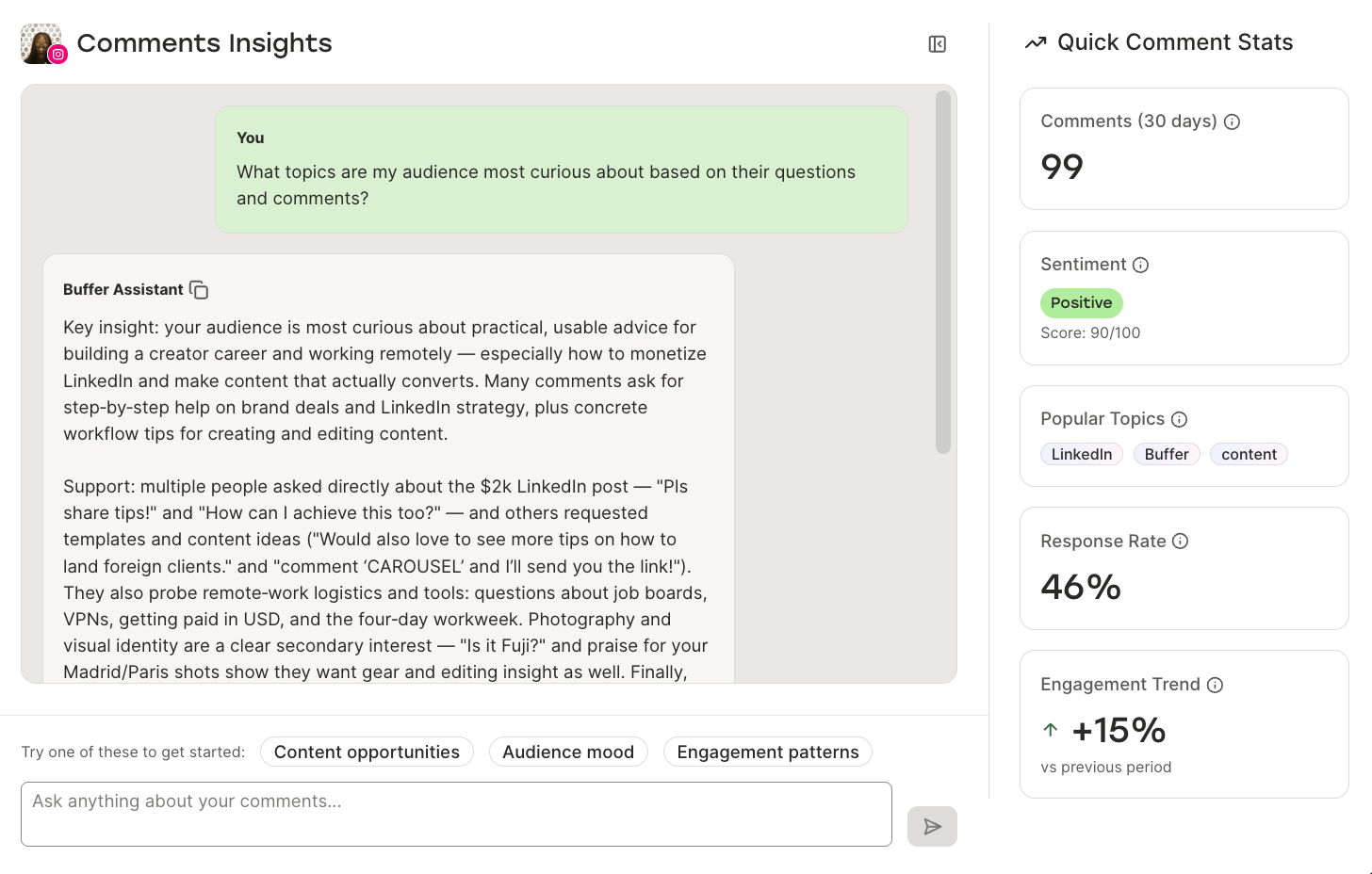
💡 Pro tip: You don't need expensive social listening software to get started. But if you're already using Buffer, the Community feature includes AI-powered Insights that can surface comment themes and patterns across your channels — helping you spot what your audience cares about without manually reading every single reply. It's a lightweight version of social listening built into your existing workflow, and it pairs well with the deeper, manual listening you're doing in niche communities.
I’ve personally been using it to spot content opportunities based on what people share in the comments.
Frequently asked questions about social media engagement
What counts as social media engagement? Social media engagement includes any action a user takes on your content: likes, comments, shares, saves, reposts, replies, link clicks, and direct messages. Higher-effort interactions — comments, shares, DMs — are generally weighted more heavily by platform algorithms than passive ones like likes.
How do you calculate engagement rate? The most common formula: (total engagements ÷ total followers) × 100. Some marketers use impressions instead of followers in the denominator, which gives you a sense of how well your content converts people who actually saw it. Both are valid — just be consistent so your comparisons are meaningful.
What's a good engagement rate on social media? It depends on the platform. Based on Buffer's research, median engagement rates currently look like this: LinkedIn (~6.2%), Facebook (~5.6%), Instagram (~5.5%), TikTok (~4.6%), Pinterest (~4.0%), Threads (~3.6%), and X (~2.5%). These shift over time — Instagram dropped 26% year-over-year while X jumped 44% — so it's worth checking benchmarks regularly rather than treating any single number as gospel.
What's the difference between reach and engagement? Reach is how many people saw your content. Engagement is how many people did something because of it. A post can have massive reach and terrible engagement (it got served, nobody cared) or modest reach and strong engagement (a smaller but highly invested audience). For most creators and brands, engagement is the more useful signal.
Why does social media engagement matter? There are three reasons, practically speaking. First, platforms use engagement signals to decide what to amplify — high engagement means more distribution. Second, engagement is how audiences signal trust, which is how followers become community (and community becomes revenue). Third, the pattern of what people engage with is one of the most honest forms of audience research you have access to.
How do I increase my social media engagement? The strategies that consistently move the needle: understanding your analytics and knowing what "good" looks like on each platform, responding to comments (Buffer's data shows this lifts engagement up to 42% on Threads), creating content based on audience feedback, using interactive formats like polls and Q&As, and building content series that give your audience a reason to come back. All 11 strategies are covered in the guide above.
Treat social media like a conversation, not a broadcast
We set out to understand engagement in 2026, and after analyzing tens of millions of posts across platforms, the answer was simpler than we expected.
The strongest signal in the entire dataset was simply: people talking to people. Replying to comments correlated with higher engagement on every single platform we studied. Not some of them. All of them.
That finding shaped this entire article. Understanding the landscape matters (Tips 1–3). Creating the right content for each platform matters (Tips 4–7). But the section of this article we'd bet on most is the last one — the tips about showing up, participating, and treating your audience like people in a conversation rather than metrics on a dashboard.
The eleven strategies here aren't meant to be tackled all at once. Maybe you start by checking your analytics against the platform baselines in Tip 2. Maybe you finally commit to a content series (Tip 6) or block 15 minutes after each post to reply to comments (Tip 8). The entry point matters less than the mindset: engagement grows when you stop broadcasting and start listening.
And if you want to make the whole process easier, Buffer can help — from scheduling and analytics to managing all your comments and DMs in one place with Community. It's built to help you spend less time managing social media and more time actually being social on it.
Try Buffer for free
190,000+ creators, small businesses, and marketers use Buffer to grow their audiences every month.


