It is our greatest marketing asset.
And we just keep changing it.
Kevan Lee, October 2015
And now things have changed again. We’ve flipped the switch, and our new design is here.
From where it started with Leo over five years ago to where it stands today, the Buffer Social blog has evolved a great deal over the years, and we’re extremely grateful to have built up a great reputation and sizeable audience along the way.
The Buffer Social blog now attracts over 850,000 readers and averages over 1.1 million sessions per month. But it certainly didn’t come easy, and it took some trial and error before we found a recipe that started to pay off.
The Google Analytics screenshot below, helps to illustrate our story:

Towards the end of 2015, we revealed that we’d lost nearly half of our social referral traffic. And the discussion around this post made us realise that if we want to continue growing, we need to see change as a necessity. We need to continue to push ourselves and figure out how to keep reinventing ourselves to stay ahead of the curve.
This new design is our latest experiment and in this post, I’m excited to go into detail about different sections of the new blog design and share some of the thinking behind our content strategy.
Let’s jump in!
What’s changed
Here are some of the new elements to look out for:
Homepage Discover Block
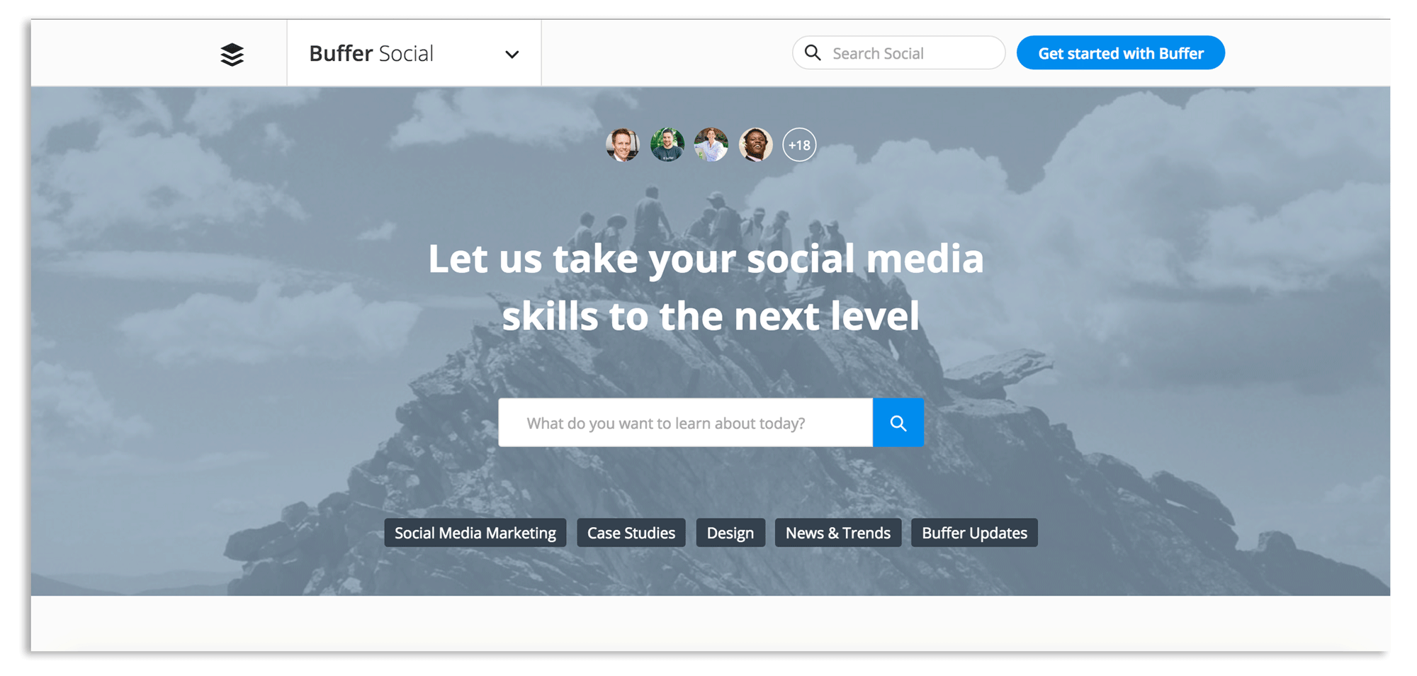
We have over 900 posts on the Social blog, and next to a visual refresh, the main goal of this redesign was making content more discoverable. We felt that a lot of the great stuff we’ve published in the past can get a little lost and that we need to signpost better where particular types of content can be found.
A brainstorm during the retreat gave us the idea to approach the social blog as a toolbox. A reference blog and knowledge hub. And the Discover block at the top of the homepage is aimed to make it as easy as possible to find what you’re looking for when you come to the blog.
You can use the search bar to discover content based on keywords you’re interested in learning about, for example, “Twitter Marketing” and you can also click on any of the categories below the search bar. Popular categories have also been added to the bottom of the homepage to make it easier to discover content about your favorite topics too:

Two-column layout

Under the Discover block, we’ve transitioned from a one-column layout to two columns, highlighting more than just the latest piece of content and guiding you through our latest articles on subjects like social media marketing, design, and the latest news and trends.
Adaptable content: Toolbox and Magazine articles
As we thought about the various blogs we have here at Buffer (Open, and Overflow), we realised that they served very different purposes, and a one-size-fits-all post style may not work across the board. Sometimes our content has an editorial flavour, and sometimes it has more of an educational angle. The new design allows us to tell stories more effectively with the help of a couple of article formats.
Toolbox articles

Toolbox articles will mainly be used here on the Social blog. They’re geared up to support our social media marketing and content tips articles.
Magazine articles
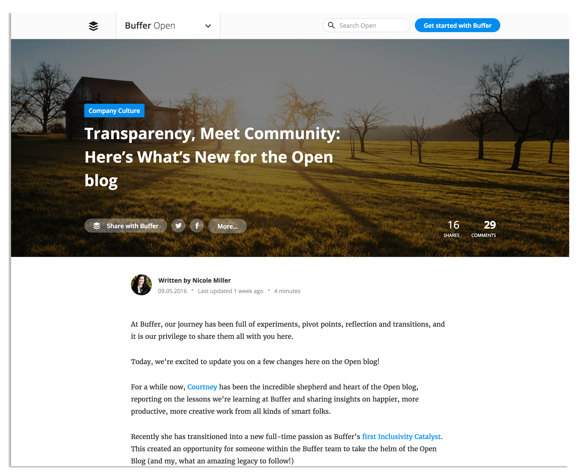
Magazine articles have an immersive heading with a full-width photo as the background and will mainly be used on the Open and Overflow blogs, as well as on any more editorial-lead posts here on the Social blog.
Behind our content strategy
In October 2015, we shared our marketing manifesto, and we’ve now evolved a section of the manifesto into our Editorial Mission Statement:
“Treat every piece of content with the utmost care. Every single piece of content is the only one that matters.
Every single piece, we have to feel like “this is going to be the one.” Not all in the same way, but all in their own unique way of redefining excellence for their own area. And then, only some of them will be the true breakout hits and most of them won’t. But that’ll be the only way for us to truly create a space of excellence.”
– Buffer Editorial Mission Statement
This mission statement will serve as a constant reminder to be vulnerable and create content that we truly believe will stand out and attract everyone’s attention. It’s also a promise to every reader of the blog, whenever you visit us here, you’ll know that we’ve put everything into the post you’re reading.
The five questions that shape our strategy
In a previous post we discussed the five ways that a blog can change and grow (though there are probably more) and our content strategy is largely based on answering these five questions:
- Topic: What will we write about?
- Audience: Whom will we write to?
- Style: What types of content will we publish?
- Depth: What level of depth will we approach a topic?
- Behind-the-Scenes: How will we organize ourselves to get the work done?
Below, I’d love to guide you through how we’re currently approaching these challenges.
1. Topics
On the Buffer Social blog, we strive to deliver content that helps readers solve a problem or challenge they face in their everyday work environment. This can come in many forms: sometimes it’ll be a “how-to” guide on using the latest social media tools, other times it could be a list of great blogs or marketers to follow.
We tend to break down the topics we cover into four types of posts:
- Definitions – Here’s what this means
- Tools – Here’re the tools you can use
- Workflows – Here’s how to get it done
- Future – Here’s where it’s headed
How we find topics to write about
Keeping a pipeline of posts we feel can break through the noise and stand out can be quite a challenge. Kevan has covered our idea curation process in detail before, but I’d love to share quickly how we keep our editorial Trello board full off (hopefully) great ideas to write about.
- Looking at our data: Google Analytics can be a great tool for content ideas, I love to keep tabs on which posts and topics are performing well. For example, posts on social media images and design have performed well for us recently, so this feels like a great topic to write about some more.
- Taking inspiration from others: What are certain people in our niche talking about? What are people sharing and writing? Outside sources are a huge inspiration for us. We come across articles that we love and want to dive even deeper into. We find headlines that grab us, and we repurpose them for other topics.
- We save every idea: I have tons of notes on my phone, scribbled down in notepads and saved in our Trello board. Sometimes, all it takes is a phrase, link or few keywords to get us started on a topic.
- Listening: An incredibly valuable source of inspiration is you, the reader. We listen to blog comments and to conversations on Twitter to see what you’d like to learn more about.
- Sharing our experiences: Sometimes, the most relatable posts we publish are the ones where we share our experiences and challenges.
2. Audience
As Buffer continues to grow and evolve, so does our audience. We’ve not been too persona focused thus far on the blog, but it feels like our audience has changed a little over the past 6-12 months.
A while ago we shared a breakdown of who we felt our current and future readers may be.
It now feels like we’re learning towards the ‘future’ vision of who we’re writing for. During the coming months, I’d love to spend some more time on customer research for the blog to identify who our readers are and what content they’re particularly excited for.
3. Style
We feel that a blog post should be as long as it needs to be. For us, this tends to be ~1,500-2,000 words per post. But we use the word count as a target, more than a restraint. If a post is 1,200 words and filled with great content, excellent, let’s not expand on it just to fill a word count quota. Likewise, if a post is 3,000 or more words and fully covers an in-depth topic, that’s great too.
We like to go into detail and give customers everything they need in one place. We include details on functionality, how things work and how to implement any ideas or strategies we discuss in the post. We love for our readers to be able to read and post and instantly know how to use what they’ve learned to benefit their business.
This is the recipe that has been proven to work for us. But we need to continue to experiment and try new types of content to push on and continue to grow the blog.
Over recent months, we’ve experimented more with news and trends, alongside our more traditional in-depth pieces on social media marketing and had a few spikes off success:
- A post on Twitter Polls (published the day after they launched), grew our search traffic by 25% – from 26.5k sessions/day to 33.5k/day. This spike lasted for a couple of weeks and got us super excited for the potential of timely, actionable content.
- We published a series of posts focused on Facebook’s F8 conference during the week of the event and brought in around 60,000 visits to these posts.
Our news experiment has provided us with some great learnings and intuition about which topics and trends we should jump on and write about as soon as they break.
Some areas I feel we could do more with include:
- Video
- Short-form / snackable content
- Opinion and thought leadership
There’s always a bit of unease and discomfort in trying something a little out of the ordinary when you have a recipe that you know can work. But we’re excited to continue trying new things.
Talking point: I’d love to hear what you’d like to see more of from Buffer? Please let us know in the comments below this post.
4. Depth
After over five years of writing about social media, you’d have thought we might have covered every topic in as much depth as possible. But the great opportunity with depth is that social media continues to evolve as does our perspective on social media and marketing.
We’re seeing many of the established social platforms switch from organic to paid networks. We are continually having to learn new things and test new techniques. Everything changes, constantly. First, it works, and then it doesn’t.
We have a lot still to explore when it comes to depth. Maybe we need to expand beyond our blog posts; create more downloadable guides, more videos, more courses.
What would you like to see from Buffer? Let us know in the comments ?
5. Behind-the-Scenes
The way we approach creating content on the blog has changed a great deal over recent weeks. We’ve switched our editorial board to focus more on our workflows.
Here’s how it used to look (with a column for each different category of content):
And here’s our new board:
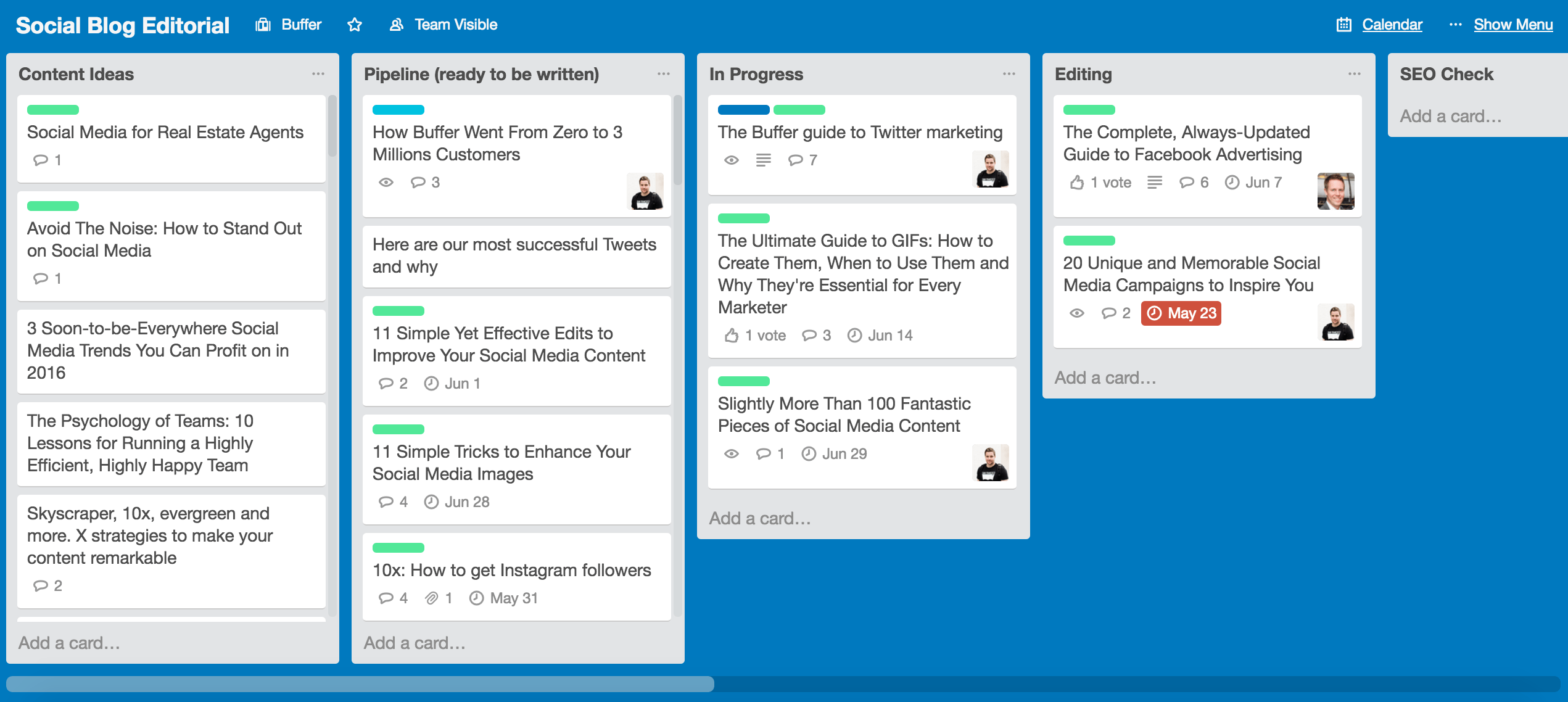
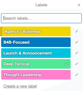
With this new board we’ve tried to reflect the editorial process a little more, and as posts transition from idea to finished article, they progress along the board. We also use Labels within Trello to signify the category of each post.
Thinking like a publication
One of our key focuses during Q2 2016 and beyond is to ‘think more like a publication’. For us, this means:
- Increasing publishing consistency and aiming for a new post every US workday at 8 am EST (this is very much work in progress, but I solid goal for where we want to be)
- Commit to having the content calendar scheduled at least three weeks ahead of publishing
- Create editorial guidelines and style guide for guest posts / new writers
- Be more transparent about how we run the blog and publicly share monthly reports
Often, it’s the small details that take a post from good to great. And by ensuring we have the correct editorial system in place throughout the process from pitching to publishing feels like a great way to ensure we feel like “this is going to be the one” every time we hit publish.
We’d love your thoughts…
Thanks for reading! If it wasn’t for you all, we wouldn’t be able to do what we do and have such a blast managing this blog. I’d love the chance to learn from your experiences here and to know how all of this feels to you:
How can we keep improving the Buffer blog for you?
What do you think of the new design? Is there anywhere we could improve?
Feel free to drop any thoughts at all in the comments. It’d be great to hear from you!
Try Buffer for free
200,000+ creators, small businesses, and marketers use Buffer to grow their audiences every month.

