As a millennial, I'm still a Facebook fan — and it turns out I'm in good company.
About 69% of my generational cohort is still active on the platform. Although only 37% of Gen Z are active users, Facebook still boasts a solid presence among older generations, with 6.6% of users aged 65 and older. In total, approximately 3.07 billion people log on to the little blue app every month.
With numbers like that, Facebook offers real opportunities you won't want to miss. But it’s not just about numbers. With its mix of generations, built-in community features, and powerful tools for targeting and content, Facebook is still a key player for brands and creators.
Thanks to new updates in AI, video, and even e-commerce, it keeps evolving with the times, which means there are still plenty of opportunities if you know how to tap into them.
So it makes sense that creators and marketers want to know how to get more followers on Facebook (for free).
The good news is that you don’t need viral hacks or a massive ad budget to grow your Facebook following — just consistency, a thoughtful approach, and the right tools to help you along the way.
That's what this guide is all about: 10 practical ways to grow your Facebook following organically in 2026.
Quick summary: How to grow on Facebook for free
- Switch to professional: Use a Facebook Page or professional mode to access analytics and ad tools.
- Prioritize visuals: Images tend to outperform text-only posts in engagement and reach.
- Consistency is key: Post regularly (aiming for early weekday mornings like Monday at 5 a.m.) to stay in the algorithm's favor.
- Engage to grow: Respond to every comment to signal value to the algorithm and build a loyal community.
- Collaborate: Partner with other creators to tap into new, relevant audiences for free.
Jump to a section:
- 1. Set up your Facebook Page or professional mode
- 2. Share authentic content that starts conversations
- 3. Keep showing up
- 4. Post eye-catching images and photos
- 5. Experiment with Facebook features
- 6. Post when your audience is online
- 7. Keep your audience engaged and coming back
- 8. Follow Facebook guidelines
- 9. Partner with other creators and brands
- 10. Monitor your metrics closely
- Facebook growth is a marathon, not a sprint
- Facebook growth FAQ
- More Facebook resources
1. Set up your Facebook Page or professional mode
To get more Facebook followers, create a Facebook Page for your business rather than a personal profile. That way, you can access Page-specific features like analytics and ads. It’s a key first step in establishing a professional presence.
If you have a personal profile, Facebook users will only be able to add you as a friend, and they won’t see a ‘follow’ button.
- Create a Facebook Page for your business, organization, or brand.
- Switch to professional mode. Here’s how:
If you're wondering which route to take, I'd usually go with a Facebook Page. It gives you access to more advanced tools like Facebook Ads Manager.
Once you’ve set up your Facebook Page or profile, be sure to complete every field. Your followers and potential followers should know you’re legit.
Here’s a quick summary of the basics:
| Profile element | Optimization benefit |
|---|---|
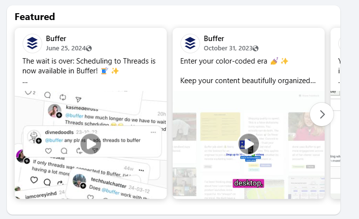
| Featured posts | Highlights top-performing or essential content for new visitors |
| Business info | Provides legitimacy via phone number and hours |
| Action button | Drives conversions (e.g., ‘Book now’, ‘Sign up’) |
| Website link | Directs traffic to your primary owned channel |
| Page category | Helps the algorithm categorize and recommend your page |
| Bio/about section | Improves searchability via niche-specific keywords |
| Visuals | Establishes brand identity with high-quality profile/cover photos |
2. Share authentic content that starts conversations
There's a lot of great content on Facebook these days — which actually means there's plenty of room for your brand to stand out.
According to Meta, “The goal of Facebook is to connect people to content that’s meaningful or informative to them. We are not focused on picking which issues the world should read about, but we are in the business of connecting people with content they find most meaningful. Publishers should ideally focus on what they do best — making content that is interesting to their audience.”
So what does this mean for your content? Focus on:
- the content that matters to your audience,
- and the stuff that you know a lot about,
- presented in a way that your audience wants to consume it.
Here’s how to do that:
- Understand your audience: Take the time to learn what they care about, what questions they have, and what kind of content they engage with most.
- Create high-quality, original content: Share your perspective, your expertise, and your story. Originality builds credibility and helps you stand out.
- Encourage interaction: Ask thoughtful questions, invite feedback, or spark conversations in the comments.
- Incorporate eye-catching images or video: Visuals stop the scroll. Use photos, graphics, or short videos to bring your message to life.
- Build trust through accurate, well-sourced information: Whether you're sharing stats, tips, or breaking news, double-check your facts and cite your sources when needed.
- Post consistently, but not excessively: Find a rhythm that works for you and your audience. Quality always beats quantity.
- Test and tweak: Try different post formats, topics, and times of day. Then check your analytics and adjust based on what’s working.
In a nutshell: You don’t need to go viral to grow — just focus on creating content that’s useful, true to your voice, and consistent.
3. Keep showing up
Want more Facebook followers? You’re going to need to show up on their feeds and continue providing value. When you visit a business page that hasn't been updated in months (or even years), it's natural to wonder if they're still around.
Social platforms want you to create valuable content, and they'll reward you for it. That's true whether you're on Facebook, Instagram, or anywhere else. Whether you’re looking to grow on Instagram, build a personal brand on LinkedIn, or increase your following on TikTok, consistency is your most reliable path to steady growth.
How often should you post? That depends on your audience and what works for you. Finding the sweet spot for your audience and growth will take time and experimentation, but my best advice is to post as often as you're able to keep up with — whether that’s daily or once a week.
Creating content takes real effort, and it's easy to burn out if you're not careful. The key is finding a rhythm you can actually stick with. Showing up once a week consistently will always beat posting daily for a month and then going quiet.
3 top tips for staying consistent and gaining more Facebook followers
Building an audience on Facebook doesn't mean you need to be constantly online. These three simple tips can help you stay on track and keep your content flowing, even on your busiest days:
1. Create a social media content calendar
One of the easiest ways to stay consistent is by planning ahead. That’s where a content calendar comes in. Instead of scrambling for ideas at the last minute, you can plan your posts in advance and always have something ready to share.
A good calendar helps you spot gaps, keep your content mix balanced, and skip the daily 'what should I post?' panic. Here’s a guide to building your calendar from scratch (and yes, there’s a handy template included).
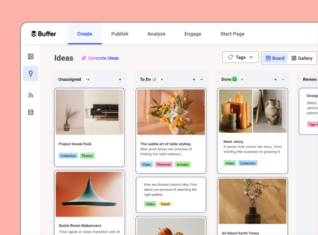
Pro tip: Buffer's Ideas dashboard helps you create, import, and organize your content so you can access everything at a glance and stay on top of your content planning.
2. Repurpose your best content
Not every post needs to start from scratch. Take content that performed well on other platforms (or even earlier posts on Facebook) and give it new life. Turn a blog post into a quote graphic, or break a video into bite-sized clips. Your audience isn’t seeing everything you post anyway, so repurposing is a smart way to get more mileage from your best work and reach more people.
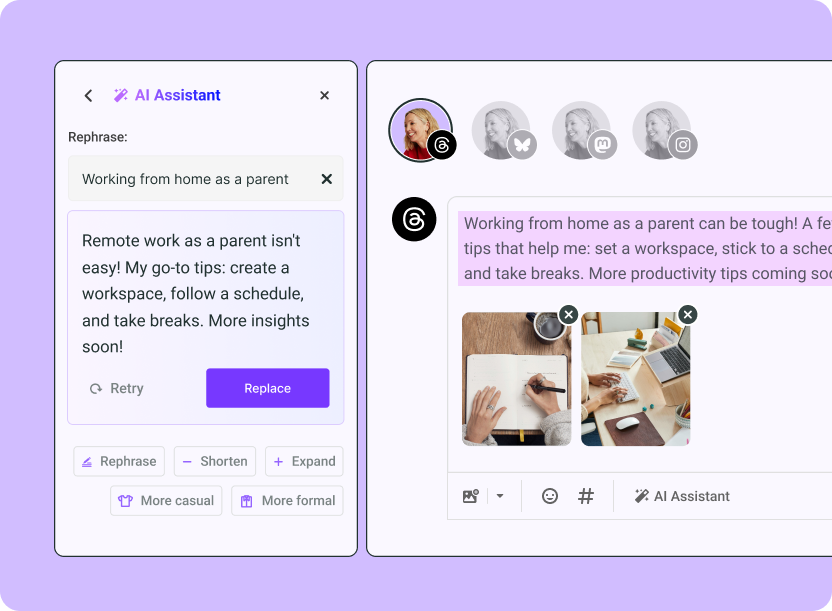
Pro tip: Use Buffer’s AI assistant to do your content repurposing for you. It quickly creates new formats from your original post so you can share it in more places.
3. Use Buffer to stay on schedule
This is where a tool like Buffer comes in handy. You can batch content and schedule it in advance, so you're not scrambling to post in real time. Buffer’s features like scheduling, streaks, and posting goals help keep you on track, especially during busy weeks.
4. Post eye-catching images and photos
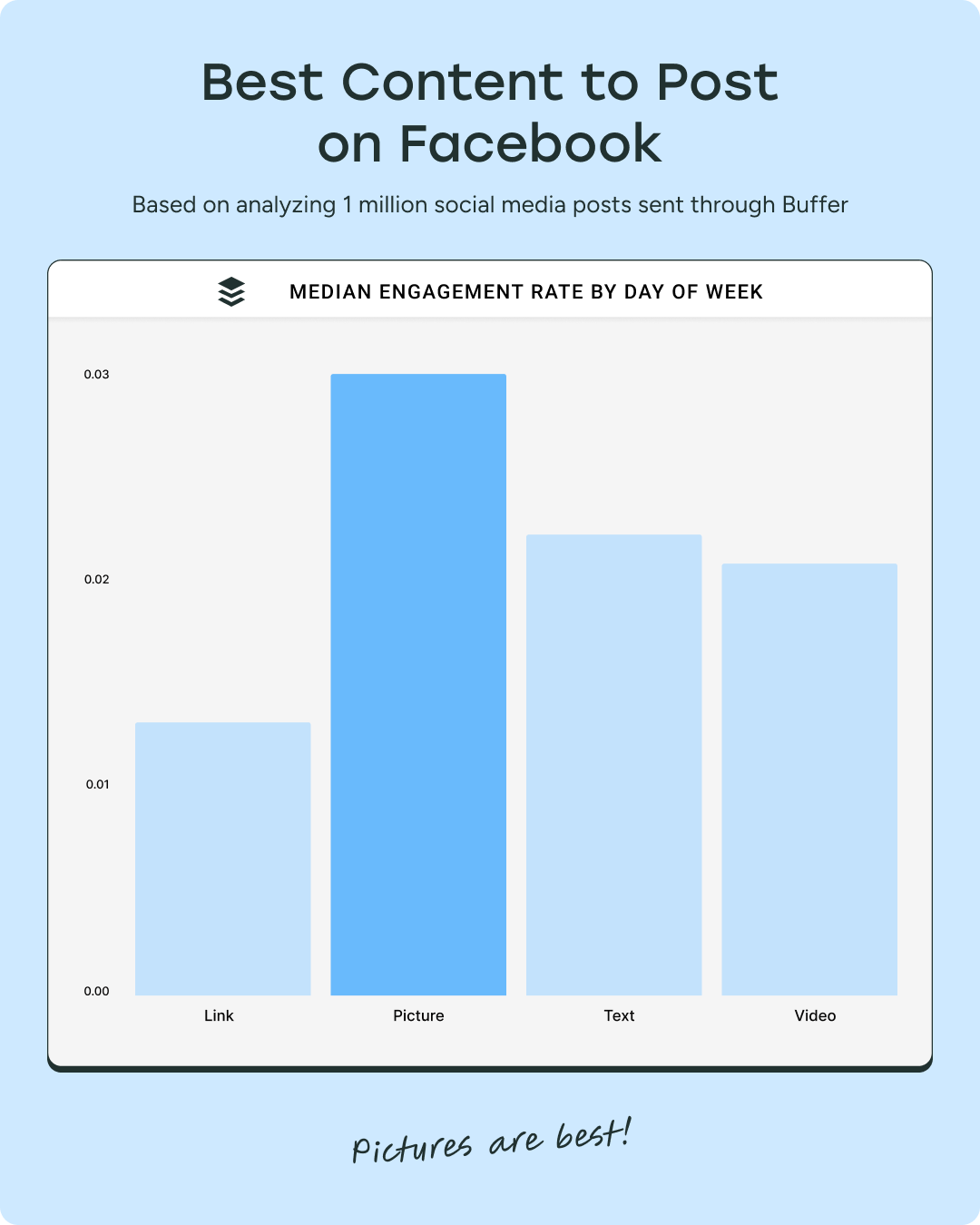
We analyzed millions of posts sent through Buffer and found that images consistently get the most engagement on Facebook.
Posts with photos or images consistently get more Facebook likes, comments, and shares than any other content type.
Posts with photos get 34.7% more engagement than text posts and 43.8% more than videos.
This engagement signals to the Facebook algorithm that the post is valuable, increasing its reach. More visibility can attract new followers.
If you're comfortable creating video, Facebook Reels are worth exploring — they're a great way for new followers to discover you.
Like Instagram’s Reels feed and TikTok’s For You page, Facebook Reels are recommended content based on user engagement.
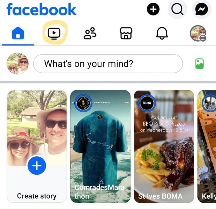
I saw a Saturday Night Live sketch in my reels feed, even though I don't follow Peacock TV. That's the algorithm at work — showing content based on engagement, not just follows. Which means if you create reels that speak to your niche, you can reach people who've never heard of you before.
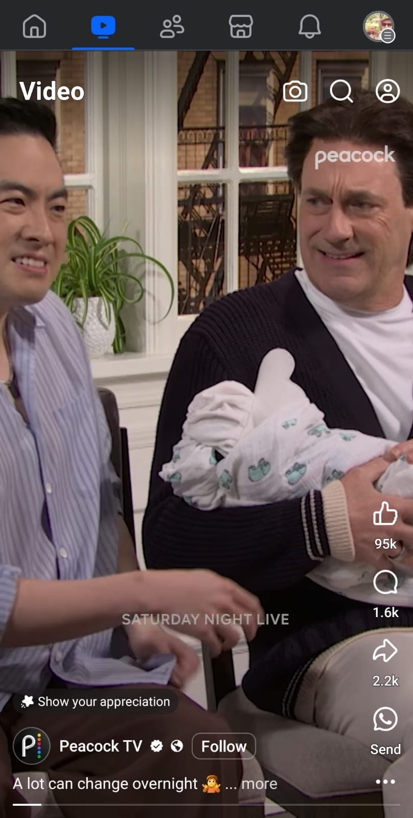
Need help and inspiration to create video and other content? Check out these best-practice resources (from creators themselves)
5. Experiment with Facebook features
Facebook offers many features beyond videos and reels to showcase your brand’s personality and reach new audiences.
Experimenting with different features keeps things interesting — for you and your audience. When you're genuinely enjoying what you're making, that tends to come through in the final post.
Here are some ideas to get started:
Facebook Stories
Use stories for temporary, low-pressure updates like behind-the-scenes moments and user-generated content.
Story ideas:
- Behind-the-scenes moments
- Quick updates
- User-generated content
- A glimpse of your workspace
Bonus: You can schedule your stories with Buffer.
Facebook Live
Perfect for instant connection and building trust through Q&As or product walk-throughs.
- Host a Q&A
- Walk your followers through a how-to
- Bring them along for a day in the life
- Share how your product is made or shipped
Bonus: Facebook often boosts Lives in the algorithm, so you're getting a chance to reach more potential followers organically.
Facebook Events
If you host any events, virtual or IRL, you’d be remiss not to promote them with a Facebook Event — these will often be recommended to non-followers interested in similar events and are a brilliant way to reach new people.
Whether you’re planning a webinar, a product launch, or your monthly “just because” community hangout, Facebook Events make it super easy for people to discover what you’re up to
Bonus: Facebook even recommends events to people outside your follower list based on their interests. Free promotion? Yes, please.
And don’t forget the little things:
- Add a GIF
- Use fun backgrounds
- Experiment with post formats
- Toss in a hashtag or two (strategically, of course)
Facebook gives you plenty of tools to work with. The key is finding the ones that feel natural to you and help you create posts that grab attention.
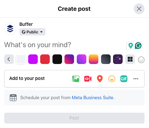
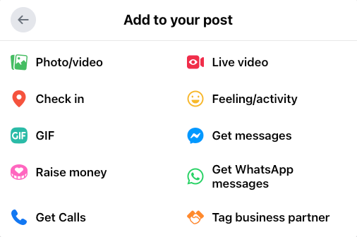
Pro tip: Trying different tools and observing audience responses helps identify the most engaging content types.
6. Post when your audience is online
According to our analysis, the best time to post on Facebook is 9 a.m. on Thursday, followed by Thursday at 8 a.m. and 10 a.m.
Keep in mind, this doesn't mean your followers see your post right as you post. It's about giving your content time to build momentum in the feed before people start scrolling later in the day.
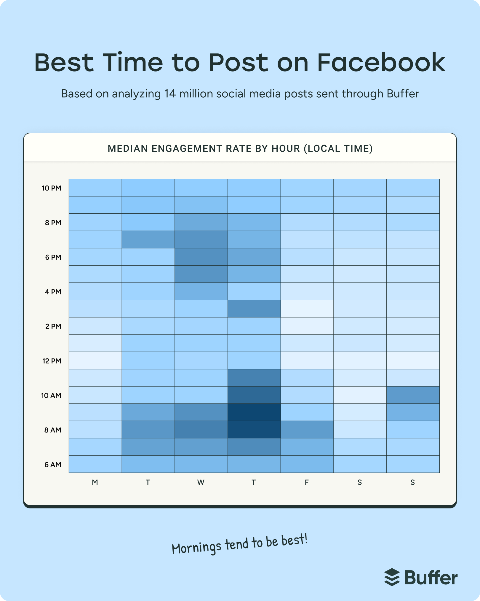
Generally, mornings on weekdays are best for engagement, but always tailor timing to your audience’s habits.
In my own Facebook Group, for example, I’m reaching people across different time zones, so I aim for a time that works across continents.
7. Keep your audience engaged and coming back
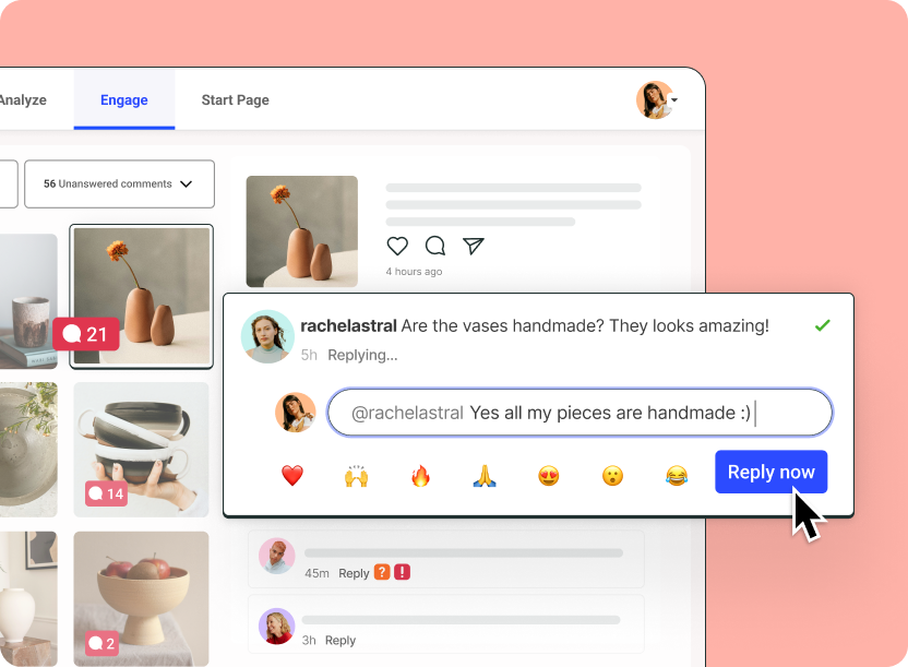
Engagement depends on responding to comments and building relationships. Here are a few ways to show your followers you value what they have to say:
- Reply genuinely to comments
- Get to know your most engaged followers
- Answer questions and consider suggestions
- Share user-generated content (UGC)
- Repost content shared by followers (with permission)
For creators, here are three quick tips for more engagement from Rylee Jenkins:
Pro tip: Buffer’s engagement dashboard makes it easier to keep track of comments and interactions across all your channels in one place.
8. Follow Facebook guidelines
Following Facebook's rules keeps your account in good standing — and honestly, it's just good practice. Review Facebook’s Community Standards.
Key points include avoiding:
- Fake news or misleading claims
- Clickbait
- Engagement bait
Posts that violate these can be penalized or reported by users. Keep your content honest, thoughtful, and aligned with Facebook’s standards.
Bottom line: Keep your content honest, thoughtful, and in line with Facebook’s guidelines.
9. Partner with other creators and brands
Collaborations are a powerful way to reach new audiences. Find partners whose followers complement yours, then create engaging joint content:
- Run joint giveaways or contests
- Crosspost content
- Create reels together
- Host joint Facebook Lives
- Swap guest posts or feature each other in stories
- Co-create themed campaigns with hashtags
For example, lifestyle creators Alix Earle and Monet McMichael frequently film content together:
The best collabs happen when both audiences get something valuable — so think about what you can create together that genuinely helps or entertains both communities.
10. Monitor your metrics closely
If you want to know what’s helping you gain new Facebook followers (and what’s not), you'll want to keep an eye on your metrics.
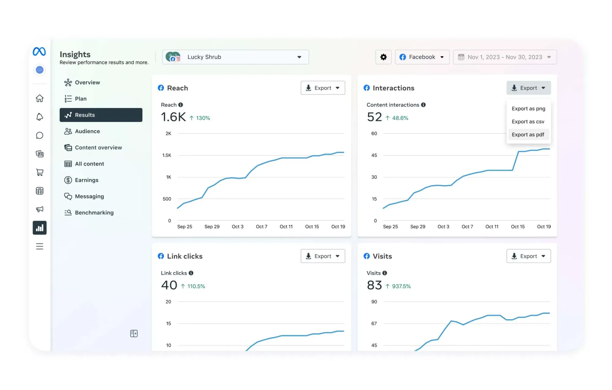
Start with Facebook Insights, which gives you a breakdown of how your posts, Facebook Page, and audience are performing.
You’ll find Facebook Insights right in your Facebook dashboard.
- Head to Meta Business Suite
- Click on Facebook Insights
- You'll find reach, engagement, audience demographics, and more:
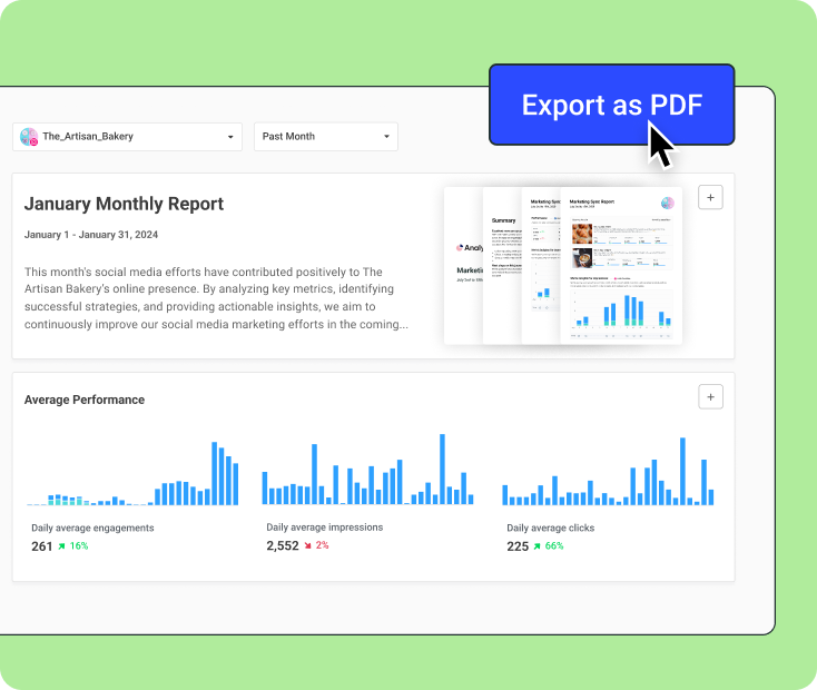
To take things a step further — and make your life a whole lot easier — you’ll want to try Buffer’s Facebook analytics:
- It’s all-in-one: See your Facebook performance AND schedule content, crosspost across platforms, and even get AI help writing your captions from one (very tidy) tab.
- You can filter and compare with ease: Want to see how your Facebook content stacks up against your Instagram or LinkedIn posts? Need to sort by campaign, post type, or timeframe? You can do all that (and more) in Buffer’s dashboard.
- It's designed to be intuitive and easy to navigate: Buffer is clean, intuitive, and built for busy creators and marketers.
- You can analyze campaigns separately: Running a giveaway or product launch? Buffer lets you group Facebook posts into campaigns and measure their results on their own.
Buffer gives you the must-haves like:
- Impressions
- Reach
- Link clicks
- Follower growth
It also helps you quickly answer the questions that actually move the needle:
- What type of content is getting the most engagement?
- When’s the best time for me to post on Facebook?
- How often should I be posting to keep my momentum?
- What are my audience’s demographics?
- How do my organic posts compare to paid ones?
Facebook growth is a marathon, not a sprint
Growing your Facebook following takes time, creativity, and consistent effort. Some weeks will feel slow — and that's completely normal. The key is to keep experimenting with what works for you and your audience. Every post you publish is a step forward, even on the days when it doesn't feel that way.
Tools like Buffer make this journey easier by helping you plan, repurpose, and analyze your content.
With the right approach and a bit of patience, growing your Facebook followers is totally manageable.
You've got this.
Facebook growth FAQ
What are Facebook followers?
A follower is someone who chooses to see your public posts in their feed without becoming your friend. The connection is one-way — you post, they see. Turning on the Follow setting lets people keep up with your updates without filling your friends list.
How do I follow someone on Facebook?
Open the person’s profile, then tap Follow. If you don’t see the button, tap the three dots and choose Follow. For Pages, tapping Like or Follow automatically adds their posts to your feed.
How can I see who follows my Facebook Page or profile?
On mobile, go to your Page, tap About > See all Page info, then choose Followers. On desktop, open your Page or profile, click the More tab, and select Followers. You’ll get a list of everyone who currently follows you.
How many followers do I need to start earning money on Facebook?
For most Facebook monetization tools, you'll need a couple of thousand followers. Requirements change often, so check your Professional Dashboard for the latest criteria.
How do I get more organic followers on a Facebook Business Page?
Complete your page with a strong bio, visuals, contact info, and calls-to-action. Post consistently, engage actively, and use features like reels, stories, and live videos. Cross-promote on other platforms and collaborate with creators or brands to expand reach.
How do I get more followers on Facebook in professional mode?
Optimize your profile with a clear niche, engaging content, and regular posting. Use reels and live videos to appear in feeds, respond to comments, and repurpose content from other platforms to keep your feed fresh with less effort.
How do I grow Facebook followers without ads?
Focus on valuable, consistent content that sparks conversations. Use Facebook features like reels, stories, and live videos. Collaborate with others and actively participate in comments and DMs to build organic growth.
How do I get organic followers on Facebook?
Create helpful, entertaining, and inspiring content tailored to your audience. Post regularly, respond to comments, share behind-the-scenes moments, celebrate milestones, and repurpose successful content.
More Facebook resources
- Best Time to Post on Facebook — New Data from 14M Posts
- Inside the Facebook Algorithm: All the Updates You Need to Know
- What Is a Good Facebook Engagement Rate? Data From 52 Million+ Posts
- 16 Facebook Statistics to Know
- Facebook Ad Specs + Image Sizes — Fully Updated for 2026
- How to Schedule Facebook Posts in 3 Easy Ways (+ Save Hours Every Week)
Try Buffer for free
190,000+ creators, small businesses, and marketers use Buffer to grow their audiences every month.

