I’ve resisted social media advertising for a long time, believing that there are a host of free tools and free strategies that can help your business grow on social media organically.
What I’ve come to find out (and I’d imagine many of you have discovered this already) is this:
If you’re spending money to advertise online, social media ads may very well earn you the biggest returns.
(In some cases, it’s the cheapest way to reach people.)
There are so many inspiring digital marketers who are pioneering the best practices and cool strategies for social media advertising. As we dip our toes further into social ads here at Buffer, it’s been fun to discover all the great tips we might try. I’ve collected seven of my favorite ones here in this blog post—a list of simple, actionable tips that drive successful social media ads.
I’d love to hear in the comments any strategies you might add!
7 of the Best Social Media Advertising Tips
1. Create multiple versions of the ad
When we write headlines for Buffer blog posts, we often come up with a big handful of options (15 or more headlines per post when we can manage it) so that we can test and see what works best.
The same idea works with social media ads.
When you read about a successful social media ad, it’s likely that the ad has gone through a few key variations based on these actions:
- Write several versions of ad copy
- Test different images
- Adjust and hone your target audience
In the comments of our post on Facebook advertising budgets, Lucie shared this great tidbit about how to gauge what’s working and what’s not:
I always have several versions of the ad and anything with lower than 1.5% CTR after few hours I deactivate.
The strategy then would look something like this:
- Create lots of ad variations
- Check often to see what’s working
- Deactivate the lowest performers and try something new
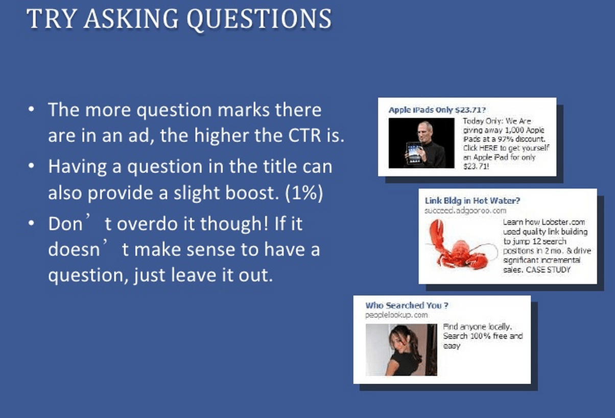
In terms of testing out different ad copy, there are many popular recommendations for what might work (including a few ideas I’ll share below). This SlideShare from e-CBD, while a couple years old, has some interesting ideas for things to try: power words, time prompts (“now,” “limited time”), and question marks.
For images, you can test things like product pictures, people and faces, even memes.
And when it comes to custom audiences, there are some great tactics on different ways to hone in on a segment that converts (probably enough tactics for a post of its own, which we’d love to cover separately). One bit of advice I’ve found helpful in thinking through things is another useful comment on our Facebook Ads post, from Bill Grunau:
You want to cast a large net, BUT not try to scoop up the entire ocean.
A target audience of 3,000 to 5,000 is very, very small. For FB ads it should be in the high five or six figures as a minimum. If it is many millions then it is likely too big.
2. Use the “Learn More” button
When creating ads for the Facebook News Feed, you get the chance to include one of seven buttons with your ad.
If in doubt, it’s best to choose a button instead of no button.
And the best button of all? The “Learn More” button.
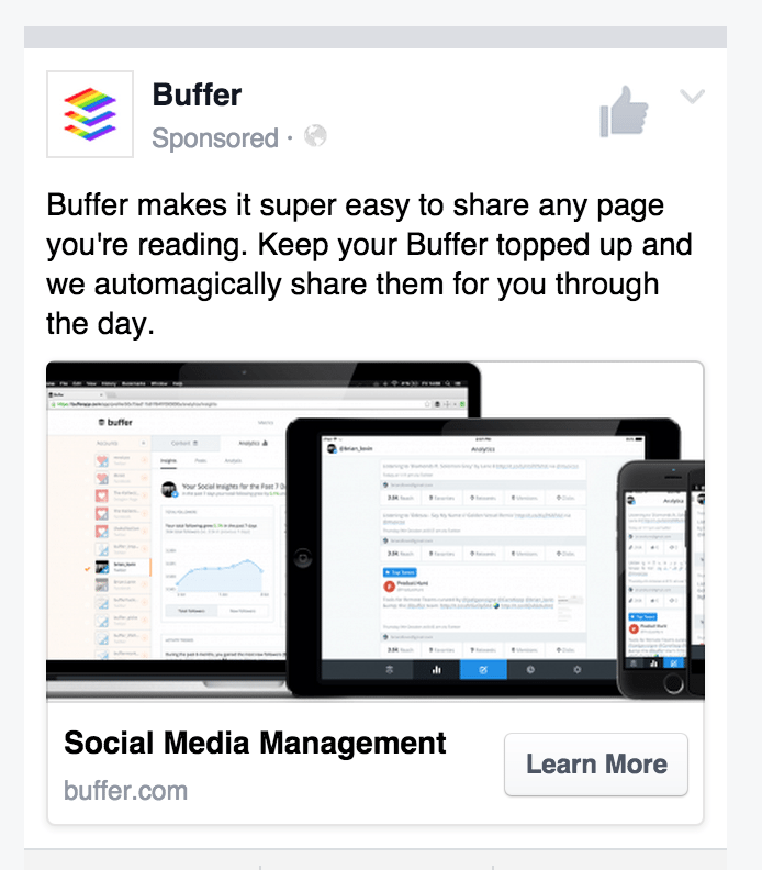
You can add the button in the bottom section of the Facebook Ads editor. These are the seven button options to choose from:
- Shop Now
- Book Now
- Learn More
- Sign Up
- Download
- Watch More
- Contact Us
The theory behind why this button works is that it helps focus your ad to an even greater degree, like a Mario mushroom for your already great copy. Adding a button enhances the call-to-action and primes a reader to take the action.
As for which button works best, you’re might notice that one fits your niche particularly well (“Book Now,” for instance, would be great for vacation spots). For the “Learn More” button, there seems to be growing evidence that it’s the best overall bet for engagement.
Noah Kagan found that “Learn More” converted better than the other options and better than using no button at all.
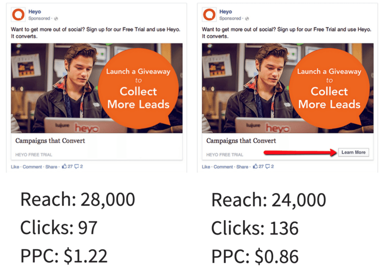
And Facebook ad tool Heyo ran an A/B test to see the effect that the “Learn More” button had, compared to no button at all. The result: a 63.6% increase in conversions and 40% decrease in cost-per-click just from the Learn More.
3. Create a custom landing page
If the goal of your social media ad is conversions—sales, signups, what-have-you—then you’ll want to think not only of the ad itself but also where a person might end up once they click.
Picture social media ads as a two-step process:
- Create the ad
- Create the destination
Some of the most successful social media advertising campaigns include custom landing pages, where the copy carries over from the ad and the action crystal clear.
The more targeted your ad, the more targeted your landing page needs to be.
You’ll see this often with e-commerce ads that do a great job targeting a single product and then send the person from the ad to the main product page, full of menus and related products and all sorts of potentially distracting (albeit eminently useful) places to click.
Siddharth Bharath, writing at Unbounce, suggests a click-through landing page, which is an intermediate page between an ad and a final destination (shopping cart, for instance).
This keeps the focus on the offer – the reason the prospect clicked – and leaves them with two options: buy now or lose the deal forever.
Videos or product images paired with a description and product benefits help to persuade the visitor to click the call-to-action.
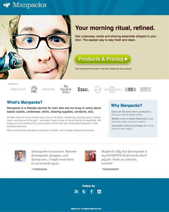
Socialmouths shared five key elements of these social media ad landing pages.
- Goal-Driven Copy Length
- Limited Form Fields
- Key Visuals
- Responsive, i.e., “Mobile-ready,” Design
- A Single Call to Action
Of these, the single call-to-action stands out as a potentially quite key element.
Also of note, the goal-driven copy length suggests the idea that there could be multiple goals for your social media campaign, something like a spectrum from immediate goals to long-term goals or sales/lead-gen to awareness/education. In general, a landing page for an immediate goal has short copy. A landing page for a long-term goal has long copy.
4. Mention price up front
Another interesting tip from Siddharth Bharath involves the idea of pre-qualifying your traffic. Essentially, it works like this:
You only want people clicking through to your ad who are comfortable paying the price for your product.
The key then is to share your product’s price early.
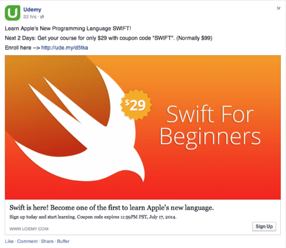
Doing so will help qualify the traffic that heads to your landing page. Instead of filtering out people when they reach your pricing page, you can do so before they even click—thereby saving you pay-per-click costs that wouldn’t have amounted to a conversion.
The goal, in other words, wouldn’t be about people clicking your ad. The goal would be people clicking your ad and eventually buying your product or service.
5. Promote a discount
In a survey of Facebook users, 67 percent of people said they were likely to click on a discount offer.
A simple strategy for a successful social media ad: Mention a discount in your copy.
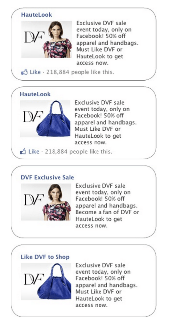
In a really cool case study from Hautelook, the clothing website ran a 50% off sale on their Diane Von Furstenberg line. Mentioning a discount in their ads led to a huge sales day—the third largest sales day in company history.
And discounts don’t necessarily always need to be tied to huge sales events. At Buffer for instance, we have three different pricing options (free, Awesome, Business), and at the Awesome price the price is lower when paying a year in advance rather than month-to-month. It’s kind of a built-in discount and one we could explore using in our social media ad copy.
6. Filter out mobile traffic
When creating a social media ad, you’ll typically have the option of segmenting the audience by a number of factors, including those using a desktop/laptop versus a mobile device.
To fully optimize your conversion rate, show your ad to those on desktops and laptops. Don’t show your ad on mobile.
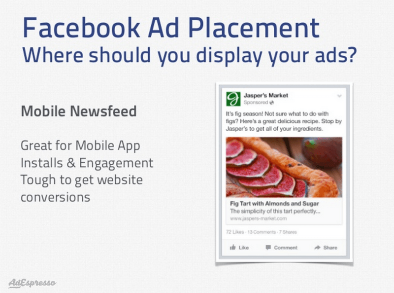
This slide deck from Ad Espresso (a Facebook ads management tool) does a great job explaining the differences between types of social media ad placement, particularly on Facebook.
The mobile News Feed is great for mobile app installs and engagement. It’s tough to get website conversions.
Here’s the key slide:
Noah Kagan also mentions excluding mobile traffic in his steps for getting started with Facebook ads.
Avoid showing your ads to mobile traffic. Most likely your page is not mobile designed and that traffic is less likely to purchase or sign up for an email address.
That last sentiment seems key here: Mobile visitors are less likely to convert to a sign up or a sale. If conversions are the goal of your social ad campaign, then it might be great to focus solely on the desktop audience.
A couple of additional notes here also:
- Not only do the most successful social media ads hone in on the device type, they also keep in mind the location of the ad. Typically sidebar display ads—like those offered by Twitter or Facebook—see lower click through numbers (they’re recommended as a great option for retargeting). The best results are those that appear natively in the News Feed or timeline. Ezra Firestone calls these “advertisements that blend in with the platform.”
- Removing mobile display from your ads is an often-recommended strategy, though there’s definitely two sides to the discussion. Brian Honigman, writing at SumAll, mentions that your ads should focus on mobile first in order to capture the huge volume of Facebook traffic that accesses the site from mobile devices.
7. Focus on relevance score
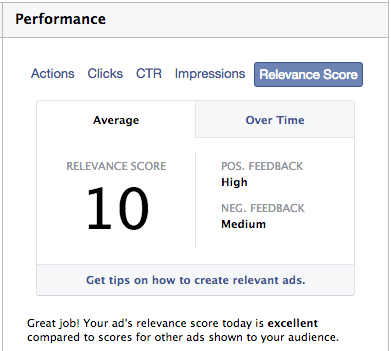
When I wrote about our Facebook Ads experiments a few weeks back, I was so grateful for all the advice and learnings that folks shared in the comments. This bit from Lucie has stuck with me:
I test my ad on a small budget and see the relevance score first. If it is less than 8/10, it means I should adjust my targeting. If it is higher, then I know I hit the nail on the head.
Jon Loomer wrote a detailed breakdown of Facebook’s relevance score, explaining what it is and how it’s calculated.
Briefly, relevance score helps explain the way Facebook views your ad and why it might prefer certain ads you’ve created versus others.
Facebook says they use relevance score to determine “expected” interaction with your ad.
Relevance score is calculated based on actual and expected positive and negative feedback from the ad’s target audience. The score is updated in real-time as users interact with and provide feedback — both positive and negative — with that ad.
Positive feedback includes people liking, commenting, and sharing your ad and also any desired actions taken with your ad (clicks to website for instance).
Negative feedback includes those instances when people hide your ad or ask not to see ads from you.
It’s all delivered on a 1 to 10 scale and based on real interactions with your ad; there’s a 500 daily impressions minimum in order to receive your first score.
From Lucie and Jon’s advice, there are a couple of great takeaways and strategies on how successful social media ads look at relevance score.
- Test your ad with a small budget first, to see where your relevance score lies. Once you achieve relevance of 8/10 or higher, then promote the ad more heavily.
- Since relevance scores update in real time, check your ads often. If the score dips below 8/10, adjust the ad.
(This second point hints at a higher-level bit of advice with social media ads: Don’t just set ’em and forget ’em. Consistent, active monitoring is key.)
Summary
As we’re in the early stages of testing out social media ads at Buffer, it’s a real privilege to be able to learn from those who have gone before us, trying and testing to see what works in social ads. We’re excited to take all the great advice here and use it in our own experiments and campaigns.
One of the best blueprints I’ve seen for creating a social media ad (particularly a Facebook ad) is this brief list from Noah Kagan, which condenses a lot of the sentiment from the above strategies.
- Call to action: Choose “Learn More”
- Headline: Give away something for free
- Text: Social proof showing why the reader should care
- Link Description: Give call to action for them to get benefit
Try to create an ad that uses natural text versus something that seems like an advertisement.
What have you found works well for you with social media ads?
Have you tried any of these strategies? How did they perform?
I’d love the chance to learn from you in the comments!
Image sources: Pablo, Unsplash, IconFinder, Jon Loomer, Unbounce
Try Buffer for free
200,000+ creators, small businesses, and marketers use Buffer to grow their audiences every month.


