Within any company, the organizational chart lives a complicated, contradictory experience.
At times, the org chart represents beloved clarity and organization. Other times, it represents rigidity and the tyranny of top-down, hierarchical systems.
Organizations often phase out their org charts only to resurrect them again when they find themselves looking for an answer on organization and structure. While some may come back in original form, many companies are looking for new and improved ways to present their company structure, to mash up the classic components that make org charts useful with new ideas that better communicate the organization’s style or culture.
Here at Buffer, we love to challenge pre-existing notions about work, and the org chart naturally falls within this. We’ve tweaked ours quite a lot, researched many others, and in the process created a roundup of unique ways that companies worldwide are thinking about how to map out their organizations.
What is an org chart and what is it good for?
First off, a definition:
An org chart is a diagram that shows the relationships of the people and areas within a company.
In general, this sounds like a great idea, right? As people we are wired to look for a hierarchy, and an org chart does just that. For this reason, the org chart has remained incredibly resilient throughout the years. There’s no replacing this tool because it solves such an important need for a company.
In general, arguments about org charts aren’t focused on the “why;” more often, it is the “how” that’s being challenged.
There are three keys to any good org chart ? ? ?
A well planned and executed org chart can come in many varieties. However, there are a few key components that all should share. Here are the three must-have elements of a good org chart:
- It contains everyone in the company. An org chart is one of the few places where everyone is represented. This means either every individual person or every individual area. An org chart is for all!
- It provides clarity on who reports to whom. You should be able to look at an org chart and see how information flows in your company.
- It is readily accessible by anyone at any time. This is more about process than construction, but the idea is that you can easily remember where you put your org chart and that each team member is familiar with how to find it.
With these three key elements in place, and organizational chart can present clarity to your organization, eliminate confusion amongst employees and teams, and benefit your entire organization.
Take a look below as we outline 10 different types of organizational charts that are in use today.
10 types of org charts
1. The classic org chart
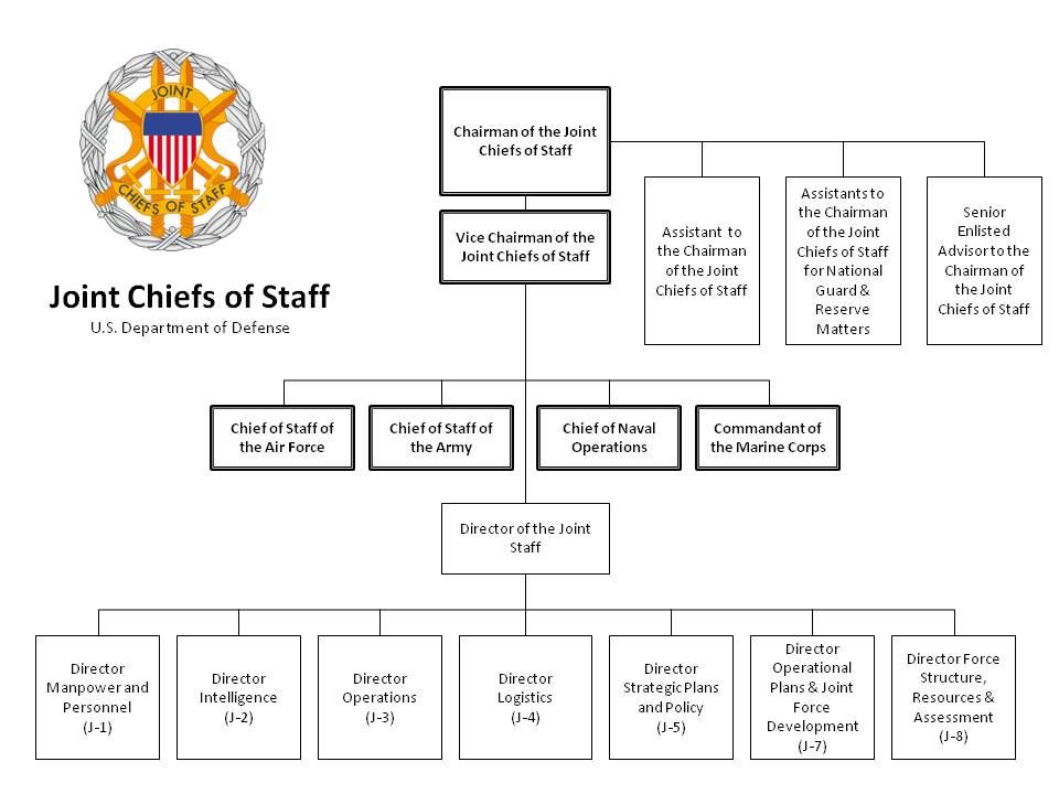
You’re probably familiar with the default org chart design: the pyramid.
Many large companies and government agencies adopt this classic version where everything funnels up to the top of the pyramid, to the CEO or president. There’s nothing wrong with this style; it provides great clarity for organizations that operate with a fair deal of hierarchy and need a clear chain-of-command to act fast.
2. A left-to-right org chart
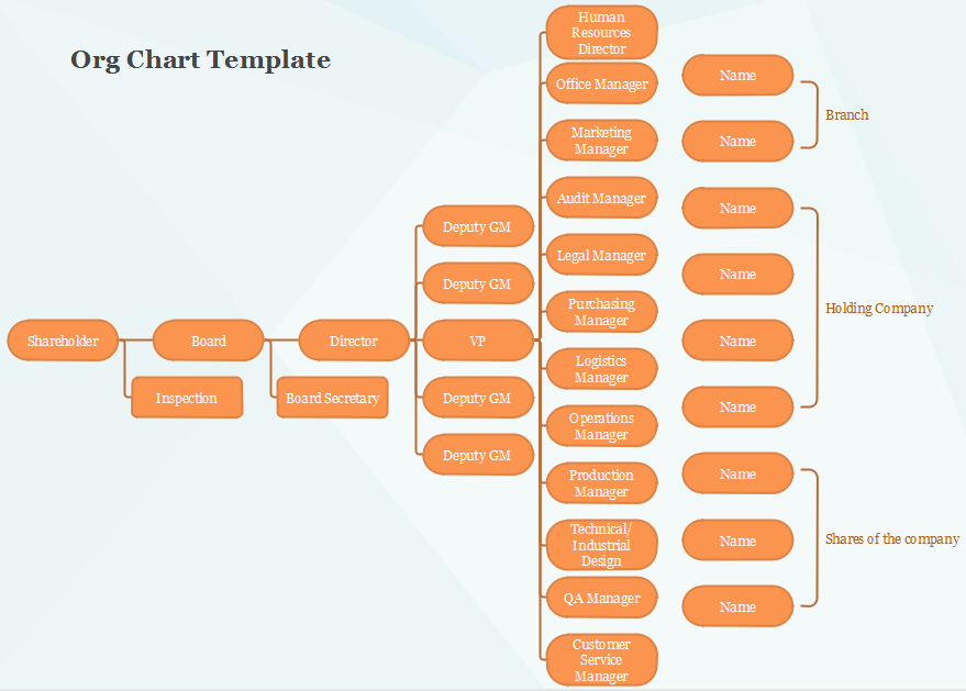
To avoid the top-down feel of a company org chart, some companies quite literally flip the chart on its side.
A top-down org chart that is rotated 90 degrees becomes a left-to-right org chart with no single entity at the top. The leader of the company is at the far left, and the rest of the organization flows from that end.
3. A matrix org chart
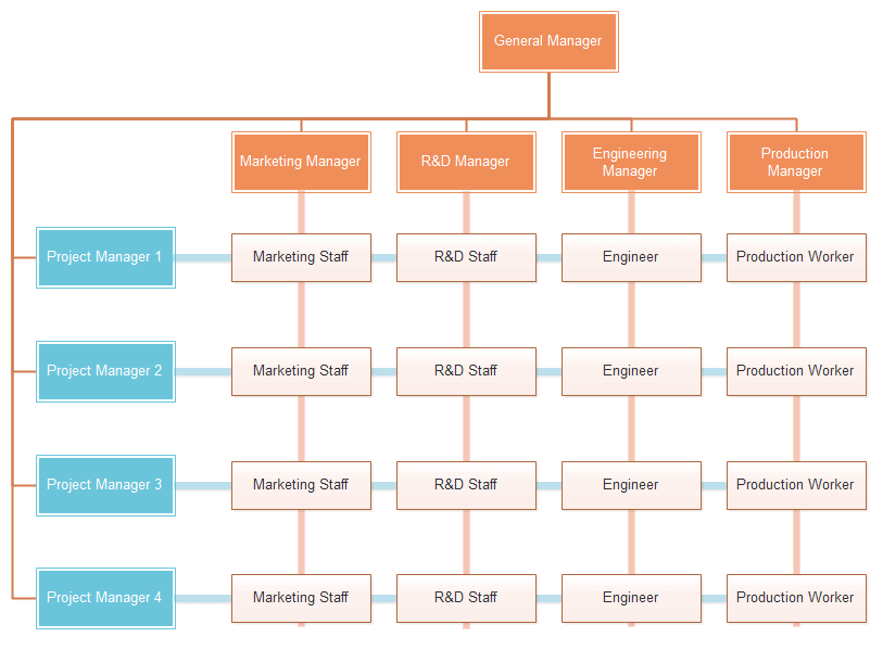
A matrix chart looks a bit like a table, and has evolved from a classic chart to include a visual representation of dual reporting. Perhaps you’re working on a short-term project and reporting to a project manager. Perhaps you live on one team and are contributing to another. The matrix chart provides flexibility to showcase this type of organizational setup.
4. A round org chart
Similar in style to the traditional pyramid, this org chart replaces the hard-edged triangle shape with rings, featuring the “bottom” of the pyramid as the outer circle, and moving inward towards the “top”, where the innermost circle is the highest ranking office. Has anything fundamentally changed? Not really. But the softer circles can feel more fluid and collaborative.
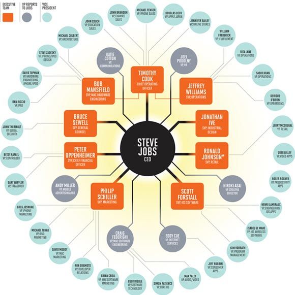
5. An inside-out org chart
Rather than put hierarchy at the top or at the far right, some organizations opt to put the top-level people and teams in the middle, with the rest of the organization spidering out from the center. This chart resembles a hub and spoke model. Here’s an example from the Sparkfun team.
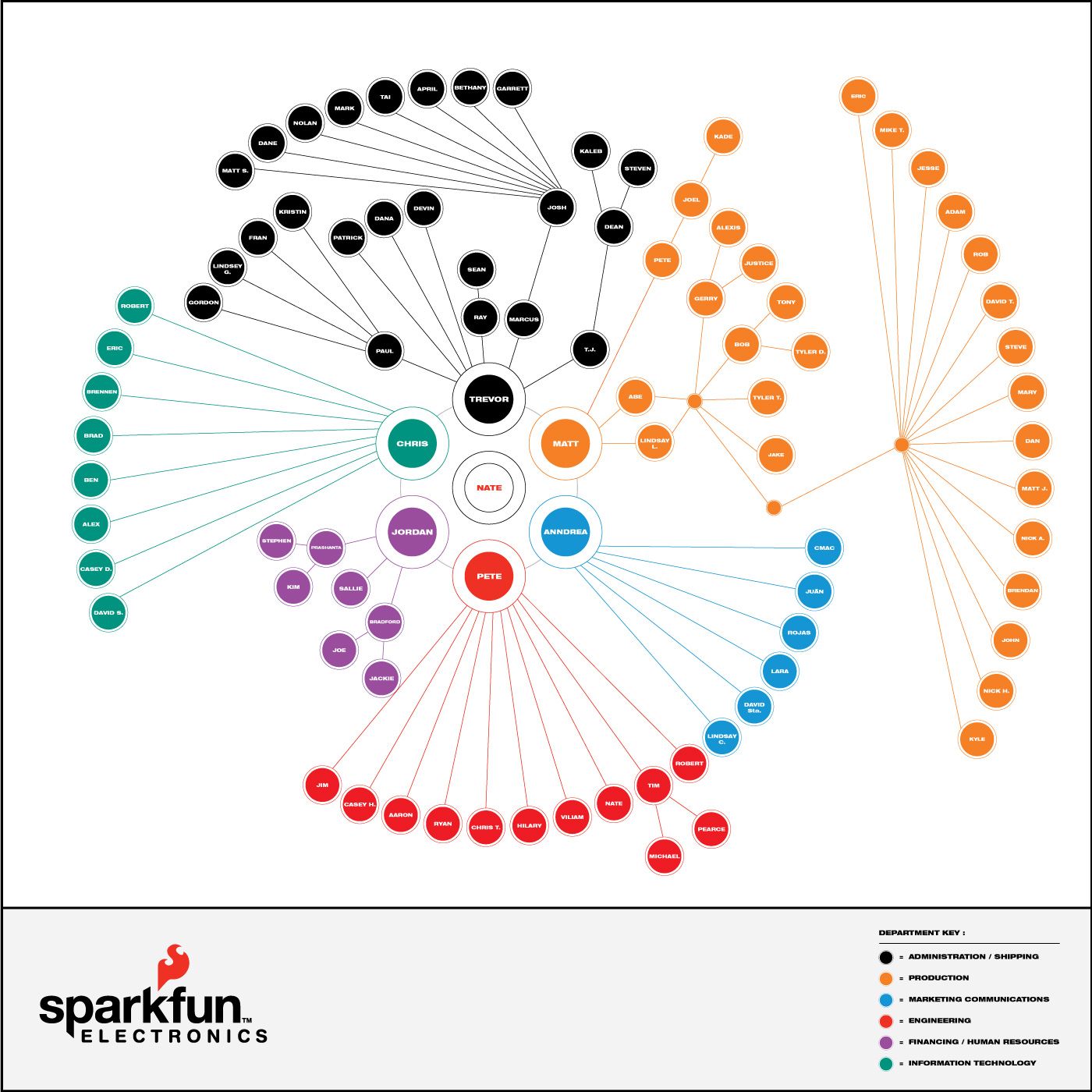
The Sparkfun team went the extra mile, putting a printed version of this chart in their breakroom so it’s visible and readily accessible for the whole team.
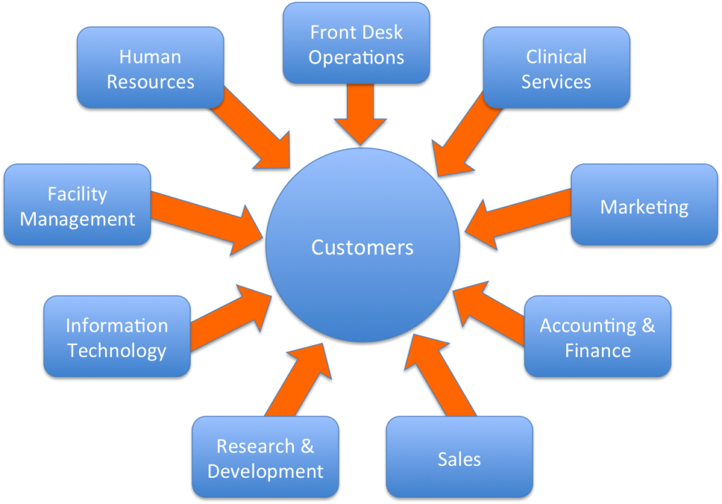
6. A customer-centric org chart
Rather than have the CEO or president in the center, you might choose to put the customer there. Some organizations rally around the idea that the customer is at the center of the business. Would your organization be willing to make that explicit in your org chart?
The idea here is that the customer sits in the center, and then each concentric ring of the organization relates to how close a teammate is to the customer. For instance, customer support is the first ring, marketing and product second, executives and admin third.
7. A table
This is how we do it at Buffer!
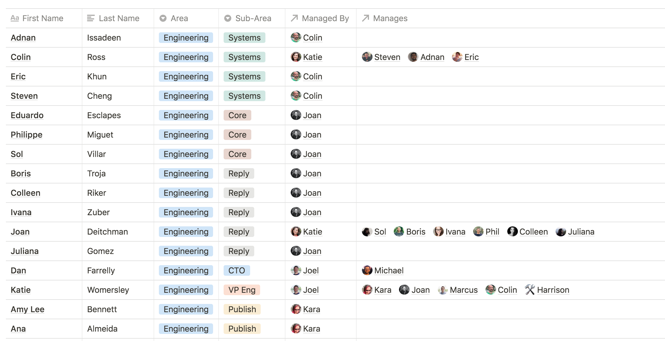
Rather than have a full diagram of where everyone sits in a hierarchical structure, we’ve leaned into the foundational elements of an org chart — clarity, order, and communication — and extrapolated those bits into a table format.
Here’s a look at how this currently looks for us:
8. Spotify’s guilds
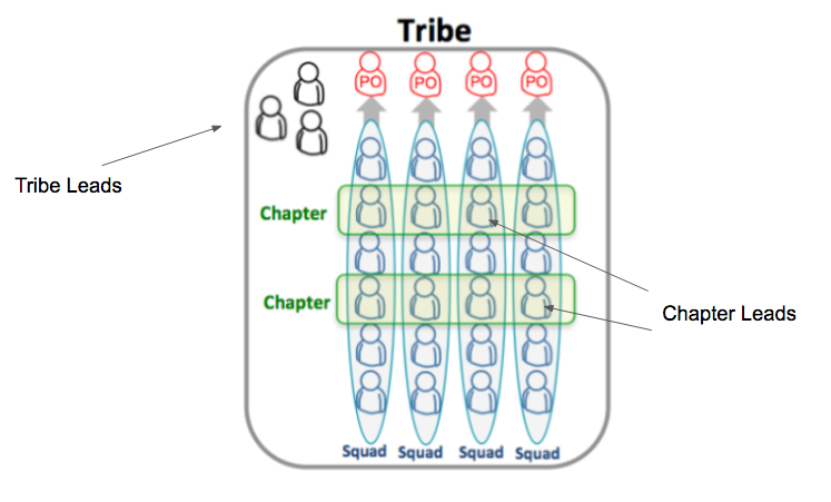
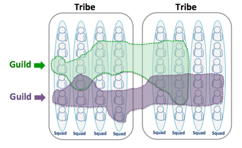
One very famous example of scaling a team is Spotify. Their thought leadership on the topic has inspired many companies (including us) to experiment with our team setup. Here’s one of the methods that Spotify has used:
- Squads: small, self-forming teams with common goals. Each squad reports to a Product Owner.
- Chapters: domain mastery groups whose members can be allocated within various Squads. Each Chapter has a Lead.
- Tribe: a collection of Squads and Chapters. Each Tribe has a Lead.
- Guild: a community of like-minded folks from across any number of Squads, Chapters, and Tribes. No formal leadership; these are open communities.
9. Upside down
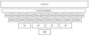
There’s a famous cartoon where an executive is sitting at a desk talking to a colleague and says, “No wonder we’re losing money; our org chart is upside down!”
That’s an interesting thought. What if the org chart was upside down… on purpose?
This would potentially have a huge impact on the feeling of employees who would see hierarchy flipped onto its head. Practically, things might not be all that different in terms of strategic vision and goal accountability, but the fact that a company could publicly and officially prop up its lower-tiered employees to the very top — there could be a lot of power in that!
10. Holacracy
Lately I’ve been interested in the concept of holacracy and how teams stay fluid and adjust to the changing demands of a market.
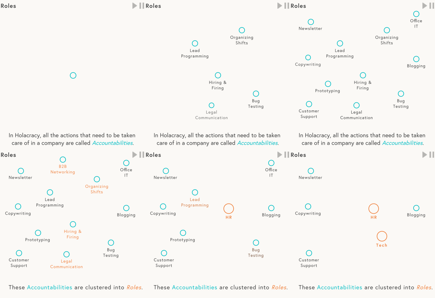
This article at Blinkist explains the concept of Accountabilities, Roles, and People. In summary:
- The actions that need to be taken care of are called Accountabilities.
- Accountabilities are clustered into Roles.
- Roles are assigned to People who have the skills and resources to fill them.
- People can hold multiple roles, even ones that seem unrelated
- Roles are flexible. Accountabilities can change.
- New Roles can emerge out of changing Accountabilities.
Bonus! The very first org charts
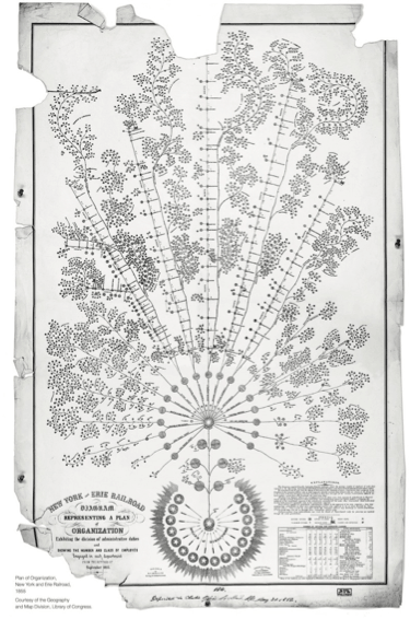
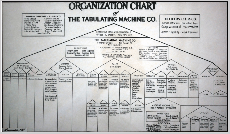
The Pingboard blog has a great write-up on the evolution of organizational charts over time, and offers a great history lesson on the very first org charts. Below are two of the very earliest.
First, there’s one from railroad engineer and manager Daniel McCallum, from all the way back in 1855. His org chart shows relationships between departments of his railroad company and everyone’s duties.
Around the turn of the 20th century, the Tabulating Machine Co. (which eventually became IBM) created their own version of an org chart. Look familiar? The pyramid style used here became the foundation for a century of copycat org charts worldwide.
Over to you
- What does your org chart look like?
- If you could wave a magic wand and change anything about your chart, what would change?
Thanks for checking out this article. If you’d like to stay in touch with our future work experiments and organizational learnings, we’d love to have you join our newsletter list.
Try Buffer for free
190,000+ creators, small businesses, and marketers use Buffer to grow their audiences every month.


