You're spoiled for choice when it comes to Facebook ads — from images and videos to carousels and collections, there’s a format (and placement) for just about every goal. Advertising on Facebook also gives you the chance to experiment and find just the right approach for your brand.
But with so many options, it’s important to keep up with the latest Facebook ad specs. Facebook offers a world of creative opportunities, and getting the specs right is your first step to making the most of them. If you’ve ever found yourself Googling “Facebook ad sizes” or “Meta ad specs” five minutes before launching a campaign, we’ve got you covered.
In this fully updated guide, you’ll find all the current Facebook ad dimensions, file types, and technical details you need to create standout ads in 2026.
Quick Tip: Add this article as a bookmark so that you never have to go spec-hunting again.
Jump to a section:
- Technical terms you need to know
- The anatomy of a Facebook ad
- Create the perfect Facebook ad: design specs for different ad types
- Choose the right Facebook ad format
- Facebook ad specs and sizes at a glance
- 5 quick tips for creating standout Facebook ads
- Keep these guidelines handy
- Facebook ad specs FAQ
- More Facebook resources
Technical terms you need to know
If all the talk about Facebook ad specs, sizes, and file types feels a little overwhelming, I hear you. But take it from a writer: the good news is that you don’t need to be a designer or a tech whiz to create Facebook ads that work.
To help you cut through the jargon, here’s a quick rundown of the most common terms you’ll see when reading this article and creating your ads:
- Audience network: Allows your Facebook ads to appear in apps and websites outside of Facebook and Instagram that are part of Meta’s ad network.
- Aspect ratio: The shape of your image or video (for example, 1:1 is a square)
- Aspect ratio tolerance: How much your ad’s shape can be slightly off from the ideal shape and still be OK.
- GIF: A short, looping animation made from several images that’s good for quick, fun visuals (Read our Ultimate Guide to GIFS to learn how to create and use them).
- JPEG: A common type of image file that works well for photos with lots of colours.
- MOV: A type of video file, mostly used by Apple devices. Facebook accepts it, too.
- MP4: A popular video file type that Facebook likes because it looks good and loads quickly.
- Pixels (px): Tiny dots that make up your image or video. More pixels usually means better quality.
- PNG: Another image file type that’s good for pictures with text, sharp edges, or transparent backgrounds.
- Resolution: The clarity of your image or video. Higher resolution means it looks sharper and more professional.
The anatomy of a Facebook ad
Every Facebook ad is built around your objective, your conversion location, and your call to action (CTA). Think of them as your ad’s purpose, destination, and invitation, which all work together to move people toward your goal.
Objective: This is what you want your ad to do. Do you want more people to visit your website? Watch your video? Download your app? Facebook offers a wide range of ad objectives so you can choose what fits your goal best.
Conversion location: This is where you want the action to happen. Depending on your objective, it could be your website, a mobile app, Instagram profile, Facebook Messenger, WhatsApp, or even a physical store.
Note: You need to have a Facebook Page to run ads using the Meta Ads manager. You can then link your Page and Instagram account to run ads on Instagram. You can only link one Instagram account to one Facebook Page.
Call to action (CTA): This is the button or prompt that encourages people to take the next step. Options include things like “Shop Now,” “Learn More,” “Send Message,” or “Download.” Picking the right one helps set clear expectations and gives your audience a helpful nudge.
Once you’ve chosen an objective, you’ll be able to choose a conversion location and a call to action:
Here's a table showing relevant conversion locations and call-to-action (CTA) options based on each Facebook ad objective:
Create the perfect Facebook ad: design specs for different ad types
I once uploaded an ad that looked great on desktop but got weirdly cropped in Facebook Stories; lesson learned. Now I always double-check my dimensions.
Using the correct Facebook ad sizes and specs is so important. When your creative meets the recommended guidelines, your ads are more likely to look great, perform better, and help you reach your goals.
Quick Tip: I like using Canva to get my visuals sized just right, fast. Just set up a custom image or video using the pixel dimensions below. It makes the whole process so much easier.
As an added bonus, when you’re creating organic posts, Buffer’s Canva integration allows you to create scroll-stopping images without leaving the platform.
Choose the right Facebook ad format
Once you select an objective for your ad, you’ll be guided through the process of creating your ad and get to choose one of four ad types to serve your target audience. Meta offers different types of ads for different products, objectives, and goals:
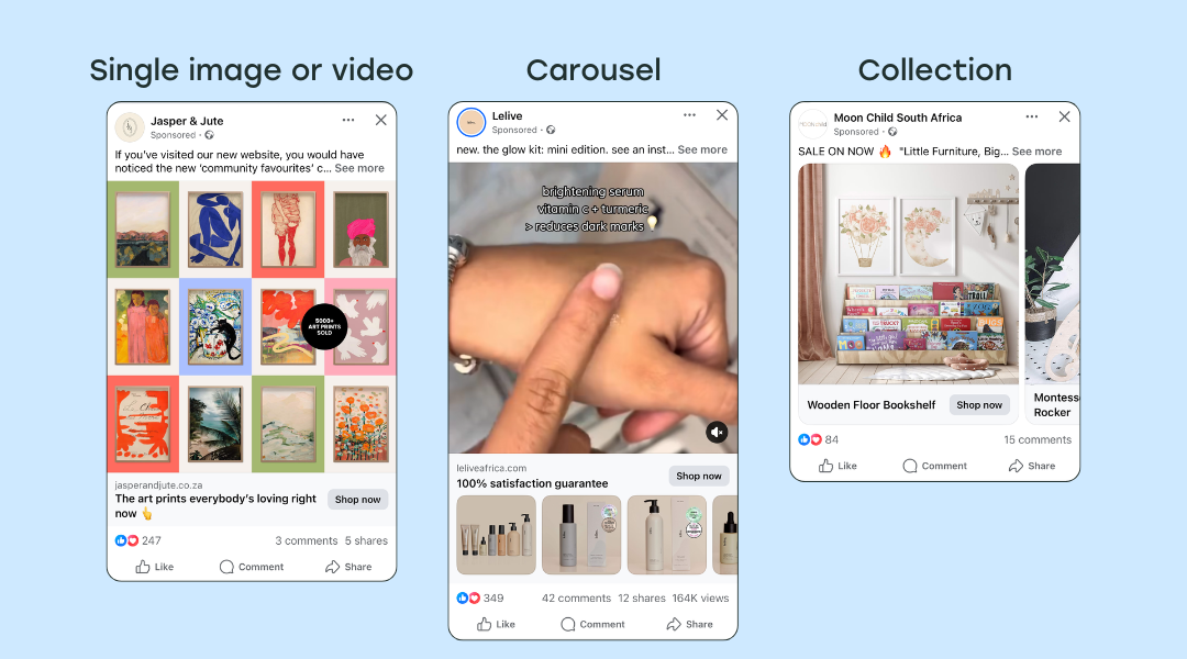
- Single image ad: Shows one picture with a message to grab attention.
- Single video ad: Plays one video to tell a story or show a product.
- Carousel ad: Several images or videos you can swipe through.
- Collection ad: Shows a big image or video with smaller pictures underneath to explore more.
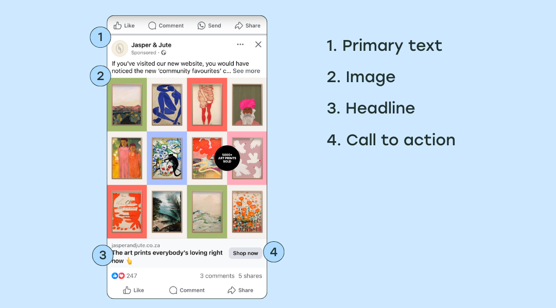
1. Single image ad specs
Want to drive traffic to your website or app? Start with eye-catching, high-quality visuals. You can use your own photos or tap into stock images to help tell your brand’s story in a way that grabs attention and encourages clicks.
Design recommendations
- File type: JPG or PNG
- Ratio: 1.91:1 to 4:5
- Resolution:
- 1:1 ratio: 1440 x 1440 pixels
- 4:5 ratio: 1440 x 1800 pixels
Text recommendations
- Primary text: 50-150 characters
- Headline: 27 characters
Technical requirements
- Maximum file size: 30MB
- Minimum width: 600 pixels
- Minimum height:
- 1:1 ratio: 600 pixels.
- 4:5 ratio: 750 pixels.
- Aspect ratio tolerance: 3%
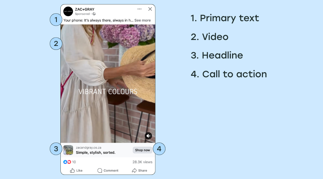
2. Single video ad specs
Show off your product’s best features and capture attention with the power of sound and motion. You can upload a video you’ve already created, or use Facebook’s built-in video tools in Ads Manager to put something together.
Design recommendations
- File type: MP4, MOV, or GIF. (Here’s a complete list of supported video formats)
- Ratio: 1:1 (for desktop or mobile) or 4:5 (for mobile only)
- Video settings: H.264 compression, square pixels, fixed frame rate, progressive scan and stereo AAC audio compression at 128kbps+
- Resolution:
- 1:1 ratio: 1440 x 1440 pixels
- 4:5 ratio: 1440 x 1800 pixels
- Video captions: optional, but recommended
- Video sound: optional, but recommended
Text recommendations
- Primary text: 50-150 characters
- Headline: 27 characters
Technical requirements
- Video duration: 1 second to 241 minutes
- Maximum file size: 4GB
- Minimum width: 120 pixels
- Minimum height: 120 pixels
360 videos
With some objectives, you can use a 360 video. When people see this type of ad, they can turn their device or drag their finger to move around within the video and explore every angle.
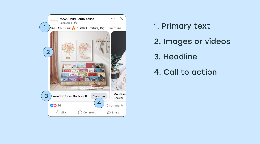
3. Carousel ad specs
Carousel ads let you showcase up to ten images or videos in a single ad, each with its own link. They're perfect for highlighting different features of the same product, or even creating one long, swipeable image to tell a visual story.
Design recommendations
- Image file type: JPG or PNG
- Video file type: MP4, MOV or GIF
- Ratio: 1:1 or 4:5
- Resolution: At least 1080 x 1080 pixels
Text recommendations
- Primary text: 80 characters
- Headline: 45 characters
- Description: 18 characters
- Landing page URL: Required
Technical requirements
- Number of carousel cards: 2 to 10
- Image maximum file size: 30MB
- Video maximum file size: 4GB
- Video duration: 1 second to 240 minutes
- Aspect ratio tolerance: 3%
4. Collection ad specs
Make it easier for people to shop by displaying items from your product catalog, automatically tailored to each person who sees your ad.
When people tap on the collection ad, it opens up and they’re taken into an immersive, full-screen experience (known as instant experience) where they can interact with your branded content — with the option to exit out of the ad at any time, of course.
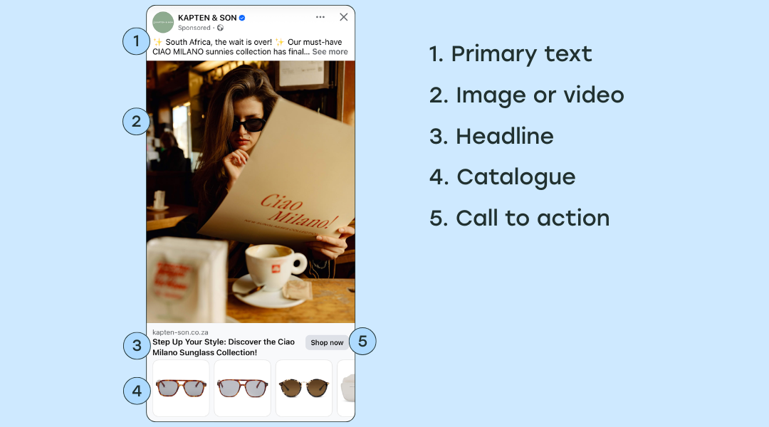
Design recommendations
- Image type: JPG or PNG
- Video file type: MP4, MOV or GIF
- Ratio: 1:1
- Resolution: at least 1080 x 1080 pixels
Text recommendations
- Primary text: 125 characters
- Headline: 40 characters
- Landing page URL: Required
Technical requirements
- Instant experience: Required
- Image maximum file size: 30MB
- Video maximum file size: 4GB
Facebook ad specs and sizes at a glance
5 quick tips for creating standout Facebook ads
- Start with a clear goal: Before you even open Ads Manager, ask yourself: What do I want this ad to achieve? This will help you select the right format, objective, conversion location, and CTA.
- Keep the text to a minimum: Facebook recommends using images with little or no text overlay, as these tend to perform better and reach more people.
- Use music legally: Facebook is strict about copyright, and using unlicensed music can get your ad taken down.
- Watch out for restricted content: Facebook has clear rules about what can and can’t be advertised. I once tried to run ads for a weight loss coach using before-and-after photos, and Facebook disallowed them. All that hard work wasted. Learn the rules and save yourself the headache.
- Make use of the Meta Ad Library: It’s a great tool for researching trends, checking out competitors, or just gathering ideas for your next campaign. Here’s a guide on using this tool effectively.
Keep these guidelines handy
Having these image size guidelines on hand will help you create awesome ads that stop the scroll and get you closer to your goals.
And when it comes to organic content planning, scheduling, and analytics, Buffer makes getting in front of your audience a breeze.
Sign up for Buffer (for free!) to start scheduling posts to Facebook and other platforms, storing content ideas, using AI to make your life easier, and so much more.
Facebook ad specs FAQ
What’s the best size for Facebook ads in 2026?
The sweet spot for single image ads is 1080 x 1080 pixels — that’s a perfect square and works great in most places. But if you're going for Facebook Stories or Reels, 1080 x 1920 (vertical) is your go-to.
Pro tip: No matter the objective or the ad types, always aim for high quality and a clear image.
Can I use the same creative across all placements?
I get it; repurposing is a time-saver. While you can use the same creative across all placements, it’s not always ideal. A square image might look great in the feed, but not so much in Stories. It’s best to tweak your ad for each placement.
What file types work best for Facebook video ads?
Stick with MP4 or MOV; they’re the most reliable and Facebook-friendly. Keep the video short, clear, and under 4GB, and you’re good to go.
What is the format of a Facebook ad?
A Facebook ad usually has a visual (image or video), headline, primary text, description, and a call-to-action button (like “Shop Now” or “Learn More”). You can also choose from different styles like single image, video, carousel, or collection, depending on your goals.
More Facebook resources
- How to Run Facebook Ads: Beginner's Guide to Advertising on Facebook
- Best Time to Post on Facebook: We Analyzed 1 Million Posts
- Meta Ad Library 101: 7 Ways to Use the Facebook Ad Library to Improve Your Ads
- The Ideal Facebook Cover Photo Size and How To Make Yours Stand Out (+ 11 Ideas and Examples)
- How to Schedule Facebook Posts in 3 Easy Ways (+ Save Hours Every Week)
- Inside the Facebook Algorithm: All the Updates You Need to Know
Try Buffer for free
190,000+ creators, small businesses, and marketers use Buffer to grow their audiences every month.


