
Delivering consistent mobile experiences is hard.
Between iOS and Android's distinct design languages, different versions of native components, and Buffer's own design language, mobile apps can sometimes feel fragmented. Designers and developers end up speaking different languages, duplicating work, and shipping experiences that feel inconsistent across platforms.
At Buffer, we really felt this friction. Our mobile design workflow wasn't as efficient as it could have been. We spent too much time reinventing the wheel, manually patching together screenshots, and playing catch-up with our web app counterpart. We knew we needed a better way.
So we built one.
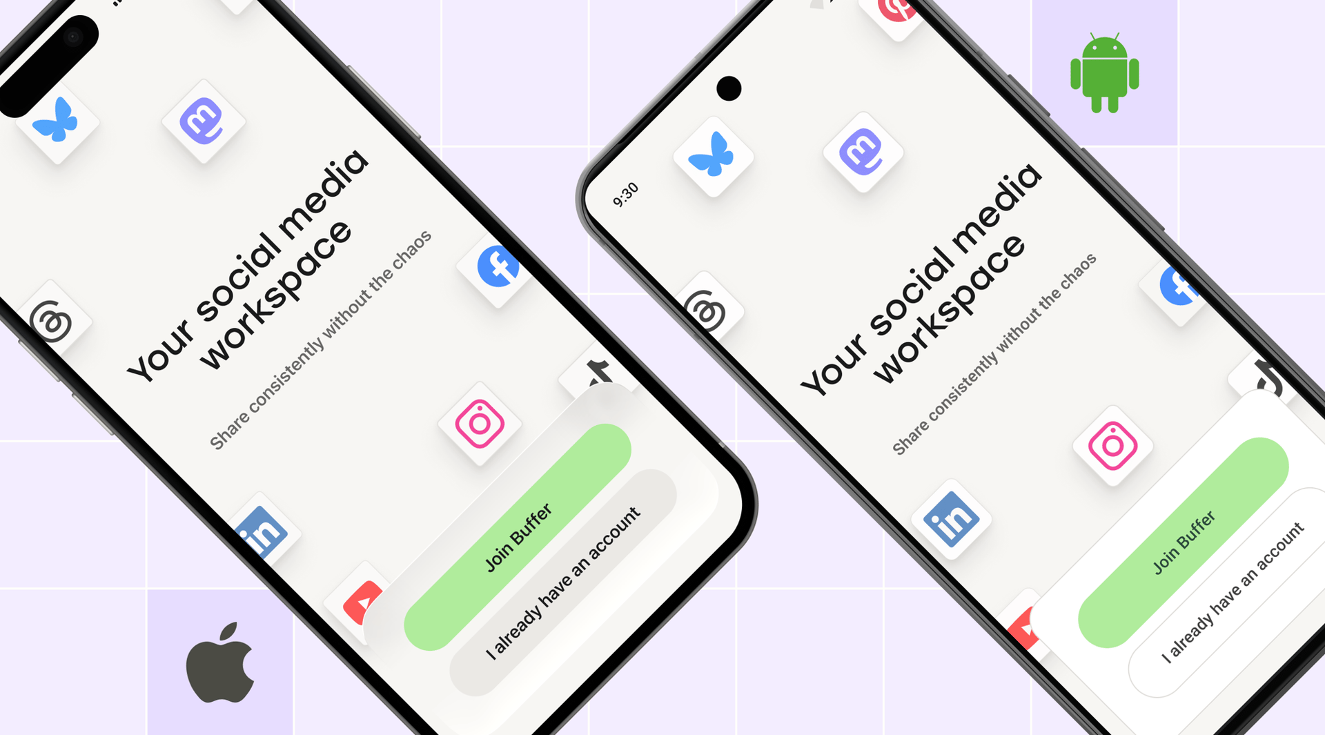
Meet 🍿 Popcorn To Go
Buffer's new mobile design system for iOS and Android. It's our answer to the chaos, and it just passed its first major test: helping us ship our iOS app with Apple's new Liquid Glass design language the moment iOS 26 launched back in September 2025.
Let's dig in. 🍿
Why we built it
Before Popcorn To Go, our mobile development process had some painful friction points:
- Miscommunication between design and engineering. Without a shared design language, handoffs were slow and error-prone. Our iOS app ended up with 300+ colors, most of which were slightly different shades of the same color. No source of truth existed.
- Design decisions made on the fly. With no source of truth, engineers were left to improvise and take on-the-fly design decisions to make things work.
- Inconsistent and inaccessible UI. Minor differences crept in between platforms, and even between different screens on the same platform. Our apps didn't feel as polished as they could be, and we weren't fully using the accessibility features built into native components.
- Dated look and feel. With all these things piling up, it became harder to adopt the latest native components or implement changes to Buffer's general look and feel.
These problems started to hold us back. Our vision for Popcorn To Go was simple: create a system that delivers efficiency, consistency, accessibility, and future-proofing, without sacrificing the unique character and advantages that native components bring to a small mobile team like ours.
The goals of Popcorn To Go
We set out with four clear goals:
- Efficiency for engineering and design teams through standardized components and smart use of native platform components.
- Unified design language that reduces miscommunication and speeds up iteration.
- Accessibility baked in by inheriting best practices from iOS and Android's native components.
- Readiness for platform evolution, like iOS 26's Liquid Glass, so we can move fast when the platforms do.
How it works
At its core, Popcorn To Go is built on two key concepts: tokens and component kits.
Tokens are the design decisions that define your visual language — things like colors, spacing, typography, and border radii. Think of them as the ingredients in a recipe. Instead of hardcoding "use brand green #8FC67D," we define a token like fill-brand that automatically adapts across light mode, dark mode, and different platforms. This means less chance of the wrong color being applied at any point.
Component kits are pre-built UI building blocks (buttons, cards, navigation bars) that use those tokens. They live in Figma for designers and are implemented in code for engineers, creating a shared source of truth.
The tricky part? Balancing platform specificity with cross-platform consistency.
iOS and Android have their own design languages: Apple's Human Interface Guidelines and Google's Material Design. We didn't want to flatten everything into a generic "lowest common denominator" experience. Instead, Popcorn To Go respects each platform's native patterns while maintaining a cohesive Buffer feel.
This approach comes with a bonus: we get to use ready-made components that are stress-tested by the native platforms for accessibility and cross-device compatibility — a huge asset for a two-person mobile engineering team.
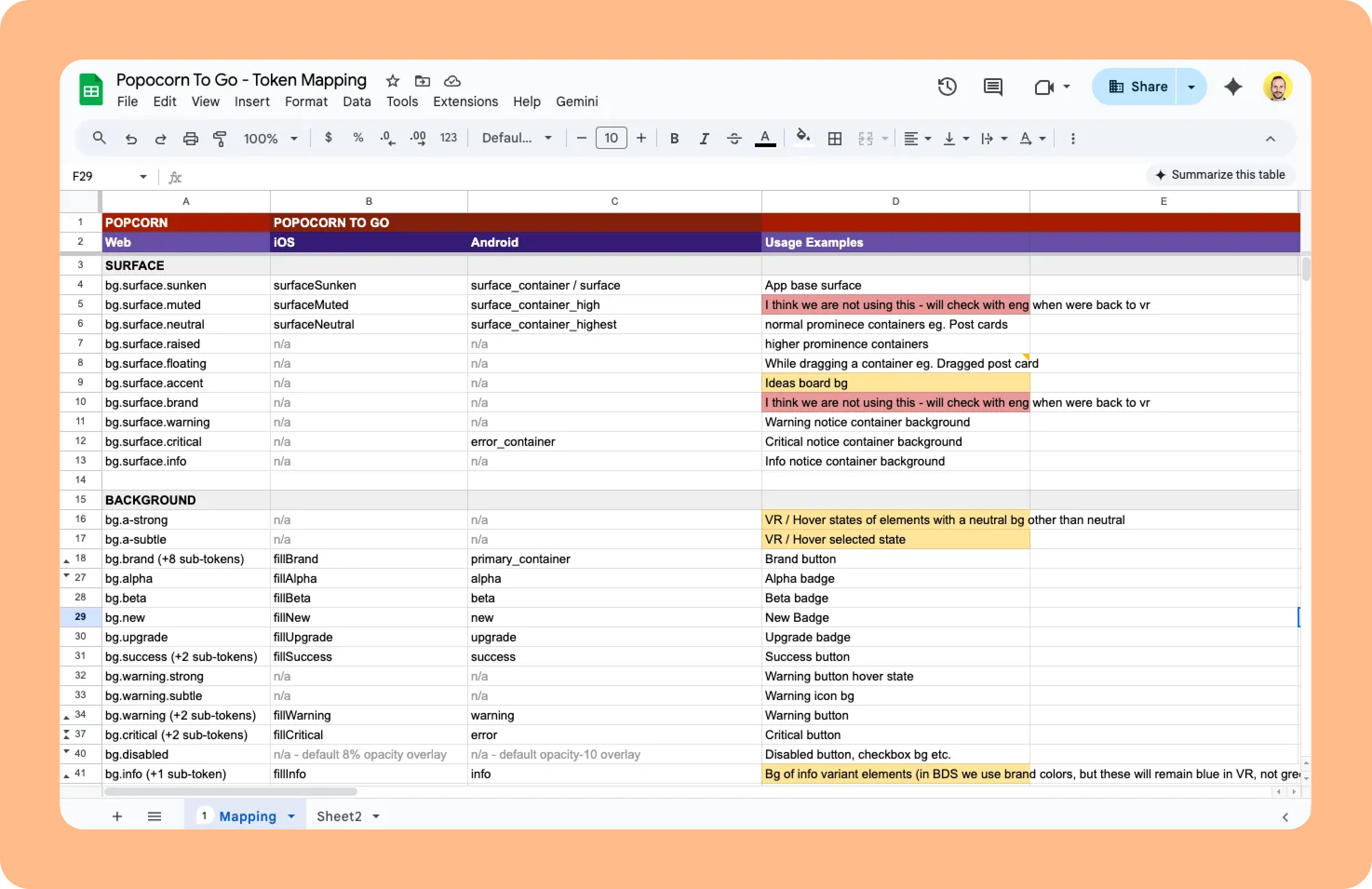
Here's how we structured it in Figma:
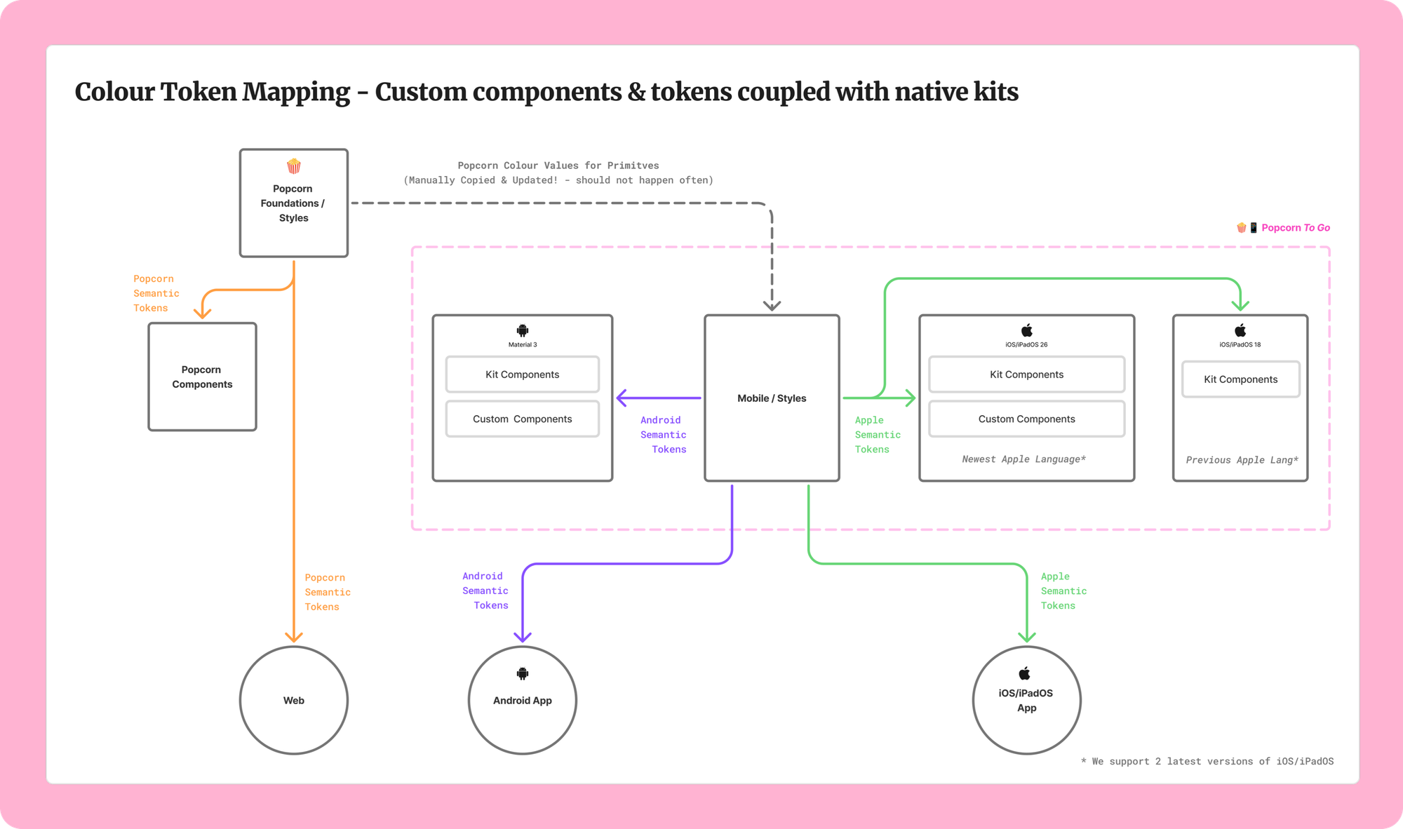
Token relationships between Figma files across the Web and Mobile design systems
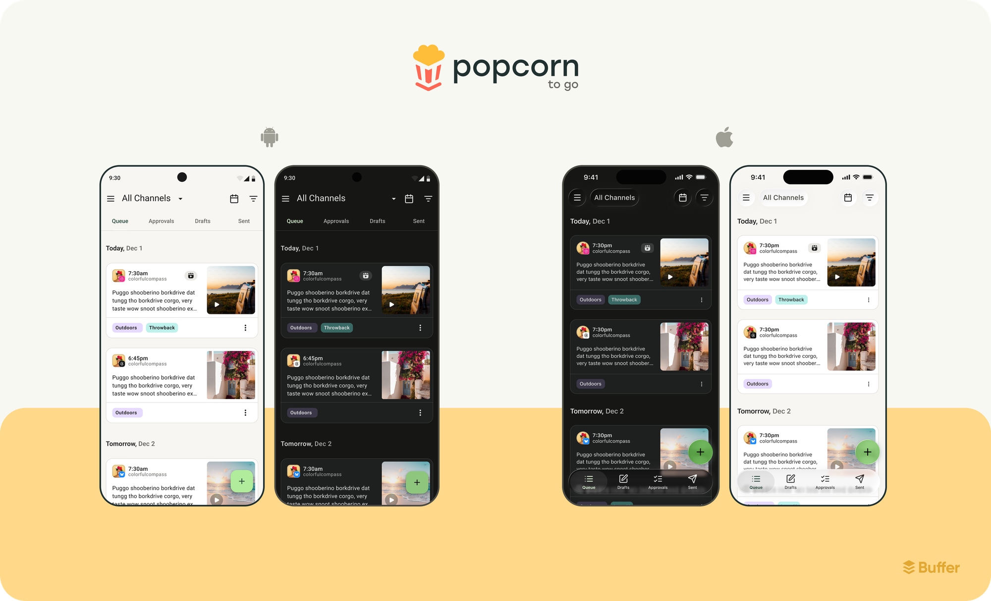
- Mobile/Styles: Our foundation layer with primitive colors and platform-specific tokens. We used Material 3 naming for Android and custom naming for Apple. The primitive colours mirror those in our web app.
- Mobile/Android M3: Components built with Google's Material 3 Expressive language, fully linked to our Android tokens.
- Mobile/iOS & iPadOS 26: Native iOS 26 components using Apple's Liquid Glass design language linked to our Apple tokens.
- Mobile/iOS & iPadOS 18: A lighter-touch kit for the previous iOS version (since we support one version back).
- Mobile/Custom Components: Buffer-specific components that don't exist natively on either platform.
Design operations challenges we solved
Getting this system working smoothly meant tackling some gnarly design operations challenges:
- Figma linking: The biggest challenge we faced was linking primitives. In an ideal world, the primitive colors would come directly from our main design system, Popcorn, and Popcorn To Go would simply map these to Android or Apple-specific tokens. However, Figma's current feature set doesn't support this. We had to create a new primitives file for Popcorn To Go that manually mirrors the web's primitives.
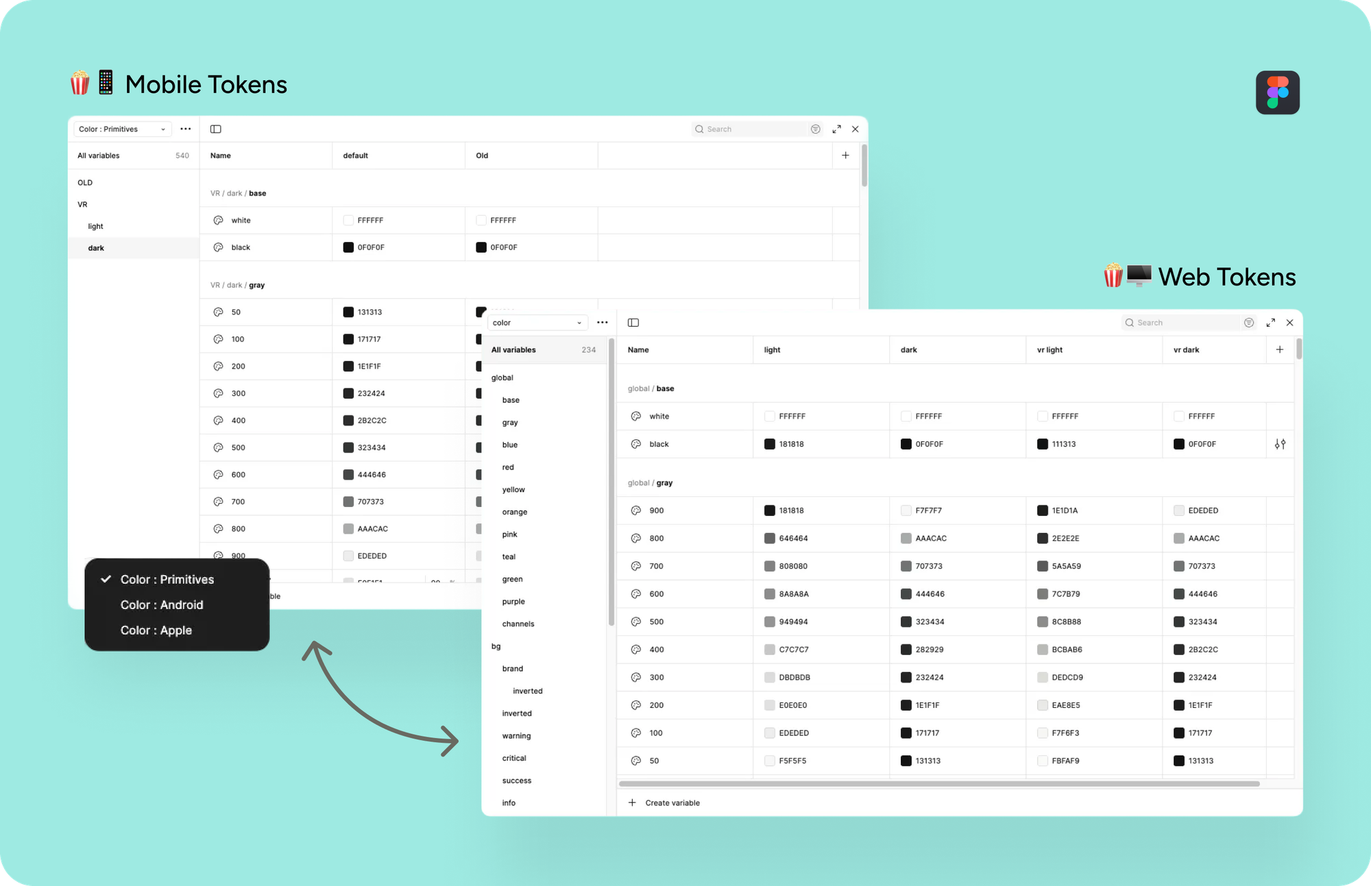
- Token naming: Creating a naming system across web, iOS, and Android that is somewhat streamlined whilst respecting platform-specific conventions.
- Kit styling: Applying our tokens to platform-specific kits while maintaining flexibility for future updates. This required using several handy plugins like Figma Tokens and Variables Importer.
Honestly, it's not the perfect, smoothly connected & humming system every designer dreams of when setting up a design system.
Apple's component kits, in particular, are complex and sometimes inconsistent, whilst Android's token naming is very specific and tricky in its own way. But we landed on pragmatic solutions that work for everyday use and achieve the goals we set out to achieve.
Strategic timing: The iOS 26 test
We launched Popcorn To Go with intentional timing. iOS 26 was on the horizon, bringing Apple's new Liquid Glass design language: a fresh, modern aesthetic with frosted glass effects, refined animations, and elevated visual polish.
By building Popcorn To Go before iOS 26 launched, we positioned ourselves to:
- Be ready from day one when iOS 26 dropped
- Leverage the latest platform capabilities immediately
- Ship our app's visual refresh alongside Apple's new design language for maximum impact.
And it worked. When iOS 26 launched in September, we were ready. Our updated iOS app shipped with both Liquid Glass and Buffer's refreshed brand aesthetic, delivering a polished, modern experience that feels native to the platform while staying distinctly Buffer.
What's next
Popcorn To Go is live and working, but we're just getting started. Here's what's on the roadmap:
Short-term:
- Applying to Android and refining based on feedback on both platforms.
- Expanding token coverage beyond colors (spacing scales, border radii, typography scales).
- Improving discoverability with better documentation.
Medium-term:
- Building out our custom component library with Buffer-specific patterns.
- Creating comprehensive usage guidelines for the system.
- Evolving with platform updates as iOS and Android continue to iterate.
Long-term:
- Keeping pace with platform evolution (iOS 27 and beyond, Material Design updates, etc.).
- Exploring opportunities to bring learnings back to our web design system, Popcorn.
Why it matters
For our designers and engineers, Popcorn To Go means smoother collaboration, faster prototyping, and less time spent on repetitive work. Instead of getting stuck on which colour to use where, teams can focus on solving more complex problems and crafting better experiences.
For Buffer users, it means more polished, consistent, and accessible apps. When design systems work well, users might not consciously notice — but they feel it. Interactions are smoother, the UI is more predictable, and everything just works better.
Raising the bar
Building Popcorn To Go wasn't just about solving today's problems but about setting ourselves up for the future.
Mobile platforms are constantly evolving. Design trends shift. User expectations rise. By investing in a solid foundation now, we're making it easier to keep pace, ship faster, and maintain quality as we grow.
This project was a true team effort: designers, iOS engineers, Android engineers, and product leaders all collaborating to make it happen. It's the kind of work that doesn't always get the spotlight, but it's what enables everything else we build.
We're proud of what we've created, and we're excited to keep building on it. If you want to see Popcorn To Go in action, download our iOS app and check out the new Liquid Glass experience.
Not on an Apple device? Keep an eye out, Popcorn To Go is coming to Android soon!
Here's to smoother collaboration, better apps, and a little more consistency in the chaos. 🍿
Try Buffer for free
190,000+ creators, small businesses, and marketers use Buffer to grow their audiences every month.