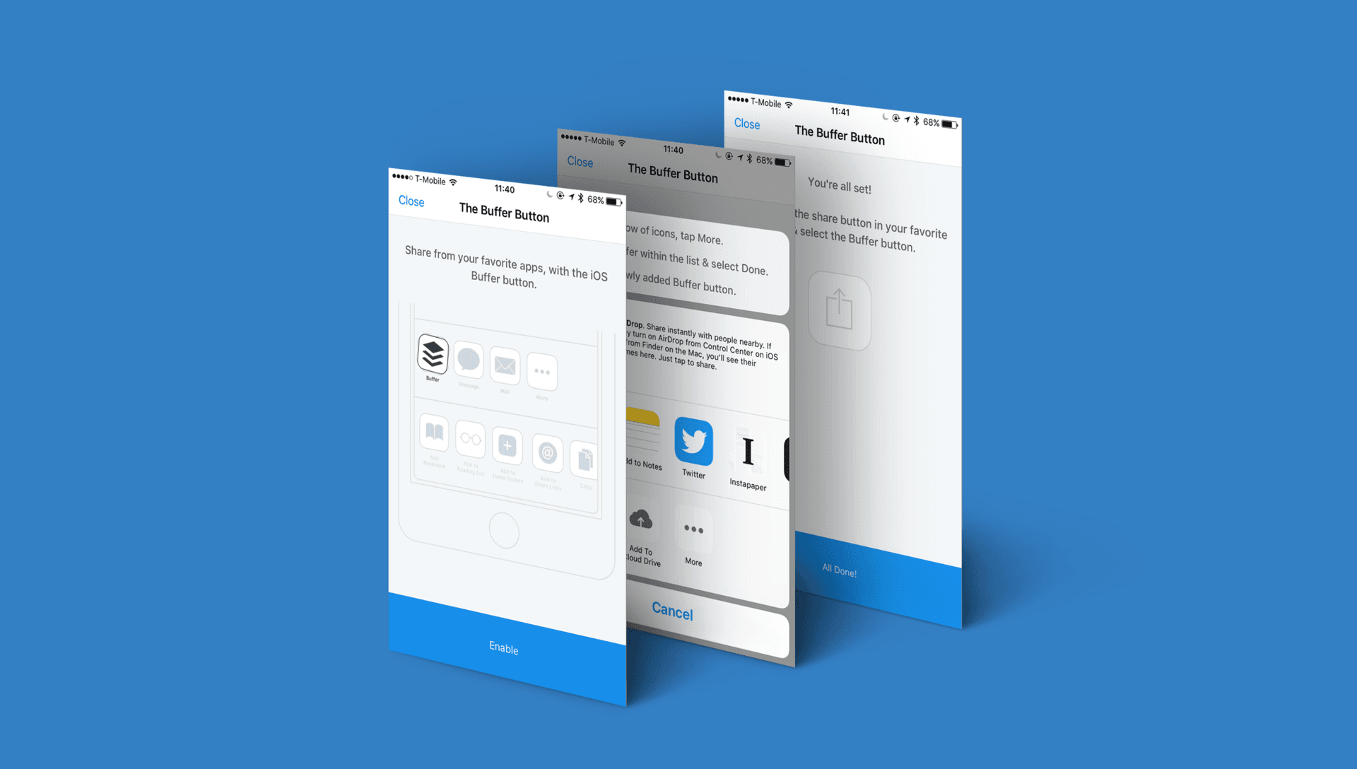
Since iOS 8, we’ve been able to ship our Composer as an extension which allows users to share from their favorite apps that make use of UIActivityViewController. We were super excited to be able to ship the share extension to replace the old Bookmarklet code we had in prior versions of the app for a similar effect.
Installing extensions on an iOS device isn’t so easy for the end user. We’ve been through a couple of iterations of guides to walk users through the process of adding the Buffer button to their list of extensions within UIActivityViewController.
Our previous guide took the approach of informing the user how to install the extension across multiple pages within a UIScrollView. We listed each and every step while an animation showed what you needed to do along the way. While this worked, it required the user to read all of the copy and felt quite long winded.
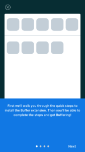
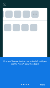
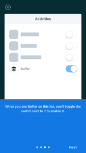
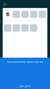
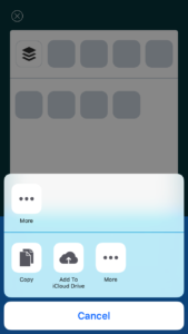
Recently, I tweeted out asking if people could share their favorite installation guides for Share Extensions and checked out the various suggestions.
I’m looking for any iOS apps out there that have awesome guides walking users through adding App Extensions. Any recommendations? ?
— Andrew Yates (@ay8s) April 4, 2017
One of the suggestions was Highly. Highly is a service that allows you to save and share highlights from almost everywhere. The iOS app provides a highlighter extension to share content you find within other iOS apps over to your Highly account for later.
The guide within Highly starts by showing you what you’re installing and the benefits of doing so. Then, when you tap “Add the Highly Button” you’re presented with the UIActivityViewController and an animated copy in the background explaining how to add the Highly Button.
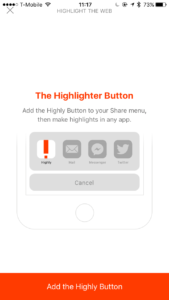
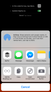
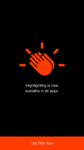
We loved the simplicity of Highly’s installation guide so we set to work on building our own much simpler version. The initial versions included the copy in the background of the UIActivityViewController, like Highly, along with a similar bounce animation to draw the users eyes to it. Unfortunately, the background of the Action Sheet dimmed the content a little and I felt we could perhaps do something to make the instructions stand out a little more.
I’m a big fan of Tweetbot and noticed that they show a view with a link above their UIActivityViewController when you trigger a share. Other apps, like Tumblr and Twitteriffic, also do something similar.
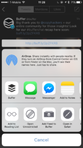
I then started looking into using this same behavior to display the instructions right above the UIActivityViewController, unobstructed by the Action Sheets background. We create a UIView with a UIVisualEffectView, which we then position based on the UIActivityViewController’s view frame.
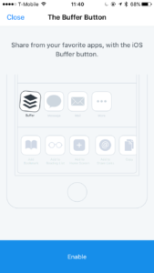
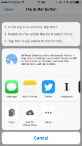
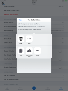
On iPad, we default back to showing the instructions within the parent view with the UIActivityViewController being presented in a popover.
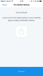
Once they’re done, the guide asks the user to open the extension. This allows us to confirm that it actually was installed since there isn’t a way to currently detect that via Apple’s APIs. This allows us to show a view to try installing it again, or show a confirmation message that reinforces what they can use the extension for.
Originally I was planning to A/B test how this approach would work compared to our existing guide. However, I felt that there was so many improvements with this new flow so we ended up pushing it live on our next update.
Since then we’ve seen a huge uptick in how many extension opens we see, this is likely due to the confirmation step requiring the extension to be opened. We’ve also seen a steady improvement in the percentage of active users using the extension which hovers around 19%.
We’ll be continuing to make small tweaks and improvements to the new guide and hope iOS 11 brings in some new features we can make use of to make the flow even easier.
Try Buffer for free
190,000+ creators, small businesses, and marketers use Buffer to grow their audiences every month.
