Over at Android on Buffer, we recently hit 1 Million downloads – so we’d like to take this opportunity to say a big thank you to all of our users for making this happen! This also came with great timing, as we’ve just launched a brand new version of our Android app (something we’ve been calling v6 internally for a short while) ? We made a bunch of changes to the app (both visually and behind the scenes) with the aim to make it easier to use, easier to maintain and also more stable for our users.
Because of these changes, we thought we’d take a little time to show what’s new and some of the changes/improvements we’ve made technically.
Motivation
But first, why did we need a change? Well, if you’ve read a previous post of ours, you may have noticed that the project reached a state where it had become difficult for us to extend on, maintain and test. Now the Composer rebuild had been out in the wild for a bit, we felt it was about time to tackle the next part of our codebase that needed some love ❤️
This began with the main screen of our app, the point at where users are able to view and manage their posts. We decided that this part of our app needed rebuilding as the state at which it had reached was quite difficult for us to work with. Making changes to these screens was a big task, even for small tweaks and fixes it was hard for us to maintain the code due to the way the screens were built. And when changes were made, we often faced fears of bug regressions with the lack of tests that were in place.
Now with the rebuild in place, Clean Architecture coupled with SOLID principles is allowing us to move quicker with both changes and fixes to this rebuilt part of our app. We also introduced a large number of tests into this part of the application, with the aim to reduce future regressions and also boost our confidence in the implementations that we ship.
Remove dependancy on Third Party Libraries
In the previous version of our app we had quite a heavy reliance on several third-party libraries which were no longer maintained. The features that these libraries provided us with are now available as native implementations with the Android Support Library, so we’ve been able to remove these libraries from our app.
The removal of these brings us several benefits. To begin with we’ve managed to reduce the size of our APK from the removal of these libraries. It’s also made our application less-dependant on other parties, meaning that we have greater control over our project. And finally, because the Android Support Libraries are better supported the implementations within our app are both more stable and more maintainable – meaning things will work smoother for both you and us. ?
Improving the native experience and performance
Our content feeds are now making use of the RecyclerView component which means it’s easier for us to support native-like behaviour and animations. This gives a more natural and familiar feel to our application, as well as making it easier for us to maintain. Switching to modern solutions also allows us to make use of awesome tools such as DiffUtil to improve the performance of operations performed on our RecyclerView data. ??
Moving to Bottom Navigation
When Google announced the release of the Bottom Navigation View in the design support library, we knew it was time for us to switch and gain the benefits of simpler navigation throughout our app. Now, you can access the core areas of our application (Content, Analytics, Schedule and Settings) from the shiny new Bottom Navigation View at the bottom of the screen.
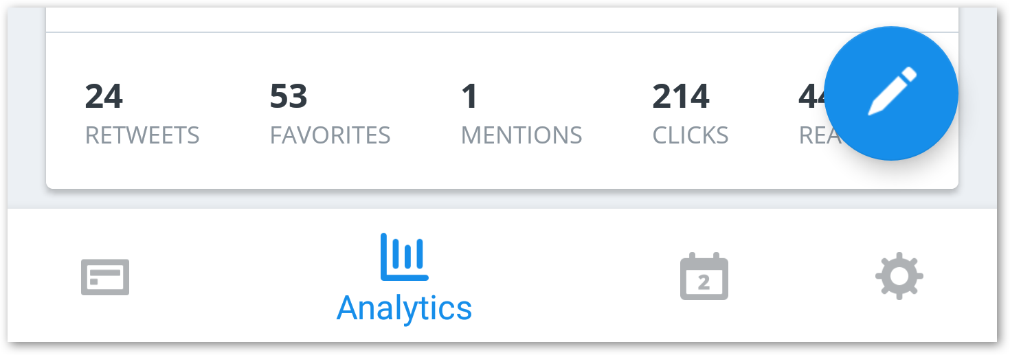
This view makes it super quick to hop between these different sections of the application without needing to open the navigation drawer or move your hand to the top of the screen to operate tabs frequently. You’ll now be able to get to where you want in fewer clicks and effort. ?
Psst: We also open-sourced a little library to make implementing Bottom Navigation into your own Android apps a little easier ? https://github.com/bufferapp/AdaptableBottomNavigation
Introducing Buffy
We’d like to introduce to a new friend that has joined us in the latest version of the app, say Hi to Buffy ?. Buffy will be there for you within the app to help you out at any time that it’s needed!

Faster Profile switching with a new Navigation Drawer
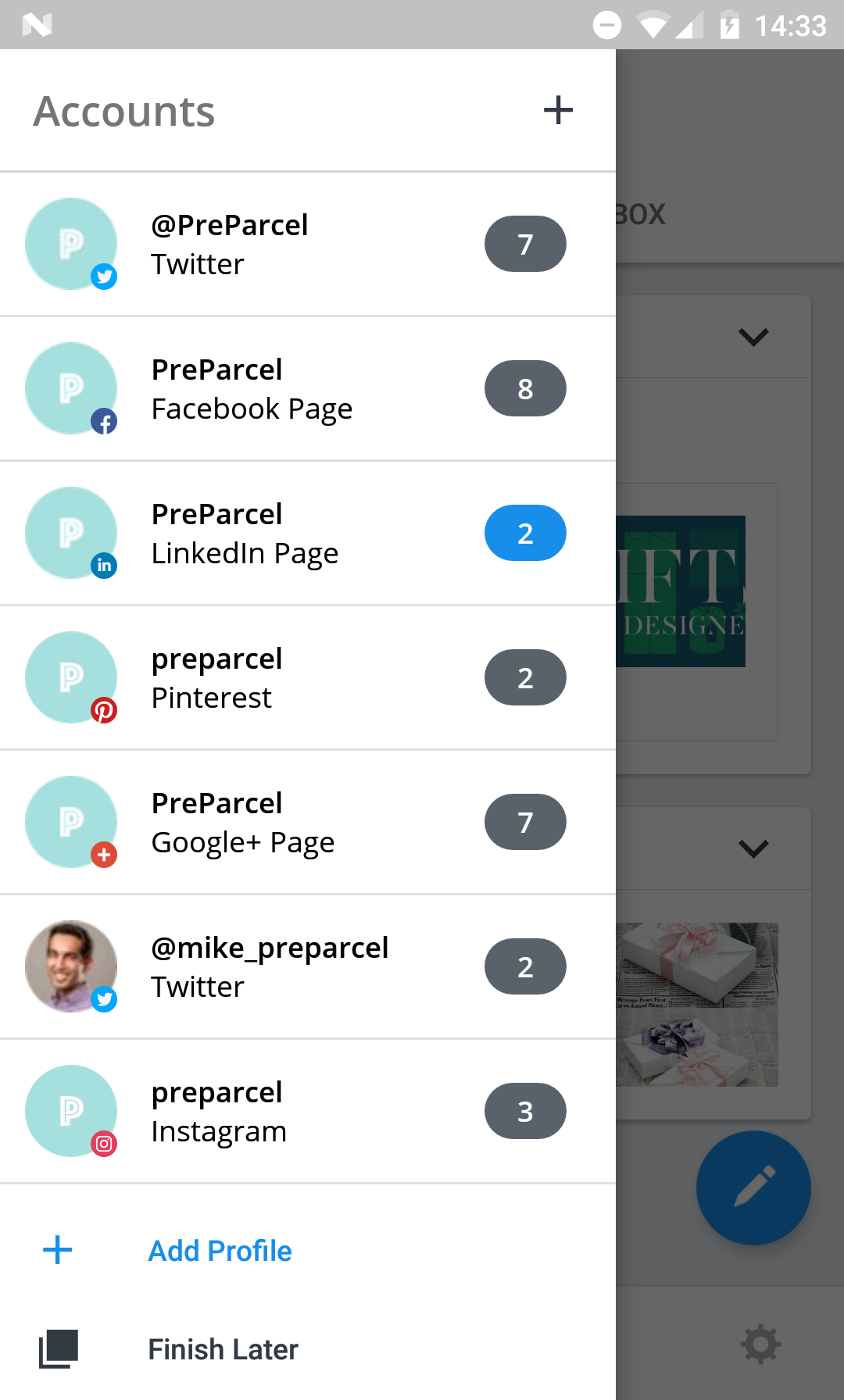
We wanted to make it quicker for our users to switch between profiles that are connected to their account, so we decided to shift the profile selection to be immediately visible when opening the navigation drawer.
Upgrade your Account Plan through Google Play
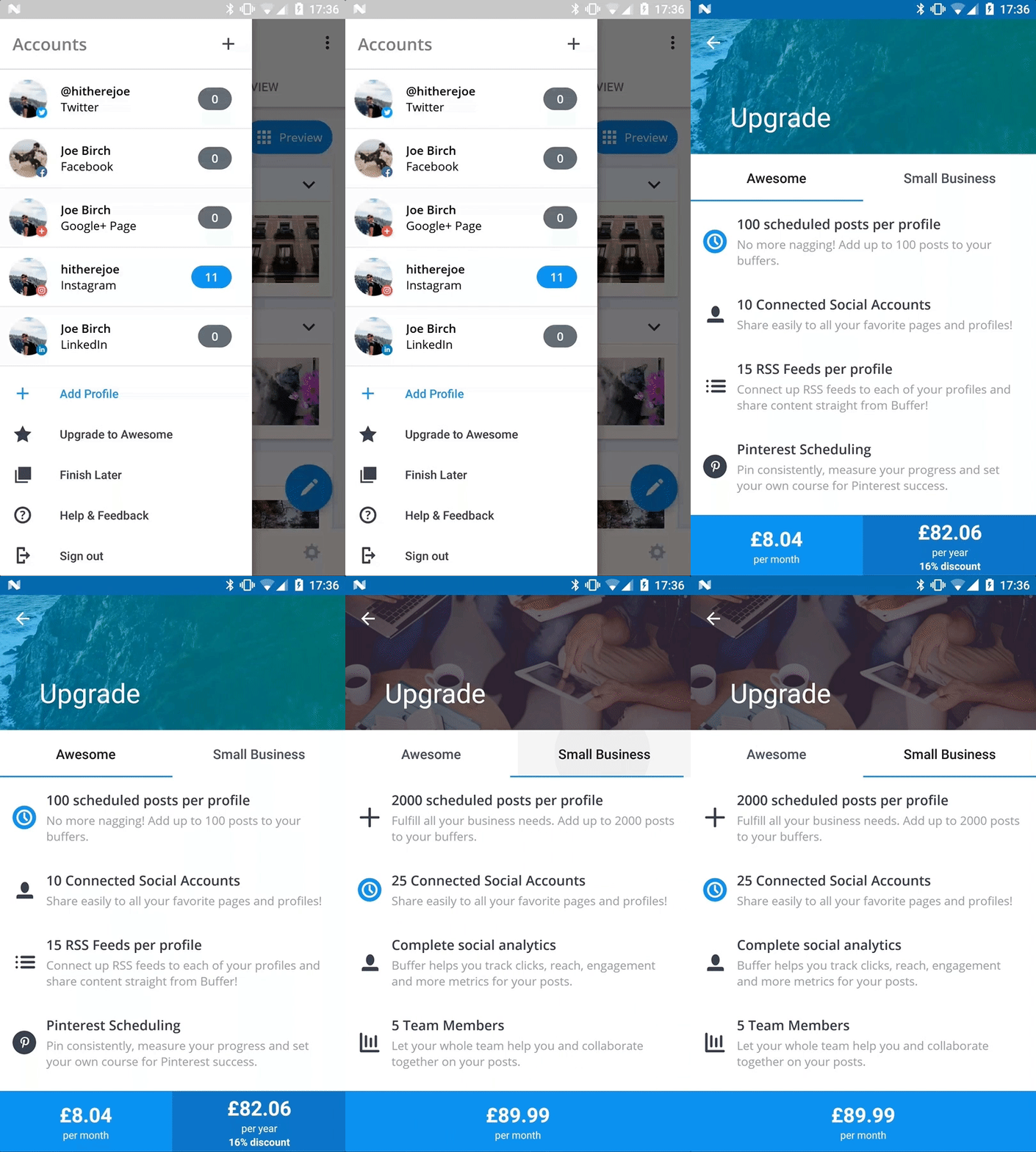
We’ve now made it possible for you to upgrade your Buffer account from within the app using Google In-App Billing. This means you can upgrade your account and pay directly with your Google account, making the upgrade process much more frictionless. ?
Preview your Instagram profile with Grid Preview
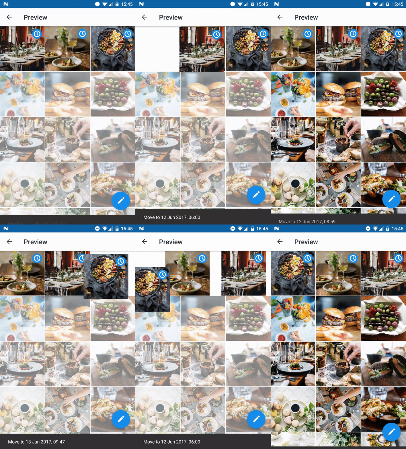
We’ve added a cool new feature for Buffer for Business users which allows you to preview your Instagram Grid before sending your posts out to your profile! (Remember those native-like animations that I spoke of ?).
With Grid Preview you can drag-and-drop Instagram reminders to re-order them before posting, allowing you to get your Instagram profile looking spot-on before they go out. ?
Compose updates quicker with the Composer App Shortcut
In Android 7.0, Google added the ability for applications to add shortcuts for quicker access to functionalities within their app. We’ve decided to make use of this and make it easy for you to quickly jump into the composer to compose an update for your queue. ?
To access the shortcut all you need to do is perform a long press on the application and the “Compose” shortcut will appear. From here you can either click it to open the composer (as shown below) or drag it onto your home screen so you can access it even quicker!
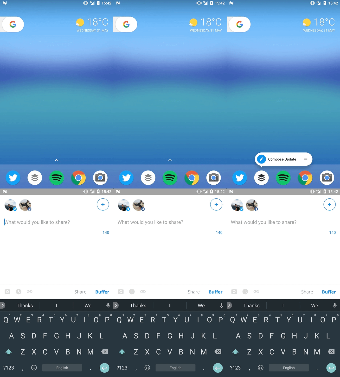
Is there anything else you’d find useful as a shortcut? We’d love to hear from you if so. Feel free to leave a comment or send me a tweet. ?
Hashtag Suggestions
Within the Composer, we now provide you with hashtag suggestions when you begin typing a hashtag. This means you can compose your updates both more quickly and easily. ?

Try out Version 6 for yourself!
Thanks so much for reading! Now we’ve told you all about version 6, why not go check it out for yourself? We’d love to hear what you think.?

Try Buffer for free
190,000+ creators, small businesses, and marketers use Buffer to grow their audiences every month.


