Since visual content arrived on the scene back in 2012, it has showed no signs of stopping.
Best practices on social media sites like Facebook and Twitter always reference images and videos as key elements for driving engagement. Graphics and visuals on blog posts are one of the best ways to get the most value and deliver the best experience for your content.
Visuals are a big deal. If you need any more convincing, or if you’d simply like to hear the argument in a beautiful visual form, I rounded up nine of the best-looking and most informative infographics focusing on visual content marketing. Take a look at the list below, and feel free to share a snippet of your favorite.
1. Why visual content is better than text
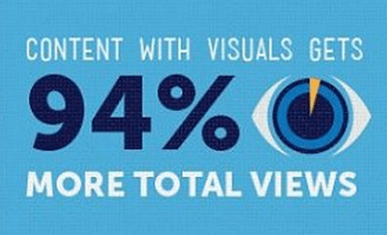
We’ve sung the praises of visual content on the Buffer blog before, and we’re trying to practice what we preach: Each of our posts contains at least one original, creative image that can be easily shared along with the article. Ragan’s infographic does an incredible job of explaining why visual content is as popular as it is, and provides a series of useful visual tools that you can act on today.
Share a preview of this infographic:
The full infographic:

2. Why our brains love visual content
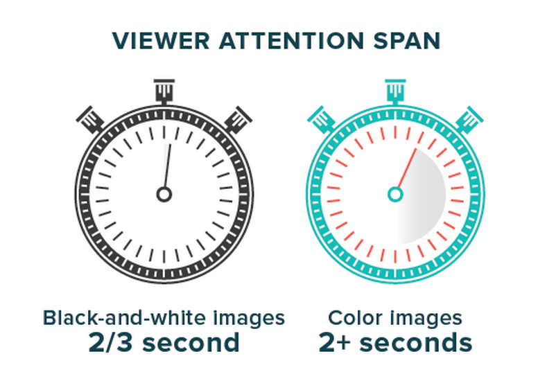
Column Five specializes in creating visual content for companies, so they’ve done plenty of research into why visuals make such an impact. Their infographic covers the neuroscience of visuals: not only why visual content works, but also how.
Share a preview of this infographic
The full infographic:

3. What is visual communication?
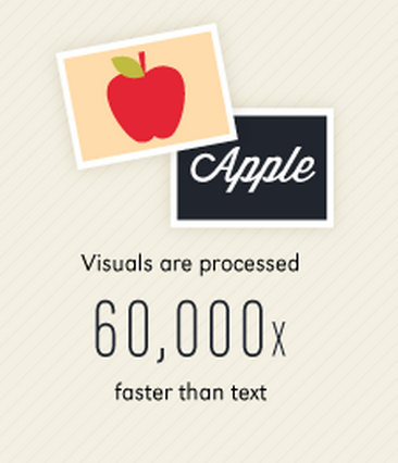
When did our love affair with visuals begin? Wyzowl tackles this question and more in its infographic on visual communication. The graphic shows an explanation of visual content, its history, and its acceptance into online marketing and modern culture.
Share a preview of this infographic:
The full infographic:

4. The visual web: A love story
Infographic by Bandwagon Digital Media
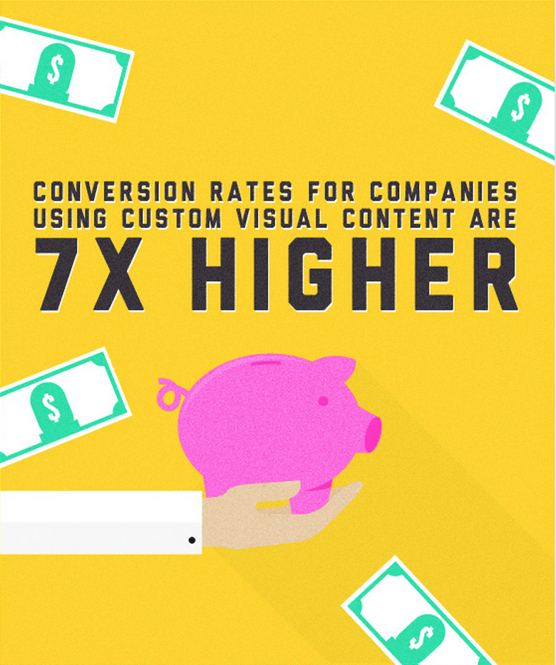
This graphic by Bandwagon Digital Media is jam-packed with stats and numbers on why visual content deserves the full focus of online marketers. From the seconds it takes make an impression to the clicks and views of visual content, the graphic covers it all—with a really fun visual style to boot.
Share a preview of this infographic:
The full infographic:

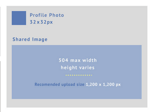
5. The ultimate social media cheat sheet for image sizes
If you’re going to do visuals on social media, it can help to know the specific sizes and shapes for cover photos, featured images, inline images, and more. Omnicore’s infographic on social media sizes covers just about every network you’d need: Facebook, Twitter, LinkedIn, Google+, Pinterest, Instagram, and YouTube. (The infographic is regularly refreshed, too, whenever a social network changes an image size.)
Share a preview of this infographic:
The full infographic:

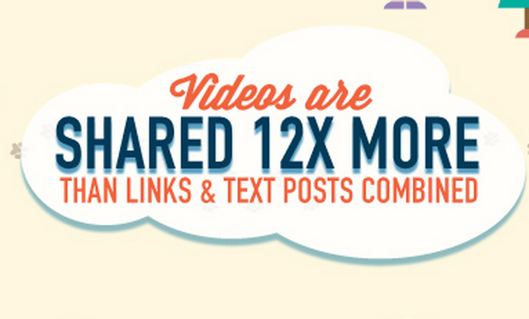
6. Visual storytelling: One frame at a time
This infographic by M Booth shows how storytelling and visual content—via photos and video—are some of the best options for brands to get their message out online. The graphic, originally made in 2012, covers the rise of visual content on social media, and the message behind the stats is as relevant today as when it was first created.
Share a preview of this infographic:
The full infographic:

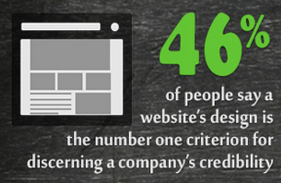
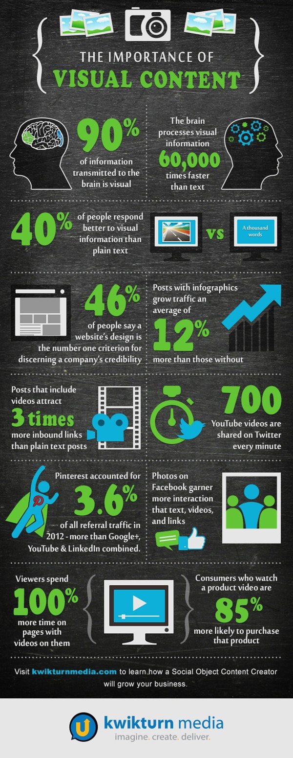
7. The importance of visual content
Infographic by kwikturn media
This graphic covers the many amazing stats behind the rise of visual content. There are some classic numbers here (e.g., how fast the brain processes visuals) as well as some lesser-known ones (e.g., video stats and web design).
Share a preview of this infographic
The full infographic:
8. 13 reasons why your brain craves infographics
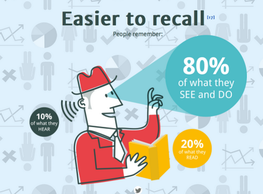
The full-page view of this infographic over on the NeoMam website is a pure joy—graphic elements move and animate as you scroll. The content of the infographic is on point, too. NeoMam shares a number of unique visual content insights, including notes on persuasion, adoption, and engagement.
Share a preview of this infographic
The full infographic:

9. The infographic of infographics
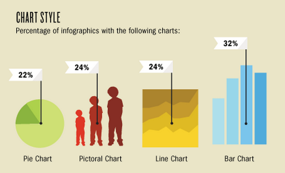
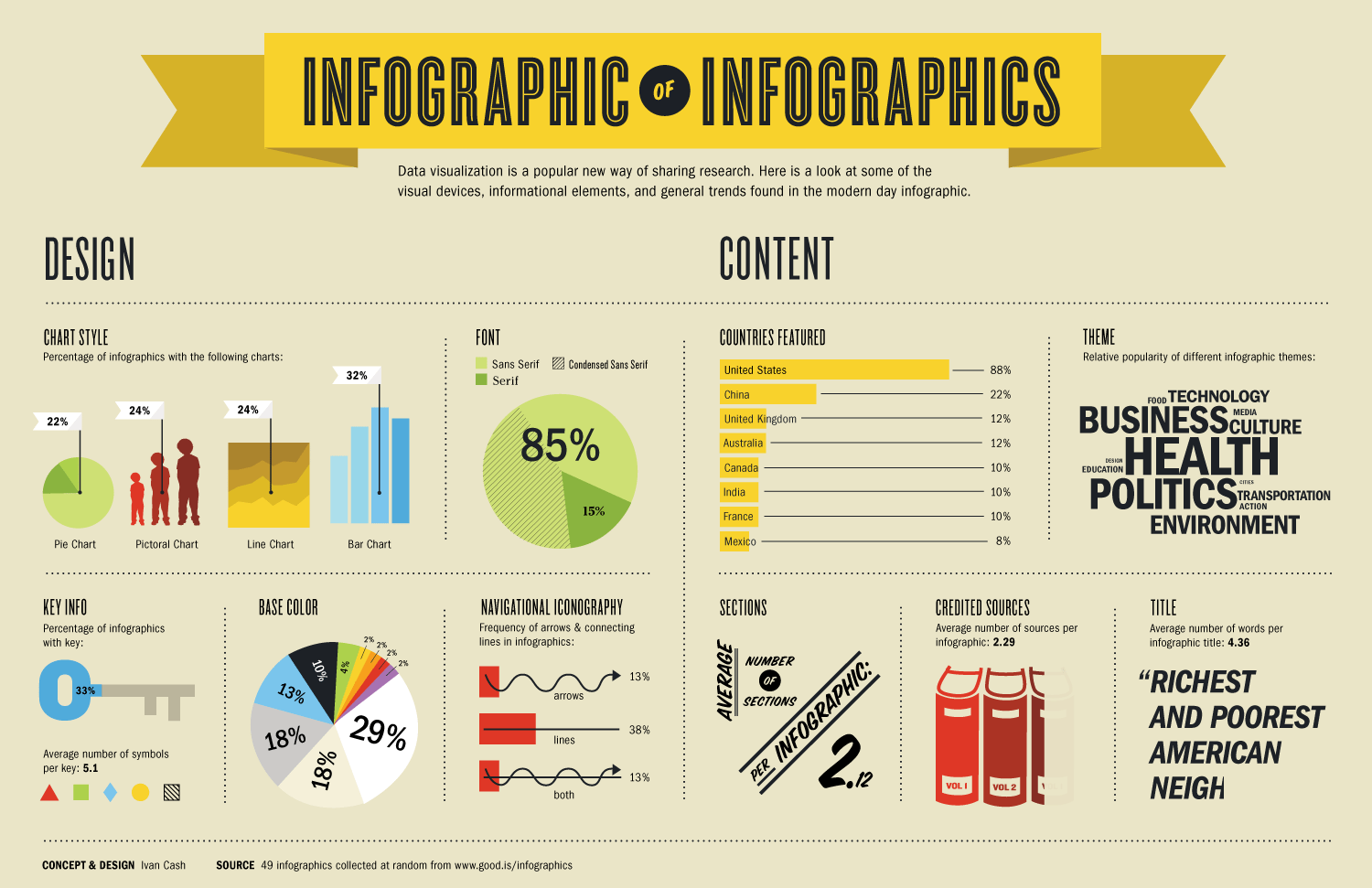
We’re getting into very meta territory here. What’s one of the best types of visual content you can create? An infographic (see No. 8 above). And what makes for an incredible infographic? Well, you can check out this infographic for details. Wired’s infographic covers a wide range of possible routes you can take when you create an infographic, from chart type to colors and everything in between.
Share a preview of this infographic
The full infographic:
(click to enlarge)
Over to you: Which of these graphics do you like best?
I’ve tried to make each of these graphics as easy to share as possible—after all, sharing images on social media is a great way to help your content spread.
Which one of these infographics resonated with you? Did you learn anything new from this data?
I’d love to hear your thoughts in the comments, and I’ll keep an eye out on social media for the infographics you liked best!
Featured image source: Scott Beale
Try Buffer for free
190,000+ creators, small businesses, and marketers use Buffer to grow their audiences every month.


