How do we know what features to work on next for Buffer?
A few months ago, we had the opportunity to test out a method of investigating which types of social accounts Buffer users would be most interested in using next.
Here’s the tool we used to find out which type of account was most-wanted, and how we followed up with everyone who sent us a request.
What we did
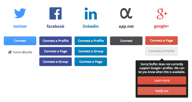
Here’s our current Connect page:

The Connect page didn’t always look like this, however. Just a few months ago several of these options—like Facebook Groups and LinkedIn Pages—were not available to users.
Rather than hiding the unsupported options, we decided to display a disabled button that, when hovered, would reveal two new options:
1. Learn More – A quick link to an entry on our FAQ page explaining why that particular account type was not available
2. Notify Me – Clicking this button logged the user’s email address in our database as “interested in X account”
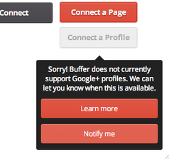
Here’s an example of how this looks for Google+ Profiles (which, unfortunately, are still unsupported in third party apps):

What happened
This tooltip worked wonders on our end in two dimensions:
We proactively answered questions that users had by linking directly to our FAQ page, where we provided more details about why we didn’t offer support for that particular account type.
The ‘Notify Me’ button allowed us to log the email address of every interested user so that when we were finally able to build out these integrations, we’d have an ultra-targeted email list to use.
Not long ago we rolled out support for Facebook Groups for Buffer. Thanks to our handy little ‘Notify Me’ button, we had aggregated a list of 1,650 email addresses of users interested in using Groups. We emailed these people and saw the following results:
• 1,650 email sent
• Open Rate: 70%
• Clickthrough Rate: 18.7%
Not too bad.
Making this work for your startup
If you’re on the fence about what feature to build next for your product, this method is a super lean way of tracking interest so that you can get a more accurate gauge of what is important to your users.
I wouldn’t go overboard with this—after all, having lots of these notifications scattered around your product might make it look incomplete. But for smaller product improvements or hypothesis testing, this is a really easy way to make informed decisions.
Have you experimented with ways to test the demand for new features? I’m always interested in learning more and improve our processes. Feel free to share in the comments!
P.S. Want to be part of building awesome new stuff at Buffer? We’re looking for a Product Designer right now!
This post originally appeared on my personal website, brianlovin.com. I write often about design, startups, and technology, and I’d love to connect with you!
Try Buffer for free
200,000+ creators, small businesses, and marketers use Buffer to grow their audiences every month.


