The composer is the heart of our app — it enables our users to craft social media updates and schedule them to post to the social networks at custom times. It’s been part of the Buffer Android app since the very beginning. And it had reached the point where we needed to rebuild what we had in place.
So grab a cup of coffee (or your beverage of choice) and let us take you on a journey through our learnings of going from legacy code to clean architecture. ☕️
A brief history of Buffer on Android
Back in 2012, our CEO Joel made the first commit to the Android project repository. Since then, it’s been downloaded more than 500,000 times, and it has allowed our users to compose updates and manage their schedules on-the-go.

Since that first commit the app has seen many changes. The composer itself has also had several iterations through its time. It’s the heart of our app, so features have been added and redesigns have taken place.
However, it’s been a while since it’s been rebuilt — and in that time a lot of changes have been made to it.
Whether these changes have been feature or bug fixes, it’s gotten to the point where the composer has become flooded with many different responsibilities and incredibly difficult to maintain and extend. And to top things off, none of the code had any tests in place. If you’ve ever worked with legacy code before, I’m sure you’ll share that feeling of uncertainty with any changes you try to make.
So we set out to begin refactoring the Composer bit by bit. A few methods later and several cups of coffee followed by some head scratching, it became apparent that this wasn’t going to be a simple task.
With the composer features so tightly coupled with the activity and quick-fix patches scattered throughout the code, it was difficult to pull things apart while retaining the composer’s correct behavior. With planned extensions for the composer in the pipeline, we knew that after this refactor would still prove difficult to extend the functionality with the way the composer was built. After some thinking, a call, and even more thinking, we decided to get clean and rebuild.
But why clean?
There are plenty of articles that explain clean architecture, so I’m not going to go too into depth here. But the general idea is that our project is separated into layers in order to create a separation of concerns.
This separation introduces several advantages over other architectural approaches:
- Layers that have no interest in frameworks are completely independent of them
- Due the separation of concerns, our code becomes more testable as we can write more focused and fine-grained test classes
- Layers that have no interest in any UI have no knowledge of these view components
- Layers are completely independent of any Databases that may be used, meaning we have the ability to add / remote DB providers if required as the project is not tightly coupled to a specific provider
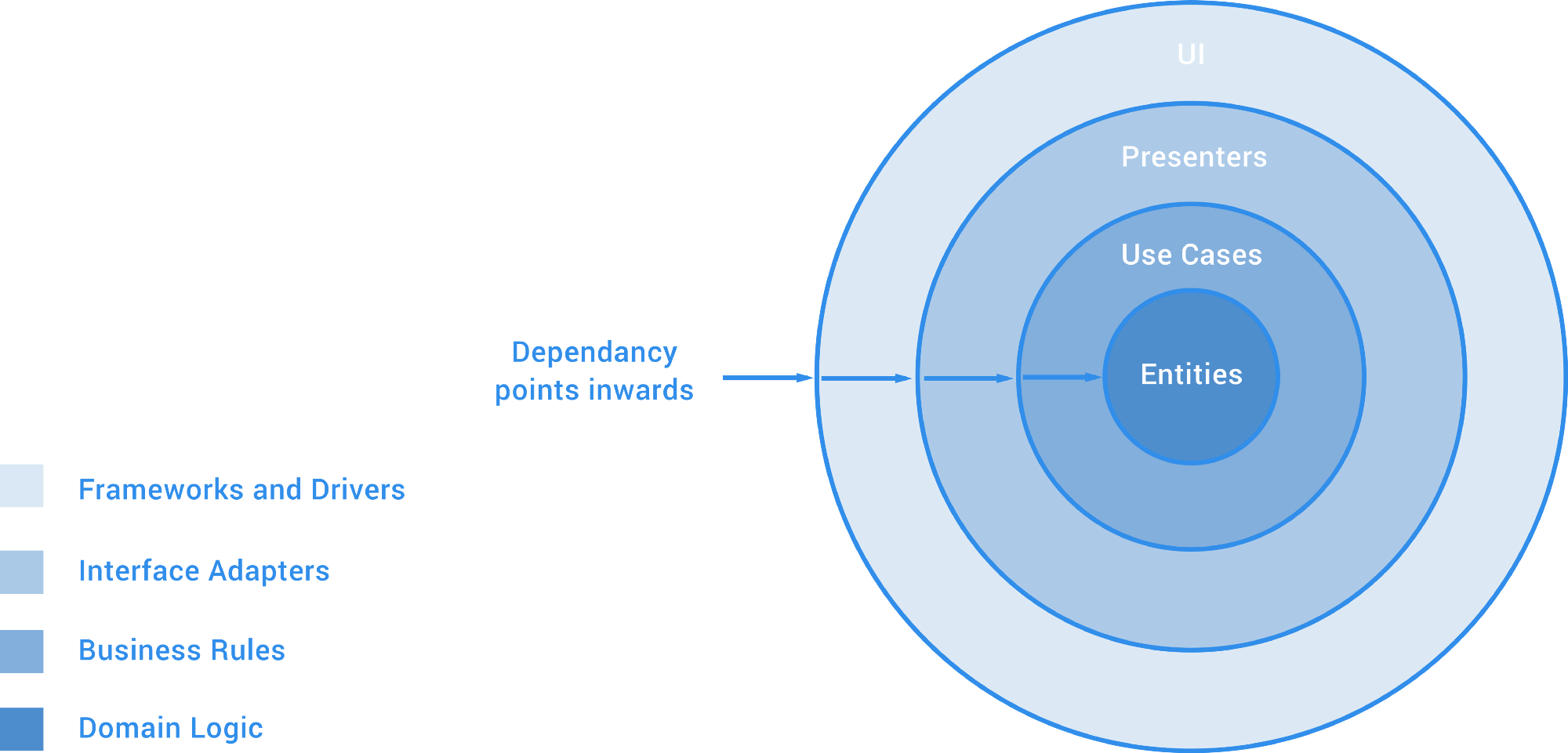
There are some great posts here, here and here on clean architecture that are definitely worth reading if you wish to know more on the topic ?
The Composer
Before we get started, I thought it might be useful to share a before and after graphic for the evolution of the composer visuals.
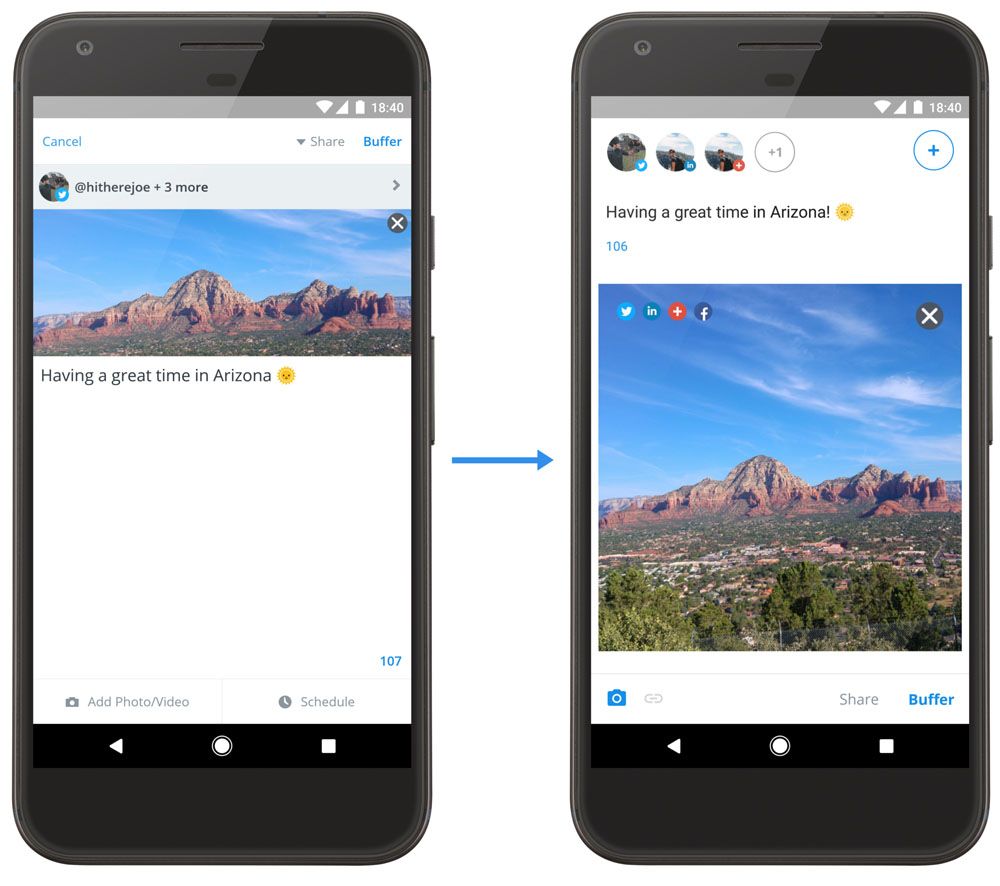
While this purely shows the changes to the UI, the big change was in the way that the composer is built. From the architecture to each component used, let’s take a look at how things have changed!
From these screenshots you can notice several changes:
- We moved the ‘Buffer’ button to the bottom bar, rather than the action bar. This makes it easier for the user to Buffer their posts when they’re ready.
- From this change we also removed the ‘Cancel’ button and moved the ‘Share’ option to the bottom bar also.
- For media, we decided to remove the label next to the icon and highlight the icon when media is attached. The same applies to the schedule, link attachment and retweet attachment icons when they are displayed.
- We removed the “Posting Update” overlay and moved the posting of updates to the background, making the UI less blocking for the user.
- We changed the way in which attached media is displayed. Rather than always displaying as a rectangle, we now show the attached media as a square with the center crop attribute. Clicking the media will show it at full size in a new window.
And as mentioned, the architecture has completely changed. Let’s take a look at how…
Architecture Evolution
The Android app had initially been built using a fairly standard approach to app development. Back in the day, Android projects tended to lack any sense of structure and this often led to single activities becoming overcrowded with many different responsibilities. These activities/fragments/views in question would then create a new AsyncTask instance and make a network request, receiving some response in a callback and handling it accordingly.
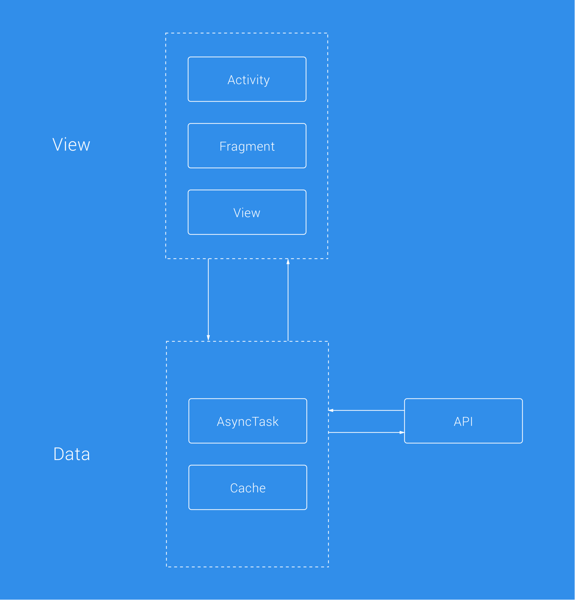
The initial Buffer for Android app had this structure in place and most of the codebase still does.
Is this approach wrong? Not in all cases. For extremely simple situations in could make sense — why overcomplicate things? But for applications with large codebases, it can grow difficult to both maintain and build on what currently exists.
With an Activity having so many responsibilities you run the risk of increasing the technical debt that already exists as well as losing time trying to find where things are broken in the first place. Yes, you can fix bugs without just patching things up and “leave the campsite tidier than you found it,” but this itself still isn’t going to help untangle the spaghetti code that we’re facing.
A few months ago, we began re-implementing the onboarding flow for our app. We needed to add the ability to “Sign-Up”, so re-implementing this also gave us a great chance to introduce some useful additions to the application (such as unit tests, UI tests, dependency injection and more). These changes were on the grasp of already being a lot, so on the fear of changing too much we decided to introduce Data Manager classes to help decouple the multiple responsibilities that the current sing-in activity had.
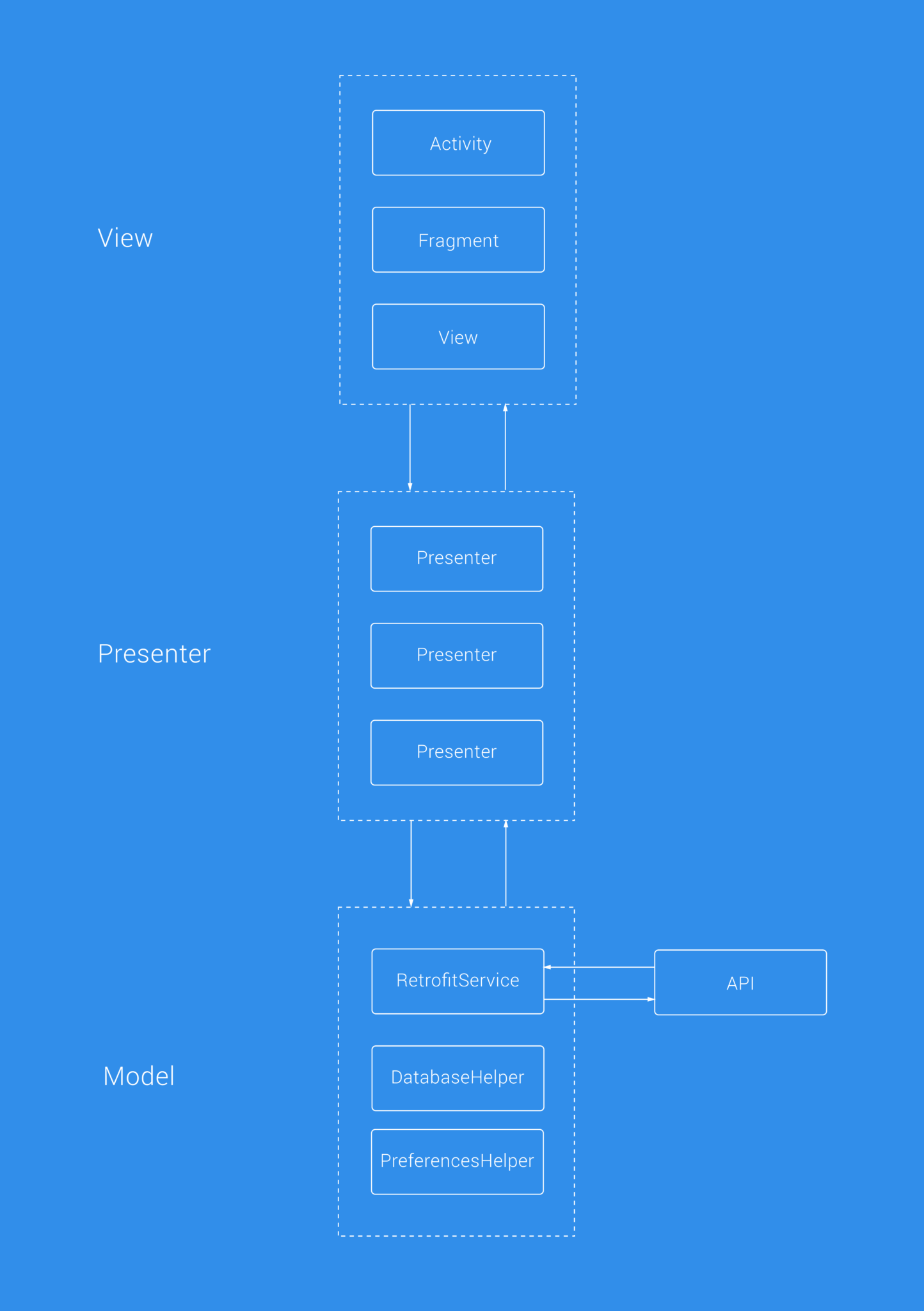
This felt like a great improvement on what we already had and felt like a step in the right direction, without changing too many variables at the same time — it also helped me personally to learn my way around the codebase and make myself more familiar with things while also contributing to the product. With this introduction of Presenter classes, we were able to move presentation logic away from the Activity, as make use of the unit testing benefits from this change.
While this was a great start to this change, it felt like it could be better. And when starting the work for the composer rebuild, we had some time to reflect on this approach. The Data Manager classes that were built were already becoming bloated. We tried splitting these out into multiple manager classes (such as UserDataManager, ComposerDataManager etc), but there were other implementation issues to discuss:
- In the near future, we plan to improve the Offline capabilities of the app, which will mean cache implementations. Where would this live? Would the DataManager be responsible for both remote and local data fetching? This would be giving the class multiple responsibilities, which is something we wanted to avoid.
- Our DataManager class was becoming bloated — we tried splitting this class up into individual Data Manager classes (such as UserDataManager, ComposerDataManager etc) but we still feared that the previous point would still hold true for each of these manager classes.
- Whilst our Presenter classes had done us some good with the separation of responsibilities, they were still tied to a specific implementation of our Data Layer, thus breaking the Dependency Inversion Principle. As it currently stood this implementation wasn’t very flexible, so if we wished to add different sources of data in the future it would prove to be a little tricky.
- Without the use of use case classes, our presenters were communicating directly with the data layer of our app. This made these classes feel like they were tightly connected to the data layer of our app without any abstraction in place to define a line between responsibilities.
With these points in place, we were able to come to the decision that change was in need sooner rather than later.
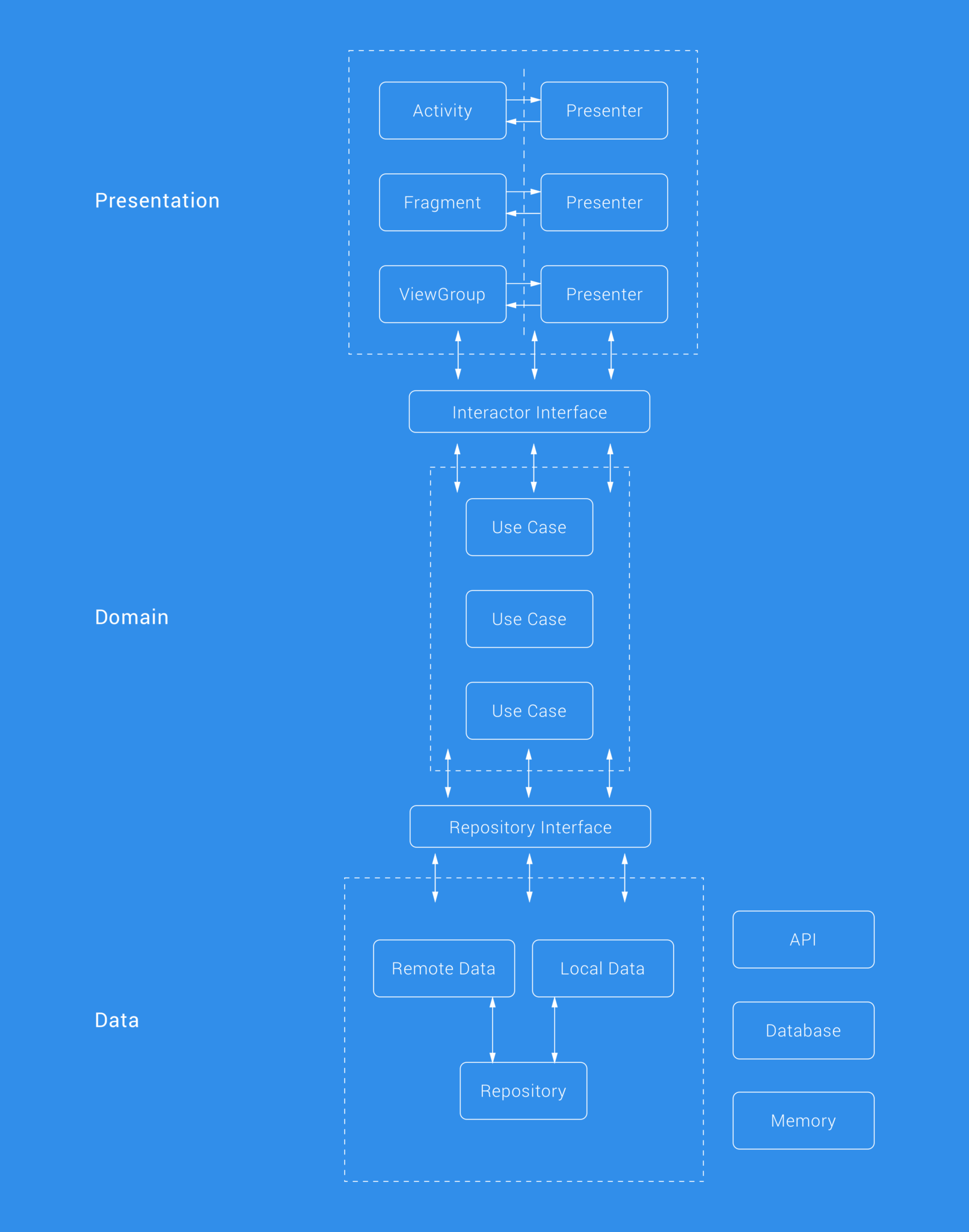
Since we do not have any business logic that is shared across our organization, we have three layers here (opposed to the general 4 in a clean approach, it would be simple for us to separate out into 4 however if we needed to). These layers are the:
- Presentation layer
- Domain layer
- Data layer
The use of a clean architecture allows us to layer our application in a way that enforces singular dependencies — in other words, each inner layer knows nothing about the layers outside of it. Communications are made betweens layers via the user of interfaces, hence keeping our code more flexible and abstract.
Understanding how the Composer is built
When first using and thinking about the composer, it’s difficult to think about just how much is going on under the hood. Our composer empowers our users with the ability to compose content for a number of different social networks and whilst we provide support for only 6 different social networks, this isn’t the only complexity that we have to think about — there’s a lot that goes on behind the scenes due to the many pieces of functionality that the composer itself houses:
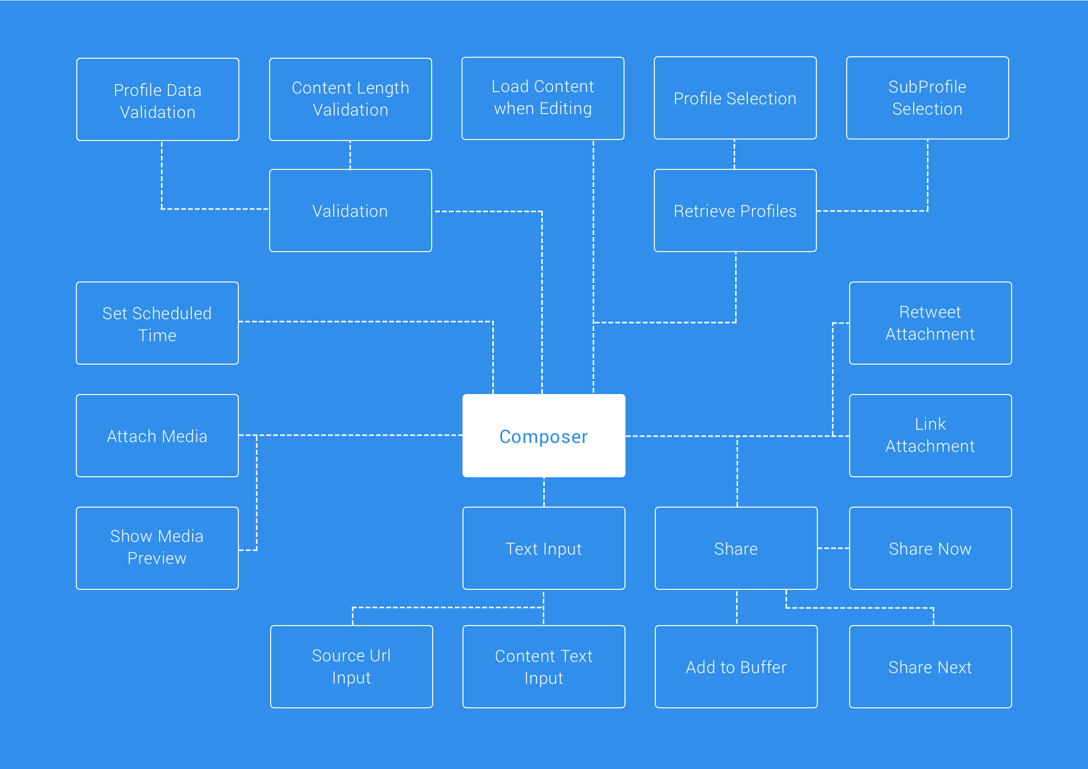
That’s a lot, right!
So alongside text entry we can attach media, add profiles to share to, set a scheduled time followed by validating the content length and attached data types against the selected social network types (and more!). The social network types introduce another layer of complexities alone, as different networks accept different types of data that can be shared:
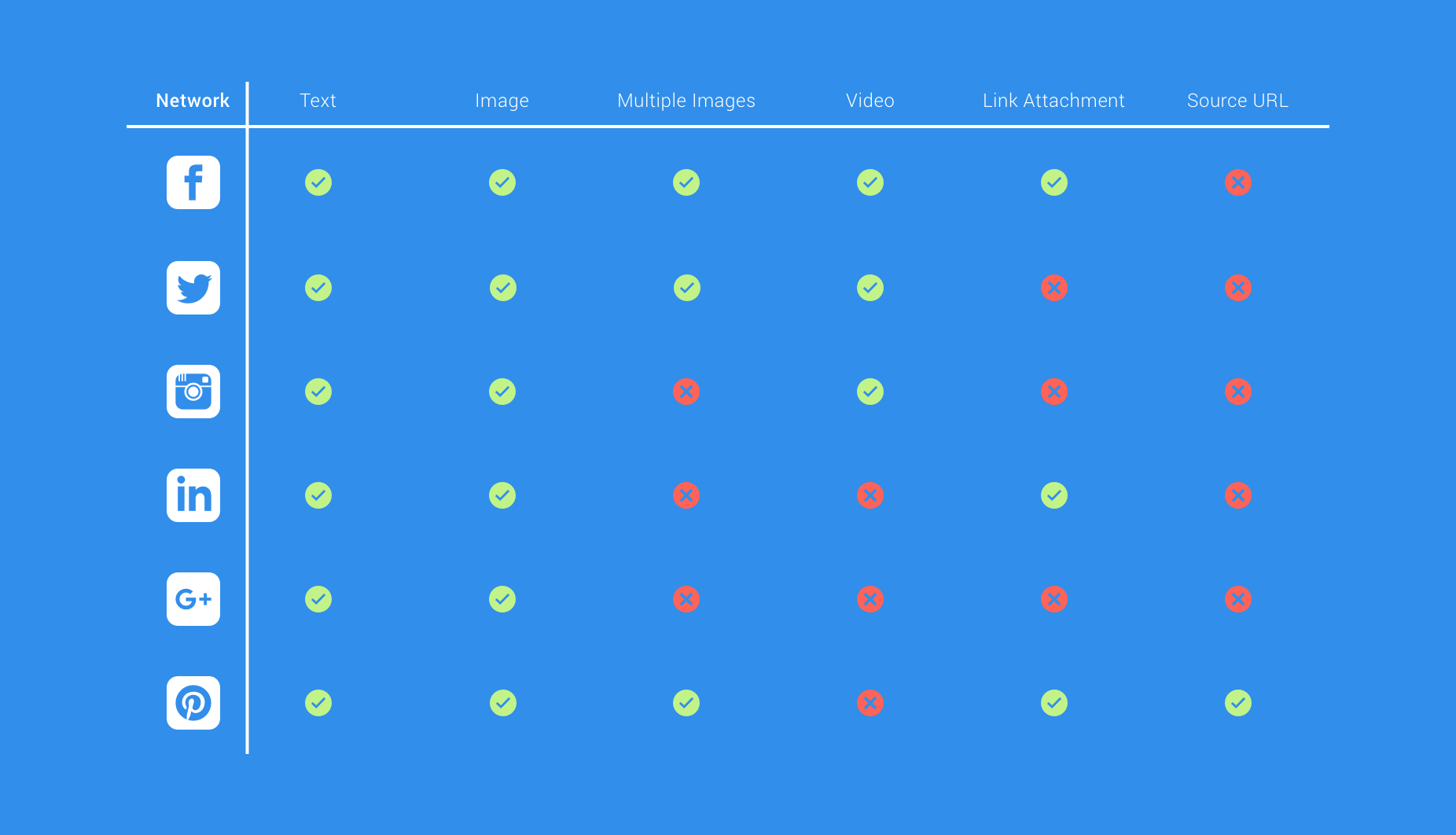
And this isn’t the only complexity around social networks, as some networks require a certain data type to allow posting. For example, Instagram requires at least an image OR a video and Pinterest requires an image, a source URL and text just to name a few…
While that’s a lot to think about, creating these diagrams helped to understand what the composer was doing and reinforced the decision for the rebuild even more. The thought of how simplified and organized it could become was exciting!
Components of the Composer
Before we take a deeper dive into the changes and improvements that have been made, let’s take a little overview of what things now look like in terms of the architecture. Below you can see a diagram of all the different components the composer is made up of.
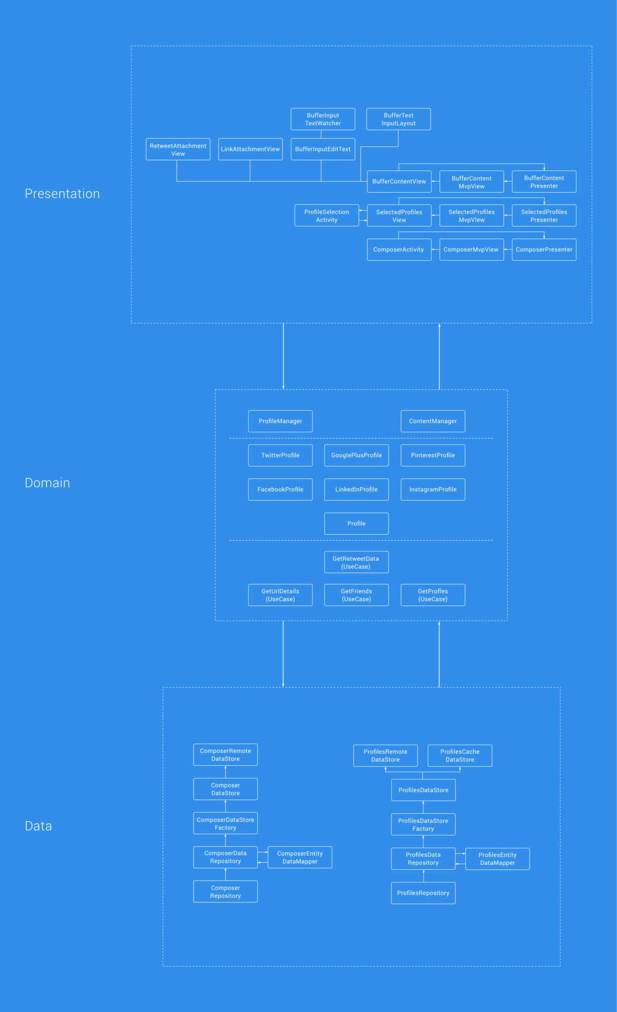
As we previously mentioned, this clean architecture approach layers our application into three different layers. The image above demonstrates now how we’ve now been able to completely decouple components, logic and responsibilities from what was once this bloated activity. There are many advantages that have come from this approach, so let’s break down each layer to understand a little more about the purpose and benefits of each.
Presentation
The presentation layer contains all of UI related components — such as Views, Activities, Fragments, Presenters etc. One of the most notable things from the rebuild was being able to decouple what was tightly coupled with a single activity and breaking the Single Responsibility Rule. The presentation layer of the composer is now abstracted from the Business logic and data retrieval within our app and where necessary, MVP has been used to decouple the presentation responsibilities from the component in question.
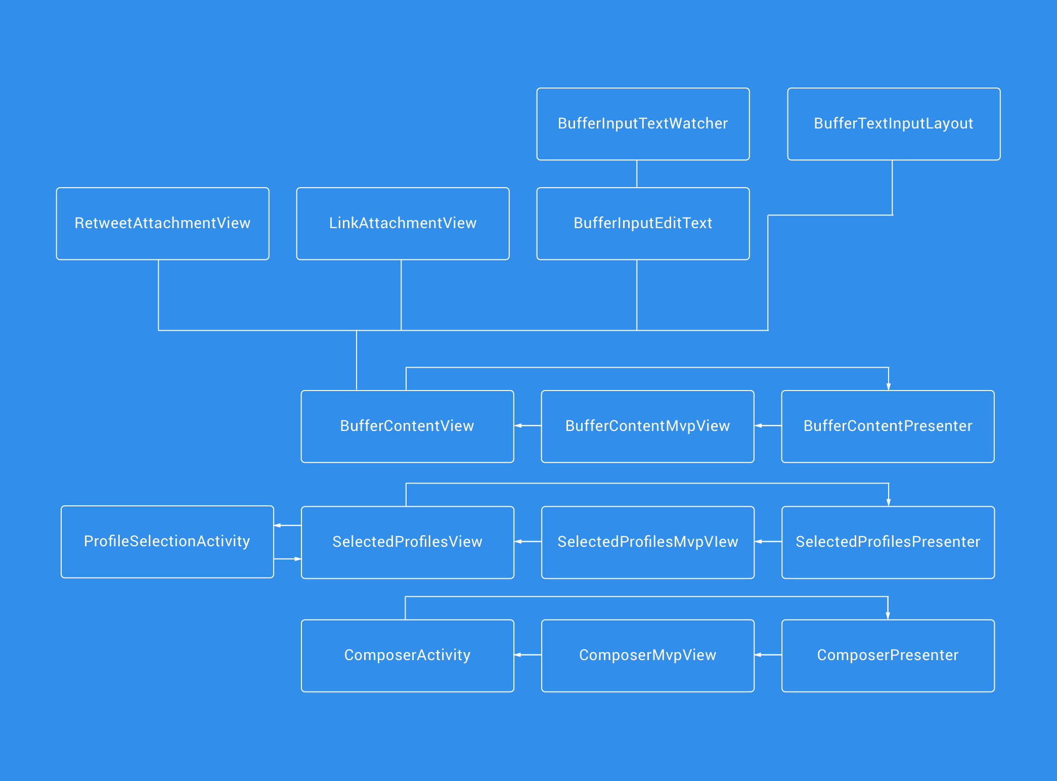
Previously the majority of these components existed within one or two classes, having this layer in place now gives the components of our composer a modular feel — meaning that if we extend or change its functionality, it will simply be a case of fitting in a new component and hooking up it’s logic. With this in mind, let’s look at some of the key advantages of putting this layer in place:
- Our presenter classes previously had a direct link to our Data Layer. This meant that they were communicating directly with the data layer of our app. This made these classes feel like they were tightly connected to the data layer of our app without any abstraction in place to define a line between responsibilities.
- Everything being now decoupled from how it previously was, finding where bugs are occurring when reports come in will be a lot easier. For example, if there’s an issue with link attachments — it’ll be in the LinkAttachmentView. Or if there’s a problem with the detection of urls then we know it’ll be in the BufferInputTextWatcher. No more searching through what was once the ComposerActivity to find where these issues have arisen from.
- It now also becomes easier to extend on what we have. Just as above, if we want to change the behavior of a certain component then we know immediately what we need to change, instead of attempting to locate and patch on code tightly coupled code.
- View components such as the Link and Retweet Attachment views were previously defined within the Composer Activity layout file — exactly the same view types are used in other places of the app, but they were un-reusable. Now these views are their own custom view components, we can easily re-use them throughout the app — hence making these parts of the app more maintainable.
- Multiple Composers is a feature which will eventually be coming to mobile, building this on top of the old composer would have been pretty hard. Now, however, this will be a lot simpler to implement with the composer already being built in a modular fashion.
- With MVP and having a presenter for each component of the composer, we can easily write unit tests for each of the presenters to ensure that the components presentation is behaving correctly.
- We’ve had to customize several android components for our composer, now that these are separated out into their own classes we can easily open-source them for others to use.
Domain
The Domain layer contains our business logic and interactors (uses cases) used to communicate with the Data layer. The introduction of this layer helps us to create a separation of concerns
- We began by creating the models that define the entities used within the composer.
- Next, we created the ProfileManager class to ensure that we could correctly verify a list of selected profiles alongside the data types (such as text, media, links etc) used within the composer. This was followed by the creation of the ContentManager to define the rules for any input content (such as text lengths when links or media are attached — twitter has certain rules around this!).
- Finally, we created the Use Case classes to allow for each of these entities to be retrieved from some data source.
We built the Domain layer first to ensure that our business logic was correct before we began creating any form of activity or view. With tests in place and the Domain layer implemented, it helped to ensure that the core of the composer was working before we even touched the UI — hence reducing any time spent digging into issues during the implementation of the UI.
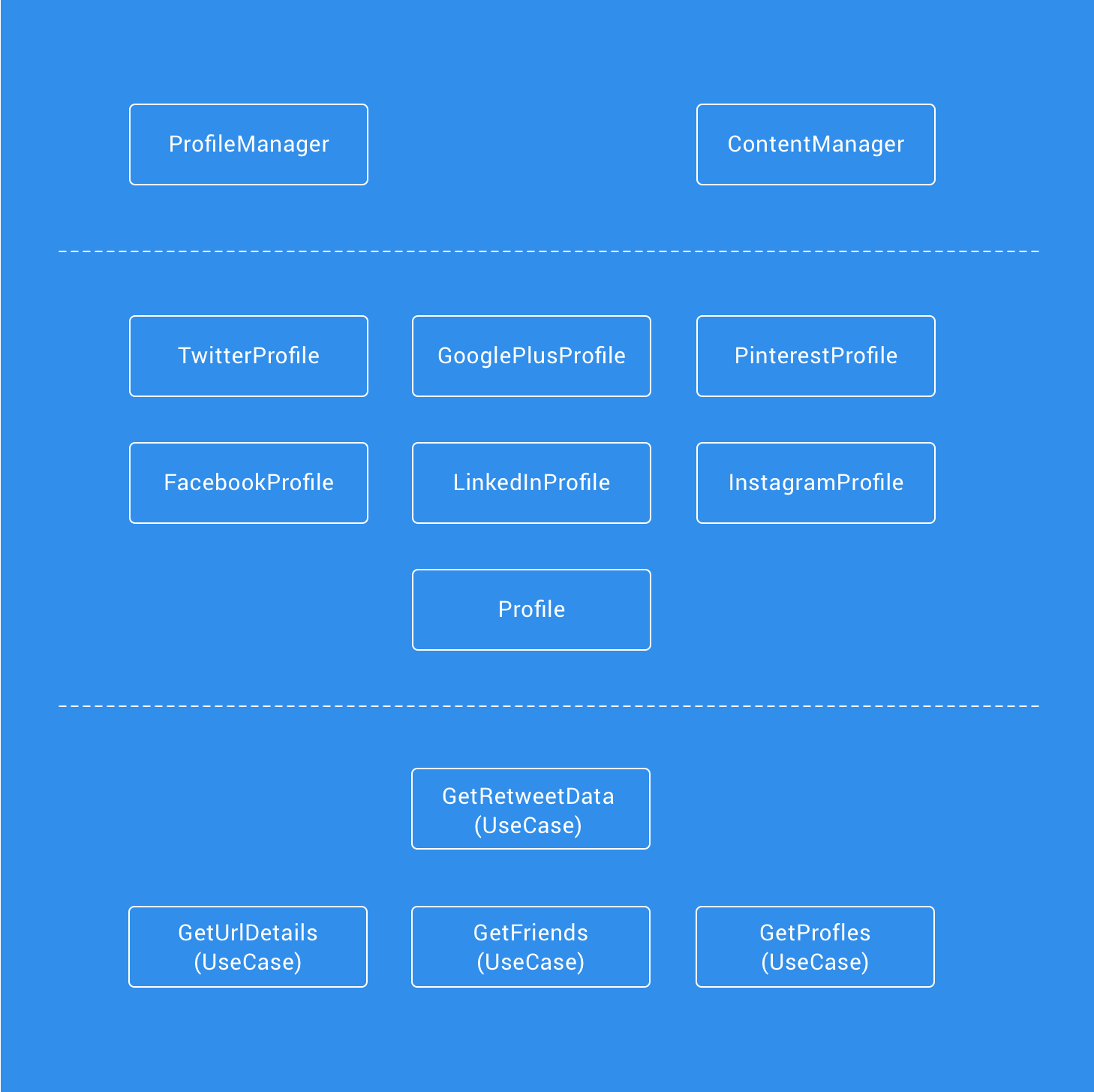
We can already feel many advantages from the introduction from this Domain Layer:
- Having multiple fine-grained Use Cases, each with its own Single responsibility helps to keep the layer clean, organized and easily testable.
- The logic found within the Profile and Content Manager classes was originally found in presenter classes, making our core business logic mixed up with our presentation logic. Now it’s living in the Domain layer we have a reduced risk of breaking any of this logic.
- Whilst the logic in this layer was previously mixed with other code, so were the tests. Now, the testing of all functionality found within this layer is also separated out into their own focused test classes — reducing the bloating and focus for these classes.
- Being its own individual module, if we need to then we can easily make use of this for other Buffer projects.
Data
Our Data layer houses the repositories used to create the classes used to fetch the data from the required data source. This layer has been approached to help adhere to the Dependancy Inversion Principle. With the use of abstractions, our Uses Cases in the Domain layer can now fetch the required data without any knowledge of where the data is coming from. This change makes way for increased flexibility as we can easily plug in new implementations of Data Stores without the need to change the implementations within our Domain layer.
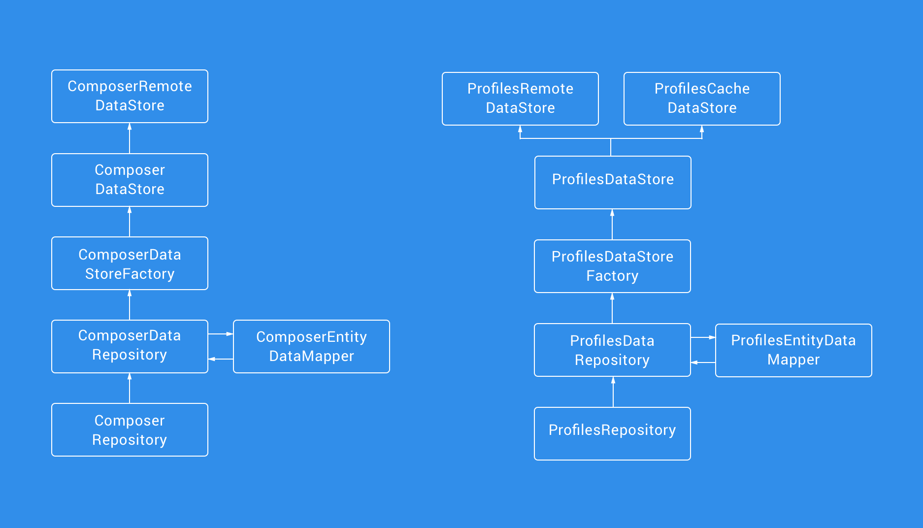
Having this refined data layer brings in many advantages of our previous approach:
- The layer is now interacted with via an interface, allowing other layers to depend on abstractions rather than concrete implementations of data classes.
- Adding in other means of Data Store classes (such as Remote, Cache etc) becomes incredibly easy as again with the use of Data Store interfaces our Repositories are relying on abstractions rather than implementations.
- We are now able to write more focused tests and generally write tests more easily for the data layer. This is because the Data Store classes separate out the sources of data (no more data manager classes with mixed remote and cache implementations), so testing that the Factory classes are returning the correct data store classes under certain circumstance is incredibly easy.
The flow of Data
To compliment this architectural approach, we’re using RxJava to provide a stream of data through the layers of the app. This allows our Presenter classes to become Subscriber classes that can react to any change that may occur in regards to data.
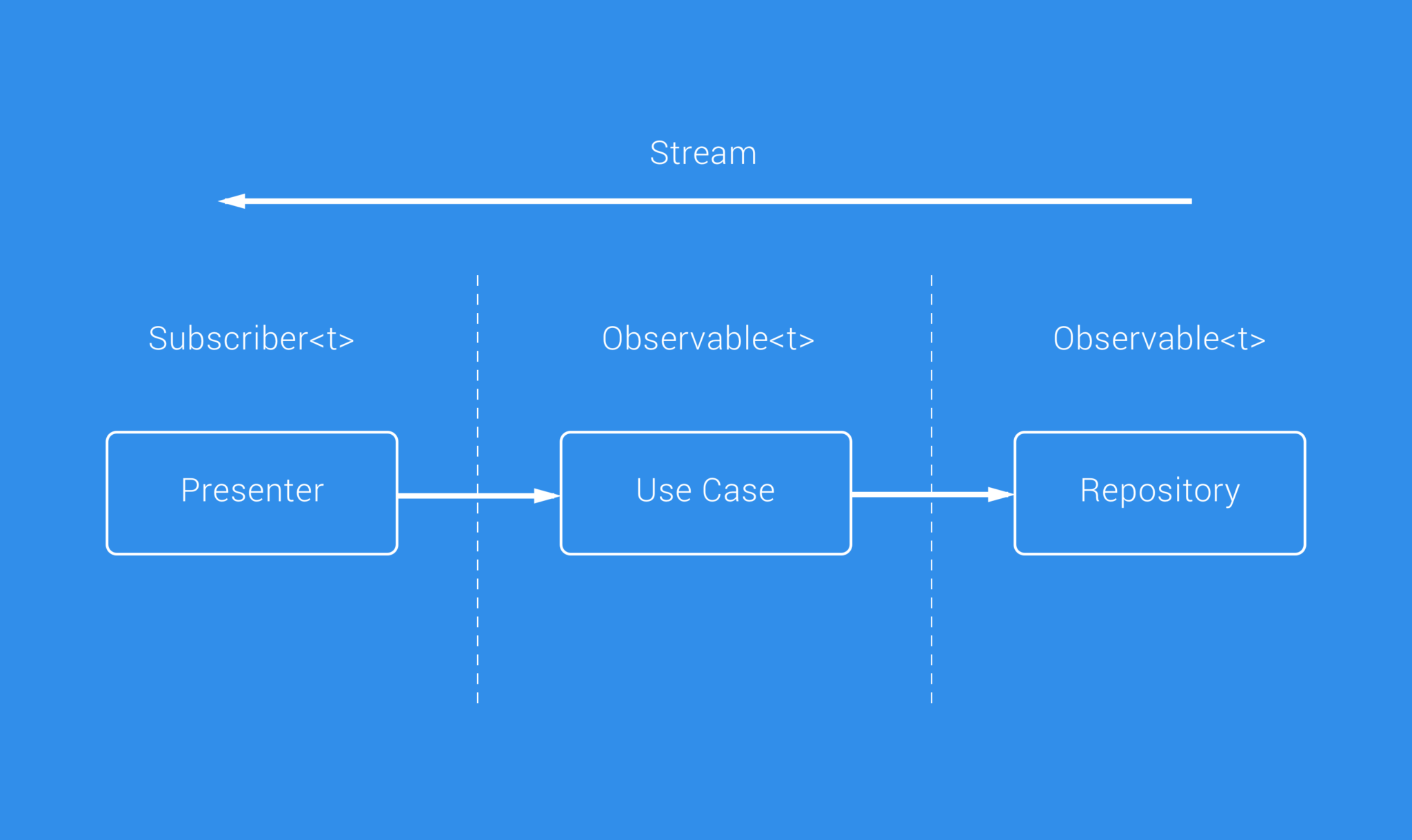
This essentially works by having our Use Case classes return Observable instances when they are executed, allows the Presenter class to subscribe and react accordingly. Our Repositories are also in check with this, seeing as the Use Case classes communicate with that layer they are essentially returning the observables through the lines of communication to the subscriber, whilst the data is passed down the stream.
We use RxJava in this way as it provides a number of advantages for our application:
- We can easily emit errors to all subscribed concepts when an error is returned from an observable chain
- Both Observables and Subscribers are decoupled, which again helps separate concerns and also makes things easier to test
- Observables can easily be combined, which makes the mapping of data objects both easier and tidier in our code
Now we have tests!
Before the rebuild, the composer had no tests in place — no unit tests and no functional tests. Because the Composer is such a core component of our application, it’s important that it’s properly tested to ensure that it’s functioning correctly. Whether it’s fixing bugs, making small tweaks or building on top of the Composer foundations, it’s important to ensure we’re not breaking existing functionality when pushing out any changes.
With the new clean architecture in place, we’re able to test each different component individually and easily achieve a high percentage of test coverage for the composer related classes. Let’s take a look at each layer of the architecture and the testing we have in place.
Presentation
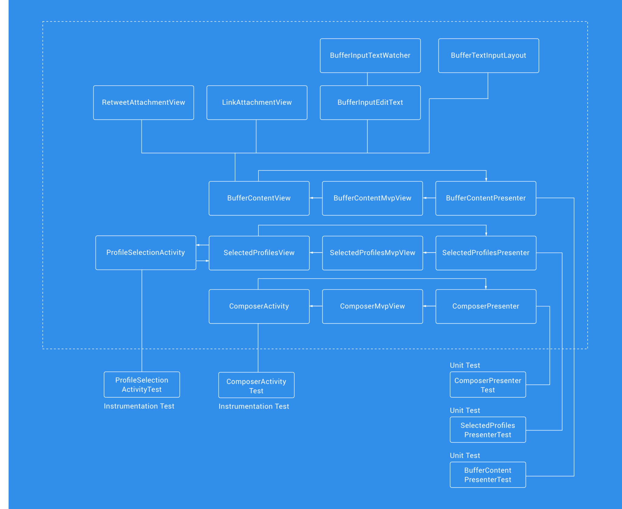
Each activity in the presentation layer now has UI tests do ensure that the components display and behave as intended. Each presenter class also has Unit Tests to check the presentation logic for each component works as intended.
Domain
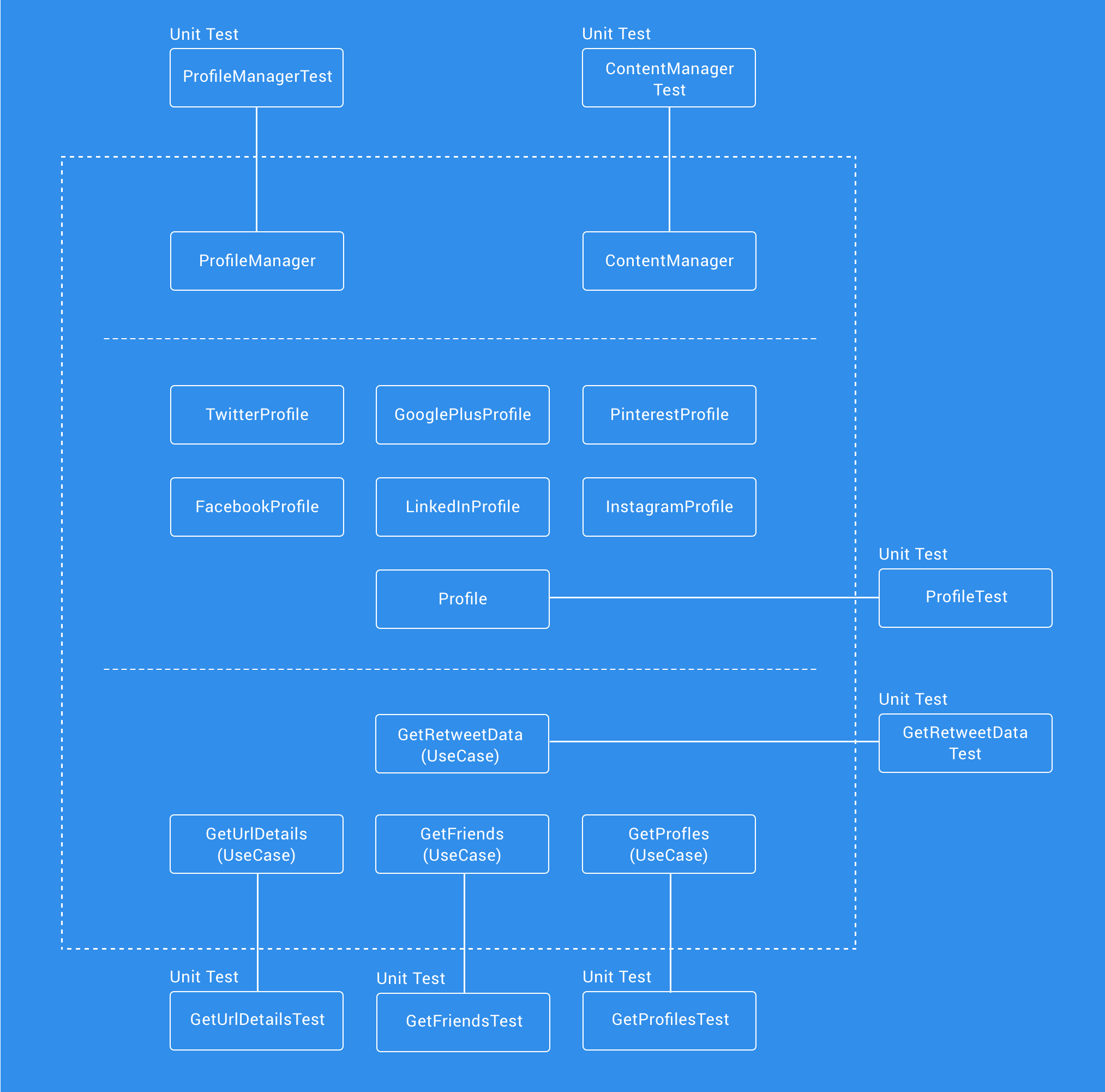
The domain layer consists of pure java only classes, so this layer only contains Unit Testing. Each of use cases has it’s own test class to ensure that they operate correctly. We also have tests for the ProfileManager (to ensure that the social network logic of our app works correctly) and the ContentManager (to ensure the logic around content length works correctly).
Data
The data layer uses Unit Testing to also ensure that each of its classes operates as intended. We were able to write tests to ensure that:
- Repository classes methods behaved as intended
- Mapper classes were correctly mapping data objects
- Data Store Factory classes were creating the correct Data Store based on some given variables
- Data Store classes methods behaved as intended
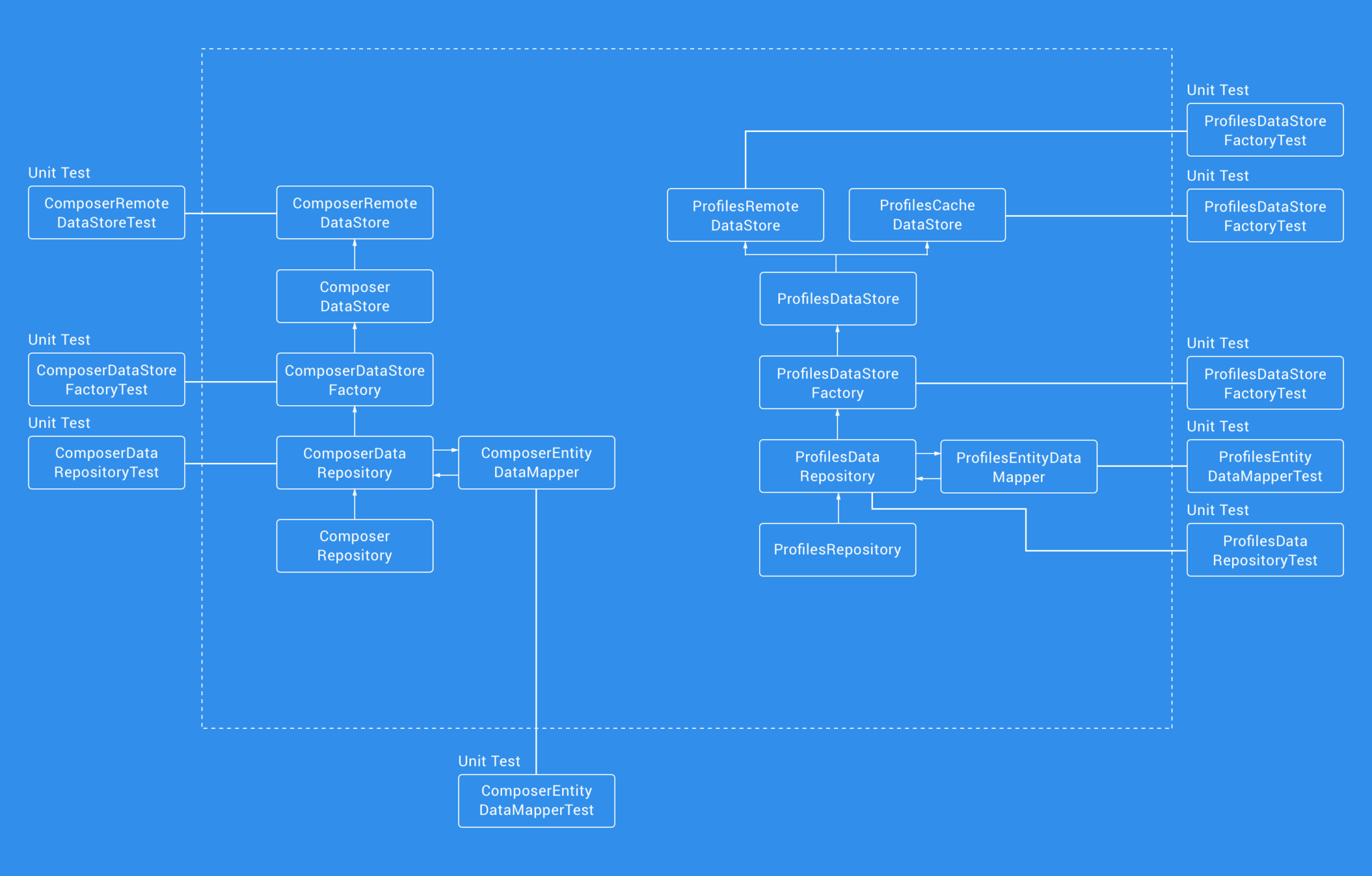
From this, you can hopefully see the kind of test coverage that we can achieve with a Clean Architecture approach. Whilst the MVP approach in the middle of our evolution already offered an improvement from what we previously had, this approach offers a higher concentration on testing.
Now it’s all done, why not check it out for yourself?
We hope you enjoyed this exploration of our composer architecture evolution. We’d love to hear if you’re currently going through any changes in your development approach. ? Please do leave us a response to this thread, or drop one of us a tweet below!
In the meantime, we’re currently rolling out our new composer in the wild, and if you don’t have the Buffer app for Android already, then you can grab it here:

Try Buffer for free
190,000+ creators, small businesses, and marketers use Buffer to grow their audiences every month.


