Do you ever wonder how often you’re being A/B tested?
The practice is so commonplace among websites and marketers these days that at any given point at any given website you could be part of a grand experiment in optimization. I often hope this is the case. I love the science and analysis behind improvements—both on the web and in the real world—so I find myself clicking a blue button and hoping my participation is making a website better.
I love participating in A/B tests, and I love performing them. We get an opportunity to test a number of different elements on the Buffer blog, always striving to add more value for our readers. It’s an ongoing process for us, and it’s one that I’m excited to show you.
But first off, just so we’re all on the same page …
What is A/B testing?
I imagine that most of you have some idea of the way that A/B testing works (a large chunk of the definition is right there in the name). In essence, an A/B test is a way to measure two versions of something to see which is more successful. This description from LKR Social Media is the perfect way of putting it in layman’s terms:
Have you ever gotten into an argument with a friend about which route is fastest to get from your house to theirs? How’d you settle that bet? You tested it! You both left the same place at the exact same time, went your separate routes, and found out once and for all whose way is the best.
I do this all the time, much to the chagrin of people in my caravan.
Another way of looking at A/B testing is this description from Shopify, which replaces cars with Biology 101.
(A/B testing) is not unlike your high school science experiment. Except, instead of dissecting a frog you’re analyzing which is the better scalpel to slice it open. Which one cuts more smoothly, is easier to handle, saves time and increases overall dissection efficiency (so to speak of course).YOu may have also heard about
multivariate testing, an advanced version of A/B testing that introduces a grid of variables that combine to form a number of different tests. The idea here is the same as A/B, but you end up with more complicated data and more specific results.
(There’s a third type of testing that I won’t go into here but thought was too cool to not mention: multi-armed bandit testing. This type of testing is essentially an automated A/B test that promotes a winning experiment as the data comes in.)
A straightforward A/B testing workflow
One of the deepest resources on A/B testing comes from Unbounce’s ebook on the subject. Conversions are a key part of what Unbounce does best: landing pages. As such, they have a huge amount of expertise on on A/B tests. Their workflow goes something like this:
- Brainstorm what you want to test and why.
- Create alternatives to your control page.
- Run your A/B test.
- Promote the winner to be the next control.
- Do it all again.
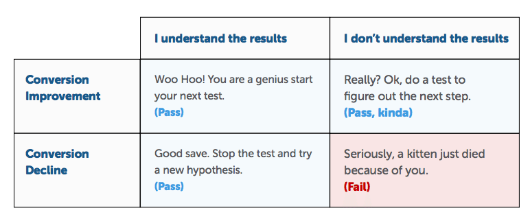
Unbounce caps off the A/B discussion with this helpful chart about how to move on after an A/B test. The takeaway here is that it’s okay for a test to fail so long as you understand why.

How we A/B test at Buffer
Testing and experimentation are at the core of our company, both the business and the culture. We document a lot of our experimentation—on Buffer products and on personal productivity—over at the Buffer Open blog (which is a sort of new experiment in and of itself).
Our main Buffer blog has been a fertile playground for A/B tests as we are always interested to learn more about what content performs best. Here are some of the recent tests we’ve tried.How we A/B test our headlines
Writing a must-click headline requires so many different elements: research, experience, intuition, style, and in the case of the Buffer blog, A/B testing. We test all our headlines in hopes we find one that really resonates with our audience.
Our primary testing ground is Twitter. A/B testing on social is a rather inexact science, but so far, we have been able to find reliable data with our headline tests. Here is what we do in a nutshell:
Post two separate headline versions to Twitter, and track which one performs the best.
Our specific headline process looks like this:
- For each post, we brainstorm five to 10 headlines and decide among the marketing team which ones we like best.
- The winners from step one become our test candidates. We take three headline variations and post them as updates to our Buffer Twitter account. Ideally, the closer together we can post them (e.g., all in the morning or all in the afternoon), the more reliable data we can expect to receive.
- We track the results in Buffer analytics to see which headline performed best. The winner becomes the new headline on the post (or stays the same, depending on what we started with).
We end up changing a good number of headlines on the blog, like our post about Hashtags, which went from “A Scientific Guide to Hashtags” to “The Research Behind Hashtags.” Note the big difference in retweets, favorites, mentions, and reach in the comparison below.
First tweet:

Second tweet:

(How we A/B test adding photos to social shares
When Twitter tweaked its layout to show image previews right in the Twitter stream, we took it as an opportunity to test. Do expanded images make any different in engagement and interaction with the content we share on Twitter?
The answer is a resounding yes.

To test this, we A/B tested tweets with pictures and tweets without, and we analyzed the clicks, retweets, and favorites from each group. The pictures group was the clear winner, outperforming text tweets in every category:
- 18 percent more clicks
- 89 percent more favorites
- 150 percent more retweets
How we A/B test our Friday publishing schedule
Content on the Buffer blog is typically new every Monday through Thursday, four days a week. We’ve found these to be the most active days on the site and that Fridays tend to be less busy. But we wanted to be sure.
So we tested just how much traction we could gain from Fridays by posting a few times on that day and comparing the stats to traffic on other days.
Our most recent test came on Friday, March 21, when we published a guest post from James Clear about the power of imperfect starts.
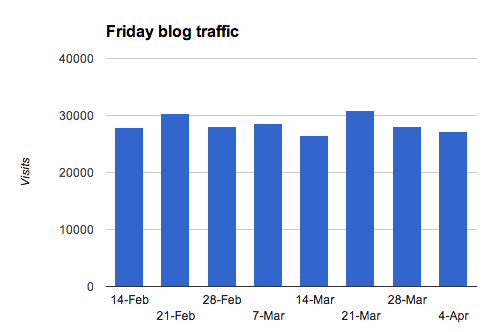
The test was to see a) how Friday, March 21, compared in traffic to other Fridays where we did not post new content and b) how this particular Friday post compared in traffic to other posts on weekdays.Friday, March 21, traffic vs. other Fridays
On a typical Friday at the Buffer blog, we average 28,000 visits. On our A/B test Friday, we had 30,796 visits—an 8 percent increase over our average. Not bad! It was a larger bump than we expected, and gave us optimism that we shouldn’t completely write off Friday posts.
Was it a sure sign that Fridays are worth publishing? Not necessarily. As you can see, there was also a nearly 8 percent jump over average back on February 21, and we didn’t run an A/B test or post that day.

Friday blog post vs. weekday blog posts
The comparison to weekday blog posts told quite a different story for the value of Friday content. Our test post was the 17th-most popular post from the past 30 days, surpassed in traffic by 16 others (which equals just about the entire month, give or take a few of the most recently published articles).
Knowing this, we might hypothesize that an extra 2,000 or 3,000 people might come to the site on Fridays to see the new content (and thus bump up the Friday average, relative to other Fridays) but overall, new content on Fridays get the same viewership as our weekday articles.
How we A/B test with Hellobar
You may have noticed the orange bar at the top of our blog. That’s the Hellobar, and it has been a fun experiment in optimizing for conversions.We’ve A/B tested a number of variables with the HelloBar to see which worked best. Predominately these tests include copy and color. Do visitors prefer an elevator pitch or a call to action? Do they prefer green or orange?
Here are some stats:
- Green bar with the text “Buffer is the easiest way to manage social media accounts.” — 0.4% conversion rate
- Green bar with the text “Enjoyed reading this article? Share it at the best time on Twitter, Facebook” — 0.6% conversion rate
- Orange bar with the text “Easily post to multiple social media accounts” — 0.6% conversion rate
- Orange bar with the text “Buffer is the easiest way to publish on Social Media” — 0.7% conversion rate

The conversion trinity, form friction, and other areas to A/B test
There is a litany of ways to A/B test on your website, and it’s always interesting to see the crazy success stories from small or off-the-wall changes.
- Two magical words near a signup button (“It’s free”) increase conversions by 28 percent
- Changing a single word in a call-to-action increases clickthroughs by 161 percent
- Landing page changes quadruple opt-in rate
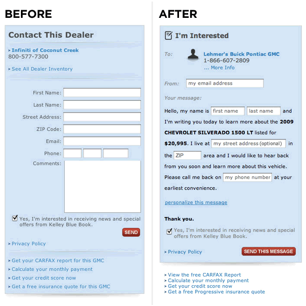
- (My personal favorite) A Mad-Libs-style form increases conversions 25 to 40 percent

The takeaway here is that you can A/B test just about anything.
So where might you begin?
Search Engine Watch offers some great advice on a few important areas to consider: friction, anxiety, and the conversion trinity.
Cut down on friction for your visitors
Common friction elements include form fields, steps in a lengthy process, and page length. Any of these can be difficult to endure for a visitor to your website, so the more you can optimize with an A/B test, the better off your conversions will be in the long run. You might consider testing a form with fewer fields or trying a multi-page versus a one-page signup process.
Avoid information-entering anxiety
Anxiety is created when people aren’t sure if they are going to be rewarded for all of their work.
With this in mind, think about your checkout process or surveys or subscription forms. Visitors will bail if they get anxious about the value of their time on your site. This doesn’t mean to abandon all forms or checkout steps but rather to A/B test different copy and design to ensure the visitor feels confident they’ll get what they’re after.
Pay attention to the conversion trinity
- Relevance
- Value
- Call to action
Visitors will seek relevance on a landing page, making sure your site fits their wants or needs. Likewise, the value proposition for your product or service will need to show the right solutions and benefits. And don’t forget the call-to-action; it should be crystal clear so the visitor knows exactly what to do.
What do you A/B test on your website?
We always love hearing stories of experimentation and improvement. Do you have a good one to share? Let us know in the comments which elements you test on your website or blog.
P.S. If you liked this post, you might also like A Scientific Guide to Writing Great Headlines and How We Increased Landing Page Conversions by 16%.Image credits: TheBusyBrain via photopin cc, Unbounce, Lukew.
Try Buffer for free
190,000+ creators, small businesses, and marketers use Buffer to grow their audiences every month.


