Instagram Stories are always the first thing I tap on when I open the app. I love seeing the more personal, in-the-moment updates — the kind of content that’s less polished and more like a window into someone’s day.
Think: a short clip of a creator’s workspace. A sneak peek at a product photoshoot. A casual poll asking what color to restock.
They appear right at the top of the app, which means your audience sees them before they even start scrolling.
Whether you're a creator or running a brand, stories are a low-pressure way to show up consistently when your followers open Instagram.
Jump to a section:
- What is an Instagram Story?
- Why you should post Instagram Stories
- How to post an Instagram Story
- Different types of Instagram Stories
- How to use Instagram Story stickers to boost engagement
- Bonus tip — the Instagram Story link sticker replaces “swipe up”
- What are Instagram Story highlights?
- Instagram Story analytics
- A winning Instagram Story strategy
- Take your Instagram Stories to the next level with Buffer
- Instagram Stories frequently asked questions
What is an Instagram Story?
An Instagram Story is a feature that allows users to post photos or videos that automatically disappear within 24 hours. They appear in a vertical format and are fast, memorable, and fun by design.
When you post a story, a colorful ring appears around your Instagram profile picture, telling your followers they can tap on your profile photo to see what you've just posted.
Your profile picture with the colorful ring around it also gets added to the top row of your followers’ home screens — known as the 'stories tray' — making it the first thing they see when they open the Instagram app.
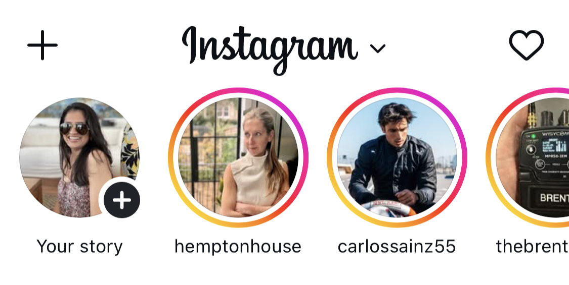
Instagram Stories are a perfect way for creators and brands to experiment with different kinds of content because, unlike your permanent curated feed, stories disappear in 24 hours.
You can also limit who sees a story by sharing it only with your Close Friends list — handy for behind-the-scenes peeks, client-only updates, or anything you’d rather keep to a smaller circle.
Small business owners use their stories to post everything from unedited videos at work to photos of their new products and short clips of them answering FAQs.
Creators and influencers may want to use stories slightly more casually by taking followers along for a day in their lives, showing behind-the-scenes footage, or just chatting to followers about an experience they may relate to.
Why you should post Instagram Stories
Stories aren’t designed to bring in new followers. They help you stay close to the ones you already have.
Adam Mosseri, Head of Instagram, described them as “a way to reach your most passionate audience.”
Instagram adds built-in interactive tools that make stories so effective. You can run polls, add questions, or link directly to a product if you sell on Instagram.
Instagram launched stories in 2016, and it didn’t take long for the feature to catch on. Within two years, more than 500 million people were creating and watching stories daily.
In short, stories can help you:
- Stay visible and top of mind with followers
- Increase engagement and build loyalty over time
- Encourage interest in your products or services
How to post an Instagram Story
Now that you know what a story is, it's time to get into how you can post your own. Here's a tutorial to walk you through posting your Instagram Story.
Go to your Instagram home page. Swipe left anywhere on the screen to open the Instagram camera, or tap the “+” button at the bottom of the screen and select “Story.”
Choose how to add your story: tap the white circle to create content, or tap the album icon to upload from your gallery.
If you're uploading, remember that Instagram Story dimensions are 1080px by 1920px, and videos can be a maximum of 60 seconds.
Create new content on the spot to access different story types. I’ll share more about these below.
Once you've created your story, add stickers, emojis, and filters. You can also draw, add text, mention people, or engage your followers through polls, quizzes, and other fun features (we'll get into all these options in a moment).
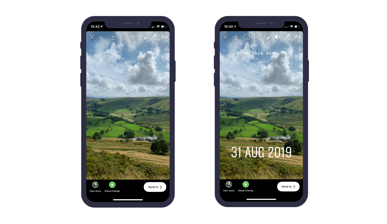
If you want to create stories even faster, you can create your content in bulk and schedule those stories ahead of time with Buffer's planning and scheduling tools. Buffer’s story tools will show you what your story is going to look like when it's live and let you schedule it ahead of time, too.
Here’s a quick look at how to schedule stories using Buffer:
- In the Buffer scheduler, select Instagram as your channel and then select Story.
- Drag or drop your photos or videos, or select the files from your computer (you can schedule up to 10 stories at a time).
- If your story is ready to schedule, click on Add to Queue, Schedule Post (to pick a custom time), Share Next or Share Now, and Buffer will take care of the rest.
- If you’d like to add some fun features like Instagram stickers, choose the option from the bottom of the scheduler. Buffer will switch to notification posting, and the Buffer mobile app will notify you when it’s time to post.
You’ve also got a few lightweight options for adding other kinds of posts to your stories that work a bit differently. They might not be part of your everyday routine, but they’re still worth calling out since they can be useful in different ways.
- You can add someone else’s story to yours if the user has mentioned your account and enabled sharing. You’ll get a notification in your direct messages that you’ve been mentioned, with a tag that says Add to your story. Just tap on the tag and create your story.
- You can also share your own feed posts, reels, and carousels to your stories. Tap the paper airplane icon below the post and then Add to story to create it. This is a handy way to get your Instagram content in front of your followers who may miss it in the non-chronological feed.
- You can share posts from a few other apps to your stories as well. If a happy customer gives you a shoutout on Threads, or your podcast’s new episode drops on Spotify, tap on Stories or Story in the share menu for that app and take it from there.
Different types of Instagram Stories
Instagram recently removed a couple of its old story-sharing options (goodbye Photobooth and Dual), but there are still five different Instagram Story types to play with. For more variety, scroll down to our section on stickers.
Standard
What is it? A regular photo or video — the default Instagram Story option. In this mode, you can add filters, which appear at the bottom of the app.
How to use it: Make your story in the Instagram app or upload content you’ve already created. If you’re making the story through Instagram, Standard mode is where you’d do it.
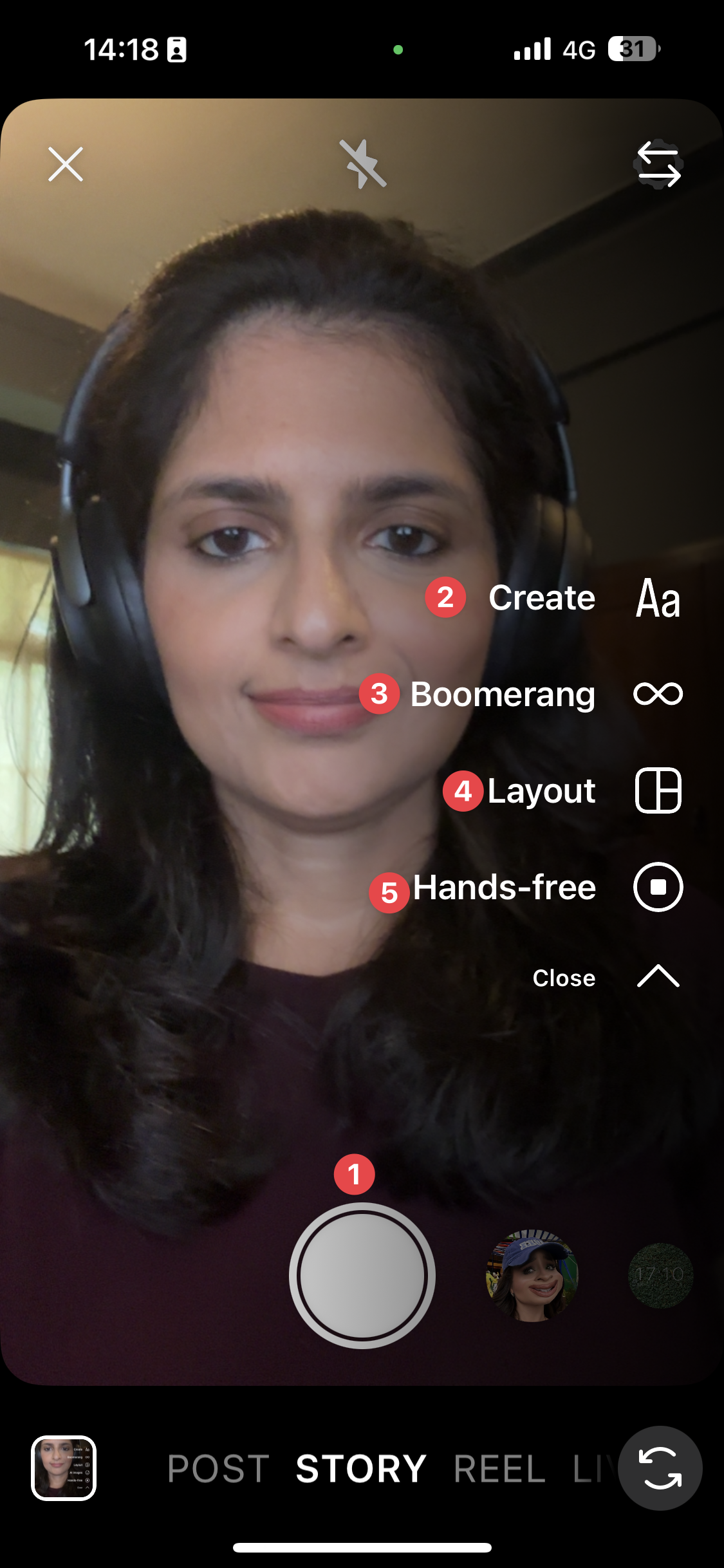
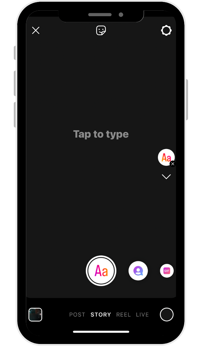
Create
What is it? Text or stickers (we'll talk about the sticker options below) on a solid background. Instagram has a ton of fun options for the various texts, including different fonts. Accounts usually use text stories to pose a question, tell a story, or create mini-blogs within their Instagram Stories.
How to use it: Choose Create mode, add your text or stickers, and customize the look to fit your message or brand.
Boomerang
What is it? A really short video that plays forward and backward on a loop.
How to use it: Select Boomerang mode, then tap and hold to capture a burst of motion for a playful effect.
Layout
What is it? A collage of different photos, with a few preset collage options. How to use it: Select Layout mode, pick your collage style, then add photos by snapping new ones or uploading from your gallery.
Hands-free
What is it? : Video mode where you can record video without tapping and holding the record button.
How to use : Select Hands-free mode, tap the record button once, and Instagram will record until you tap again or reach the time limit.
How to use Instagram Story stickers to boost engagement
Instagram Stories are so powerful because they help you build loyalty and boost engagement by showing the human side of your business.
Your followers probably already love your brand. Sharing true, relatable, or interesting stories will encourage them to keep coming back and interacting with your content — which can lead to more engagement and conversions over time.
Now, Instagram has made it even easier for creators and brands to harness the power of stories and create engaging content: stickers.
What are Instagram Story stickers?
Instagram Story stickers are creative elements you can place on your stories to make them more engaging and interactive.
You can use stickers in lots of different ways.
- Add some text or GIFs to your boomerangs
- Share a poll with a photo of your new products to ask your followers which ones they're most excited about
- Build some mystery with a blurred story that people DM you to reveal
You can add more than one sticker to a story. To add stickers, take or upload a photo or video, and then tap the stickers button (a smiley face on the top of the screen) to find customizable stickers for the weather, the current time, location, and more.
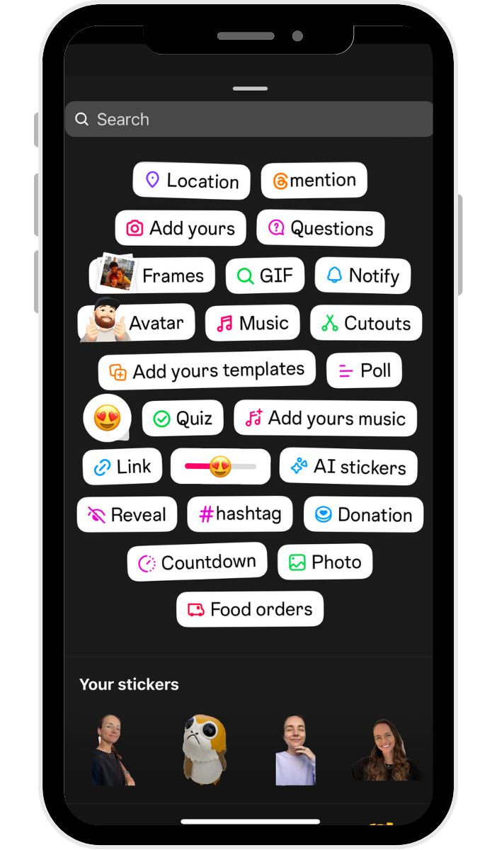
You can move stickers by dragging them across your screen and resizing them by pinching or expanding them with two fingers.
Instagram has also launched new types of stickers — like the shop sticker and captions sticker — to help Instagrammers with professional and business accounts increase accessibility and keep their audience engaged.
Here are some of my favorites.
1. ‘Add Yours’ sticker
Instagram's ‘Add Yours' sticker lets creators start public threads to connect content with a similar theme. When more users add their stories to the sticker, it creates a content chain that brings different users — including those who don’t follow you — into the conversation.
2. Captions sticker
Instagram introduced the stories captions sticker to make the platform more accessible. You can add automated subtitles or transcripts to your stories by simply adding this sticker.
Keep in mind that this feature isn't available everywhere yet — it's currently rolling out in select languages and locations.
3. Shopping sticker
If you have Instagram Shopping set up for your business account, you can use the shopping sticker to add clickable product icons to your story.
4. Donation sticker
The donation sticker is an interactive sticker Instagrammers use to encourage donations to a specific cause. People who tap the sticker can donate within Instagram to the linked cause.
5. Quiz sticker
The quiz sticker lets you add an interactive, multiple-choice-type question to your stories so you can ask your followers fun questions and see which ones get the right answer.
6. Question sticker
You can use the question sticker to ask your followers a question. It can help you gather some insights into what your followers or customers love, what they're interested in, what they'd like to see, and more.
You can also flip it — use the question sticker to let your followers ask you a question, and create new stories where you answer them. Adam Mosseri does this often, answering users' questions about Instagram, AMA style.
7. Poll sticker
The poll sticker allows you to ask your followers a question, giving them four poll options to choose from. All the sections are fully customizable, and you can easily share the results to your story, too.
8. Countdown sticker
If you want to build anticipation around a product launch or event, include the countdown sticker so they can quickly tap to get a reminder for the date.
Some other fun stickers you can use are:
- Location sticker: Tag the location of your story
- Music sticker: Add a song as a soundtrack for your story
- Hashtag sticker: Tap into a trending Instagram hashtag or create your own
- Time and/or weather sticker: Personalize your content
- GIF sticker: Adds a fun, interactive element
- Mention sticker: Tag other Instagram accounts
Bonus tip — the Instagram Story link sticker replaces “swipe up”
The link sticker technically belongs in the sticker category above, but I’m giving it its own shoutout because of just how useful this one is!
When links first came to stories, they were available as a 'swipe-up' feature to verified accounts and business accounts with 10K followers. In 2021, the Instagram Story link sticker officially replaced the swipe-up feature — and it became available to everyone.
This change from swipe up to sticker was good news for content marketers and small business owners, since it meant you could link to a website whether you had 100 followers or 10k.
This sticker makes links highly visible, and they can be placed anywhere on your story.
In a statement, Instagram shared their reasoning behind the change:
“We made this decision based on feedback we heard from the community about how impactful it would be for creators and businesses of all sizes to benefit from link sharing to grow in the same way larger accounts do.”
Here are some ways you can use the link sticker:
- Send people to a product page during a launch or restock
- Link to a new blog post or newsletter signup form
- Share your latest YouTube video or lead magnet like a free download
- Direct followers to a booking calendar or inquiry form
- Highlight a press feature or media mention
How to add a link to your Instagram Story
- Go to your Instagram Stories sticker tray and tap the sticker that reads “link.”
- Paste your link into the link field.
- If you have a long or unwieldy URL, tap the “Customize sticker text” button to type in any text you'd like and tap Done.
- You can change the color of your sticker by tapping on it, pinch to resize, and drag it to where you'd like it to appear on the story.
What are Instagram Story highlights?
Instagram Story highlights are collections of Instagram Stories that you curate to stay on your profile even after they expire. They're located at the top of your profile in the form of tappable circles.
Since stories are designed to be temporary, Instagram introduced highlights in 2017 as a way for users to give their favorite or most relevant stories a more permanent placement and keep around for more than 24 hours.
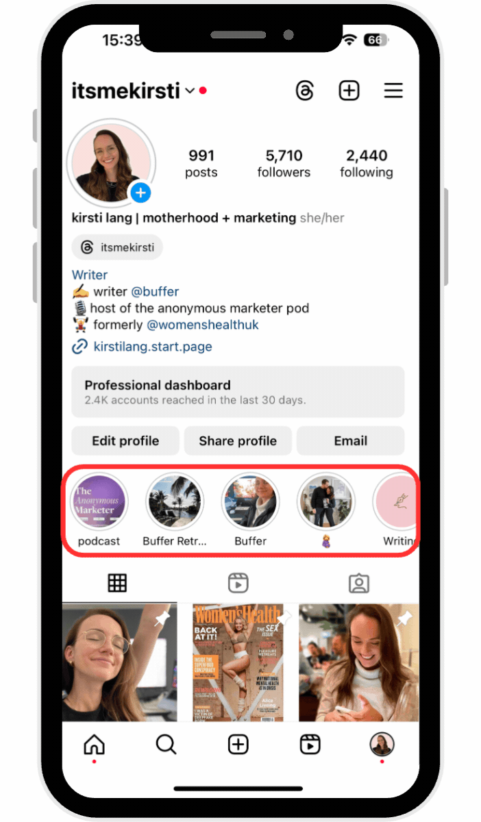
Story highlights appear directly below your bio, so they’re one of the first things your followers see when they go onto your profile.
For brands, these highlights are a great place to save important information (e.g., restaurant menus, product lists, etc.) upfront. They're also a good spot for testimonials and case studies. When you re-share customers' stories about how happy they are with your product or service, instead of letting those testimonials disappear, save them in a story highlight.
As a creator, you may want to save highlights about important life events, brand partnerships, or affiliate shopping links so your followers can easily find products you love.
Here's a step-by-step guide to creating your own Instagram Story highlights:
- Go to your profile page by tapping your profile photo located at the lower-right corner of your screen.
- Tap the New circle located right underneath your bio to the left.
- Choose some Instagram Stories from your archive and then tap the Next button on the top right corner of your screen.
- Give your highlight a name.
- Optional: Edit your highlight cover by either uploading an image from your phone's camera roll or choosing one of your highlighted stories.
Once you're done, your Instagram Stories highlight will appear as a bubble on your profile. You can have as many highlights as you like, and they will stay on your profile until you remove them. To edit or remove a highlight, just tap and hold that highlight on your profile.
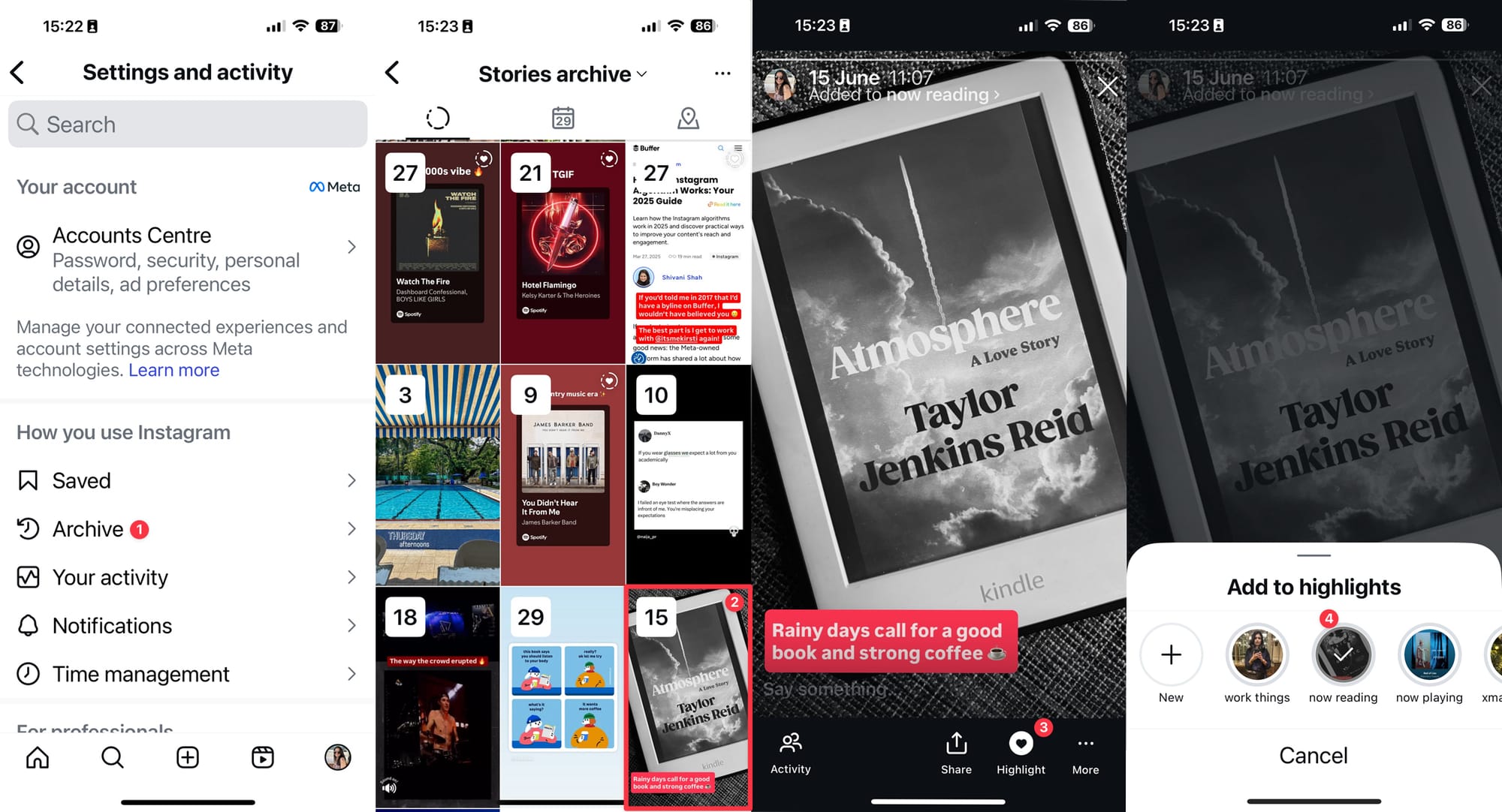
You can add stories to highlights at any time. Go to Archive in your app settings, open the story, and tap the Highlight button at the bottom of the screen. Choose the highlights you want to add it to (you can choose more than one), and you’re done.
Instagram Story analytics
If you have an Instagram creator or business account, you can access Instagram analytics in the app. Your profile analytics and story analytics are different, but both contain important data that can help you create more of the content your followers love.
You can access your analytics for a specific story by tapping the story, then the ‘Activity' icon on the lower-left corner of your screen. From there, tap on the bar graph button on the left.
From your analytics, you will see:
- How many followers and non-followers your story has reached
- How people interacted with your story (tap for the next story, finish the story, go back, exit)
- How many Instagram Story views you received
- How many people followed you after viewing that story
You can find out which pieces of content are the most engaging based on Instagram's Story analytics. If you need more in-depth information, you can check out Buffer's Story analytics dashboard.
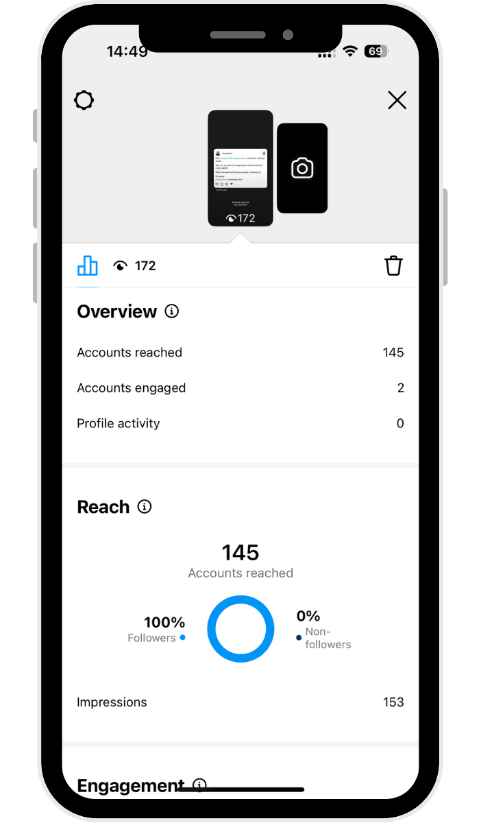
Check story analytics from Instagram Insights
You'll be able to access all this data and more via Instagram Insights, where all the metrics for your Instagram posts — stories, carousels, reels, and more. Yes, you'll even find stats for Instagram Stories that have already expired.
To get to your insights:
- Tap on your photo on the bottom right of your app to get to your profile
- Tap the ‘Professional dashboard’ button beneath your bio
- For metrics specific to your Instagram Stories, tap on ‘Content you shared'
- Tap the ‘All' button on the top left, then tap ‘Stories'
- Your stories will automatically be arranged by reach, from highest to lowest. Tap on a specific story to get more data, such as reach, likes, replies, shares, and more.
A winning Instagram Story strategy
On average, social media campaigns on Instagram see about a 20% increase in reach when Instagram Stories are involved.
Spontaneously creating Instagram Stories and sharing snippets of your life with your followers is a great way to build engagement and start learning about the feature. But to really grow with Instagram Stories, you need a solid strategy.
The Instagram stories algorithm uses viewing history and engagement to decide where in the stories tray your stories show up for followers. Use the algorithm to your advantage to drive interactions with your followers — little changes, like frequency of posting, using in-app features, and posting at certain times of the day, will help your ranking.
1. Post Instagram Stories daily
Our Instagram Stories research suggests that posting between one and seven Insta Stories per day will yield the best results. Over 70% of accounts that posted within this range had a high stories completion rate.
Completion rate is determined by calculating the number of times viewers watch your stories, from the first story frame all the way to the last, within the given 24-hour time period.
This means that if you post between one to seven stories, the chances are 70% of your audience will stick around until the end of your last post.
If you post longer stories, the drop-off isn't too bad. You can still see completion If you post longer stories, the drop-off isn't too bad. You can still see completion rates above 50% for stories that are made up of more than 20 photos and videos.
2. Post stories consistently and at optimal times
Consistency is key to social media, and the Instagram algorithm agrees. Given that stories only last for 24 hours, you want to maximize their reach.
Consider posting your story content a few times in one day and sharing your photos and videos in bite-sized chunks.
Another factor to consider is posting your story content at the times when your followers are most active on the app.
According to our analysis of the best time to post on Instagram, weekday afternoons are best for engagement, but there are other hotspots to take advantage of during the week, too.
Tap on Professional dashboard on your profile, then tap New followers. If you scroll down to the end, you'll find your followers' most active times for each day of the week.
3. Take advantage of creative features and tools
As you'll have seen above, Instagram has plenty of fun features to help you get creative with.
You can create your stories right on the Instagram app or use other tools to create and prep them ahead of time. Just one thing to keep in mind — Instagram’s algorithm may limit reach for content that includes visible watermarks or logos from other apps, like TikTok.
If you’d rather schedule your stories in advance, you can absolutely do that. Buffer’s notification publishing lets you set things up ahead of time, then make quick edits in the Instagram app before posting — like adding music or creating polls.
4. Use Instagram Story ads to boost reach, engagement, and conversions
Stories created for ad placements help small business owners reach a targeted audience, get more eyes on their brand, and send people directly to their website or shop.
Because they take up the whole screen, your audience won’t see Instagram content or notifications from other brands — just your ad.
To save you time on content creation, make use of existing stories saved in your highlights. If you have an Instagram shop, you can use product links so users can purchase your products directly through the ad.
And if someone sees your story ad, and they follow another account that already follows you, that connection will show up at the bottom of the screen.
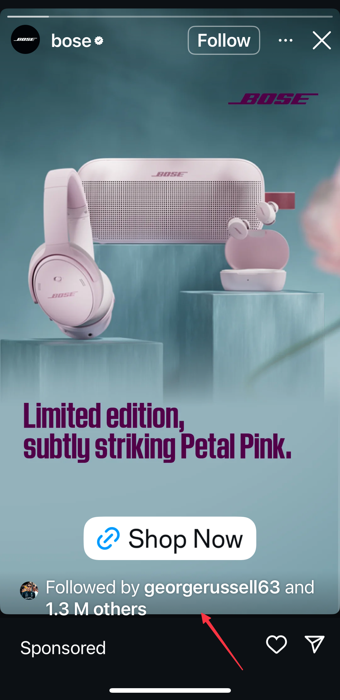
Check out our starter guide to Instagram Stories ads, which includes ad specs and Check out our starter guide to Instagram Stories ads, which includes ad specs and tips for making ad creatives. All you need to get started is a Facebook ads account!
5. Use Instagram Story templates to make your story pop
There are perks to tapping into templates to create visually appealing Instagram Stories. For one thing, you can batch create them (making it oh-so-much easier to schedule your stories in advance).
It's also a great way to maintain brand consistency that you can even carry across your Instagram Reels and carousel posts. Check out these 11 places to find scrollstopping Instagram templates. (Spoiler: Canva is not the only place for great free ones.)
Take your Instagram Stories to the next level with Buffer
Stories have become an incredibly important part of brand awareness and should absolutely be included in your Instagram marketing strategy.
With Buffer, you can plan, preview, and schedule your Instagram Stories ahead of time, so you have everything ready to post with a single push notification. Get started for free now →
Instagram Stories frequently asked questions
Looking for quick answers about Instagram Stories? You’re in the right place. Check out some of the most common questions below, or let us know if there’s something else you’d like to see covered.
What’s the difference between an Instagram Story and a regular post?
Stories vanish after 24 hours, live at the top of the app, and let you add interactive stickers, polls, and links. Feed posts stay on your grid permanently (unless you delete them), can show up in Explore, and are better for ongoing discovery.
How do I see who viewed my Instagram Story?
Open the story, swipe up, and Instagram shows the usernames of everyone who watched. Instagram keeps viewer data for 48 hours, so you still have an extra day to check who watched even after the story disappears from the tray.
Can people see if I view their Instagram Story?
Yes. When you watch a story, Instagram adds your username to the viewer list that only the story owner can see. They won’t know how many times you viewed it — just that you did.
More Instagram resources
- 🤝How to Use Instagram Collab Posts (+ 8 Collab Ideas to Boost Engagement and Reach)
- 🎧17 Trending Sounds on Instagram in 2025 (+ How to Use Them)
- 💸How to Make Money on Instagram in 2025: 13 Ideas for Creators and Small Businesses
- 🖼️Instagram Image Size Guide 2025: Post, Story, and Reels Dimensions
- ⚡️13 Ways to Get More Followers on Instagram in 2025
Try Buffer for free
190,000+ creators, small businesses, and marketers use Buffer to grow their audiences every month.


