OK, let’s be honest. While this may be a pretty darn good guide (if I do say so myself), it’s not going to be the last thing anyone ever writes about landing pages. So what’s with the “ultimate guide” stuff?
Well, it’s part of what brought you here—which makes it one component of an effective landing page.
You are, right this very minute, looking at a landing page. Technically, a landing page is any page on your website upon which visitors can arrive, or land. That may not be how we think of landing pages created specifically for marketing or advertising purposes, but it’s true. You clicked a link, you landed on this page, and now the key is to get you to do what this page was created for.
In this case, for now, it’s to read this blog post.
If you’ve gotten this far, our landing page is already doing pretty well! The key is to make sure the content is worth the click it took you to get here, and that it’s worth your time to make it to the end where—spoiler alert!—you’ll find a call to action (CTA).
For the purposes of this post, let’s narrow landing pages down to those connected to content marketing or email marketing campaigns, and meant to generate conversions, bearing in mind those conversions may not necessarily be revenue-generating sales.
So, this being an ultimate guide and all, let’s start at the beginning.
What is a landing page?
By its narrower, marketing-focused definition, a landing page is a Web page set apart from your website, created for a specific purpose. It’s not included in your site’s navigation, and—if it’s a good landing page—it doesn’t offer many click-out options, either.
You can create a landing page to encourage visitors to:
- buy something
- sign up for something
- visit a physical location
- donate money
- take some other action (pretty much any action you’d like)
Why do I need landing pages?
You’ve spent countless hours creating your website, building your social presence—why do you need special pages with specialized content and specific goals?
Well … because they’re special pages with specialized content and specific goals.
Your website remains, for the most part, static. Probably the one area of your site that changes on a regular basis is your blog. You may be able to publish posts about holiday-specific events or special offers once in a while, but it’s not feasible for a larger site, and definitely not for an e-commerce site.
But here’s the main reason: You need landing pages to increase conversions. When Buffer changed the design of its home page, they saw a 16% increase in landing page conversions.
Now, 16% may not sound like much overall. But when you consider that increase came from simply changing ONE page on their website, it’s pretty darn impressive. What kind of increase do you think you could get by redesigning one page? By using landing pages?
The two main types of landing pages
While landing pages can have several purposes, they can be broken out into two broad categories: click-through landing pages and lead generation landing pages.
Click-through landing pages
While you can create landing pages to sell things, the actual sale likely won’t take place on the landing page itself. The visitor will click through the landing page to get to the product page, and that’s where the transaction will occur.
Why is this? Well, first, imagine having to create a landing page for every single item you have for sale on your e-commerce site. Now imagine Amazon having to do that. It’s impractical, to say the least.
Plus, click-through landing pages can be more effective when they’re tied to specific events or dates, such as holidays, particularly because those pages are often a part of email marketing campaigns.
You’re not going to email your list about every single item you have for sale. (If you do, count on your unsubscribe rate skyrocketing.) You likely save the emails for the special occasions, the deals, the really good reasons to show up in your list members’ inboxes.
The next step is to make sure your landing pages support those emails, and encourage your readers to click through to get to the good stuff so you can get the conversion.
Lead generation landing pages
That list you use for your email marketing campaigns—how do you build it in the first place? Through lead generation, or “lead gen” for short.
A lead gen landing page allows you to collect data about your site’s visitors. Names and email addresses are often enough for most marketers’ purposes because you just want to be able to contact that person at a later date, most likely via digital means such as your newsletter or an email campaign.
But people don’t just give that information away freely. Not anymore. Just as the landing page itself has to be worth the click, you need to make it worth the while for someone to provide you with the means of contacting them directly.
Some of the things you can offer in exchange for personal data are:
- newsletter subscriptions
- free trials of your service
- e-books
- contest or giveaway entries
- webinars
- event registrations
- and more
Before you decide what to offer, you may want to consider what will work best for your audience and why. For example, emails offering e-books have a nearly double click-through rate (CTR) over emails offering webinars:
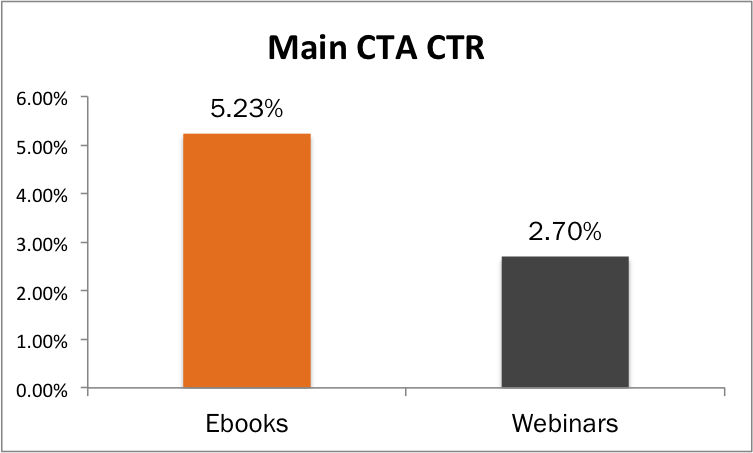
The Hubspot article that discusses this phenomenon says:
For one reason or another, the majority of the HubSpot audience seems to prefer text-based content.
I’m not sure this is true. Think about it for a moment.
To attend a webinar, you have to be present. You probably have to at least sign in somewhere, if not download software to your computer in order to see and hear the webinar. Attending a webinar can mean a good 30- to 60-minute chunk out of your day. And how many times have you tried to attend a webinar, only to have it waylaid by technical difficulties?
If you download an e-book, you can read it whenever you want, when your schedule allows. You don’t even have to read it all at once.
I’m willing to bet this increased CTR isn’t about text-based vs. video/audio content at all. It’s about convenience.
The lesson here is, make sure whatever you’re offering is convenient for—and therefore, more appealing to—your site’s visitors.
What should a landing page look like?
How much text is enough for a landing page? How much text is too much?
It depends. What is the landing page about? Can it be explained in a couple of sentences, or does it require a few paragraphs? What action are you trying to elicit from your page visitors? Comments? A name and email address? A click?
You may have heard it before, but there’s no one-size-fits-all solution when it comes to content. You can still follow a few guidelines, though:
- Use as much text as it takes to adequately convey the purpose and goal of your landing page.
- Try not to be any more wordy than is absolutely necessary to avoid losing your reader before they arrive at the CTA.
- Use powerful and evocative words and phrases.
- Avoid making the reader have to scroll down too far—or too many times—to reach the end of the page.
- Keep your text size and spacing consistent, and use the same font (or at least, the same font family) throughout.
- Be clear and concise.
- Get to the point.
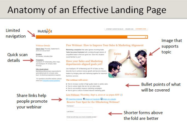
Here’s a quick graphic from Hubspot that hits some of the high points of an ideal landing page.
Edit, edit, then edit again
The first draft of anything you write should be exactly that—a draft. Once it’s written, you’ll want to edit not just to find grammar and spelling errors, but to make sure your text is doing its job to the best of its ability.
The thing is, after you’ve written a page and read it 148 times, you’ll no longer see where it can be cut, where it’s not performing, and how it sounds to someone reading it for the first time.
An editor can help you make your landing pages both appealing and functional. Bring in another set of eyes—preferably a professionally trained set—to whittle your content down to the most interesting and effective text.
Landing page components
So, aside from at least one good, colorful image, and not-too-short-but-not-too-long text, what else should your landing page contain?
- An eye-catching headline: If your landing page is linked to an email marketing campaign, the page headline should mimic if not repeat the email’s subject both for consistency and to avoid confusing page visitors.
- At least one good image: A colorful image that echoes the page’s theme or simply shows the product or item the page is about. Images should be large enough to see clearly, but not so large that they displace text, or add to too much scrolling.
- A clear call to action: Whether you’re asking for donations, or encouraging readers to sign up for a newsletter, webinar, what have you, your CTA should not be at all vague. Include at least one of those powerful conversion words, and you’re in business.
- Clarity and focus: This doesn’t just apply to the CTA, but to all your text. Make it very clear to your visitors what the page is about, what its purpose is, and what you expect them to do there. Don’t make them have to figure it out, or choose between way too many options.
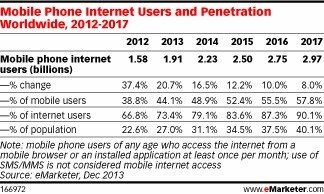
- Mobile responsiveness: If your website is mobile responsive—which it should be—then it follows your landing page will also be easily viewed on mobile devices. (If you’re still not convinced about the prevalence of mobile, consider that the number of people who use the Internet on their mobile phones is expected to increase from 2.23 billion in 2014 to 2.97 billion in 2017.)
A look at three different landing page examples
Aside from what they’re offering, what should your landing pages look like? Let’s look at a few and see what’s working and what could potentially be improved.
P&G: Timely email, overwhelming landing page
This is an email I received from Proctor & Gamble, via their P&G Everyday list:
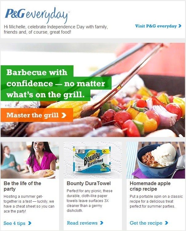
This is a good email for a few reasons:
- It’s timely: I received it on June 10, and the main feature is focused on grilling, just in time for summer.
- It’s brief: Not too much text, not too many images, it’s just the right amount of content that I can quickly see what’s available, and choose something to click.
- It’s colorful: Our eyes are drawn to colorful images, and this email makes great use of avariety of colors, but not any that are garish or unpleasing to the eye (at least, to my eye).
- It’s well branded: The email leaves no doubt as to who sent it, but it’s not intrusive with logos or brand mentions.
So, P & G is doing pretty well so far. Let’s see the landing page connected to that grilling feature:
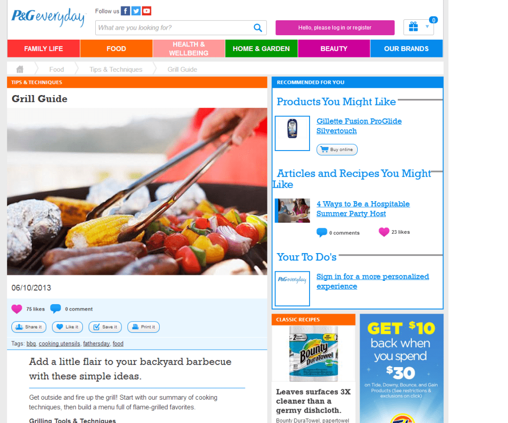
What happened? We went from a fairly subtle email to a landing page with clashing colors, reviews, coupons, social icons, recipes and a list of all their brands and their logos. I have to scroll four times before I reach the bottom of the page.
There’s also that grilling information promised in the email. Aside from one featured image, it’s all text, all black and white, and all completely overwhelmed by everything else on this landing page.
What are you supposed to do on this page? Which link should you click? Which one is the most important, not only to you as the consumer, but to P&G? What do they want from you? It’s impossible to tell.
Giving your visitors options can be good. Giving them too many options can be detrimental.
Remember: your landing page is meant to serve one purpose, two at the very most. Overwhelm your visitors, and you run the risk of losing them altogether.
California Pizza Kitchen: Carousels can cause confusion
Here’s another example, from an email I received from California Pizza Kitchen (CPK):
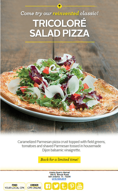
The bulk of this email is an image, which makes sense because it’s a promotion for food. If they not only get you to look at that photo of a delicious-looking pizza, but imagine what it might taste like, you’re more likely to click through.
So where does this email take us? To the CPK home page:
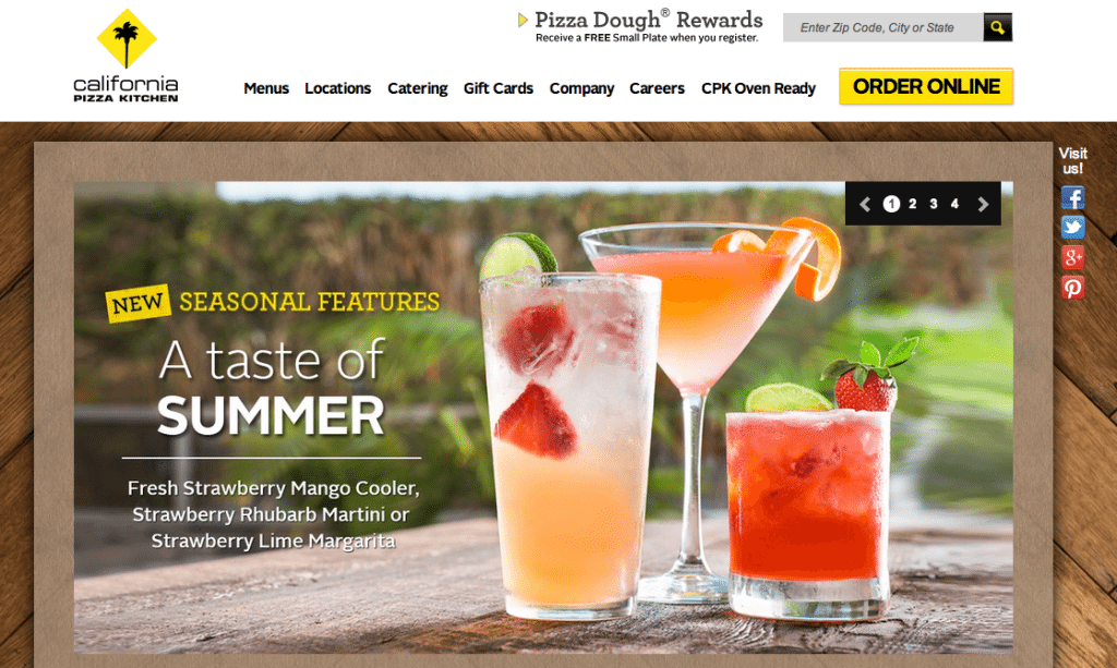
Rather than build a specific landing page for their promotion, they’ve opted to use their home page as their landing page. In general, there’s nothing wrong with that. Let’s take a closer look at what’s going on here.
The home page is using an image slider to display images. When I clicked through from the email promoting the pizza, I was instead shown a different promotion, this one for summer beverages. Not until the third image comes around do I see what brought me here—the pizza.
A better approach might have been to match the first image in the slider to the one that went out via email. If that’s what got me to click through, that’s what I was expecting to see when I got to the site. Should you ask your audience to either sit through a rotation of images or click a few more times to find the one they want?If you’ve already gotten them to click through once, don’t make them continue to work for it.
All that said, using an image carousel for your landing page might not be the best idea. Turns out, image sliders kill conversion rates.
Erik Runyon, Director of Web Communications and developer for the University of Notre Dame, conducted an experiment where he used an image slider on the home page of nd.edu. The experiment ran for about three months, and the basic findings should be enough to put you off image carousels forever:
Approximately 1% of visitors click on a feature. There was a total of 28,928 clicks on features for this time period. The feature was manually “switched/rotated” a total of 315,665 times. Of these clicks, 84% were on stories in position 1 with the rest split fairly evenly between the other four (~4% each).
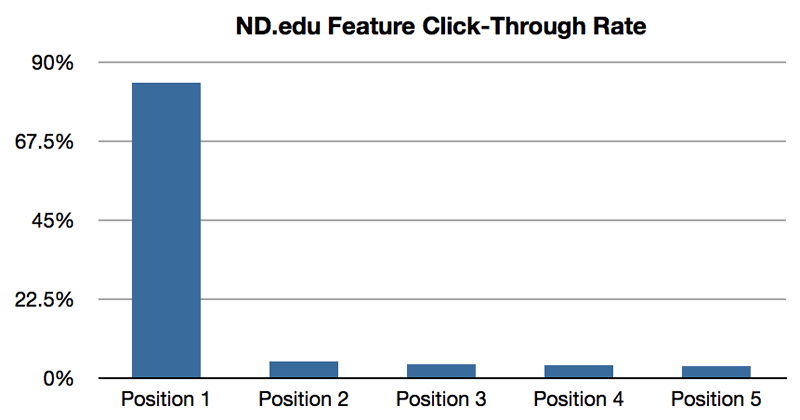
Let’s play devil’s advocate for a moment. If most people click on the image in the first position, then by including one image in the email, and another in that first position, didn’t CPK essentially get two promotions for the price of one?
Maybe. But not really. The fact remains, I clicked on that email because that’s what interested me. That’s what I wanted to learn more about. That’s what I wanted to see when I landed on that page.
Give your readers and customers what they want. Don’t pull a bait and switch, offering them one thing, and then “surprising” them with something else. Maybe they’ll go ahead and click through anyway. But maybe they won’t.
Hotels.com: Coordinated and focused
Want to see how one company is giving customers what they want? Check out this email I received from Hotels.com:
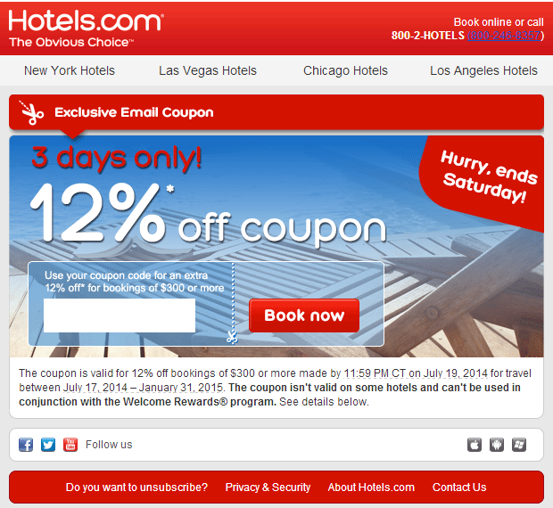
It’s pretty straightforward. Let’s see where it goes:
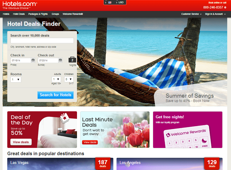
Well, this page does have quite a bit going on, but it’s all related to the subject of the email—hotel deals. You’ll notice the form where you can search your desired destinations is above the fold. If you scrolled down, you’d find that same form at the bottom of the page, in the opposite corner. Brilliant.
If you did scroll down to see the city-specific deals included on the page, but don’t find the location you’re interested in, you can still search for it without having to make your way back to the top of the page.
Hotels.com is also making great use of beautiful photos of the destinations they’re advertising. It’s easy to picture yourself in the empty hammock, isn’t it?
A few more details contribute to this page’s effectiveness. The phone number at the top if you prefer to book that way; the ability to choose other currencies by clicking the icon at the top middle of the page; a space touting their rewards program, yet more incentive to proceed with a booking; and a catchy line to grab your attention—”Summer of Savings.”
But none of those things take up too much space on the page, and they don’t detract from its main purpose—hotel deals.
Now that’s a landing page.
Over to you: How do landing pages work for you?
Will landing pages work for you? The only way you’ll know is to try it out. Create a landing page. Create more than one landing page. Try different things, test everything, use tools to run reports, and document it all. Find out what people want, and what makes them click through.
And if all else fails and you’re still not quite sure how to go about using landing pages most effectively, if you don’t know whether your visitors want e-books over webinars, if you’re trying to decide between a slide presentation and a video, if you’re simply at a loss as to what your audience wants, make use of one of the most effective investigative methods you have available to you: Ask them.
What are your tips for creating effective landing pages? What kind of success have you had with them? Share in the comments!
Oh and don't forget, Start Page by Buffer is a free, fast, and simple way to build beautiful landing pages. Build your page (in 60 seconds) here.
Photo credits: HubSpot, P&G, emarketer.com, cpk.com, WeedyGarden.net (Erik Runyon), hotels.com
Try Buffer for free
190,000+ creators, small businesses, and marketers use Buffer to grow their audiences every month.

