
Change is coming to your Twitter profile. Big, beautiful change.
Twitter is currently rolling out a profile redesign to all users, a redesign that puts an even greater emphasis on the great Twitter content that you share and one that provides some bonus opportunities to make a branding splash. Visual content will get a big boost. Top tweets will get a bump. And we’ll all be scrambling to find out what works best on this extreme makeover of our Twitter homes.
While you wait your turn to find your way around your new profile, you might be interested to plan ahead. We collected some Twitter tips from past stories, some psychological studies on marketing best practices, and some ideas on how each of these different factors might combine for some truly terrific tips on how to handle your new Twitter profile.
What’s changed on the new Twitter profiles
The Twitter redesign has a lot of people seeing shades of a certain other highly popular social network. It looks a lot like Facebook.
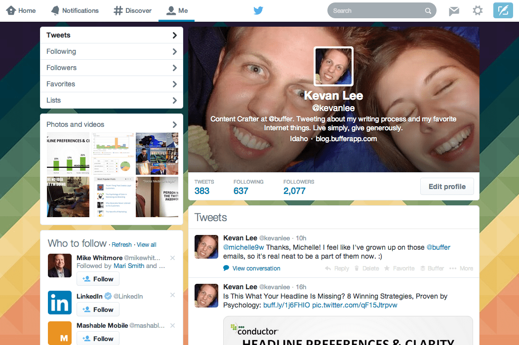
Here is a before and after of how the new Twitter profiles look.
Before: (I’m still waiting for mine.)
After: (Buffer’s Adam Farmer already got his.)
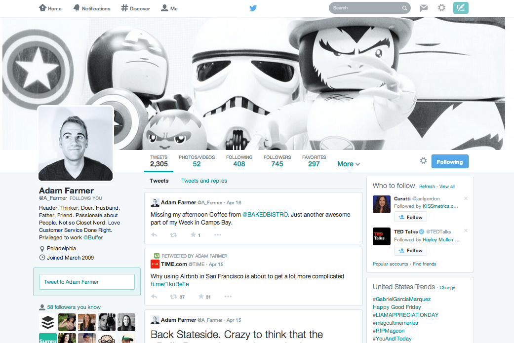
The full list of what’s changed appeared on Twitter’s blog when the redesign was announced. Here are the details:
- Larger profile photos. These photos are now 400 pixels by 400 pixels, the same aspect ratio as before but with larger dimensions.
- Customizable header image. This main image spans the browser, and users are encouraged to upload a 1500 pixel by 500 pixel image. Your current header image might fit, but the bigger scale might make it look a little fuzzy. (Images sizes are relative to device, too, so you might notice different layouts on different screens.)
- Best tweets. Your tweets with the most engagement will appear in a larger text size inside your stream of updates.
- Pinned tweet. You can pin one of your favorite tweets to the top of your profile page.
- Filtered views. When visiting someone else’s profile, you can choose how to view their tweets: tweets only, tweets plus replies, or tweets with photos or videos.
- Pinterest-style grid view of your followers, who you’re following, and your visual content.
These changes are being slowly rolled out to users over the next few weeks, so if you haven’t received the new profile yet, your turn is coming.
In addition, new users will start with these profiles, so if you’re at all interested in doing some early test runs to see how the profiles work, you can set up an alternate account and give the new design a go.
How might the new profiles affect you and your social media marketing? We’ve brainstormed some ways that you might be able to take advantage of this Twitter refresh. We’re curious to try these out for ourselves.
1. Header photos: Learn from the best Facebook pages
The comparisons of Twitter’s redesigned profiles to Facebook pages and profiles are obvious. So why not take a page from the most successful Facebook pages?
Many businesses big and small have found a way to use Facebook cover photos effectively. These inspiring samples might pique your own creative ideas for your new Twitter banner. One of my favorite lists of ideas comes from Constant Contact’s roundup of Facebook cover photos. Here are a couple standouts that you might consider trying:
Give back to your community with a user-driven header image

Show a behind-the-scenes look at your offices or employees

Show what you sell – products, services, widgets, or alpacas

(One minor note here is that you may not want to copy over your Facebook cover photo directly into your Twitter profile because the dimensions may be off. Facebook is 850 pixels by 315 pixels, and Twitter is 1500 pixels by 500 pixels.)
Certainly, the new size for the Twitter header image gives you more real estate to show off a branded message. The previous headers were covered with your Twitter bio and avatar, but these new ones have room to spread out.
What are some of your favorite Facebook pages? Can you take a cue from them when creating a Twitter header image of your own?
2. Pin a tweet that drives an emotion
You now have the ability to pin any tweet of your choosing to the top of your Twitter profile. That’s a lot of freedom. Where to begin?
- One of your best tweets
- An upcoming event
- A new announcement
- A tweet that summarizes your brand and mission
- A tweet that drives an emotion
You can go in a lot of different directions with your pinned tweet, so perhaps a good idea to keep in mind is the effect of emotion on your social media marketing.
We covered emotion in-depth in an earlier blog post, hitting on a number of different types of emotion and the feelings they engender. This particular emotion might be especially relevant to your social sharing strategy:
Happiness makes us want to share
Consider pinning a tweet that makes profile visitors feel happy—something positive, funny, or delightful, perhaps —and you might start a chain reaction of sharing.
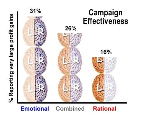
Emotion in general is a good indicator of effective marketing, as evidenced in a study by IPA dataBank. Their research points to emotional content outperforming rational content nearly two to one.
3. Share more photos and videos
The value of visual content is a topic near and dear to our hearts (and our experiments) here at Buffer. We have seen great results in adding photos to our tweets and in making those photos as self-explanatory as possible.
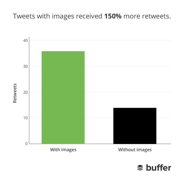
By our numbers, tweets with photos outperform those without. Tweets with photos get 18 percent more clicks and 150 percent more retweets.
So what does this have to do with Twitter’s new redesign?
Well, photos and video are much more prominent with the design refresh. At the top of every profile is a list of links, many of which are familiar from before: Tweets, Followers, Following. One of the new additions is Photos/Videos.

People who view your profile now have easier access to the visual content that you post. You’re likely already making a push for visual content, so the redesign should just add more incentive to keep your content fresh because it’s now top of mind for everyone.
4. Be aware of Twitter’s No. 1 rule for @-replies
If you have a tweet that you want the world to see, you should not start the tweet with an @ symbol.
Twitter recognizes this as a reply, part of a larger conversation. As such, these tweets are hidden by default in a number of places around the network, including the redesigned profiles.
The new Twitter timeline filters create distinct views of tweets, tweets plus replies, and tweets with photos and videos.
The default view is simply “Tweets,” minus the @-replies and conversations.
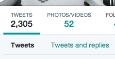
So if you want to ensure that your content is reaching the masses, be careful about when and how you use the @ symbol. And if you do start your tweet an @, be sure to place a period as the first character.
This type of tweet will end up in a stream:
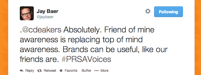
This won’t:

5. Rethink your “favoriting” strategy
There are many of us on Twitter who use favoriting as a form of social currency—and we’re all quite generous. I’ve seen examples of people marking tweets as favorites any time a tweet mentions their name or anytime a conversation ends and there’s nothing left to say. Favorites mean different things to different people on Twitter.
How does Twitter feel about favorites?
According to the redesign, favorites might be more important than many of us thought. The new look gives a Favorites tab a prominent place in the main navigation.

With this new focus, you might consider treating favorites in a different way. One idea is to use them as social proof for your brand. Favorite the recommendations, testimonies, and positive blurbs from your customers and fans, and transform your favorites tab into a board of brand high fives.
How will you use the new Twitter profiles?
If you’ve already started playing with new ideas on the Twitter profiles, what are you trying? What works? If you’re planning ahead on what to do, which of these ideas might you try?
I’d love to help you brainstorm in the comments or hear your ideas on how to best take advantage of the new designs. Oh yeah, we can take the conversation to Twitter, too. ?
P.S. If you like this post, you might also like Twitter Tips for Beginners: Everything I Wish I Knew About Twitter When I Started and The Power of Twitter’s Expanded Images.
Image credits: Twitter, Constant Contact, Wix, Neuroscience marketing.
Try Buffer for free
190,000+ creators, small businesses, and marketers use Buffer to grow their audiences every month.


