The 5 Techniques That Increased My Conversion Rate by 134.85% in 60 Days (You Can Do the Exact Same Thing)
This may sound crazy, but here it goes…
Building your email list isn’t as hard as you think.
Really.
In fact, when you know what to do and how to do it, list building is pretty darn simple.
How do I know?
I struggled with my blog’s conversion rate (1.4%) for over a year.
That is, until I discovered the 5 secrets that I’m going to reveal to you in this post.
After implementing these 5 simple techniques, my blog’s conversion rate skyrocketed by 134.85%.
And today I’m going to show you exactly how you can do the same thing on your blog.
But first, let me show you what already worked
OK, so a 1.4% conversion rate may not be anything to brag about. But I know quite a few bloggers that would trade their left kidney for a 1.4% conversion rate.
And I’d be doing you a disservice if I didn’t tell you what helped me get to this:
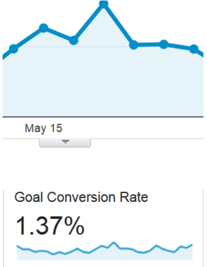
Before showing you the 5 strategies that led to this:

1. I turned my about page into a squeeze page
When someone visits your About Page, it means two very important things:
- They enjoyed what they’ve read on your blog
- They want to learn more about you
In other words, they’re already primed to subscribe.
So why wouldn’t you pitch your email list directly on your about page?
In fact, I have two opt-in forms embedded inside of my About Page.
#1
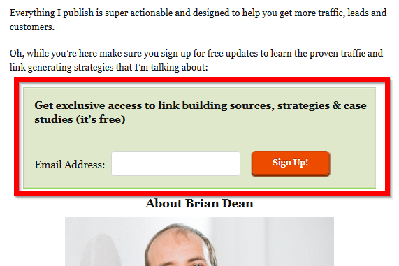
#2
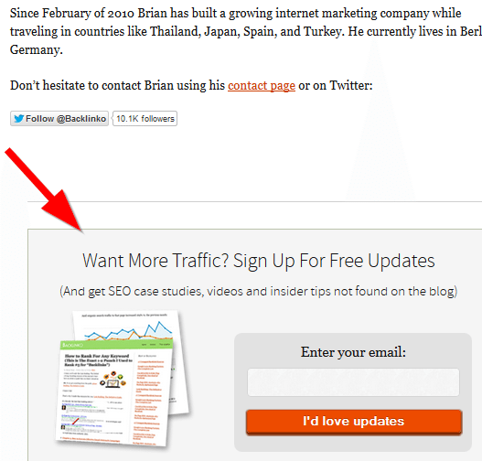
And those two forms convert like gangbusters.

In fact, before implementing the 5 strategies I’m going to reveal to you in a bit, my About Page converted 4x better than any blog post on my site.
2. I used this box to turn my homepage into an email-sucking vacuum
A feature box is a giant box that sits on top of your blog’s homepage.
Its job?
To collect emails like a boss.
Here’s mine:
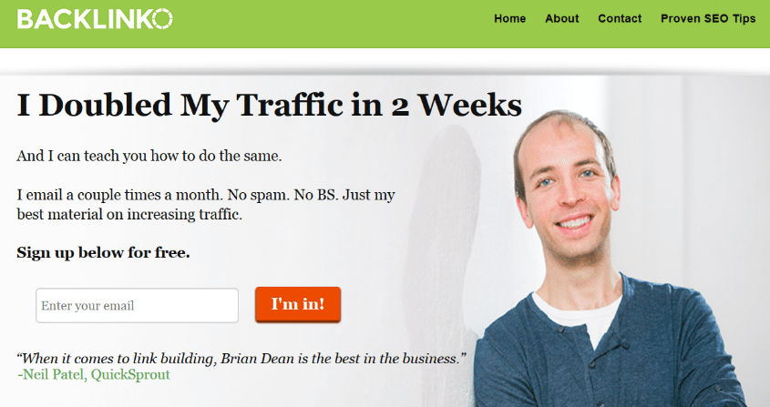
The feature box works because it puts your opt-in offer where people will actually see it.
As you know, most op-tin forms (like in your blog’s sidebar) are VERY easy to ignore.
On the other hand, a feature box is right in your visitor’s face (without being obtrusive).
In fact, this very blog has a nifty feature box:
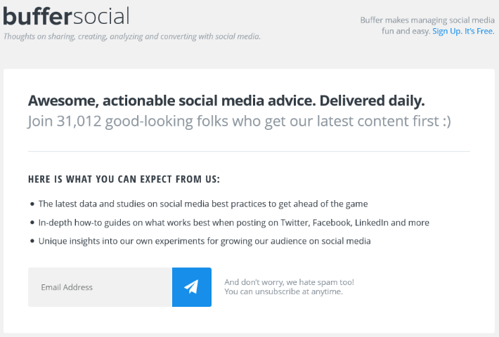
Here are the elements you want to include in your feature box to maximize conversions:
- Placed above the fold on your blog’s homepage
- Strong, benefit-driven headline
- Concrete reasons why people should sign up
- Social proof in the form of subscriber numbers or a testimonial
Thanks to my FeatureBox, my homepage was one of the best converting pages on my blog:

3. I created a squeeze page that converts at 21.7%
If you’re serious about building your email list, you NEED at least one page on your blog that exists solely to collect emails.
Also known as squeeze page.
The only problem is:
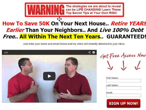
Traditional squeeze pages don’t covert like they used to.
When today’s visitors see an overhyped squeeze page like this, they hit their back button faster than you can say “spam”:
The fact is:
If you want people to subscribe to your list, you need to offer value on that page.
How can you do that?
Something I like to call the Social Squeeze Page.
It’s a page that offers a valuable video…and several opportunities to sign up to your list.
Here’s an example from Backlinko:
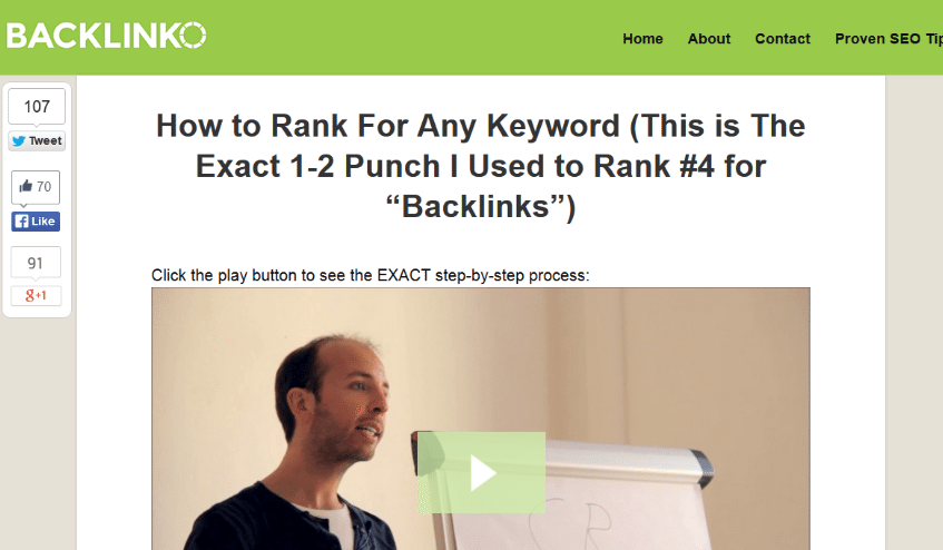
As you can see, that page looks NOTHING like your average squeeze page.
And in many ways it isn’t. Unlike traditional squeeze pages, the #1 priority of a Social Squeeze Page is to provide value.
Value is nice and all, but you’re probably wondering “how does it convert?”
Does 21.7% do anything for you?
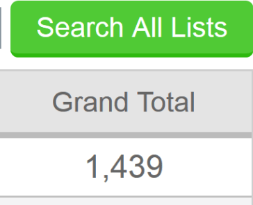
Not to mention the fact that over 1400 people to date have signed up to my list via my Social Squeeze Page:
Here’s how to set up your own Social Squeeze Page:
Step #1: Choose a Hot Topic
Your topic needs to be something that people struggle to find anywhere else.
Because SEO case studies are so rare, I decided to make my Social Squeeze Page about a real life SEO case study.
Step #2: Create Your Video and Page
There’s no shortcut: your video has to really bring it.
The upside is that an awesome video will maximize the number of subscribers you get from your Social Squeeze Page.
In fact, my video provides so much value that it’s been shared on social media over 250 times.
Try getting shares like that from your traditional “gimme your email!”-style squeeze pages.
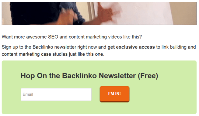
Once you have your video ready to rock, add at least one opt-in form right below the video:
Step #3: Promote Your Page
You need to treat your Social Squeeze Page like a blog post.
That means promoting it just like you would any other awesome piece of content on your site.
For example, I shared my Social Squeeze page on Twitter, Facebook, Google+ etc.
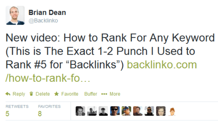
I also sent it out to my email list.
And that promotion has helped the page generate over 6000 unique visitors over the last year.
Here’s where I struggled…
Those average conversion rate of the 3 pages I described above was an impressive 10.64%.
As long as someone landed on my homepage, my about page or my Social Squeeze Page, I was good as gold.
Only problem was:
90% of my site’s visitors landed on a blog post.
And my average blog post conversion rate was less than 1%.
Not good.
That’s when I decided to focus on turning blog post readers into subscribers.
The result?
My conversion rate skyrocketed by 134.85% in two short months.
Here are the 5 strategies that did the job.
1. Wow visitors with the content upgrade
Raise your hand if you’re PUMPED when you get access a free ebook.
Don’t feel bad: I didn’t raise my hand either.
The fact is, ebooks and free reports ain’t what they used to be.
The fact is,if you want people to subscribe in 2014, you need to offer something laser targeted.
I’m talking about a giveaway so insanely targeted that it’s on the EXACT topic that they’re reading about.
Let me give you an example…
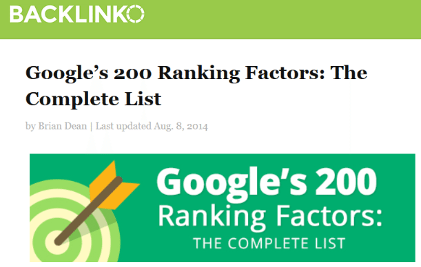
The most popular post on my blog is “Google’s 200 Ranking Factors: The Complete List”.
It’s a post that attempts to outline a list of 200 potential signals that Google uses to rank pages:
Even though that post has brought in over 100,000 unique visitors to my site, VERY few of them have converted into subscribers.
In fact, that post was converting at a paltry 0.57%.

The reason?
I didn’t have ANYTHING compelling on that page that would get someone to sign up.
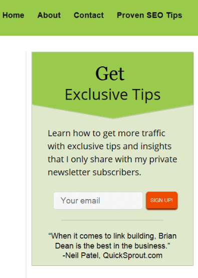
Sure, I had your run-of-the-mill sidebar opt-in form:
And another one at the bottom of the post:
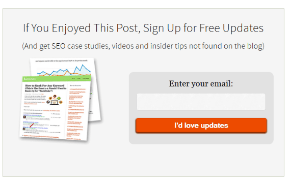
But those two forms weren’t enough to move the needle (as the .57% conversion rate proves).
That’s when I decided to try something a little bit crazy:
Offer a giveaway unique to that post.
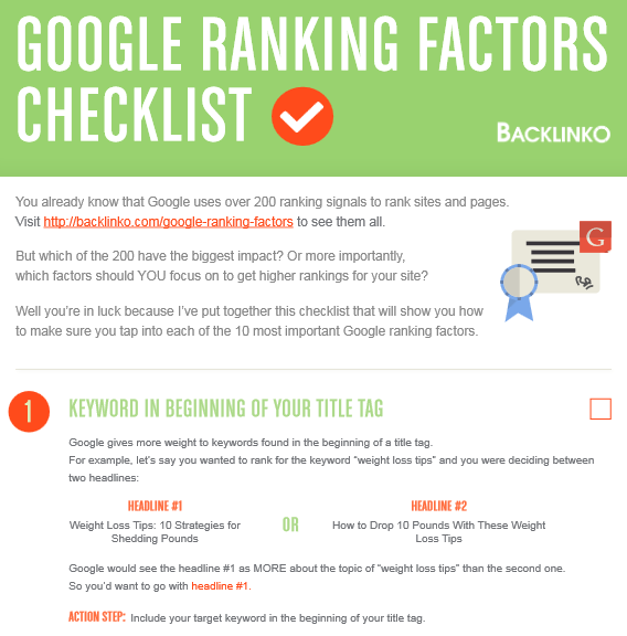
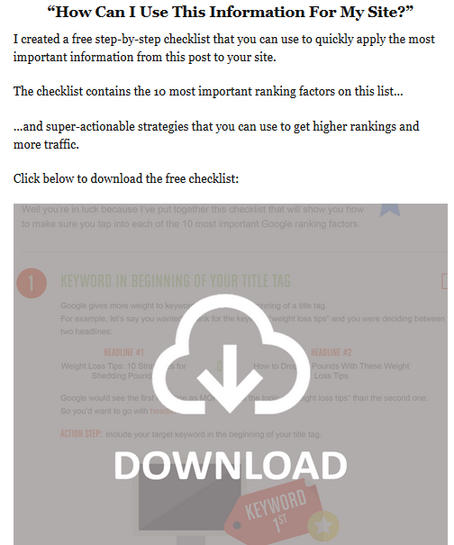
I quickly whipped up a checklist that outlined the 10 most important ranking factors on the list.
Here’s what the checklist looks like:
Then I added two pitches for the checklist within the blog post itself.
One pitch at the top of the post…
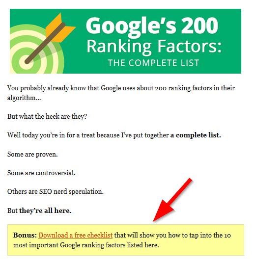
And I added another at the bottom (with a nice download image):
What happened?
The conversion rate on that post jumped by 785%.
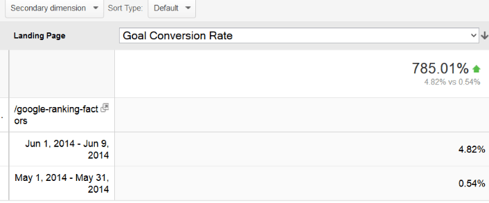
I call this list building superpower The Content Upgrade.
That’s when I realized:
The Content Upgrade works so well, I should apply this to every popular post on my site.
And that’s what I did.
To date I’ve added the Content Upgrade to 14 additional posts. And the conversion rate on those posts have also bumped up considerably.
I’m not the only one that’s seen stellar results from The Content Upgrade.
Bryan Harris at VideoFruit.com routinely uses this strategy on every single one of his blog posts.
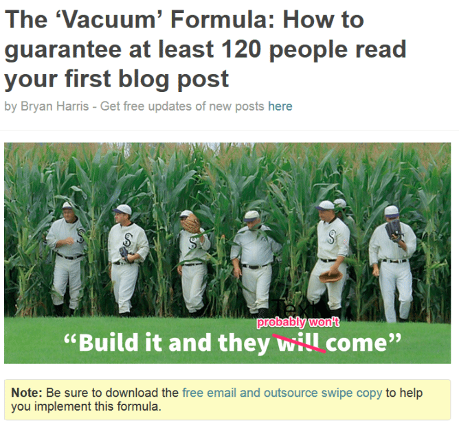
Bryan reports that many of his blog posts convert at 20-30% (!) thanks to The Content Upgrade.
Ready to try it?
Here’s the step-by-step formula:
Step #1: Find a popular blog post on your blog
I’m not going to lie to you:
The Content Upgrade takes some work to set up (mostly from creating the upgrade itself).
To get the most bang for your buck, start The Content Upgrade on a post that generates the most traffic.
Not sure which posts are driving the most visitors? Google Analytics will hook you up.
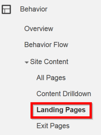
Step #2: Create a resource that will make your blog post even better
Next, create a bonus that would add value to your existing post.
Here are some ideas to get you started:
- PDF checklist (my personal favorite)
- List of “additional resources”
- A tutorial (video or PDF)
- An excel spreadsheet
- Infographic or diagram
The possibilities are endless.
Don’t get too bogged down choosing the type of resource. As long as it fits the blog post’s topic like a glove, you’re set.
Step #3: Offer the bonus within your blog post
This is key.
If you want your readers to see your Content Upgrade offer, you need to pitch it inside of your blog post.
As I mentioned earlier, adding opt-in form offers at the top and bottom of my blog posts worked best for me.
That way, readers can’t possibly miss your pitch to sign up.
Key takeaway: Creating post-specific bonuses (“The Content Upgrade”) can quickly skyrocket your blog’s conversions. If I could only give you one piece of advice, I’d say: “try the Content Upgrade”.
#2: Have Fun With Your Copy
The fact is, signing up for an email list is a stressful moment:
“What if they spam me?”
“What if they sell my email address?”
“What if that ebook ends up being useless?”
I used to write copy that made those fears even worse.
I’d say stuff like:
“Register for my email list”
“Sign up for my newsletter”
Needless to say, scaring the hell out of people doesn’t encourage people to sign up.
Instead, I’ve found that fun, upbeat copy makes skittish subscribers more likely to pull the trigger.
For example, I make sure my opt-in button copy is upbeat and positive.
Instead of “submit” and “register”, I use phrases like “Let’s do this!” or “Get proven SEO tips”.

In my experience, copy like this converts MUCH better than “register” or “submit”.
I also like what they do here at the Buffer blog.
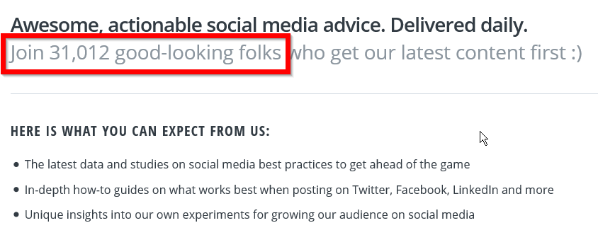
That little joke makes the sign-up process A LOT less stressful.
Key Takeaway: Ditch terms like “Sign up” and “Register”. Replace them with fun and positive copy like “I’m in”, “Get free tips”, “Let’s do this!” and “Send me my ebook!”.
#3: Gently Nudge Visitors With a Popup
For some reason people get super emotional when they talk about using popups.
“I WOULD NEVER USE A POPUP. I HATE POPUPS SO MUCH!!!!”
The truth is this:
When done right, popups get results.
HUGE results.
Results like this:
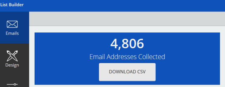
(Those stats are from a tool I’ll talk in a bit)
And contrary to popular belief, your readers don’t mind popups as much as you may think.
In fact, my site’s popups have been seen by over 15,000 people. And I’ve received a grand total of one complaint.
If you’re ready to give popups a try on your blog, I recommend the free and highly-customizable SumoMe.
Of all the popups I’ve tested, it’s the easiest to set up. And when I first added it to my site a few months ago, my conversion rate more than doubled overnight.
So you may be wondering: how well do popups actually convert?
My popup conversion rate is 3.5%.
(As I’ll show you later, I’ve found a way to easily double this conversion rate)
Here are some things I did to make my popup work so well (and not annoy the crap out of my visitors).
Exit-intent
There’s nothing worse than digging into an awesome article…
…only to be interrupted by an annoying popup.
As Full House’s Stephanie Tanner would say: “How rude!”.
Fortunately, you can set your popup so that it only appears for people that are about to leave your site anyway.
I’ve found that exit intent popups annoy visitors less than popups that appear after a certain time frame.
That’s a win-win if I ever heard of it.
Give Your Visitors a Breather
As I said, most visitors don’t mind closing the occasional popup.
But if you bug them every time they stop by your site, you WILL annoy people.
That’s why I set my popups to not show again until 90 days after someone closes it out.

Craft a Valuable Pitch
If you’re going to bug someone with a popup, you want to make it count.
Don’t waste the opportunity by pitching something lame like “free updates”.
Use something ultra-specific instead:
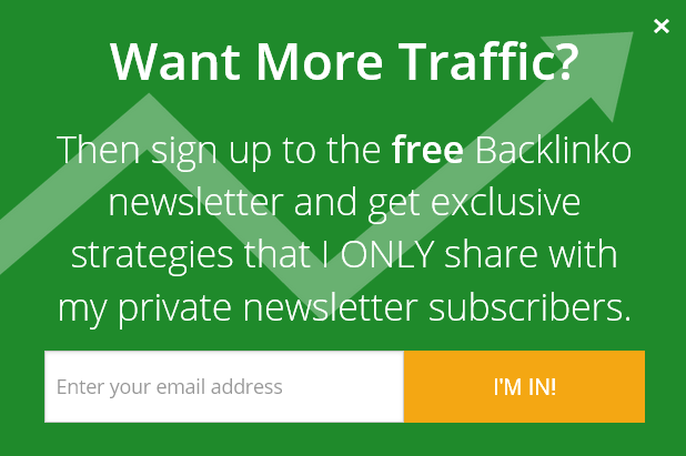
As you can see, my popup pitches a crystal clear benefit (“more traffic”).
Conversion experts agree:
Crystal clear benefits (“lose 10 pounds this month”) outperform vague promises (“get healthier”).
Every. Single. Time.
Key Takeaway: I recommend at least TRYING a popup if you haven’t already.
#4: Content Upgrade Popups
OK so you’ve tried your first popup and are pleased with the results.
Nice work.
Yu probably want to know: “How can I make my popup convert even better?”.
The answer: combine the laser targeted Content Upgrade with the attention-grabbing popup.
In other words, a Content Upgrade Popup.
Here’s what I mean:
A few months ago every single visitor on my blog would see the same exact popup.
It didn’t matter if they were reading about list building or keyword research. That popup is what floated in front of their eyes.
Although that popup converted nicely, I realized something:
It wasn’t targeted to what my visitor was reading…AT ALL.
So I applied what I learned from The Content Upgrade (laser targeted>generic pitch), and created a popup specific for each page.
(I used a popup software called OptinMonster to create page-specific popups)
Here’s an example from my Keyword Research Guide:
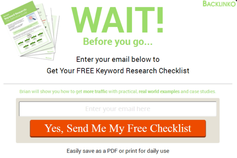
It probably won’t surprise you to find that my laser targeted Content Upgrade Popup converts at over 6%.
That’s 50% better than the generic popup.
Before you think “that’s too much work”, hear me out: You don’t necessarily have to create a unique popup for every single page.
You simply need to create a popup for each TYPE of post on your site.
For example, if you ran a health and fitness blog, you’d create different popups about:
- Losing weight
- Nutrition
- Building muscle
- Stress relief and meditation
Then you’d use each of those popups on the corresponding page.
So:
You’d use your “losing weight” popup in articles like “10 foods for fighting fat” and “The no-nonsense guide to interval training”.
And you’d have your popup about building muscle appear on articles like “5 moves for bigger biceps” and “Use this little-known trick to squat 50% more weight”.
That way each popup would resonate with the person reading that specific article.
Key Takeaway: Laser-targeted pitches within popups can dramatically increase their effectiveness
#5: I Pitched Subscribers Within Blog Posts
Here’s the truth about building an email list in today’s world:
Traditional list building like sidebar optin forms and ebook giveaways are becoming less and less effective.
“Banner blindness” has crept into the strategies you and I use to build our email lists.
So what can you do to keep people’s eyeballs fixated on you opt-in forms?
It’s simple, really:
Pitch your email list inside of your content.
How?
It’s simple: pitch your newsletter, an ebook or a free report inside of your blog posts.
For example:
I recently tested this strategy with one of my latest posts.
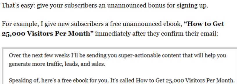
In that post I casually mentioned an ebook that I give away to my newsletter subscribers.
Then I thought of something:
If I’m going to talk about the ebook, why not give people an opportunity to subscribe right then and there?
So I included a brief pitch for the ebook inside of the post:

That single-sentence offer has turned into 81 new subscribers.
Here’s another example:
A few weeks back I published a post in kind of a rush. So much of a rush that I didn’t have time to create a Content Upgrade for the post.
Instead of a Content Upgrade, I created a little teaser for the next post coming up.
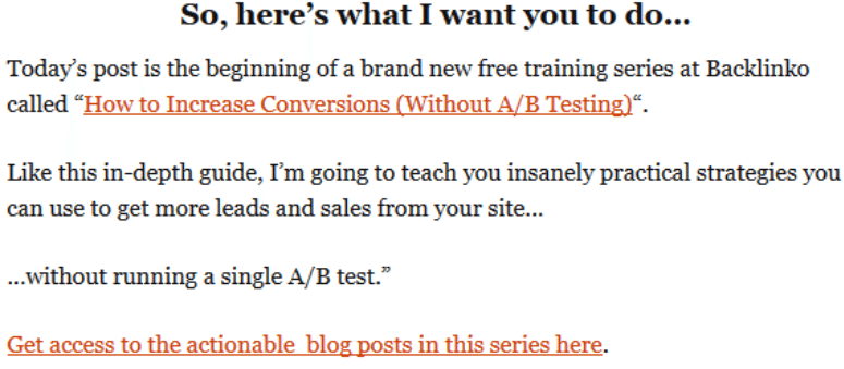
That teaser added 330 new subscribers to my list.
This is something I plan on experimenting more with in the future.
Key takeaway: Give readers an opportunity to join your email list from within your blog posts.
Ready to get started? Here are a few bonuses to help you out.
It’s important to me that you use the strategies that I shared with you today.
To help you do just that I’ve set up a special bonus section just for you.
The free bonuses include:
1. Two awesome list building techniques that I didn’t have room to include in today’s post.
2. Step-by-step PDF checklists that will help you quickly implement The Content Upgrade and the Social Squeeze Page (two of the most powerful list building strategies from this post).
3. My personal “swipe file” of conversion rate optimization tutorials and case studies
You can enter the bonus area by signing up here.
Brian is the Berlin-based creator of the SEO blog Backlinko.com, a case study-focused site that reaches over 70,000 marketers every month. When he’s not writing case studies for the blog, he’s…testing stuff out so he can write case studies on the blog.
Try Buffer for free
180,000+ creators, small businesses, and marketers use Buffer to grow their audiences every month.
Related Articles

Black Friday and Cyber Monday marketing guidance to help you stand out from the crowd in 2024 — complete with tried-and-tested examples.
In this article, I’ll explain what SEO is for social media, why you should care about it, and how you can use it to your advantage.

I spoke to leading B2B content marketers (an in-house content director, agency owners, top freelancers, and thought leaders) to find out what they think B2B brands can do to create good content in 2024.