We’ve been working hard at Buffer to launch new features and products, improve existing product areas and build out our internal tools to help us move faster than ever. This is our first product report of the year, and I’d love to explore everything going on behind the scenes at Buffer!
What we launched: New product launches in June
In June we had several major launches that are helping us to move the needle of Buffer’s growth.
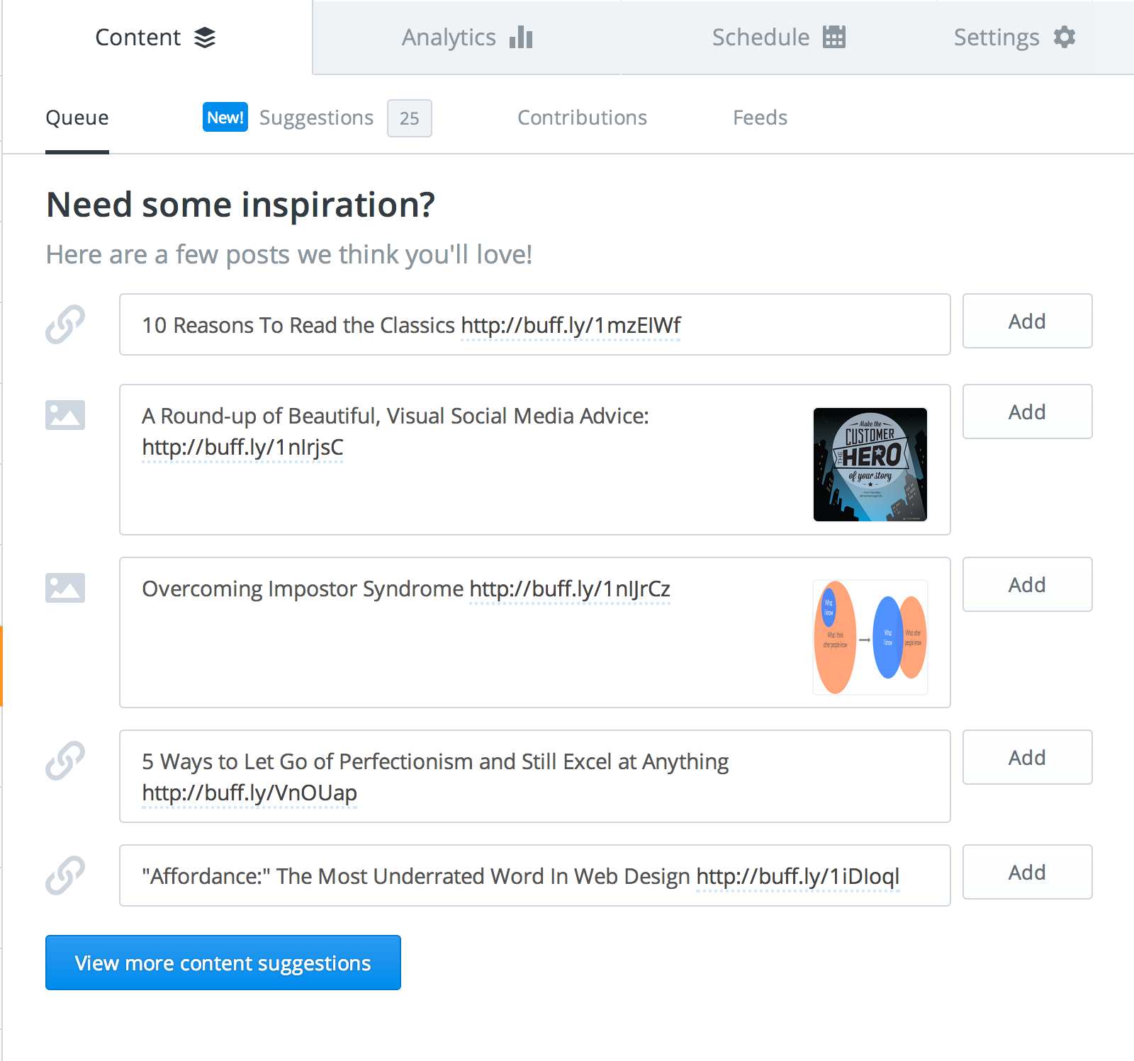
In the web app, we’ve begun curating new topics for content suggestions. Suggestions are also available for Facebook pages. We’ve seen an amazing reception of our content suggestions from the Buffer community, and we’re excited to keep developing this area of the app to make finding and sharing content easier than ever!
We’ve had a big month for mobile as well, including a brand new iOS product, Daily, a design refresh of our flagship iOS app and a rollout of a redesigned Android app! Daily by Buffer provides a simple, accessible way to browse content suggestions and add them to your queue. We’re now seeing more than 5,000 suggestions being shared through Daily each day, and we’re working hard to make Daily more useful for everyone that enjoys thoughtfully-curated content.
Our main iOS app underwent an incremental redesign in June, bringing a new navigation structure and color scheme to all areas of the product. The new style reflects our efforts to unify the different areas of Buffer underneath one centralized style guide. In addition to the redesign, the Buffer iOS app now supports feeds management – Buffer users are sharing more than 3,000 feed items per day, and we’re excited to continue making this area of the product more powerful for our Awesome and Business users!
What we’re testing: Experiments at Buffer
Experiments at Buffer are a major part of our product development workflow. In June, we rolled out several new experiments focused on revenue, activation and increasing overall sharing with Buffer.
Here are a few of the key experiments we launched in June:
1. Add a ‘share image’ button when hovering over images
For users with the browser extension installed, there’s now an even easier way to share images with Buffer! Simply hover over an image and click the ‘share image’ button in the bottom right corner to activate the extension.
Decision: We’ve found that this experimental feature has increased image sharing—and sharing overall—from folks who use the Buffer browser extension.

2. Show suggestions in the empty queue
If your queue is empty, we now show you our favorite content suggestions of the day below the composer.
Decision: We’re still awaiting statistically significant data on this experiment

3. Disable the 7-day free trial for business users
We ran an experiment that removed the 7-day free trial from the business plans at Buffer. We wanted to learn more about how the trials are being used, and how they impact upgrades to our business plans.
Decision: We’ve decided that it didn’t feel quite right to remove the trial from our business plans. We decided to return the trials for all users.
4. Change the default tab in the Buffer web app
We launched an experiment to try and increase the activation rate of new users. On a basic level, we consider activation to be a new user sharing their first post through Buffer. For this experiment, 50% of users landed on the ‘Queue’ tab, while the other 50% landed in the ‘Content Suggestions’ view.
Decision: We’re still awaiting statistically significant data on this experiment.
5. Show content suggestions during the onboarding flow
This is another activation experiment we launched to see if showing content suggestions before a new user hits the dashboard would improve sharing.
Decision: We found that this experiment successfully activated new users, so we’ve rolled it out to be a new part of the onboarding flow of Buffer.
Scaling the team: How our workflow has changed
As our team has grown in 2014, we’ve experienced some growing pains in terms of product management and overall development workflow. Late in June, we decided to change our approach to development which I’d like to share below.
Our previous workflow looked a bit like this:
Each week I would evaluate everything that had been built during the previous week. Based on what was completed, I specced out the next week’s tasks for each engineer individually.
Joel and I would collaborate on the weekly plan to find a good balance of new feature developments, bug fixes, product quality improvements, and code quality/refactoring.
This flow worked well enough for us while we had just a few engineers. As we’ve hired more people, however, a few problems with this process began to emerge:
Each engineer ended up working in a different product area each week. It wasn’t unusual for a developer to spend a few days on the dashboard, then jump to the extension, then return and add endpoints to our API. Having this broad knowledge of the codebase has historically been helpful for us so that any engineer can feel comfortable in any part of the codebase. The downside of this, however, is a lack of focus and expertise on each important area of the product.
Over time it was hard to build up an invested ownership in any particular area of the product. Constantly switching between different product areas felt more distracting and less productive, and didn’t help engineers to feel a long-term sense of accomplishment or growth.
Below are a couple key points about our new, restructured workflow. We’re still experimenting here to make sure things feel right for all our engineers and team members.
- We’ve broken down the entire Buffer product into distinct areas: the web dashboard (further broken down into content/sharing and analytics), the browser extensions, mobile (including iOS and Android), growth, and happiness. Growth simply refers to the internal tools we use at Buffer that help us track key metrics like activation, retention, signups, churn, and revenue (among a plethora of other data points!). Happiness refers to the internal tools we use to track our response times and response volume to customer emails and tweets. These tools help us keep an eye on our current capacity to help our customers as quickly and thoroughly as possible.
- Each engineer now “owns” a product area. For example, one engineer can now focus entirely on the browser extension, working to improve key metrics, speed, code quality and launch new experiments.
- Code reviews remain cross-domain, which means that engineers will still be exposed to the new code launched in other product areas. The goal here is to keep everyone in sync on what bugs are being fixed, what features are under development and what new launches are happening in different parts of the product.
In the last week, since we’ve changed up the workflow, things have been moving much faster. Our hope is that this new process will help us be more focused in each specific area of Buffer, increase the rate of new feature development and allow us to spend time on speed improvements and code quality.
Up next: What we’re working on at Buffer this month
As part of these monthly product reports, I’d love to offer a brief look into the short-term projects we’re working on at Buffer!
- We’re setting up several experiments at the moment to improve our onboarding experience. We’re starting from scratch to craft the first-time flow for brand new Buffer users in an effort to improve activation and help users find the value of Buffer faster than before.
- We’re integrating the Buffer browser extension with more sites, making sharing easier than before – keep an eye out for Buffer links on Quora, LinkedIn and Pinterest in the coming weeks!
- We’re rolling out a totally refactored composer that users will see in the browser extension and web dashboard, helping to provide a more consistent (and developer-friendly) experience!
- We have three engineers working hard to build up our internal tools – like the growth and happiness dashboards – that will help us to gather and analyze data faster than ever before. A new initiative in the growth area is a project called Seamless, which will allow us to launch experiments and begin collecting data instantly. This means that we’ll no longer need to run queries each day for each metric we’re tracking – all of this will be automated on the backend.
- We’re also rewriting the way that our team creates and curates content suggestions for Buffer. This process currently takes 10-20 hours per week to manage content suggestions – we’d love to knock this down to less than an hour per week of management and editing.
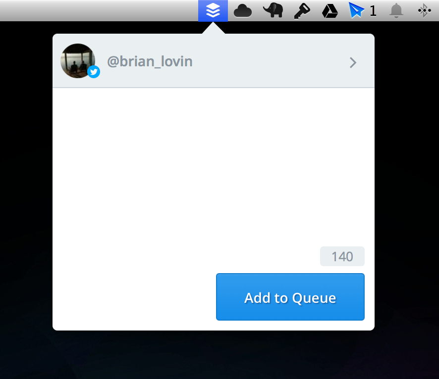
- We’re experimenting with a new Mac toolbar application! Here’s a sneak peek:

- If you’re an Android user, get ready for a big Android update coming in July! We’ve already begun rolling out a major overhaul to the design and structure of our Android app, bringing both the style and navigation more in line with the web and iOS apps. Expect your app to update sometime in the new few days!
- Finally, we’re working a redesign of the Buffer blogs! The blogs are seen by hundreds of thousands of people each week, and we’re working hard to unify the experience between the blogs and other areas of the Buffer product. Keep an eye on blog.bufferapp.com in the coming weeks for this design refresh!
Over to you
This is my first crack at a monthly product report for the Open blog, and I’d be keen to hear what you’d enjoy hearing more about!
What areas of the product interest you? Which launches, experiments, and future projects caught your eye? Simply leave a comment here on this post. It’d be awesome to hear from you!
Try Buffer for free
190,000+ creators, small businesses, and marketers use Buffer to grow their audiences every month.


