When you sign up for a new app, what are the first steps you take?
Customizing your settings?
Installing add-ons and extensions?
Setting up your profile pic? (<– this is a personal favorite)
The steps you’re asked to take—click here, customize this, try that—are referred to as onboarding, the process of helping a new person get accustomed to a new place.
You’re likely to experience onboarding in many different cases. There’s onboarding in the new apps you download and services you use. There’s onboarding when you start a new job or take on a new role.
There may even be a subtle type of onboarding in the way that you organize social media marketing campaigns to support the content you create. Can content be considered a type of onboarding? And if so, how might we be able to help a new person get accustomed to a new piece of content? I’d love to explore these questions further—and to hear from you about any thoughts this brings up!
What we learn from how new users experience an app
The idea of content as onboarding struck me as I was reading through some onboarding research that Buffer co-founder Leo Widrich had shared with our team. He looked at the routes taken by individual Buffer customers in their first several interactions with the product. For example, here’s one person’s route:
- First day
- signed up via email
- skipped onboarding
- connected facebook
- connected Twitter
- changed their schedule
- connected bit.ly
- Second day (3 days later)
- changed schedule some more
- shared update through dashboard
- played with queue editing, twitter auto-complete, etc.
- added lots more updates
It’s fascinating detail to know! And it helped me remember back to when I first started using the product, too. (If you have similar memories, it’d be really cool to hear your first steps also!)
Looking through this research, a couple of big thoughts surfaced:
- A lot of my assumptions were wrong about how people come on board with Buffer.
- Onboarding is quite the non-linear flow.
In my mind, I had an idea about how people may first use the product, going progressively from adding content to adjusting the schedule to editing the profile, all on the first day. My assumptions were wrong. The awesome people who use Buffer have their own unique way of starting out with the product, likely influenced by things like past experience and even how their day is going.
Can these lessons from product onboarding relate to how your audience consumes your content?
How readers find your content
What is your audience’s first touch point for your article?
When someone lands on a piece of content, they must have arrived from somewhere.
- Via social media
- Via an email newsletter link
- Via a search results page
- Via an RSS reader
What I find most interesting is that the way someone arrives at the content I write is very seldom the same way I arrive at my content. I view my content by clicking on the Preview link inside my blog post editor or by navigating directly to the blog post URL itself. In doing so, I may be missing out on a chance to empathize with my audience’s experience and perspective.
They’re likely not finding my articles via the URL I use to preview my writing—unless I could somehow sneak into all my readers’s homes and add the URL to their browser window before their next Internet session.
A reader must take an action before finding an article.
So in trying to see things from the reader’s perspective, here is a bit more detail about the different ways someone can find an article and the different factors that may be taken into consideration for whether they click through or not.
Via social media. This could mean being enticed by a headline in a social media stream, a photo/visual/image, the social proof of a lot of likes or comments, or something as simple as seeing your name + “new content.”
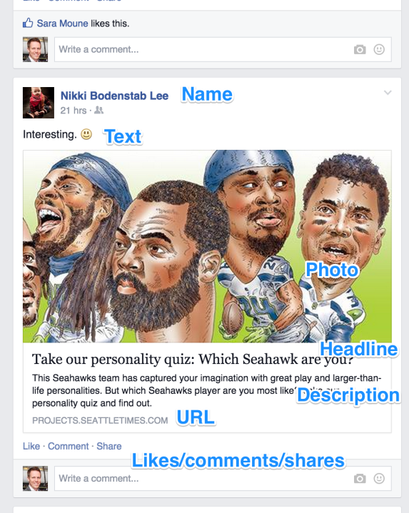
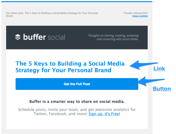
Via email: The reader must be intrigued enough by either a) the subject line or b) the “From Name”. And then, in the body of the email, there must be a further connection to your content: a headline, a thumbnail photo, a button.
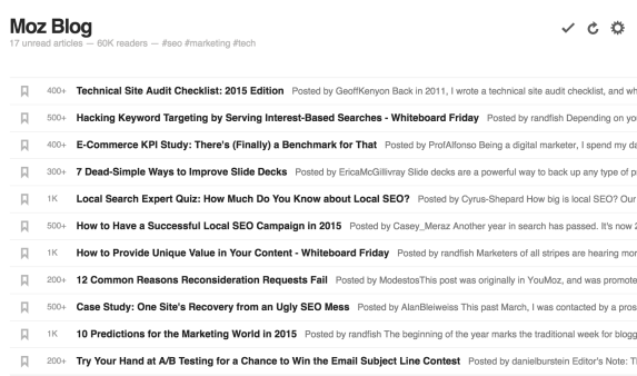
Via an RSS reader. Depending on format of the RSS reader, this touch point could be a headline or a photo/visual/image. Here’s what a list of posts looks like in Feedly’s list view.
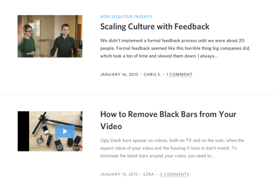
Via your blog or website homepage. Some folks might bookmark your home page and come back daily, weekly, frequently, etc. They’ll see your headline or thumbnail however you might have this designed on your blog. Here’s a sample from the Wistia blog:
How do people read your posts?
For that matter, how do you read blog posts?
When I write a new post, I get absorbed into the flow and minutiae of the words. I pore over the details. I observe my content from a deep, thorough perspective, which is super great for creating high-quality content—yet it’s likely to be quite different from how an average reader experiences things.
The way I view my content as the writer may not be the same way someone views my content as its reader.
I like to think of this with a cooking analogy. We writers are the chefs, and blog posts are our entrees. We fuss over the perfect ingredients, seasonings, and pairings. Meanwhile, a huge handful of the people we serve might eat the salmon and push the spinach off to the side, or say it tastes “good” without recognizing any of the subtleties, or pick off all the capers and take 3/4 of it home in a doggy bag to microwave later.
Point being, there are a million different ways to consume content, including the way we writers consume it ourselves, which is quite often different than how our reader does.
For instance, here’s an “onboarding flow” for a recent post I enjoyed.
- First day
- See an interesting link mentioned in a newsletter.
- Save to my Pocket account to read later.
- Second day (5 days later)
- Notice the image + headline in my Pocket.
- Remember why I wanted to read this in the first place.
- Open the story in Pocket.
- Read the first heading after the intro.
- Get intrigued by heading, read the first part of the section.
- Start scanning.
- Find an ordered list and start reading.
- Get hooked.
- Read the rest of the story.
- Mark the story as favorite in Pocket, which turns on an IFTTT recipe to add the story to my Buffer.
- Revisit the story in my Buffer queue to change the text of my status update and to check on imagery.
- Share.
To a certain extent, it’s possible to find these unique onboarding flows for your content by looking at your website stats and social media stats and by using a few helpful tools.
For the stats, you can dig in to categories like referrals to see how people are getting to your website. In Google Analytics, you can find this report by going to Acquisition > All Traffic > Referrals. The results you get will show the URLs that someone visited before landing at your website, and these URLs will include social networks like Facebook and Twitter, tools like Feedly, and other websites that may have linked to you.
(Note: You can tell if someone visited from a mobile version of Twitter or Facebook by noticing the URL. If you see t.co in your list, this is a mobile Twitter visit. If you see m.facebook.com, this is a mobile Facebook visit.)
Another neat way to learn how people read your articles is with tools like CrazyEgg and Inspectlet.
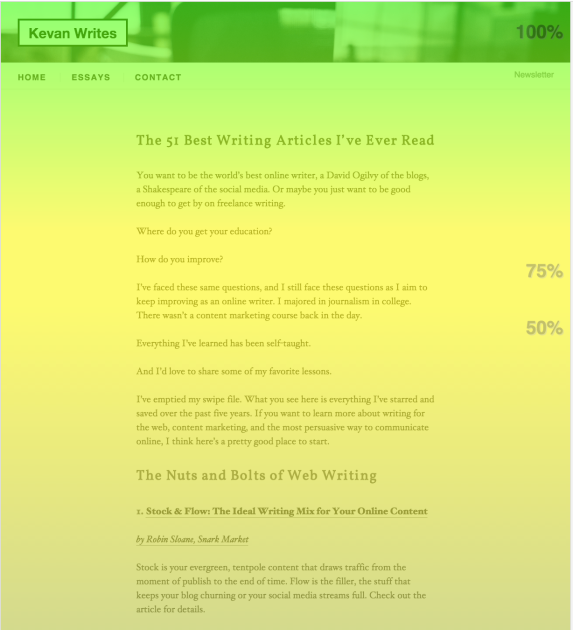
One interesting takeaway from these tools is the heatmap feature, which shows you much of your page is being viewed on average. Here’s an example of a page from my personal website.
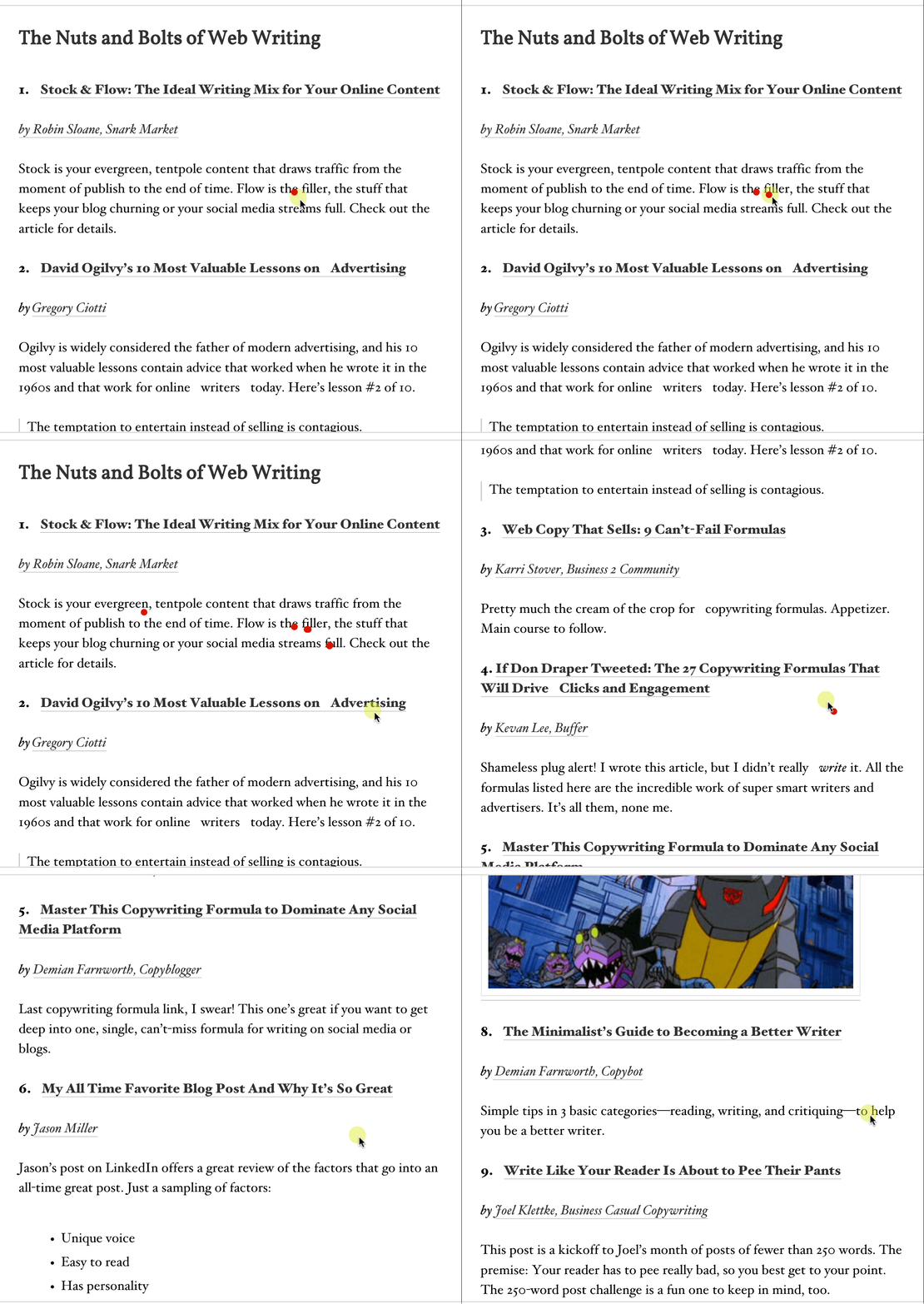
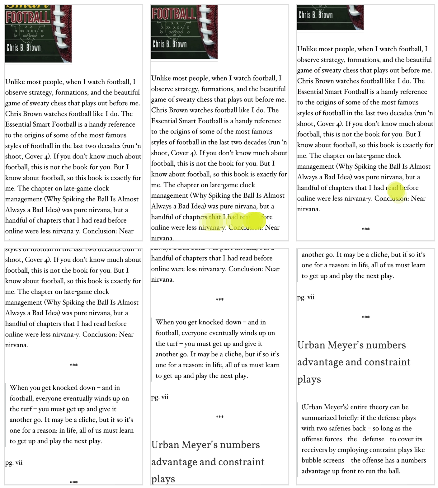
Inspectlet also has a way to record the sessions of your website visitors so that you can see exactly how someone scrolls and where they move their mouse (or finger, for mobile devices). Here are a couple examples.
On desktop.
On mobile.
How to design your content to best help your audience
Jakob Nielsen’s 1997 article on how users read on the web continues to be relevant and true even to this day.
In general, people don’t read on the web, they scan.
I like the modern take, written this past year, by Zana Fauzi and Dahlia Ahad of Stampede Design as they describe how people consume online articles and content.
The way users read on the Web is different from the way they read printed pages. People rarely read word-by-word on the Web. Internet users scan a page until they find something of interest, and then they read.
This is a hugely helpful reminder for me as I think about not only the way that I write content but also the way that I design content. It seems a bit odd to talk about “designing content,” but as you might notice from the way that people actually look at your website (thanks to tools like Inspectlet), it’s clear that a well-designed article carries great value.
Here are some elements to consider as you’re designing your content and helping your audience find nuggets of interest.
The headline
Does your reader really look at your headline? Or, better put, does the headline on your article’s page make a difference on whether the reader keeps reading?
Quite possibly not. They’ve already seen a headline on social media or email or RSS. They might very well skip it here on your post. Headline writing remains a super important part of a quality piece of content. However, it may be that the most important headline you write is the first headline that your audience sees—and increasingly, those headlines appear in social media streams and email subject lines.
The meta information
Here’s another area that might often get skipped by a reader … unless it catches the reader’s eye for the wrong reason.
An untrustworthy profile picture. The eyes and brain make instant calculations about faces, so if there’s something off with your photo—if it’s tilted or skewed or you’re making a funny face or it’s just overall unprofessional—people will notice.
A wayback date. Occasionally, people will skip a post if the date is too old. Reading something from 2011 in 2015 could likely send people away.
The first paragraph
Adding a storytelling element to your opening paragraph could be huge for your reader retention. The blogging team at Groove saw a 300% rise in the number of people who scrolled to the bottom of an article when the article included a storytelling element.
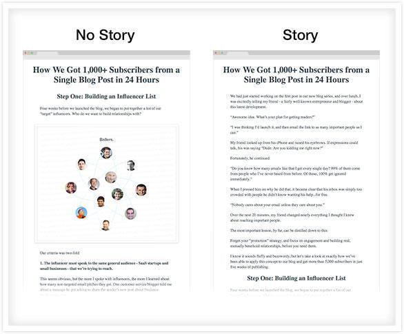
The introduction—especially the first words of your introduction—figure to get the most attention by those reading your article. If you look at the heatmaps for your content, you’re likely to notice that the most viewed portions of your articles are the headlines and intros.
Headers
Use variations of headings. A mix of large headings and small headings (H2 and H3) are all you should need (if you end up going any deeper, use bold).
Images
Create awesome, eye-catching images. Make the images as self-explanatory as possible.
Captions
Here’s a crazy stat from Bnonn of KISSMetrics:
Captions under images are read on average 300% more than the body copy itself.
If you do captions, do them well. Add keywords and useful descriptions and nuggets.
The conclusion
I’ve recently started renaming some final sections on blog posts as Summary. I found this is often what people are looking for at the bottom of a post—Summary, Takeaways, Action Steps, TL;DR. Any of these will work.
The P.S.
The P.S., like captions, are a hugely popular spot to read. According to Michael Fortin, it is the second-most-read part of a sales letter. It is a “second headline.” If readers scroll all the way to the bottom while scanning, the P.S. leaves a great, small spot to make an impact.
Subheads, blockquotes, bullet lists, short paragraphs, etc.
Based on your headline, your readers have gained an expectation to receive a certain value from your post.
Give them this value.
And make it easy to find.
If it’s a list of tools, make the tools easy-to-see with a heading. If it’s a lesson you’ve learned, bold your key paragraphs so the reader can find them. Make the value easy to find and locate without having to read every single word. And in the process of doing so, add additional nuggets.
A nugget can be anything useful, interesting, entertaining, or helpful that a reader takes from a post.
A nugget can be a teaser or a hook to draw people into reading more in-depth.
Here’s where the real content design and onboarding. As writers, we can do our best to guide readers from section to section throughout our posts. Readers aren’t obligated to follow, mind you. They might still skip around.
And in that case, we make it easy to skip. Subheads, blockquotes, bullet lists, short paragraphs, and bold font can do wonders for making a smooth reading/scanning experience for the reader.
Sometimes, I’ll cross my eyes when looking at a blog post I’ve written so that the words on the screen are slightly blurry and all I’m catching is the general layout and flow of a piece. For example:
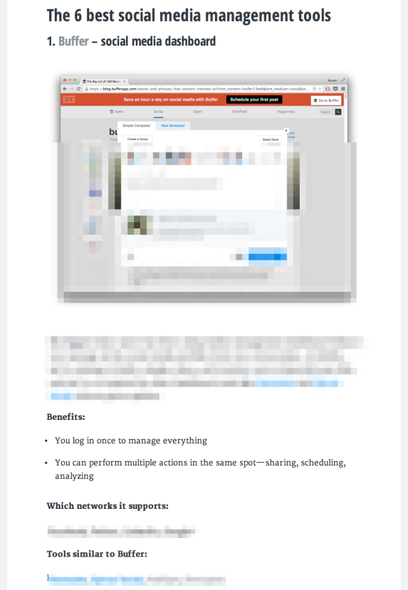
It’s likely that some of your readers might see your posts in a similar way, seeking out the headlines and looking for a nugget to read deeply.
Summary: How do you put this all to good use?
Knowing how someone views your page—or at least considering the many different “onboarding flows” people may take to consume your content—should be helpful in thinking of your finished articles from a new perspective. Here are some tips I’m excited to try out on future Buffer blog posts.
- Think of the first touch points for your article. Emphasize the headlines on social, email, and SEO as much as you do on the post itself.
- Format your blog post with scanning in mind. Break up long paragraphs, add lots of headings and lists.
- Share your most valuable nuggets. Place your key elements and catchiest taglines in easy-to-find places throughout the post. Guide the reader along.
Do you have any tips about what you’ve discovered with content? How do you feel about the whole concept of “content as onboarding” and “content design”? I’d love to hear your input. Feel free to leave any thoughts you might have in the comments!
A version of this post originally appeared on KevanLee.com. Check out the blog for more about what I’m writing and reading.
Image sources: The Noun Project, Blurgrounds, Unsplash
Try Buffer for free
190,000+ creators, small businesses, and marketers use Buffer to grow their audiences every month.

