Pinterest is the underdog of all social media sites.
- It marries the social media aspect with a visual search engine
- It’s one of the most rapidly growing social media platforms
- It gives you a fertile ground to grow your website traffic
If that wasn’t enough, Pinterest ads also give you twice as much return on ad spend (ROAS) compared to other social media marketing channels. Pinterest advertising is also more cost-effective than other digital marketing avenues.
Given all the benefits, why is Pinterest marketing so underutilized by creators and small e-commerce businesses? It’s because the platform can be a bit of a mystery. It has unconventional features and Pinterest marketing isn’t replicable on any other social network.
In this guide, I’ll share a step-by-step guide on how you can forge a Pinterest marketing strategy. If you’re a total newbie to Pinterest, I’d recommend reading this article first. It breaks down the basics of the platform that can help you better use the framework below.
How to create your Pinterest marketing plan
To create a solid Pinterest marketing plan, you need to tie four components together:
- Your ideal customer profile (ICP) or your target audience
- Your Pinterest keyword strategy
- Your pinning strategy
- Your performance analysis
We’ll tackle how you can ace each element in detail.
Step 1: Create a persona of your ideal customer on Pinterest
Defining your target audience is often the first step of forming a social media strategy. You need to ask yourself three questions to understand your Pinterest audience:
1. Is your target audience using Pinterest? Pinterest is excellent for brand awareness. It has 498 million active users and 69.5 percent of them are women. Most of these women are aged between 25 and 34. That said, since 2020, GenZ and men have been among the fastest growing user segments for Pinterest. It’s likely that your target audience is already using Pinterest. If not, they will be starting soon.
2. What is your target audience using Pinterest for? Pinterest users often have that ready-to-buy attitude that’s absent from other social channels. 46 percent of weekly pinners say they’ve discovered a new brand or a product on Pinterest.
However, Pinterest is a full-funnel platform. This means you have Pinterest users at all stages of the buying journey — awareness, consideration, and purchase.
Part of your target audience might be coming for inspiration (awareness), another segment might be using Pinterest with an open mind to buy (consideration), and the last portion might be coming with a “let’s go buy!” attitude (purchasing).
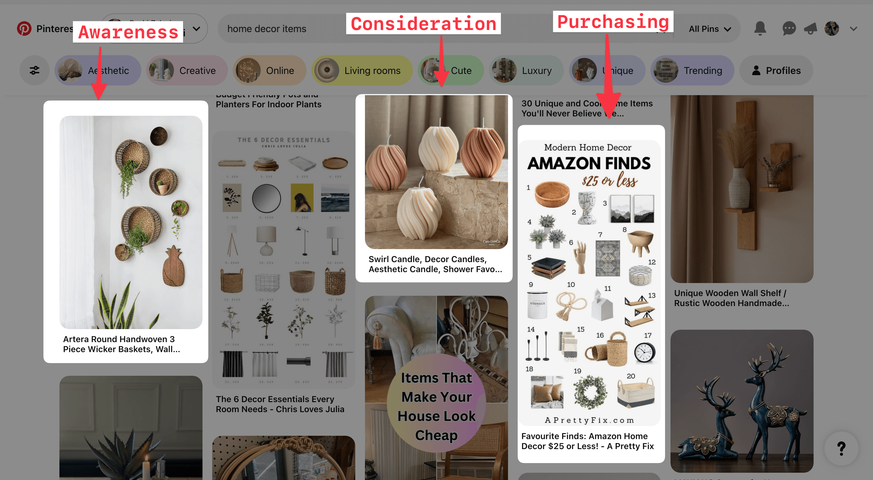
For example, if I’m searching for “home decor items” on Pinterest, I could be:
- In the awareness stage: Using the items I see as inspiration to decorate my own home
- In the consideration stage: Searching for items I could potentially buy to decorate my house
- In the purchasing stage: Have already decided on a few items I want to buy, but not chosen a brand yet
If you look at the Pinterest search results for this query, they display results that serve all three user intents.
3. What’s your target audience’s pain point and how can you help them resolve it? The last question you need to answer is what your audience struggles with. You don’t need a Google Slide full of data and analytics here. Knowing a few basic details is more than enough. This will guide your keyword strategy and then your performance analytics will help you understand more about your audience’s problems (see how it comes full circle?).
For example, suppose you’re a food creator and know your audience struggles with making healthy meals quickly and on a budget. In that case, you already know some keywords you’re going to target — like “healthy eating,” “quick recipes,” or “budget-friendly meal-prepping.”
To understand your target audience’s needs, ask yourself the following questions:
- What job are they trying to complete when logging in on Pinterest? How can you help?
- What are the top ten most frequently asked questions you get from your audience?
- What does your target audience struggle with in your industry or niche?
To continue the above example of the food creator, some content pillars they can have are “Meal prepping” or “Quick dinner recipes” or “Under $10 meals.”
These content pillars can become one (or more!) of your Pinterest boards. You can target more long-tail keywords within those boards and create niche pins.
For instance, you can post a “Affordable pasta with only three ingredients” recipe on the “Under $10 meals” board.
A reminder: This audience insight doesn’t exist in isolation. You need to supplement (and update) it with your keyword strategy and performance insights.
Step 2: Build a keyword strategy for Pinterest
Pinterest is a visual search engine. This means it uses keywords to understand your post's topic and rank it when the audience searches for similar queries.
What are keywords? They’re your audience's search phrases to resolve their queries — essentially, your content topics. But you have to be a bit more intentional about using specific phrasing and related wording to rank at the top of the search results.
Let me illustrate with an example. Shreya Dalela, founder of The Creatives Hour, uses a primary keyword and several secondary keywords in all her Pinterest posts.

In the above image, Shreya targets “wall paint pattern ideas” but also uses related phrases such as “geometric wall paint patterns,” “DIY ideas,” and “vibrant kitchen,” to name a few.
Using all these phrases helps the Pinterest algorithm rank her post in multiple search queries when it’s relevant to the user intent.
The above is a classic example of how you can use search engine optimization (SEO) techniques to rank your Pinterest content at the top.
How do you find relevant keywords for your Pinterest account?
Pinterest doesn’t share its API, so it’s impossible to see backend data for the platform for keyword research. But here are four ways you can find SEO keywords for your Pinterest account:
1. Remember the legwork we did when we were narrowing down our target audience? That process will give you a rough idea of the keywords your audience might be using to find your pins. You can cross-reference this by searching for your industry keywords on Pinterest and seeing related keywords other creators are using. Also note Pinterest’s recommended keywords in the auto-complete search bar.
2. Pinterest also has a trends tool to help you see which topics and keywords your target audience is searching for.
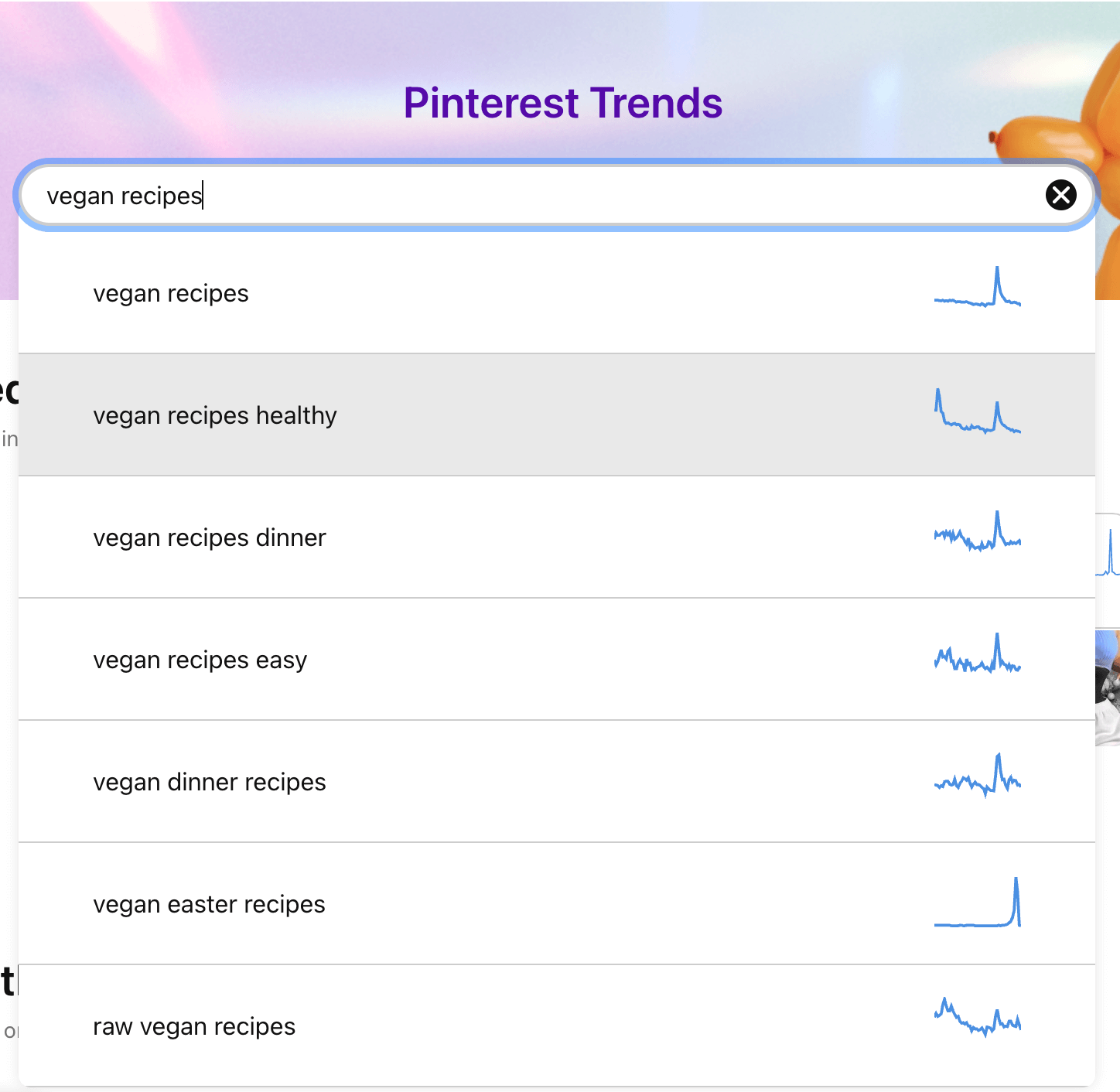
3. Pinterest also releases a trends report every year based on Pinterest user searches and behaviors. This can help you do some content planning in advance. These reports have an 80 percent success rate. So, there’s a high chance that you can create useful content for your audience that’ll perform well based on the keywords/topics in this resource.
4. Apart from this, you can also use SEO tools like Keywords Everywhere or Answer the Public to get some topic inspiration. But take these keywords with a grain of salt because these tools are designed for search engines like Google and Bing, not Pinterest.
5. Remember to use a mix of branded keywords (your company name) and industry-related keywords for the pins you create. Solution-aware buyers might know your company name and search for it directly, while problem-aware customers will search for topical keywords.
Now, you need to use the right keywords in three places on your Pinterest account:
- Your Pinterest profile
- Your Pinterest boards
- Your pin designs & copy
Let’s address how to use Pinterest SEO in each place one by one.
1. SEO in your Pinterest profile
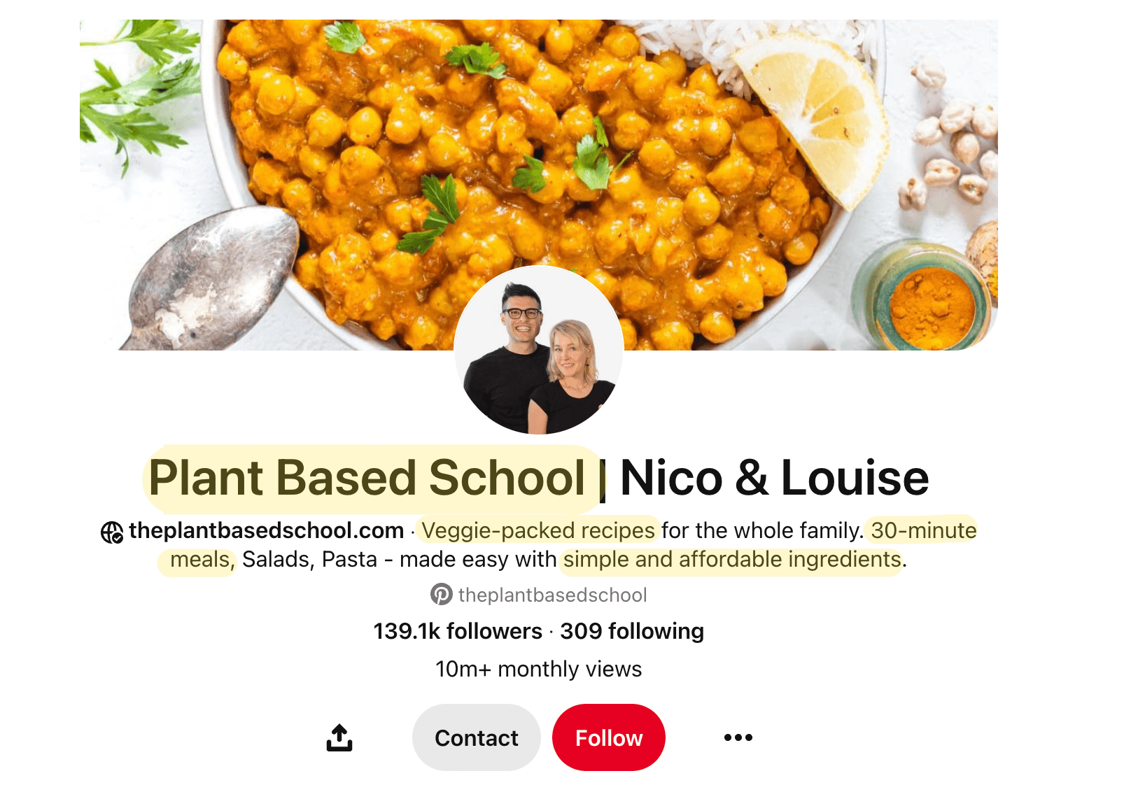
On your Pinterest profile, you need to use keywords in your username, name, and bio.
Username: You want to keep your username consistent across all your social media accounts to make it easy for people to find you. If you have any obvious keywords attached to your username already, that’s going to help you rank higher in search when someone types the keyword you’ve used.
Display name: Like Instagram, you can extend your display name to showcase your main niche. Write your full name and use the “|” symbol to add a few keywords about what you post on your Pinterest profile. Your profile will appear at the top when someone searches for the keywords you used.
Bio: Your social media bio everywhere should be about how you serve your audience and not all about you, you, you. That said, ensure you add a few relevant keywords organically about what you do and who you serve with your Pinterest content.
Creators Nico & Louise of The Plant Based School have the perfect Pinterest bio showcasing how they help their audience at every corner of their profile with the right keywords.
2. SEO in your Pinterest boards
You should have relevant keywords in your board name, your board’s description, and your board cover. Travel creator, Alexane Said, is a good example of how to do this right. She categorizes her boards according to locations and uses descriptive keywords in the description to highlight what the board contains.

Remember that just like Google, the Pinterest search engine also looks at your overall niche. If you consistently share pins related to one topic and pin each piece to the right board, the Pinterest algorithm will start considering you an “expert” in your niche. But if you post about various things without focus, Pinterest will get confused.
It’s all interlinked. So, ensure the pins you add to each board are relevant to the keywords & topic you’ve used in the board name, description, and cover.
3: SEO in your pin designs and copy
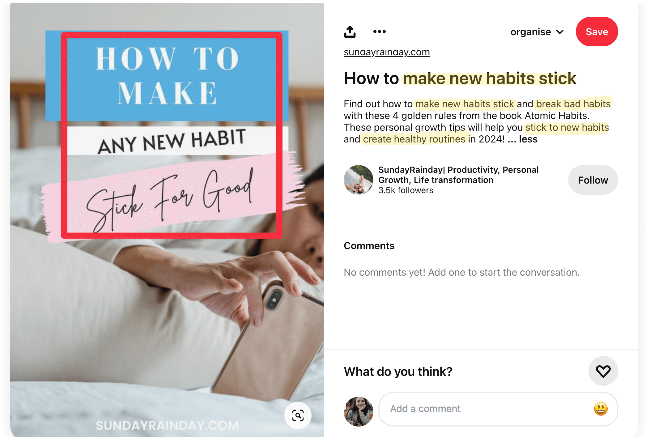
Your pins are the meat of the matter when it comes to Pinterest SEO. You should use your targeted keywords in text overlays, pin titles, and pin descriptions. Pinterest also lets you add “tags,” which are essentially topics related to your Pinterest pin. Think of them as a replacement for hashtags. And of course, add each pin to a relevant board.
This pin by Sofia is a good example of how to sprinkle SEO-friendly keywords across each pin.
Step 3: Implement a smart pinning strategy
A pinning strategy is all about maximizing your return-on-investment (ROI) from your Pinterest marketing efforts and minimizing the time spent creating content.
How often should you pin per day?
The ideal posting frequency for Pinterest is posting at least one pin a week, according to the platform’s recommendations.
But a Tailwind study found that its most successful users pin around 15 – 25 new pins per day. But pinning more than 50 times a day can negatively impact your content distribution.
Like any other social platform, Pinterest values consistent and fresh posts. Aim for publishing high-quality pins regularly and gradually increasing your number of pins to boost your following on the platform (instead of repinning the same post over and over).
And instead of pinning manually, use a social media management tool like Buffer to schedule pins to go out automatically.
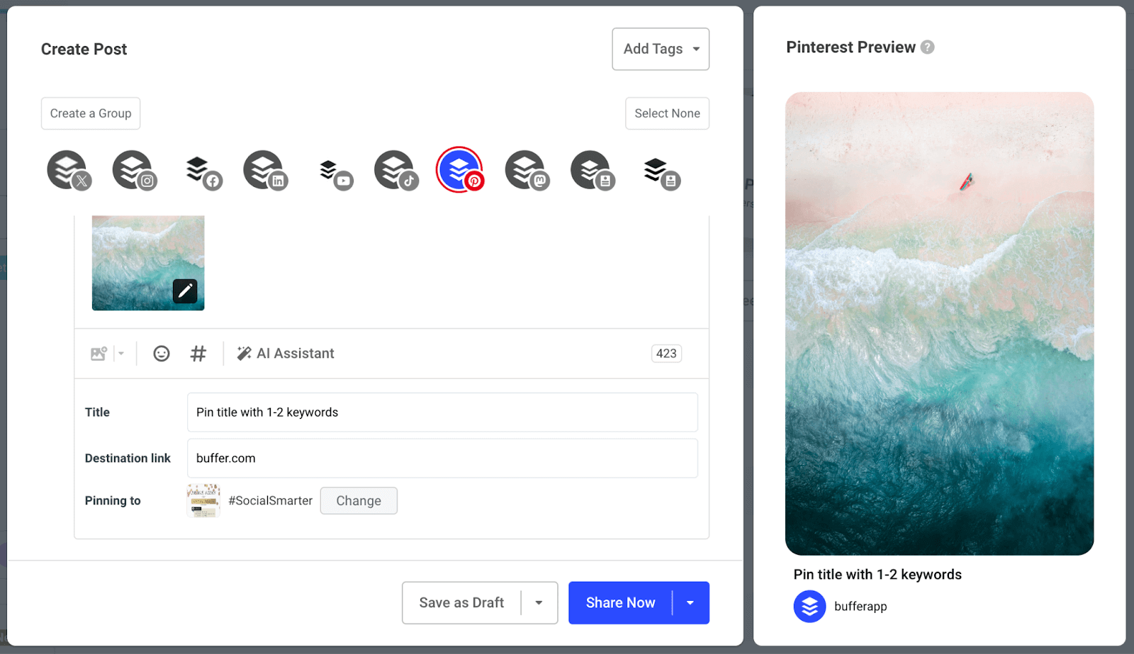
Buffer helps you minimize the job even further by automatically pulling in images from your destination link. If you’re already creating Pinterest-friendly images on your website, you don’t need to reupload them on Buffer to publish them on Pinterest.
Pinterest has four types of pins (idea pins are now a thing of the past):
- Image pins — pins containing a static image
- Video pins — pins containing a video
- Rich pins — pins that automatically pull information from your website
- Product pins — pins that feature products you can buy
You should have a healthy mix of all types of visual content. Once you start reflecting on your analytics, you can start spotting patterns if one type of pin is outperforming the others. When that happens, you can create more of one type of pin than others.
⚡ Reminder: Ensure you meet the aspect ratio for every pin to create. You don’t want half of your pin to get cut off in search results.
But even hearing “create 15 – 25 pins for a single day” makes me bone tired. Who has the time to run a business and create so much social media content?
Luckily, you can rotate through the same keywords with (only slightly) different images on Pinterest. To put it simply: You can create multiple pins targeting the same keyword. This is possible because Pinterest’s SEO doesn’t cannibalize you for creating multiple posts targeting the same keywords.
For example, if you’re a fashion creator targeting a keyword like “fall fashion outfits,” Google can punish you if you have multiple blog posts on your website fighting to rank for the same keyword.
On the contrary, Pinterest’s SEO does no such thing. You can create content targeting the same keywords repeatedly. This lightens the load on your end and also allows you to exercise your creativity on a single topic.
And since Pinterest is all about repurposing your existing blog content into fresh pins to boost website traffic, you can create multiple templates targeting the same keyword with slightly different designs. You can easily do it on Canva. The company Elite Content Marketer did this on a regular basis to increase their traffic by 825 percent in three months.
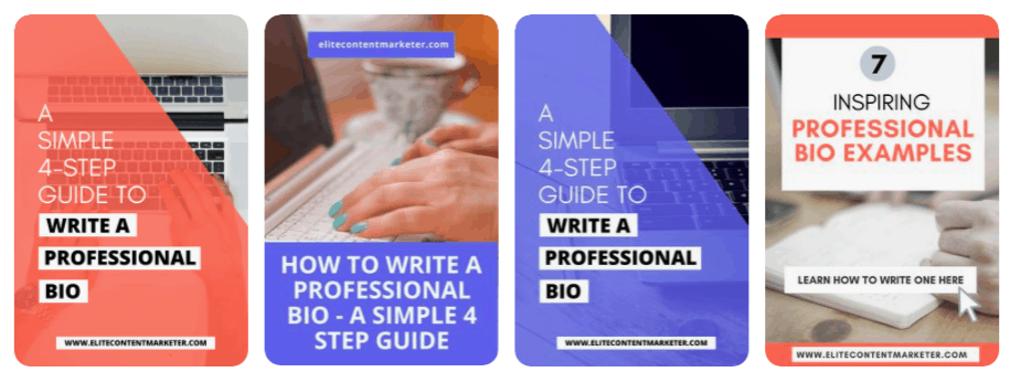
But don’t schedule all similar-keyword-and-destination-link content in one day because you can be flagged as spam. You can schedule one pin for a single URL every day.
Creating a high quantity of pins without compromising on quality (or nearing creator burnout) is all about doing smart work. Think how you can get the most out of each piece of content you’ve already created before starting from scratch.
Step 4: Reflect on your Pinterest analytics every month
If you’ve just started marketing on Pinterest, give it around three to four months of consistent work before you check your analytics (unless one of your pins goes viral and you want to check how you can double down on it!).
After three months, here are the metrics you should check on your Pinterest business account:
- Outbound links: How many people clicked on the link you had attached to your pin?
- Pin clicks: How many times did someone click on your pin in search to view it close up?
- Saves: How many times have people saved your pin to one of their boards?
- Impressions: How many times your pin was viewed?
In addition, you should check your Google Analytics reports to determine which pins contributed to the highest traffic via Pinterest.
Adjust your Pinterest marketing strategy based on what you find in your analytics report.
Find the common themes in the pins that gave you the most conversions in Google Analytics. Are they of the same style (like infographics or tutorials), using the same call to action, etc.? Are multiple pins variations of the same keyword? Are the results seasonal? Analyzing click-through rates can tell you which content format pins work the best for you and which keywords get you the most ROI.
In your Pinterest native analytics, check if you’re getting more impressions but less outbound clicks. This might mean you need to improve your Pinterest images and copy. Are certain boards getting more reach than others? Are certain font styles getting more saves? Double down on them.
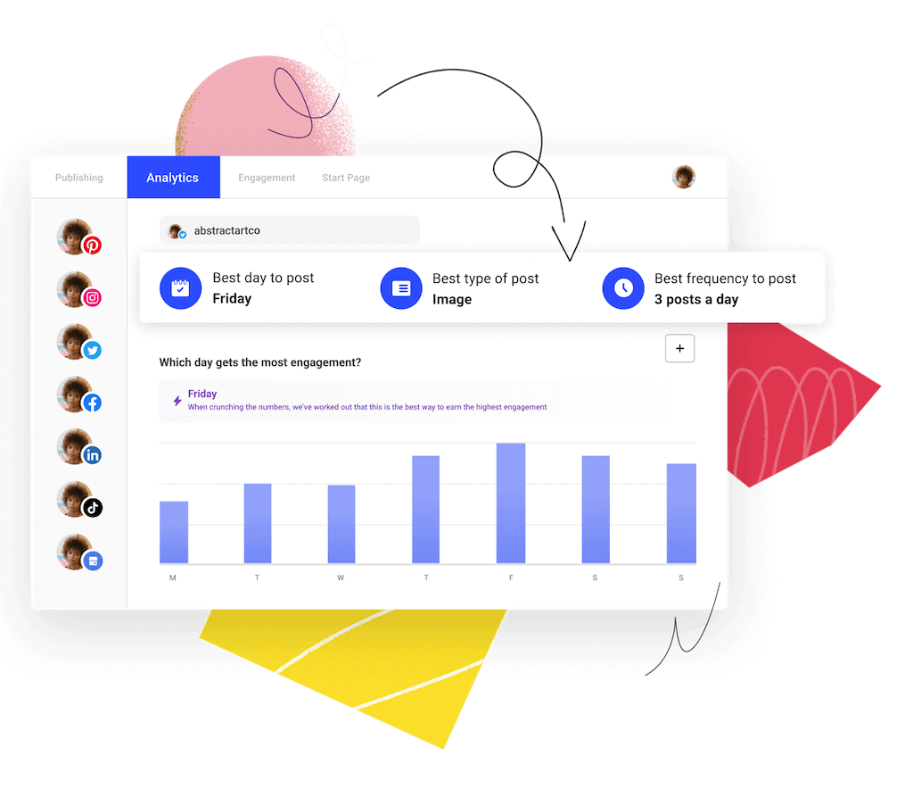
You can take this analysis a step further by using a marketing tool like Buffer that gives you advanced data like your top-performing content types, the times when you get the most engagement, and more.
Tying all the Pinterest marketing elements together
Using Pinterest for business means tying all the above four steps together:
- Continue creating pins (step 3) based on your keyword strategy (step 2) for a while
- And tweak your marketing strategy based on your performance data (step 4) and audience behavior (step 1) as you progress
You might have to do this for a while before you see tangible results from Pinterest. That’s the nature of a visual search engine. But the other side of the coin is you can garner traffic from Pinterest for years as more & more users discover your content.
Read more:
17 Tips, Tools and Tricks to Improve your Pinterest Marketing Strategy
How to Use Pinterest – And Why You Should as a Creator or Business
Try Buffer for free
190,000+ creators, small businesses, and marketers use Buffer to grow their audiences every month.


