A few weeks ago I had the opportunity to design a totally new landing page for Buffer. I had the green light to get creative and to try something new, even if that meant throwing everything away and starting from scratch.
So that’s exactly what I did.
The Experiment
This experiment, for me, was all about learning. Learning what people care about, learning what imagery tells a story, learning about how visitors examine a landing page, and learning how they decide whether or not to sign up. I had the mindset that I could totally fail — that this new landing page might suck and people wouldn’t respond.
But that didn’t really matter — this was about setting a base line, defining a style for Buffer that felt good and matched the brand; a design language that I could begin to translate across all areas of the product.
It was about connecting with users in order to get a better understanding of their needs and their desires, and knowing what features are best suited to make their lives easier.
Process & Constraints
Just for a frame of reference, here’s what the old Buffer landing page looked like:
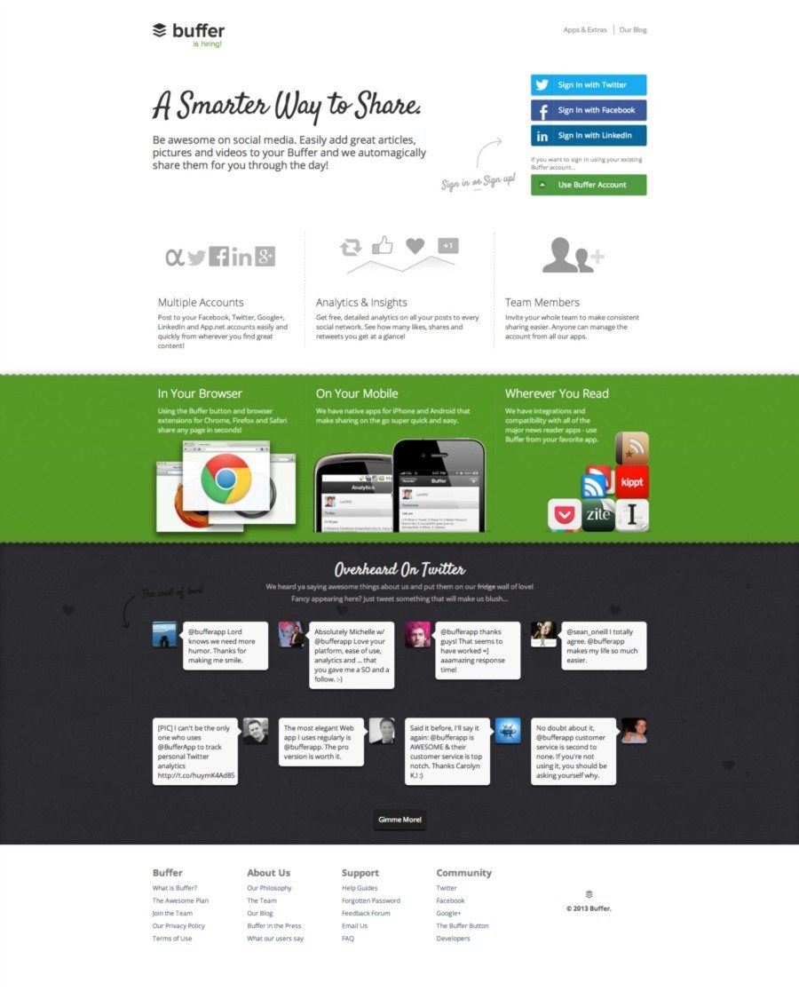
I actually like this view. It’s what I saw when I first signed up for Buffer almost a year ago. It does a good job of explaining what the product is, outlines a couple of key features and shows off a few exceptional user testimonials from Twitter. None of these sections, by themselves, are “bad.” But when you put it all together, it felt a bit bloated. Lots of text, lots of images — lots of places for a user to get distracted and click away. That’s no good.
The Headline
So I took a fresh look at the landing page from the standpoint of a new user — what was the most important thing I needed to know? In my mind, it was the value proposition of what Buffer is truly about — saving me (and my business) time, energy and money with social media marketing.
I came up with a little headline and stuck with it for the experiment:
A better way to share on social media.
Buffer shares your content at the best possible times throughout the day so that your followers and fans see your updates more often.
I haven’t had a chance to optimize this headline, but it feels good for now and seems to be working. I wanted something clear and precise, something that could be understood in 5 seconds and tell a first-time reader what this product is all about.
Sign-up/Login Flow
Next I started to rethink the actual log in/sign-up flow. Here’s the old style, aligned to the right side of the page:
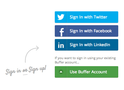
And here’s the new version, centered nicely underneath the headline:

I knew beforehand that Twitter and Facebook were the two biggest sources of conversions. I later learned that they are actually the largest by a substantial amount — 82.69% of Buffer users sign up with their Twitter or Facebook account.
With this in mind, I wanted to really make these options nice and clear. One constraint I came up against was that many users do sign in with LinkedIn and email, so I knew it wasn’t possible to eliminate those options.
I decided to deemphasize the LinkedIn and email options, both in color and size. They’re still there, but our goal is to really encourage sign ins with Facebook and Twitter.
Imagery
The last key element of the new landing page was a central image to illustrate what it is that Buffer actually does. This was quite the challenge. I really liked what Stripe has done with this idea of a cloud, working for you behind the scenes:
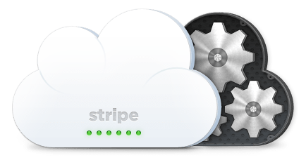
In my head this idea translated well to Buffer — you give us your social media updates, sit back, and relax. We’ll do all the heavy lifting behind the scenes, out of sight and out of mind. We handle the tedious bits so that you can spend more time focusing on what’s really important — reaching your fans and growing your online presence.
Here’s what I put together:

I’m not a Photoshop ninja, by any means, but I managed to scratch together my own interpretation of this cloud in the sky doing all the work, turning those tweets and statuses into likes and comments while you sleep (or do other fancy things).
I will continue exploring this imagery, trying new ways to illustrate clearly what Buffer does, why it’s worth using and what value it can provide to people involved in social media.
Results
Having explored the headline/value proposition, sign-up/login flow and the main imagery, I arrived at the current version of the landing page:
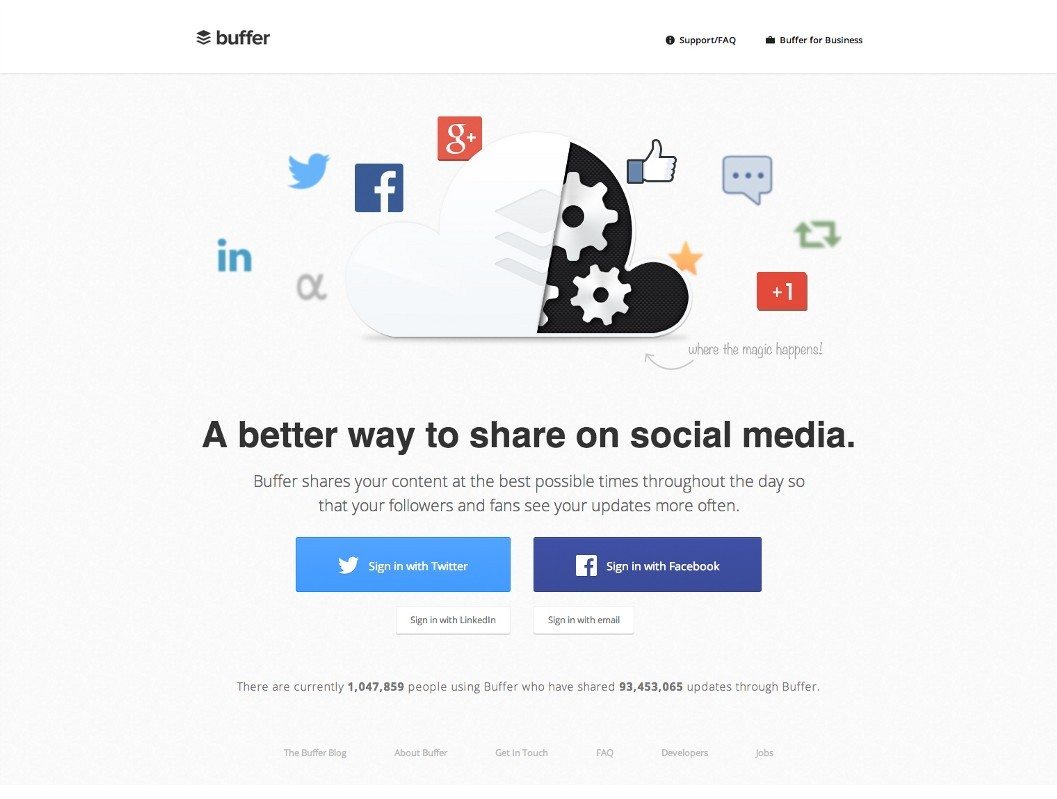
It’s probably not perfect, but it’s a start, and it has set the ball in motion that will help our team to continue experimenting and optimizing. Over time we will come to understand what has the most impact on user conversions.
While I feel like the new landing page is certainly cleaner and to the point, it would all be for nothing if it didn’t return results for Buffer’s bottom line.
Here’s what we tracked during a 24-hour period last week, sending 50% of visitors to the new landing page and 50% of visitors to the old:
Old Landing Page:
- 14,556 Unique Visits
- 762 new sign ups
- 5.23% conversion rate
New Landing Page:
- 16,437 pageviews
- 994 new sign ups
- 6.05% conversion rate
Overall:
- ~16% increase in overall new user conversion
Note: The conversion rate accounts for unique visitors, and strips out views from robots and internal views.
People using the Chrome web browser also converted much better than those using Safari, with Firefox users somewhere in between. We saw the largest increase in conversions for Firefox users, with a 30% better conversion rate on the new landing page.
Key Takeaways:
It was a huge relief for me to see that the new page did in fact convert new user sign ups better than before. I’ll take a 16% increase any day.
It’s also important to notice that existing users who saw the new landing page didn’t have any trouble finding the new sign-in options. This is always something to look out for when redesigning a page that users are familiar with. So far we haven’t heard feedback from existing users that are expressing confusion over the changes.
What’s Next
When I first started redesigning the landing page, I knew that there was a good chance I could fail miserably. Users have had a long time to get used to the existing landing page, and I didn’t want to introduce a confusing new alternative that left people stranded.
Seeing the 16% increase in new user conversions has been a wonderful result of this first experiment — but it’s just that: the first experiment. I’m not finished, and our team is already working on ways to improve our sign-in flow, activation rate and upgrade rate.
One major issue that I’d like to address in the future is that, on smaller screen sizes, the sign-up buttons can sometimes end up below the fold. I wonder if we can improve our conversions by moving the buttons above the fold to remove an extra step (scrolling) from the registration process.
I’m also going to experiment with outlining a few key Buffer features below the sign-in options. Multiple accounts, team member managers, custom scheduling and analytics are all powerful tools for Buffer users. I’m interested to see if putting those on the landing page will help to convey the value of Buffer more than before.
Closing
I’m having a blast working on Buffer — we’re growing fast and engaging with thousands of happy users every day. I’m fortunate to work with a company that encourages experimentation, moving fast and trying new ideas.
If working at Buffer sounds fun to you, we’re hiring! Check out our job listings.
If you enjoyed this article, you might also like “5 things that seem essential that we launched Buffer without” and “Idea to paying customers in 7 weeks: how we did it”
If you liked this article, you should follow me on Twitter — I tweet about design, web development and startups.
Photocredit: Slim Teller
Try Buffer for free
190,000+ creators, small businesses, and marketers use Buffer to grow their audiences every month.

