On March 21, 2006, founder Jack Dorsey set up his “twttr”:
Since then, some of the most important, world-changing moments have unfolded on Twitter in real-time for all to see, react to, and engage with.
A lot has changed since those early days, including the platform’s name. When Elon Musk officially acquired Twitter on October 27, 2022, for $44 billion, he renamed it X. Almost four years later, people are still calling the platform Twitter, so, in this article, we’ll jump around between the two names or use both.
just setting up my twttr
— jack (@jack) March 21, 2006
If you’re new to X, or feel like you’re no longer sure how to use Twitter after all the changes, this article has you covered with everything you need to know.
Jump to a section:
- Why use Twitter/X?
- How to set up your Twitter account
- Optimize your Twitter/X profile
- Build your Twitter/X marketing strategy
- How to post on Twitter/X
- Create content for your Twitter/X account
- Popular X features to use in your social media marketing
- Best practices to grow your following
- Feeling confident that you now know how to use Twitter/X?
- Your quick guide to Twitter/X terminology
- FAQ about how to use Twitter
- More Twitter/X resources
Why use Twitter/X?
You might have heard that X isn’t what it (and by “it”, I mean Twitter) used to be — and in some ways, that’s true. The platform has changed a lot. But it’s far from irrelevant.
X still sees around 557 million active users per month, which is more than competing platforms like Bluesky (41 million) and Threads (400 million). In other words, the audience is still very much there. And, according to our research, they’re highly engaged.
X has always been the place where conversations happen in real time. News breaks, trends start, and industry debates unfold. If you want to be part of the conversation, X is still one of the fastest-moving platforms around.
Here are some other reasons why people are on X:
It’s still one of the best platforms for visibility
Unlike some platforms that prioritize content from people you already follow, X makes it easier for your posts to reach beyond your immediate audience. A thoughtful reply in the right thread can get you in front of thousands of people, or a well-timed post about a trending topic can spark meaningful engagement.
It’s evolving beyond short posts
When he acquired the platform, Elon Musk’s vision was to evolve the social networking site into a broader “everything app,” encompassing much more than simple messaging and tweeting. Some of the new features include different account types (we’ll get into those later), longer posts, enhanced video sharing, and limited (but developing) digital transactions and possibly e-commerce functionalities.
It’s a strong platform for personal brands
If you’re building a personal brand, X offers something unique: proximity. You can:
- Reply directly to industry leaders
- Join public conversations with decision-makers
- Build credibility by consistently sharing insights in your niche
And because posts move quickly, you can experiment often. The feedback loop is fast, which makes it a great platform for learning what resonates.
Twitter/X is not for everyone — and that’s OK
X isn’t the most visual platform. It’s not built around highly curated feeds. And it can feel noisy at times. But if you enjoy conversation, commentary, sharp insights, and real-time interaction, X still offers a lot of value. The key is understanding what it does best and using it intentionally.
So, is X on your list? In the next section, we’ll look at how to set up your account for success from day one.
How to set up your Twitter account
OK, X marks the spot. Now, it’s time to set up your account. Before you do so, it’s helpful to have an idea of which kind of account will work best for you.
Should I use a personal or professional account on X?
If you’re using X to grow a brand, build an audience, or market a business, using a professional account instead of a personal account is usually the smart move. It’s free, and you can switch back at any time.
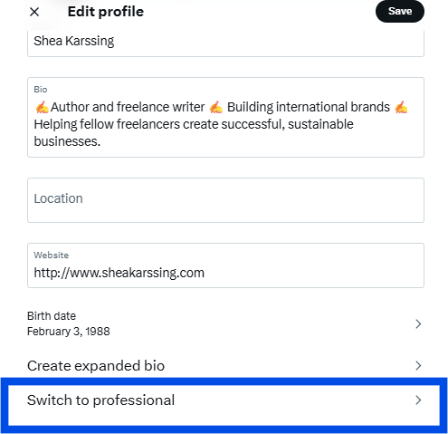
- A personal account works well if you’re posting casually, engaging in conversations, or simply exploring the platform. You still get access to core features like posts, threads, replies, and polls.
- A professional account unlocks business-focused features. You can add a category label to your profile, access profile spotlight options (such as linking to a newsletter), and — if eligible — showcase products through a shop module.
In short: If you’re building something on X, go pro. If you’re just participating socially, a personal account is perfectly fine.
Which Twitter/X subscription tier is right for me?
One of the biggest changes on X in recent years is that the platform now offers four major account tiers:
- Free
- Basic
- Premium
- Premium+
Each tier comes with different features — and, as we’ve discovered, different levels of visibility. More on this in a few.
Comparing different X subscription options
The free account
If you’re just getting started, the free tier is still a solid option.
You can:
- Post up to 280 characters
- Share images and videos
- Build an audience
- Join conversations
For many casual users or early-stage creators, this is more than enough to test the waters and see whether X is a good fit. If your goal is to learn the platform, experiment with your voice, and engage consistently, you don’t need to pay to do that.
X Premium
If you’re serious about growth, X Premium is where things start to get interesting.
Premium includes:
- The ability to post longer content
- Post editing
- A verification checkmark
- Fewer ads
- Potential favor with the algorithm
A recent study by Buffer’s data scientist, Julian Winternheimer, found that Premium accounts get around 10x more reach per post than regular accounts.
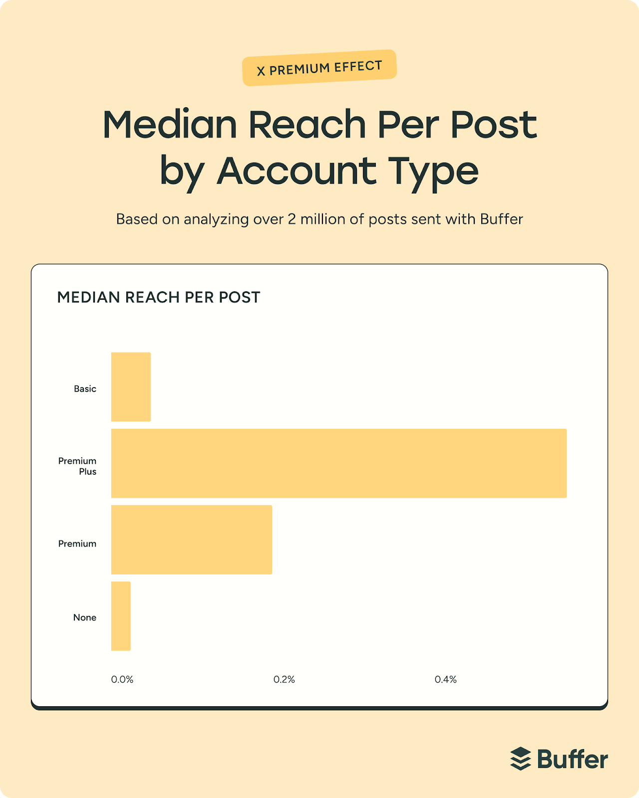
Buffer’s own Tami Oladipo tested the impact of upgrading and saw a noticeable shift.
After subscribing to X Premium, she published less frequently, but her reach and engagement stayed steady. In other words, performance didn’t dip with lower output.
“X Premium immediately seems like a great fit for anyone looking to grow an engaged audience, especially if your content is primarily text-driven,” she said.
“Features like editing and the ability to make longer form content are invaluable for maintaining quality and depth in content. Some of my best-performing posts were longer, and they did pretty well.”
That’s an important takeaway. If your strategy relies on thoughtful threads, nuanced takes, or educational content, the ability to go long can make a real difference.
Basic and Premium+
Basic and Premium+ sit on either side of Premium in terms of features and pricing.
- Basic offers some enhancements over the free tier, but without full verification benefits
- Premium+ typically includes the highest level of ad reduction and additional prioritization in replies and search
So, which one should you choose?
Here’s a simple way to think about it. For creators and business owners who rely on X for visibility, Premium or Premium+ may feel like an investment in distribution. For casual users, it may not be necessary.
- Exploring or posting occasionally? Free is fine.
- Building a personal brand or growing an audience? Premium is worth considering.
- Using X as a core marketing channel? Premium or Premium+ may give you an edge.
Also remember that you don’t have to decide forever. You can start free, learn the platform, and upgrade later if you feel limited.
So even if you’re not quite sure which account or subscription you need just yet, we can go ahead and get set up.
How to set up Twitter/X on mobile
- Download and open the app.
- Click on Continue with Google (to sign in with Google) or Create Account.

- Add your details.
- You’ll be sent a verification code via SMS or email, depending on your preference.
- Verify using the code, set up your password, and hit Sign up.
- Add a profile picture.
- Create a username.

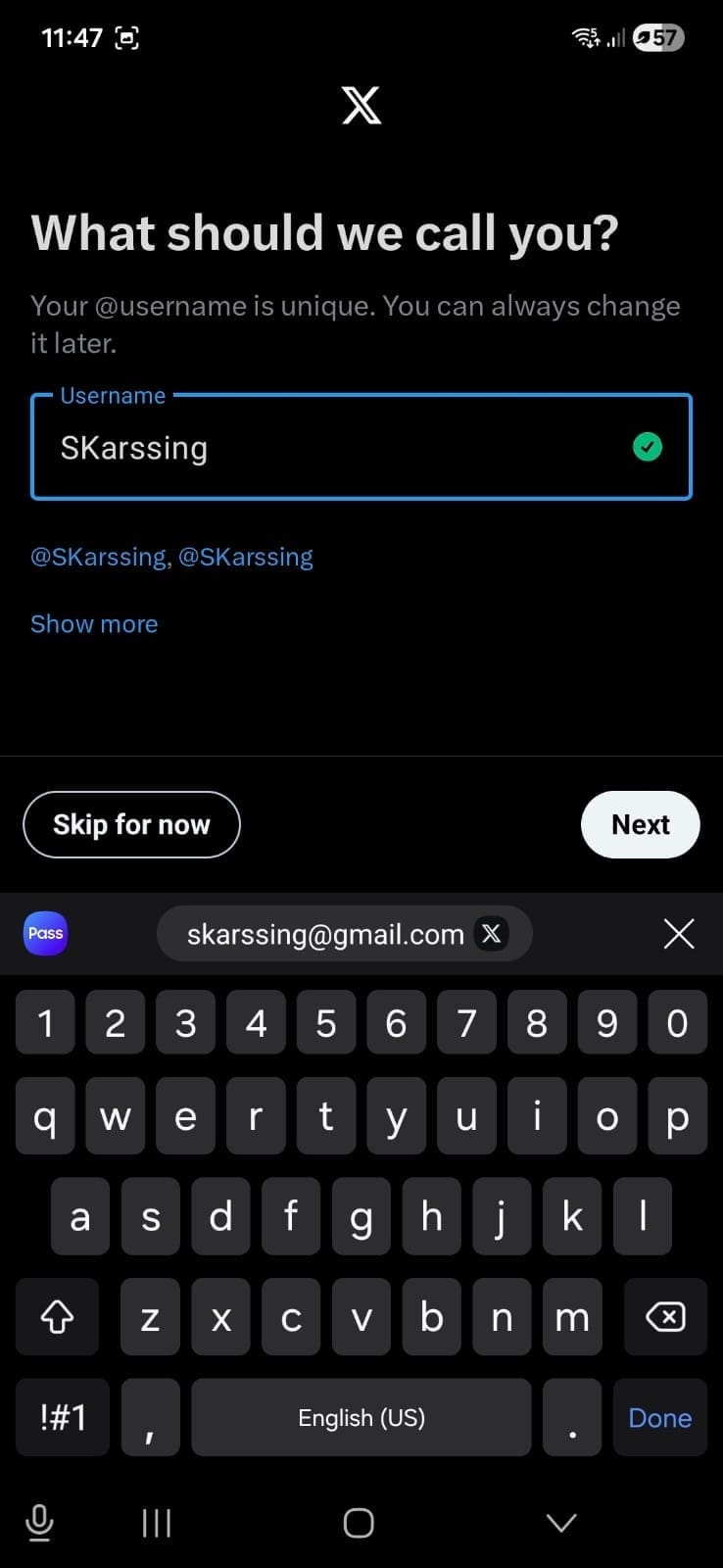
- Set your notification and contact preferences.
- Follow one or more accounts.
- You’re in.
How to set up Twitter/X on desktop
- Head over to x.com and click on Continue with Google (to sign in with Google) or Create Account.

- Add your details.
- You’ll be sent a verification code via SMS or email, depending on your preference.
- Verify using the code, set up your password, and hit Sign up.
- Add a profile picture.
- Create a username.
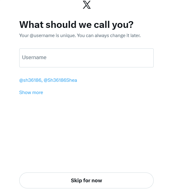
- Choose some topics that interest you.

- Follow one or more accounts.
- You’re ready to explore.
Optimize your Twitter/X profile
Before you post a single update, take 10 minutes to set up your profile properly. Think of it as your digital storefront — when someone clicks through from a post, this is what convinces them to follow (or not).
Here’s how to make sure your profile works for you.
Upload a profile picture
Your profile picture may be small in size, but it makes a big first impression. If someone sees your reply in a busy thread, your profile photo is often the first thing they notice.
Use a high-quality, well-lit headshot or your brand logo. The recommended size is 400 pixels x 400 pixels.
A few quick tips:
- Faces tend to build trust faster than logos (especially for creators and founders)
- Keep it simple — avoid busy backgrounds
- Make sure it’s clearly visible in a small circle
Add a cover photo
Your cover photo is valuable real estate. Because your bio is limited to 160 characters, your header image can help tell the rest of your story.
Consider using it to:
- Highlight what you do
- Showcase your product or work
- Share social proof (like “Helping 10K+ creators grow”)
- Add a bold call-to-action (CTA)
Keep the design clean and easy to read on mobile, as most people will visit your profile on their phone.
Write your bio
You’ve only got 160 characters, so make them count. A strong bio answers three simple questions:
- Who are you?
- What do you do?
- Why should someone follow you?
Keep it clear, not clever. You can tag brands you’ve worked with (when relevant) to add credibility — just don’t overdo it.
If you’re stuck, try this formula:
I help [specific audience] achieve [specific result] using [your method].
Add your website or Buffer Start Page
You only get one link in your bio, so if you have multiple things to share (like a newsletter, YouTube channel, and services page), a link-in-bio tool can help. Buffer’s Start Page is a free option that lets you create a simple landing page with multiple links.
On your Start Page, you might include:
- Your latest work
- Your main website
- A lead magnet
- Other social profiles
- Booking links
The goal is simple: Make it easy for people to take the next step.
Pinned tweet
If someone new visits your profile, your pinned post is your first impression. Think of it as your highlight reel. If someone only reads one thing on your profile, make sure it represents you well.
You could pin:
- Your most engaging tweet or thread
- A “Start here” introduction post
- A summary of what you share
- A big win or announcement
Follow relevant accounts
Who you follow matters more than most people realize.
A few things to keep in mind:
- Follow people in your niche
- Engage with accounts that inspire or educate you
- Avoid following spam or inactive accounts.
Also, pay attention to your follower-to-following ratio. While it’s not everything, new visitors often glance at it. If you have 500 followers and follow 50K accounts, it can send the wrong signal. It may suggest you’re following people simply to get a follow back — even if that’s not your intention.
Instead of mass-following, focus on building real connections.
Here’s a great X profile example from Neil Patel:

Build your Twitter/X marketing strategy
Posting randomly on X and hoping something goes viral isn’t much of a strategy. Growth on X comes from knowing why you’re showing up, who you’re speaking to, and how you’ll measure progress.
Here’s a simple three-step process to build your X marketing strategy:
Step 1. Set clear and measurable goals
Start with the big question: Why are you on X? Do you want to grow your audience and build authority in your niche? Drive traffic to your website? Generate leads? Support customer service?
Once you know the answer, you need to set metrics to measure that you’re on track — think of them as your KPIs (key performance indicators). For example:
- If your goal is brand awareness, you’ll focus on impressions, reach, and profile visits
- If your goal is community building, you’ll track replies, reposts, and engagement rate
- If your goal is website traffic, link clicks and conversions become your priority
Keep your goals specific and measurable. Instead of “grow our presence on X,” aim to “increase profile visits by 25% in three months” or “gain 1,000 relevant followers this quarter.”
Step 2. Create a content plan
On X, consistency builds familiarity, and familiarity builds trust.
A content plan outlines:
Start by defining three to five content pillars.
For example:
- Educational threads
- Industry commentary
- Behind-the-scenes updates
- Customer stories or case studies
- Curated resources
This prevents the “What should I post today?” scramble and helps you build a recognizable voice.
Next, decide on a cadence you can keep up with.
That might be:
- One to two posts per day
- Three to five posts per week
- One in-depth thread per week plus shorter daily posts
The key is sustainability. Posting consistently for six months beats posting 10 times a day for two weeks and burning out.
To stay organized, use a social media management tool like Buffer to plan and schedule your X posts in advance.
With Buffer, you can:
- Schedule posts across multiple platforms
- Visualize your content calendar
- Collaborate with your team
- Refine copy with AI
- Track performance in one dashboard
Step 3. Engage intentionally
X is built for conversation. If you’re posting and ghosting, you’re missing the biggest growth lever on the platform. Replies, quote posts, and thoughtful interactions often drive more visibility than standalone posts.
Build engagement into your strategy by:
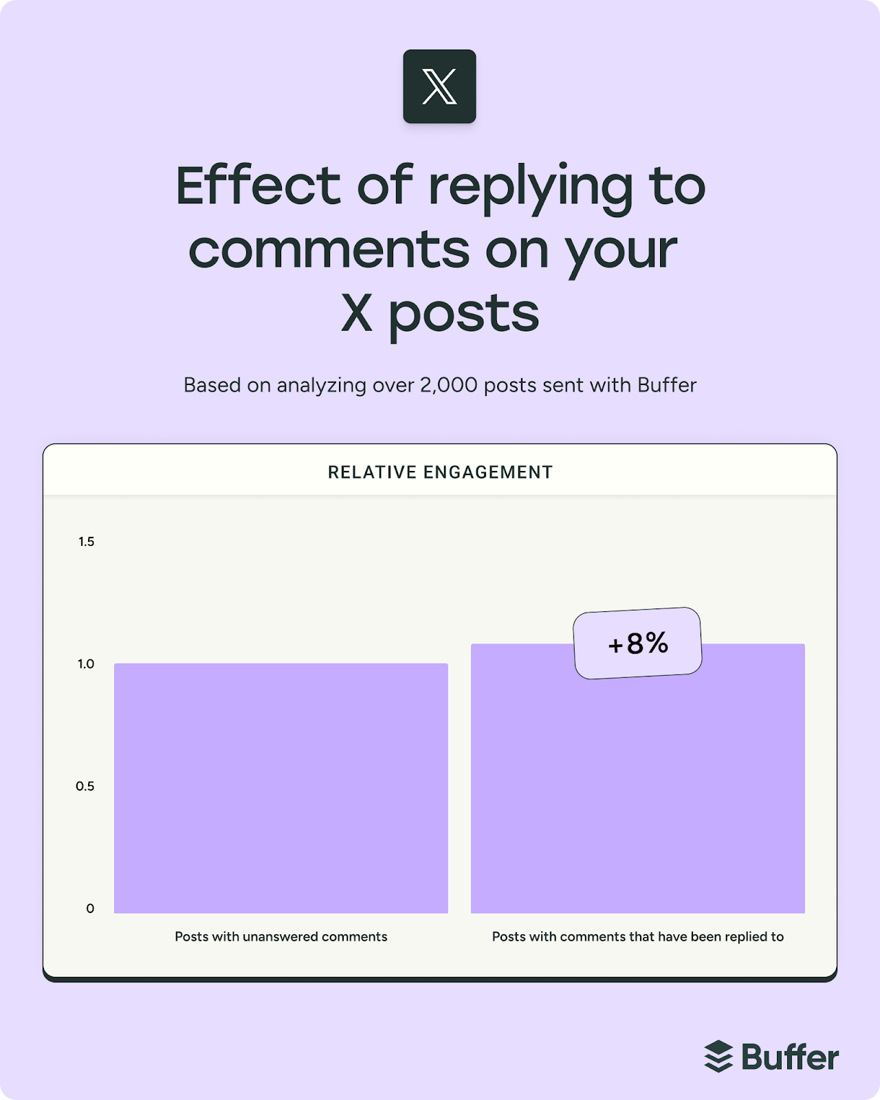
- Replying to comments on your posts (one of Buffer's latest studies shows it can boost engagement by 8% on X)
- Starting conversations with questions
- Engaging with creators and brands in your niche
- Participating in relevant trending discussions (when they align with your brand)
Pro tip: You can use Buffer’s Community to respond to replies in one place, track sentiment, and make sure nothing slips through the cracks.
Strategy sorted? If so, you’re ready to go. The next section covers how to post on Twitter.
How to post on Twitter/X
Whether you’re on desktop or on your mobile, it’s pretty straightforward to post to X. Here’s how.
How to post to X on desktop
- Open X.
- You can post directly at the top of the page, or choose the Post button on the left to create your content in a pop-up window.
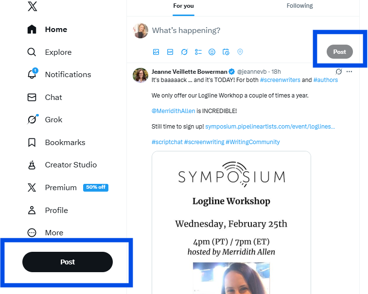
- You can use the little buttons at the bottom to add images, GIFs, polls, or emojis. You can also choose to schedule your post for a later time and use Grok as an AI Assistant.

- Add your content, and hit Post. Simple as that.
How to post to X on mobile
- Open your X app.
- Click on the + button.
- Choose Post from the options.
- Add your content and tap the blue Post button.



Note: Native scheduling isn’t available in the standard Twitter/X mobile app. If you need to schedule Tweets from your phone, you can use a third-party social media management tool like Buffer.
Create X-cellent content for your Twitter/X account
Now that your profile is set up and you know how to post, it’s time to focus on what everyone’s here for: the engaging content you’re about to create. Let’s walk through a few practical ways to create posts that spark conversation, build visibility, and help you grow on X.
What is the best content format on Twitter/X?
Our analysis of the best content for major social media platforms found that text-based posts receive the most engagement on X (30% more engagement than videos, 37% more than pictures, 53% more than link posts, and 113% more than retweets).
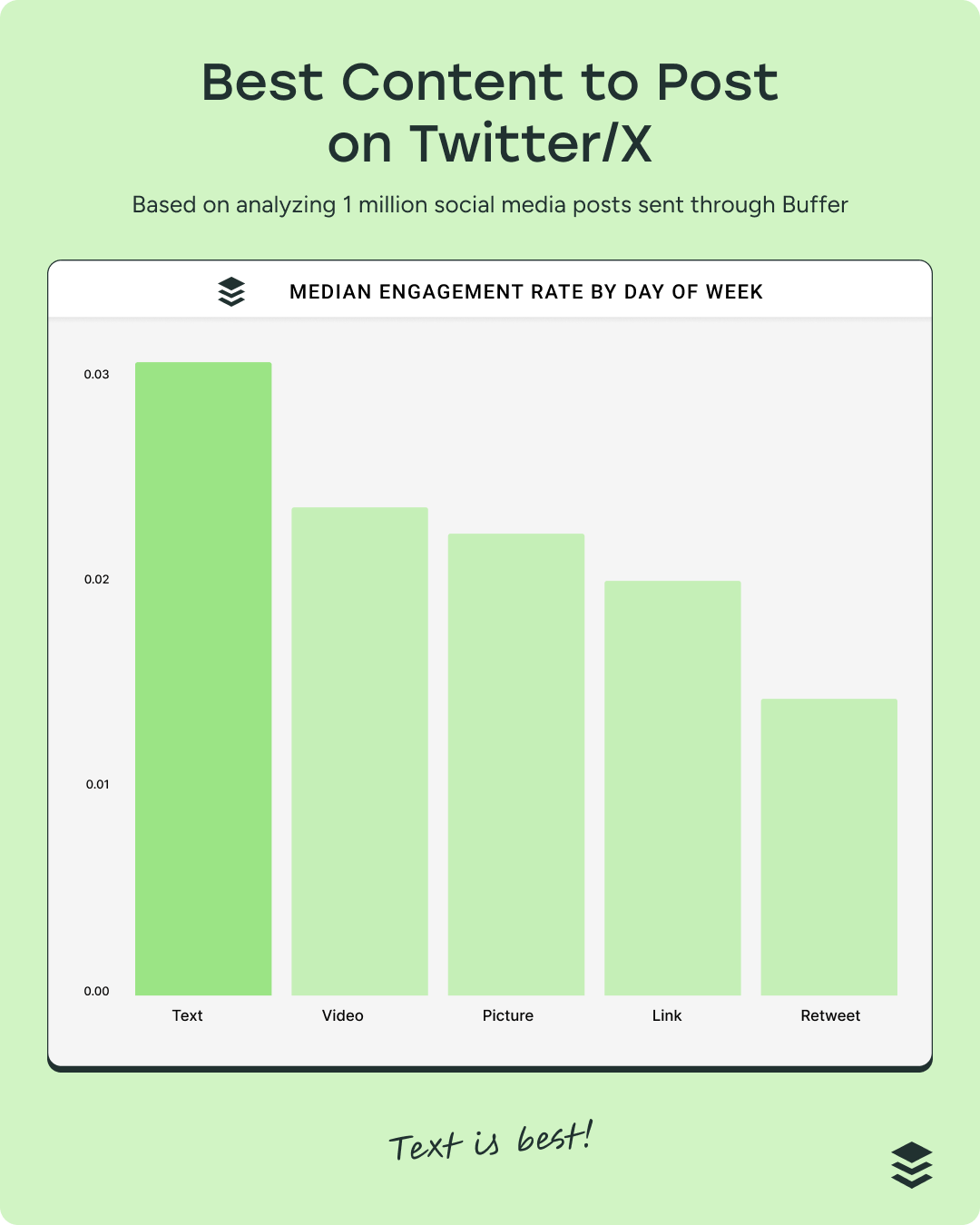
While there is certainly a place for video on X (the runner-up), it is fundamentally a text-first platform. Your real-time news, hot takes, and punchy one-liners are most welcome.
That said, if you have videos or photos that add depth and context to your content, go ahead and post those too. At the end of the day, the best content format is the one that works best for you.
Pro tip: Keep an eye on your analytics to identify patterns over time and see what content formats perform best.
Should I include links in my posts?
According to our data, it’s a hard no, unless you’re in the Premium tier. Posts with links perform significantly worse than other content types:
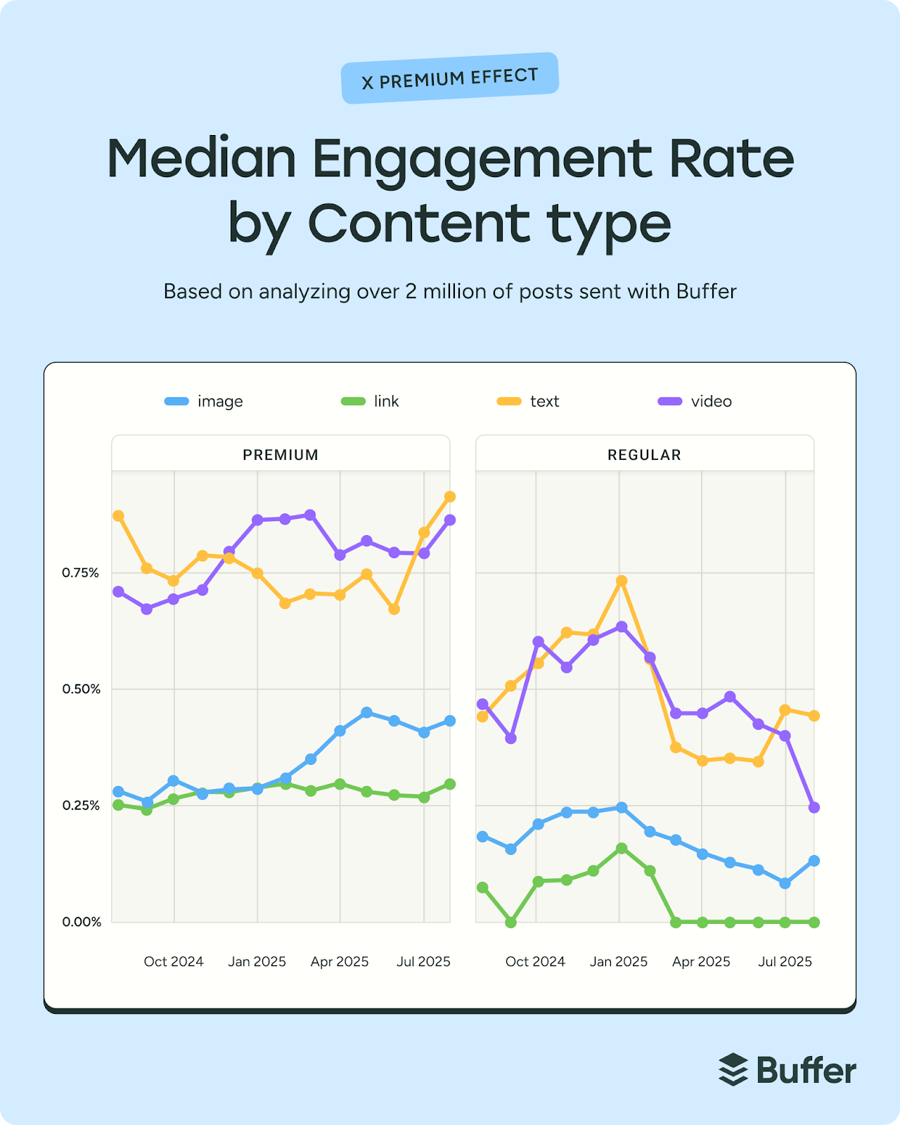
Since March 2025, link posts from non-Premium accounts have seen dramatically reduced visibility, with median engagement rates hovering at 0% (again, you read that right). This means that newsletters, product pages, and blog posts shared directly in the timeline aren’t getting the same results as they once did on Twitter.
Pro tip: Instead of leading with a link, lead with value: share the insight, spark conversation, and make the link a secondary step (for example, placing it in a reply or directing people to your bio).
Be smart about hashtags
X has put the record straight: Using multiple hashtags can get you penalized by the algorithm. That said, hashtags still help categorize your posts and make them discoverable in search, so here’s how to use them well:
- Stick to one or two hashtags max.
- Choose keywords that genuinely describe your post.
- Don’t use spaces or punctuation (#SocialMediaTips works. #Social Media Tips doesn’t)
- Place them naturally
- Type a hashtag into the search bar to see how active and relevant it is before using it
Popular X features to use in your social media marketing
X offers more than just posts and replies — it’s packed with features that can help you grow, connect, and even convert. Here are some of the most useful X tools to incorporate into your social media marketing strategy.
Feed customization
Your feed is the stream of posts you see when you log in. Here, you can toggle between For You and Following.
- The For You feed is algorithm-driven and surfaces content based on your activity, which makes it great for discovering trends and conversations in your niche.
- The Following feed shows posts in chronological order from accounts you follow, which is helpful for staying close to peers, customers, or competitors.
Spaces
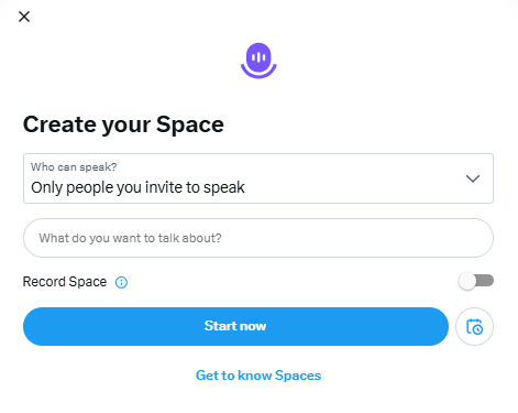
Spaces are live audio conversations hosted on X. They’re powerful for thought leadership, community building, product launches, or live Q&As. You can invite speakers, bring listeners on stage, and record your sessions for replay.
Pro tip: This is great content for repurposing, so turn one conversation into a bank of content.
Community
Communities are topic-based groups within X where people share posts around a specific interest. Posting in relevant Communities can help your content reach a more targeted audience, especially if you’re building authority in a niche.
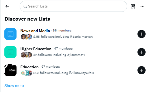
Twitter Lists
Lists let you create curated feeds of specific accounts. Marketers often use lists to monitor competitors, industry leaders, customers, or media contacts without cluttering their main feed. In my opinion, it’s one of the most underrated research and engagement tools on the platform.
Polls
Polls are simple, interactive posts that allow followers to vote on predefined options. They’re excellent for sparking engagement, gathering quick insights, validating ideas, or encouraging low-friction interaction, especially when you’re testing messaging or content themes.
Long-form posts (Premium feature)
Premium users can publish longer posts beyond the standard character limit — a lot longer. While standard accounts only get 280 characters, Premium accounts can go up to 25K characters. This can be useful for deeper storytelling or thought leadership without needing a full thread.
Threads
If you don’t have a Premium account, one workaround for longer content is to use threads. Threads are a series of connected posts that expand on a single idea. They’re ideal for storytelling, teaching, sharing frameworks, or breaking down complex topics step by step.
Here’s an example from Buffer’s Twitter account:
Buffer is built by a fully remote global team, and we bring everyone together once a year for a working retreat. Our expected budget for our April retreat is $332,127.74.
— Buffer (@buffer) March 17, 2025
It’s not a small expense, but we’re big on investing in our team.
Here’s why it’s worth it:
Digital transactions and ecommerce
X is gradually expanding into ecommerce. Features like the profile shop allow eligible businesses with a professional account to showcase products directly on their profile, while product drops help build anticipation around upcoming launches with reminder notifications.
Combined with creator monetization tools like subscriptions and paid content, X is evolving from a traffic-driving platform into a potential conversion touchpoint.
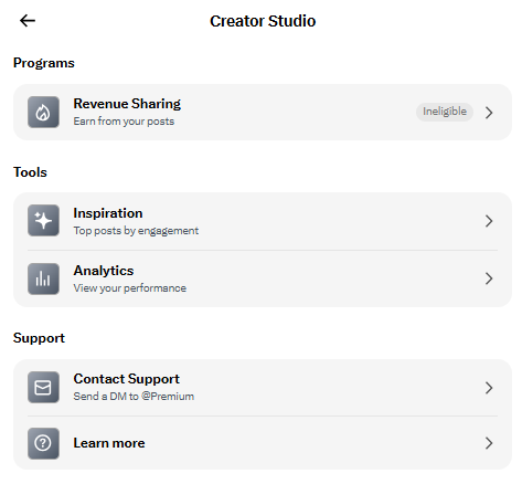
Creator subscriptions
Creator subscriptions are available to eligible creators who want to monetize their audience directly on X. This feature allows you to offer exclusive content — such as subscriber-only posts, replies, or Spaces — in exchange for a monthly fee.
You don’t need a separate creator account type to use subscriptions, but you do need to meet X’s eligibility requirements and typically be on a paid tier.
Best practices to grow your following
Growing on X doesn’t happen overnight — but with the right habits, good things happen. Here are a few practical, proven best practices to help you build momentum and attract the right audience.
Join trending hashtags and topics
To find what’s trending, click on the Explore page and click the Trending tab. You can explore trending hashtags in your region, or select different categories from the Global Trending menu.

Post consistently
If you want to grow on X, consistency matters more than almost anything else. The algorithm tends to favor recency and active participation, so showing up regularly gives your content more chances to be seen.
If you can manage it, a sustainable sweet spot is around three to five posts per day, spaced out over time. That doesn’t mean churning out content for the sake of it. It means staying present in the conversation with a mix of original posts, thoughtful replies, and occasional reshares.
Pro tip: If that sounds like a lot, a simple content calendar and scheduling tool can make it far more manageable — helping you stay consistent without burning out.
Schedule your tweets in advance
Showing up consistently takes planning, especially when you consider that the X/Twitter algorithm loves fresh content and rewards accounts that post regularly.
Scheduling your tweets helps with that. It lets you create your best content when it works for you, then automatically publish it when your audience is online and scrolling. You get to stay visible and consistent without being glued to your phone all day. That's a win-win in my books.
CALLOUT: Here’s a step-by-step guide on how to schedule your tweets, both on the platform and using Buffer.
Post at the best time
Although X no longer has a chronological feed, the times you post still seem to affect the performance of your content.
Our analysis of more than 1 million tweets found that the best time to post on X is 9 a.m. on Wednesday. The next best times to post are Tuesday at 8 a.m., followed by Monday at 8 a.m. In general, tweeting during mid-morning every weekday tends to yield solid engagement.
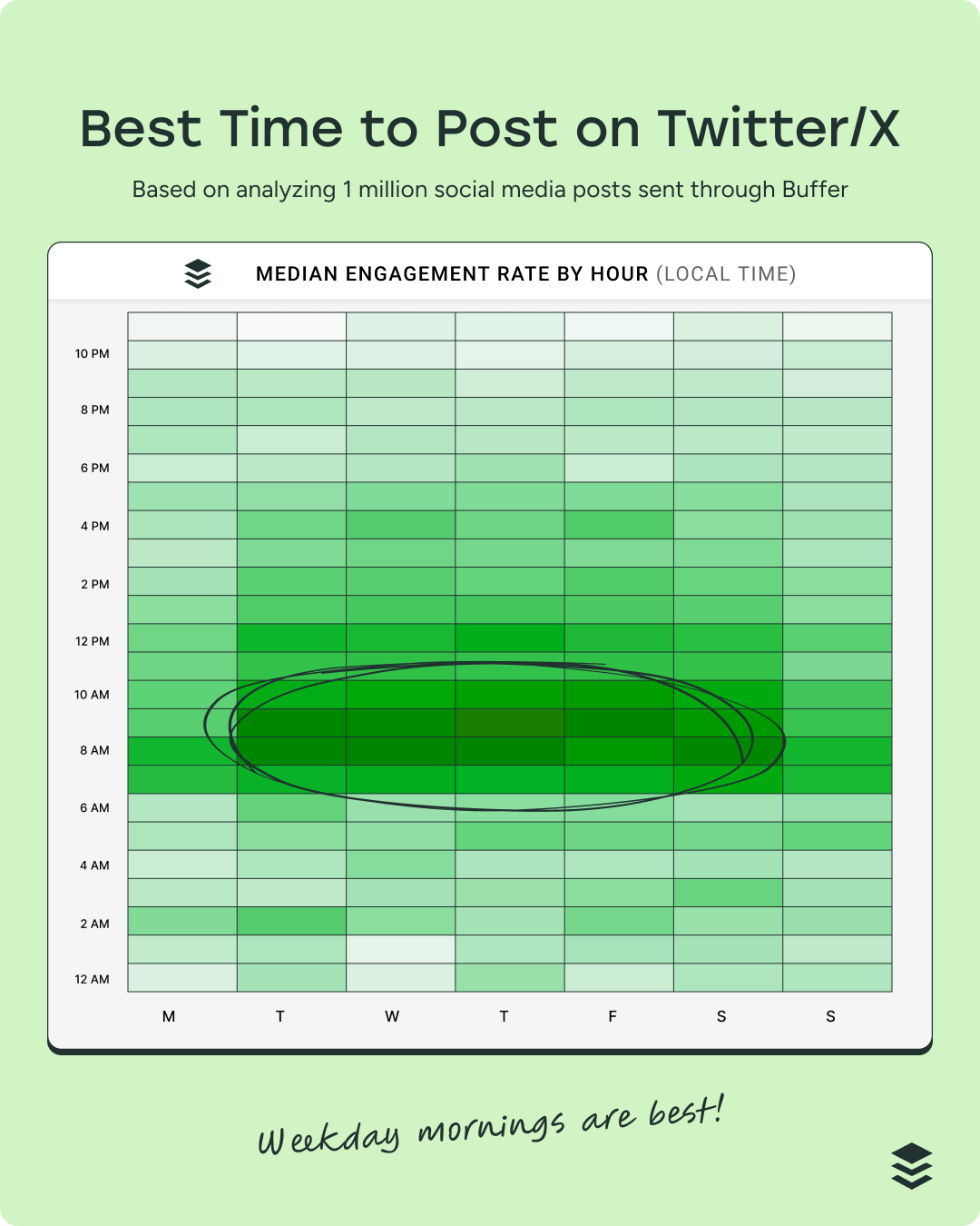
Overall, the best time to post is when your audience is online and engaged. While this general data provides a helpful starting point, it’s not one-size-fits-all. The real insight lives in your own context.
For example, a B2B founder sharing insights on startup growth might see stronger engagement early in the morning on weekdays, when their audience is commuting or catching up on industry news. On the other hand, a gaming creator could find their posts gain more traction late at night or over the weekend, when their community is actively playing and scrolling between sessions.
Monitor your analytics
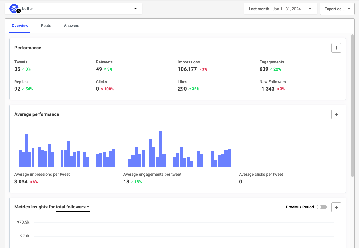
Every post on X tells a story in the data. Behind every impression, reply, repost, and follow is a clue about what resonates and why.
These metrics reveal patterns in attention, timing, and momentum. Over time, they show you what sparks conversation, what builds credibility, and what quietly falls flat. For creators, marketers, and small business owners, that clarity can shape not just what you post next, but how you approach your entire strategy.
Use your analytics to:
- Look for patterns across post impressions to see which ones perform better
- Use audience insights to check if you’re reaching the right people
- Identify what’s driving follower growth
- Compare your average tweet performance for this month with the previous month to see if your performance has improved
- Identify patterns that show you which kinds of posts drive the most engagement
- Evaluate engagement rate over time
CALLOUT: Here are 7 ways to use Twitter analytics to help you make smarter decisions and grow your following.
Actively engage with your audience
On X, replying to comments won’t magically double your reach, but it does make a difference. Our research found that creators who replied to comments saw about an 8% lift in engagement.
What’s more compelling is how consistent that pattern was: more than half the accounts we analyzed performed above their own baseline when they engaged back, regardless of account tier or shifting visibility rules.
Here’s something fascinating I found out when X open-sourced parts of its algorithm: Not all engagement carries the same weight. A reply you respond to can be weighted up to 75× more than a like — and a like alone barely moves the needle.
What does that mean in practice? Posting and ghosting doesn’t just stall relationships; it can limit your reach significantly.

Pro tip: If you want your content to travel further, prioritize real conversations. Set aside time to respond to thoughtful replies, answer questions, and join conversations under your own posts.
Feeling confident that you now know how to use Twitter/X?
I hope this guide has given you a clear, practical starting point — and maybe even a few ideas you’re excited to test.
Like any platform, growth on X comes down to showing up consistently, sharing ideas that spark conversation, and staying engaged with your audience. You don’t need to do everything at once. Start small, experiment, learn from what works, and build from there.
And if staying consistent feels like the hardest part, having the right tools can make a real difference. Planning, scheduling, and analyzing your posts in one place can free you up to focus on what matters most: Creating content your audience cares about. Create your free Buffer account.
Your quick guide to Twitter/X terminology
Post: The official term for what used to be called a tweet. Posts can include text, images, videos, GIFs, polls, and links.
Repost: The equivalent of a retweet. A repost shares someone else’s post with your followers.
Quote: Short for “quote post.” This lets you repost someone else’s content while adding your own commentary.
Reply: A response to someone else’s post. Replies create threaded conversations.
Thread: A series of connected posts from the same account, usually used to share longer thoughts or storytelling.
Handle: Your username, preceded by the “@” symbol (e.g., @buffer).
Display name: The name that appears at the top of your profile. This can differ from your handle.
Feed: The stream of posts you see when you log in. This can be sorted by For You or Following.
For You: An algorithmically curated feed that surfaces posts based on your activity and interests.
Following: A chronological feed showing posts only from accounts you follow.
Blue check: A verification badge available through X Premium subscriptions.
Pinned post: A post fixed to the top of your profile.
Like: A quick way to show appreciation for a post.
Mention: Tagging another account using their handle (e.g., @username).
Trending: Topics or hashtags gaining rapid traction across the platform.
FAQ about how to use Twitter
How do beginners use Twitter/X?
If you’re brand new, start simple. Set up your profile with a clear photo, short bio, and link, then follow a handful of people in your industry. Spend a few days observing how others post, what gets engagement, and how conversations unfold. When you’re ready, share a short post introducing yourself or offering a helpful insight. You don’t need a viral thread on day one — consistency and curiosity will take you further than perfection.
How often should I post on Twitter/X?
There’s no magic number, but most growth-focused accounts benefit from posting multiple times per week — and often multiple times per day. X moves quickly, so showing up regularly helps you stay visible. A sustainable starting point is three to five posts per day, spaced out over time, mixing original posts with replies and reshares. The key is choosing a cadence you can maintain.
What should I post on Twitter/X?
The best content on X is clear, concise, and conversational. Educational tips, industry commentary, behind-the-scenes updates, lessons learned, and thoughtful replies all perform well. If you’re stuck, answer common questions your audience asks or share a quick takeaway from something you’re learning.
Do hashtags help on Twitter/X?
Hashtags can help categorize your posts and improve discoverability in search, but more isn’t better. In fact, using too many can hurt performance. Stick to one or two relevant hashtags, and use them intentionally. If the keyword fits naturally into your sentence, even better.
Should I include links in my posts?
You can, but be strategic. Posts with links often see lower engagement, especially from non-Premium accounts. A better approach is to lead with value — share the key insight in the post itself — and make the link a secondary step, such as placing it in a reply or directing people to your bio.
How do I get more followers on Twitter/X?
Growing on X is less about hacks and more about habits. Post consistently, engage in conversations, reply to comments, and contribute thoughtfully to discussions in your niche. A single helpful reply in the right thread can introduce you to hundreds — sometimes thousands — of new people.
Is Twitter good for business?
It can be, especially if your business benefits from conversation, thought leadership, or real-time engagement. X is particularly strong for personal brands, founders, consultants, SaaS companies, and media-driven businesses.
Do I need X Premium to grow?
Not necessarily. You can absolutely grow on a free account by posting consistently and engaging intentionally. That said, Premium tiers offer additional features like longer posts, editing, and potential visibility advantages. Start with your goals, test the platform, and upgrade only if the additional tools support your strategy.
More Twitter/X resources
- The Best Time to Post on Twitter/X: Based on Data from 1 Million Posts
- Do Posts with Links Affect Content Performance on X?
- Does X Premium Really Boost Your Reach? An Analysis of 18M+ Posts
- How to Schedule Tweets: When to Post, What to Use, and How to Do It Right
- We Analyzed 1.7M Posts from X, Threads, and Bluesky: Here’s What We Learned
- How to Get Your First 1,000 Followers Across All Major Social Media Platforms: The Ultimate Guide
- Ads on X (Formerly Twitter) Are an Untapped Opportunity. Here’s How to Make the Most of Them
Try Buffer for free
190,000+ creators, small businesses, and marketers use Buffer to grow their audiences every month.


