Solving the challenges we face at Buffer has always brought us to some unique places.
From trying many different forms of management to recovering from a serious hacking incident, we are always learning valuable lessons along the way.
Recently, we just wrapped up our 7th Buffer retreat. As our distributed team from corners all around the globe prepared to meet up in Hawaii, we thought one thing that we could improve would be a way of letting everyone on the team know where things are happening—and when.
In the past we’ve used Facebook Messenger to share plans, locations and reminders amongst the team. But now that we’ve grown to 70+ teammates, we’re a bit too large for Messenger to handle. We needed a new solution.
Thus the Buffer Retreat app was born! Here, I’d love to walk you through how we created a fully functioning app to power 92 of us through the retreat in just 45 days time.
Identifying the need for an app
Since Buffer keeps on growing, our retreats keep getting bigger and bigger. As with anything that scales, keeping communication fast, efficient, and easy becomes a challenge.
Patrik, one of our amazing customer researchers, is a retreat veteran. Having been to a few them before, he was quick to recognize a need and propose a solution in the following email:
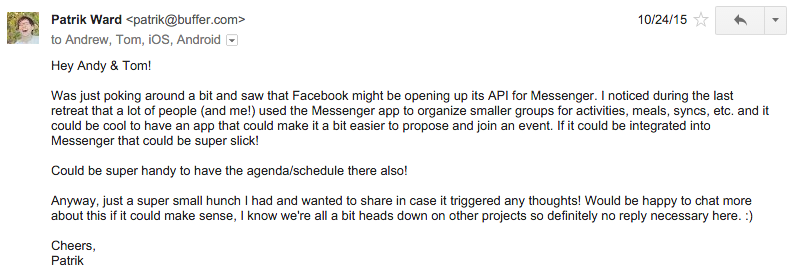
We all agreed that there was a need for what Patrik had proposed. That’s when the retreat app officially started!
Staying lean: Creating our core list of features
You can probably imagine how big our ambitions were in the beginning in terms of features. It’s easy to succumb to feature creep when you start on a project you’re particularly excited about.
But part of the trick to pulling off projects like these is tempering expectations to a certain degree, and identifying just what the user will need most.
Plus timing was a big constraint since the retreat wasn’t far off. We all agreed that staying as lean as possible would be the only option.
So our dreams of implementing cat GIFs for messaging quickly went into the “Nice to Have” column!
After a little back-and-forth in emails and on Slack, we settled on a few core ideas and needs for the app. The main goals looked something like this:
- Easily show the entire schedule of the retreat
- Interact with events of the retreat (i.e. mark yourself as attending, leave comments, etc.)
- Have two types of events – an activity (for everyone) and a session (for Buffer employees, and optionally significant others)
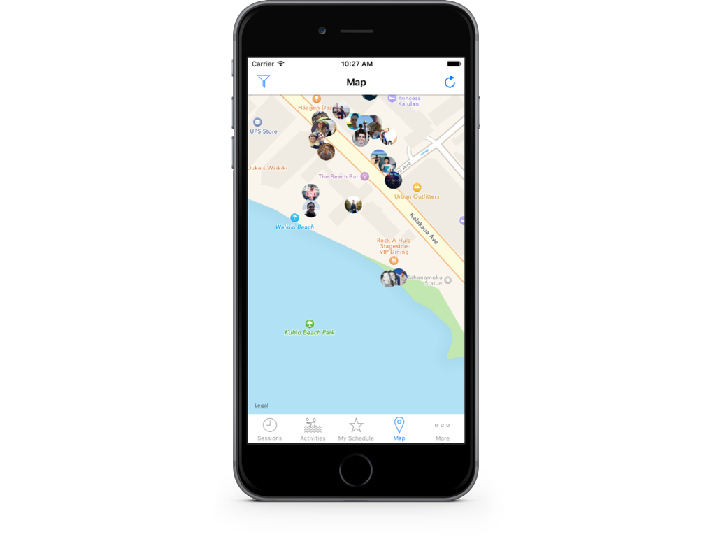
- Show everyone’s location on a map if they allowed it
- Release it on iOS and Android
Having a list of things we needed it to do helped guide the rest of the process and made us identify some things we could cut out to revisit later.
Designing and streamlining our idea
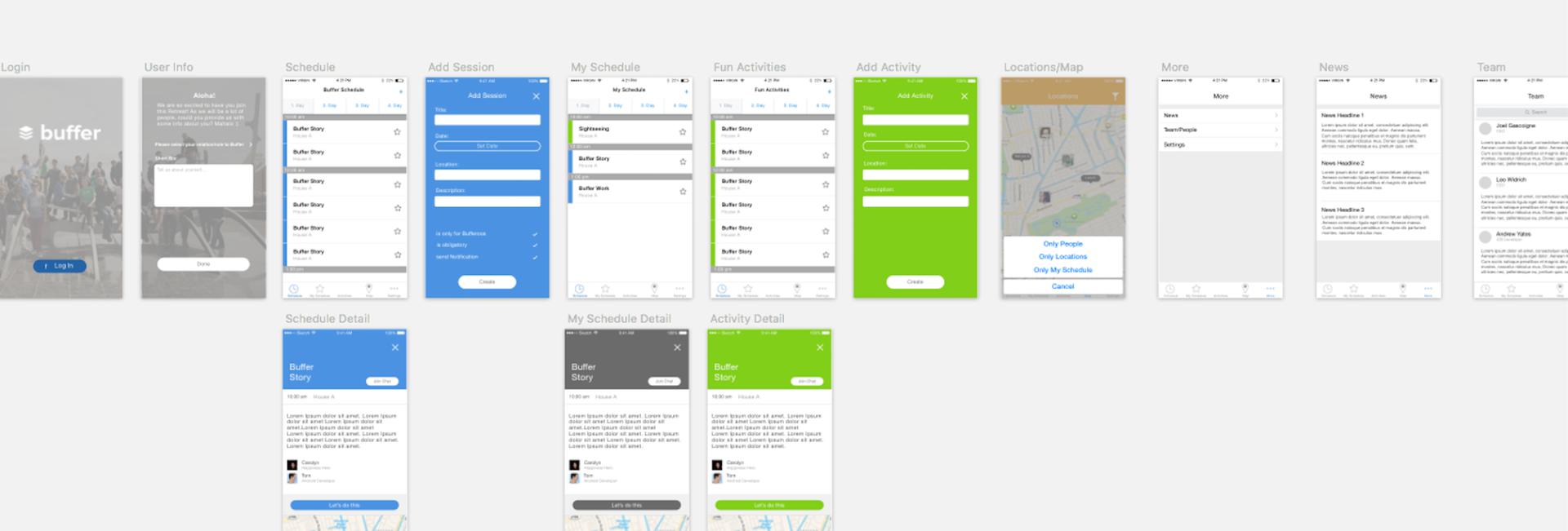
Lucky for us, Marcus has quite the design chops in addition to being a talented developer. Within a week, he put together a Sketch file that acted as a first pass for the app’s design and became our overall guide to the project.
This was incredibly valuable, since it confirmed a few assumptions we had about the app while also making us challenge other features we initially thought were valuable.
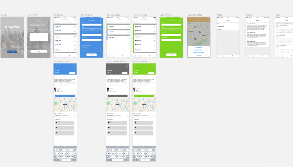
For example, we felt we could do without the “News” section once we saw it laid out.
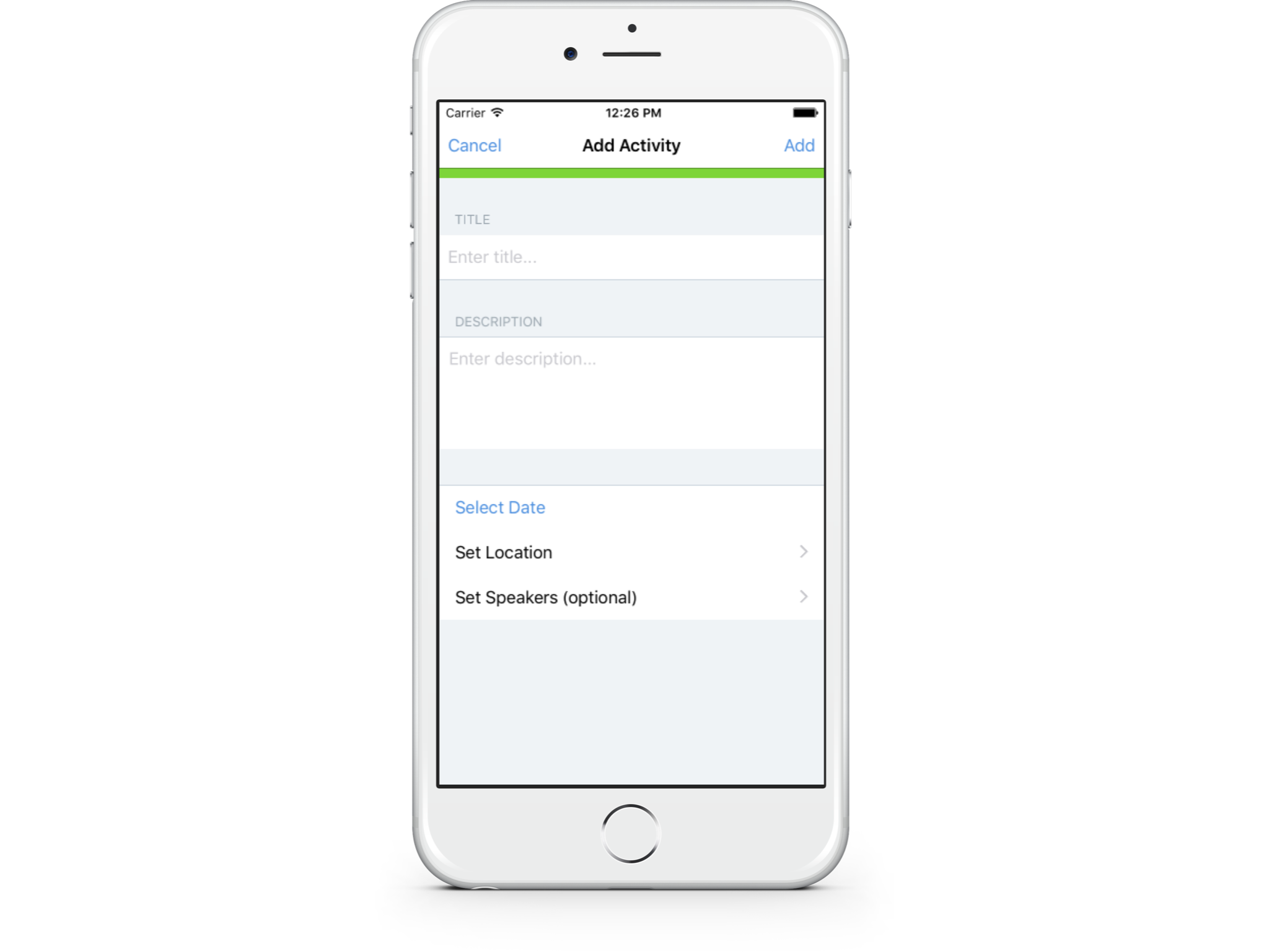
Other changes were more along the lines of optimizing the feel for each platform. For instance, in the Sketch file the “Add Activity” view feels more catered towards Android. On iOS, I ended up giving it a little more of a native feel:
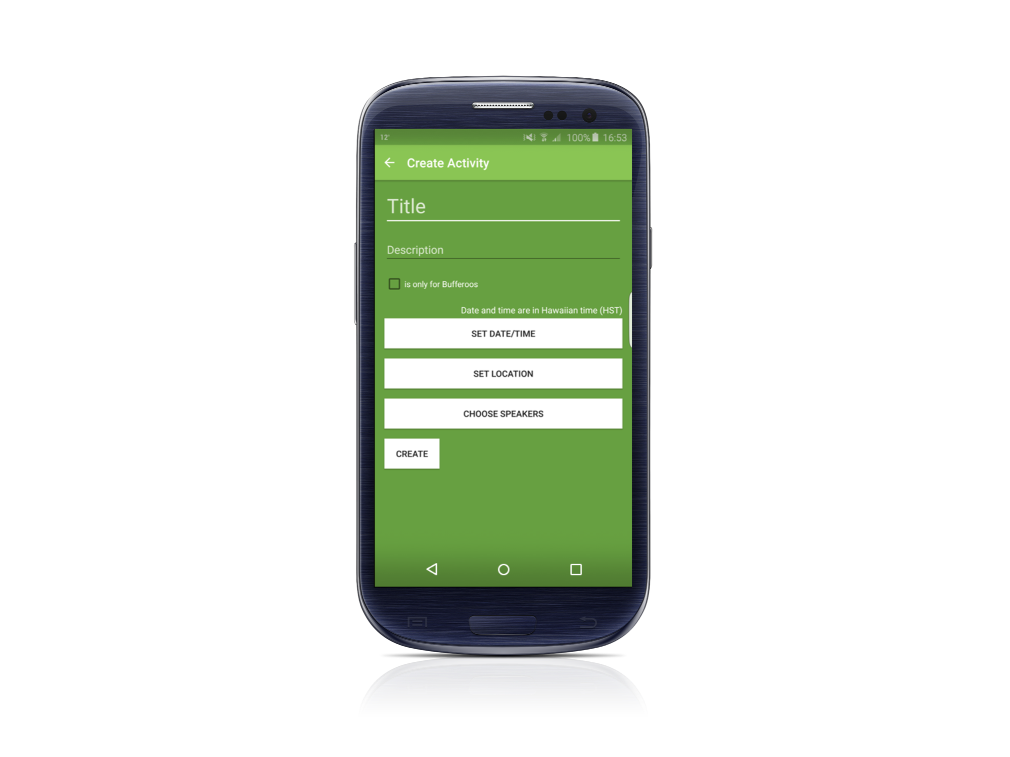
The themes and flows for the user, though, remained as consistent as each platform would allow. For instance, adding an activity looks like this on Android:
The biggest design changes only happened with the icon. Marcus had come up with a few different versions, with the first drafts originally tweaking Buffer’s iOS icon.
Eventually, we decided it was a bit hard to differentiate between the retreat app’s icon and Buffer’s official one. This was amplified by the tendency of most users to place the retreat app right next to Buffer’s app on their iPhone/Android devices.
The answer ended up being simple, as Marcus eventually inverted the colors, which felt perfect:

Development: Borrowing from our codebase for speed
At this point Marcus and I started the development charge! I handled iOS, and Marcus took on Android.
We knew we would have to cut corners wherever possible to deliver the app in time. This meant looking at existing technologies and frameworks that could save us some time.
For the backend and API, we used Parse—everyone on the mobile team had used it before and it meant we wouldn’t drain any bandwidth from our backend developers. (In the future, we’ll need to make some changes here as Parse will close its doors next year.)
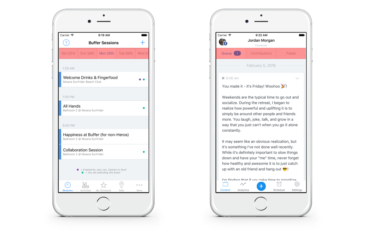
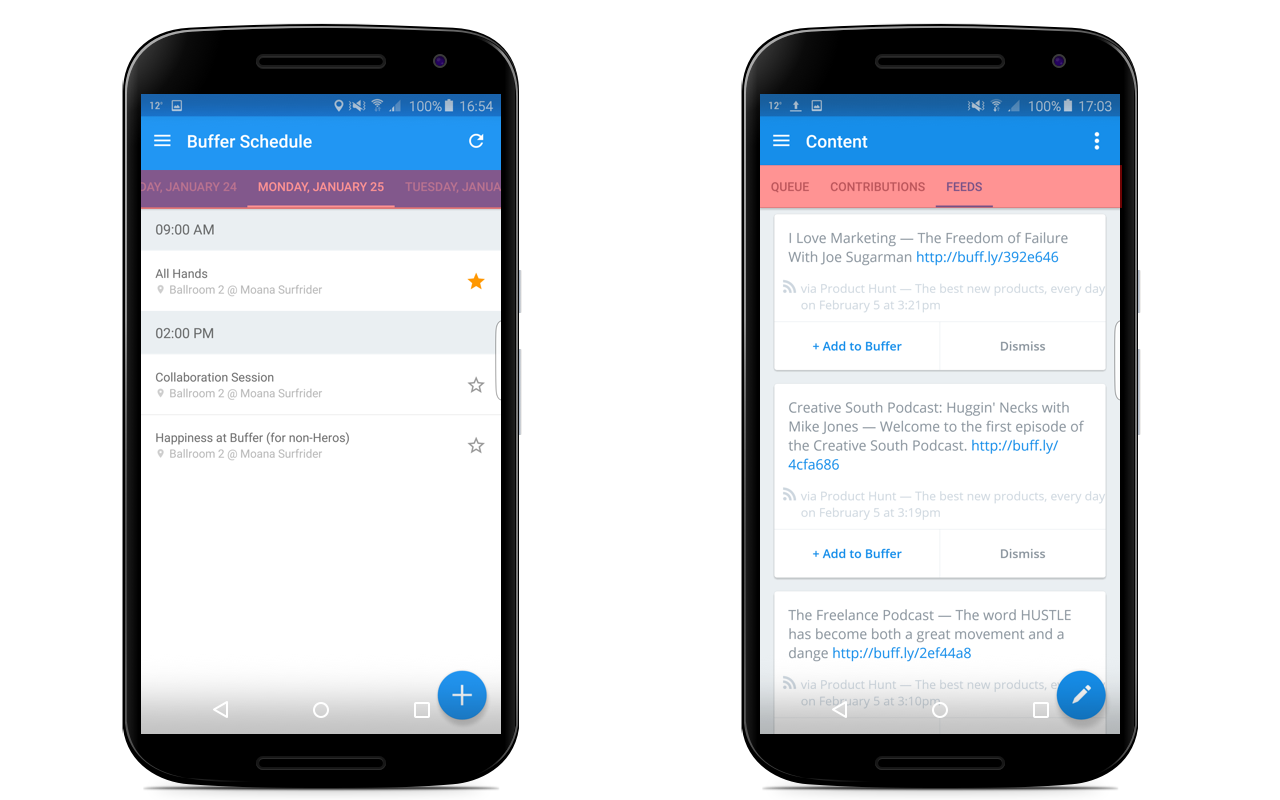
For some of the finer points of the user interface, I turned to some of our own internal solutions. We are huge fans of Cocoapods and use it frequently. Since the design called for each day of the retreat to be listed at the top, I ended up using one of the pods that we use extensively in the Buffer iOS app.
For example, each day of the retreat displays a different view controller when it’s tapped. It’s the same setup we have in Buffer iOS, where we list “Queue,” “Contributions,” and “Feeds.”
It’s a handy subclass of a collection view controller that Andy had built, and it worked perfectly for the retreat app. I’ve highlighted the control red in the picture below, which you can used between both apps:
Over on Android, Marcus was able to do the same thing:
All of us on the mobile team at Buffer were welcome to propose changes and contribute. Even though there were two of us primarily developing the app, the rest of the team would push up commits to help us stay on track.
In particular, Andy worked out a lot of the onboarding on iOS. Tom was extremely proactive in getting some tricky details worked out for the location tracking on Android while Humber suggested Fastlane for automation.
The final stretch: Seeing it through
As the weeks went on, Marcus and I had made progress by allotting a few days out of the week to focus on the app. As December rolled around, I took a two-week vacation and Marcus was in the middle of traveling across the United States. As the retreat inched closer, we devoted a little more time each week to get it shipped.
During development, we would hold a weekly sync over Zoom to discuss how things were going on each platform. This was a key part of the process, as it’s easy to make assumptions of how something should work. Ensuring we were coding features to work the same way across each platform was important.
One hiccup I caused was accidentally creating a duplicate boolean flag on our Event model. As I mentioned previously, events for the retreat could either be a “session” or an “activity”—which we tracked by using a simple enumeration. If we were creating a session in the app, a user could set the event to only allow Buffer employees (a.k.a. Bufferoos) to attend.
Since I didn’t notice Marcus had already added that field in Parse, I added another one. We were each using different flags to set that value in our code:
anEvent.onlyBufferoos = YES; //iOS
anEvent.isOnlyBufferoos = true; //Java
Of course, holding a quick video chat or a simple exchange over Slack always leads to quick resolutions!

Putting it to the test: Time for the retreat!
Once January 23 came around, most everyone at Buffer and their significant other had the retreat app installed on their phone!
Thanks to Fabric, we were able to catch and debug a few things that cropped up during the login flow. I also learned firsthand that dealing with different locales and date formats is something to be especially cognizant of!
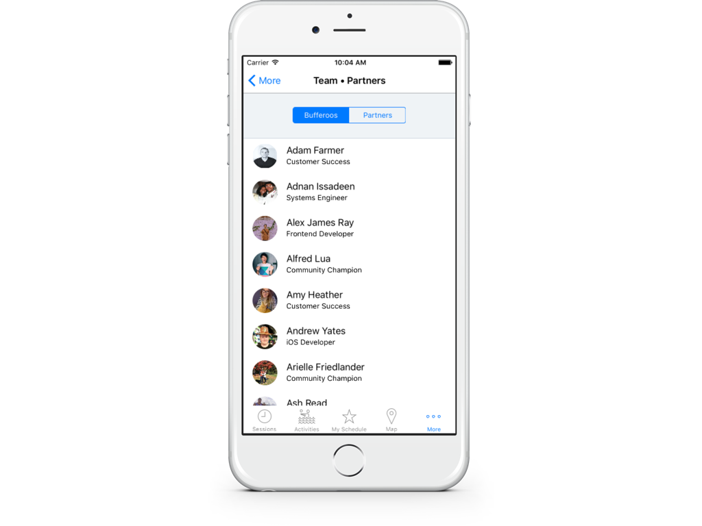
Immediately, something all of us found really useful was the team directory page. Since we are a remote company with people working all over the globe, most of us were meeting in person for the first time! It was truly magical, as my good friend Ross explained here.
Having a listing of teammates, what they did at Buffer, and their partners or family (if they brought others) ended up being super helpful!
Andy also added a nice touch using Parse’s cloud code functionality.
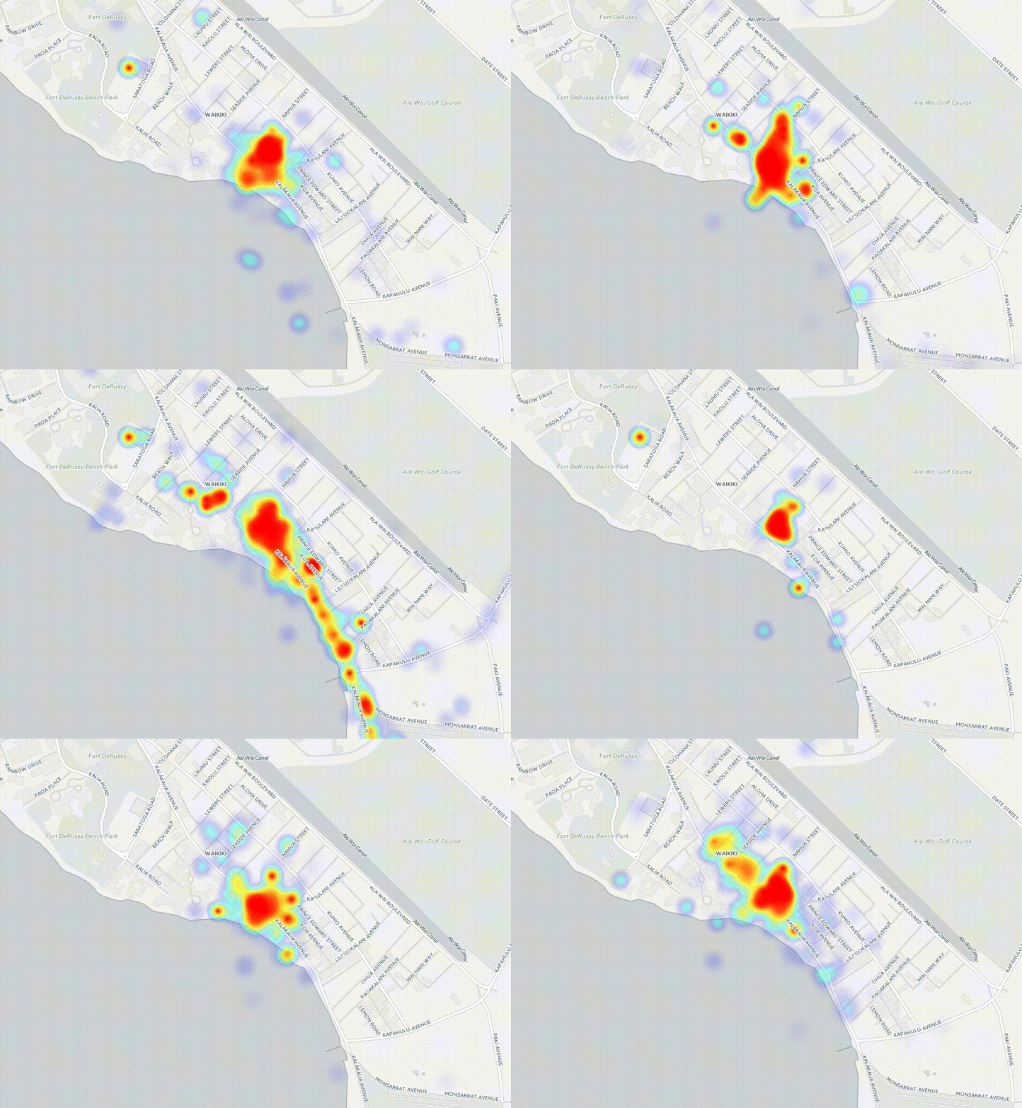
If a user allowed us to track their location, anytime it was updated an instance of a UserLocation object was created and saved to Parse. This created a breadcrumb-like effect of users’ movements during the retreat.
Tom took this data (over 131k rows!) and made this incredible heat map of our movements:
The app really helped us stay on track during the retreat. Seeing when and where sessions were taking place and giving our partners a place to create activities and meet others while we worked during the day worked very well!
In fact, waking up and seeing what sessions or activities the day held became a part of our morning routine. Whether it was checking to see where a particular Buffer session was, or seeing who was brave enough to go on a 5 a.m. hike, there was always something to partake in!
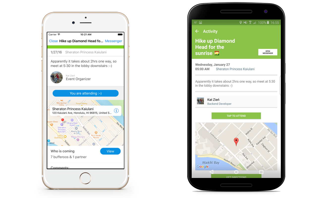
It was also not uncommon to use the map to find where some of our friends were to meet up. I remember using it one day in particular to find Marcus on the beach to go snorkeling!
What we learned: Move as fast as possible, but not faster
There were times were I had to make a conscious decision to not “overengineer” some of the code. Since time was short, there were some instances where I coded the app to just work and not think about scaling as much.
An example is when a user creates an event. As soon as the new event was saved off to Parse, I reloaded all of the events in the app to refresh the user interface. This wasn’t much of an issue since we would be dealing with 20–30 events, tops.
If the retreat app lives on and Buffer keeps growing (which I hope is the case!) then shifting this approach to use a local cache will be crucial. The way I have it implemented now is equivalent to Facebook fetching and reloading their entire user interface anytime a user hits “like” on a photo!
After development was complete, I found that there were a few times I would open a view controller to see something with “//Clean up later” or “//HACK ?“!
For me, this was an important lesson to learn. I tend to preplan architecture and want to know how things will fit perfectly before I code. There is a time and place for this, but on the flip side it’s important to know when to pick your battles. Releasing an app on time that worked was our measure of success, not scaling it to a million users!
Over to you
We learned a lot through developing the retreat app. It was the closest I’ve been to customer development, and being able to learn from that experience was truly inspiring.
Watching all of my friends inch closer to Waikiki via the app leading up to the retreat was also incredibly fun!
What about you? Do you have any experience building internal apps for your company? Anything we could’ve done better or optimized more? We’d love to learn from you!
Even better, feel free to visit our Journey page and help us bring mobile at Buffer to the next level!
Try Buffer for free
190,000+ creators, small businesses, and marketers use Buffer to grow their audiences every month.
