What governs the way you write?
Consistency in style, tone, grammar, and punctuation is essential to an enjoyable blog experience. Successfully done, these elements go unnoticed by readers who are too busy consuming the easy, breezy content. That’s the way it should be. Style guides create uniform content and allow that content to shine.
Invisibility is the hallmark of a well-used style guide. You may not even notice the hundreds of subtle decisions that make browsing a blog seamless, but know that they are there. Everything from capitalization to commas, styles to sources, and so much more gets covered in a content style guide.
Need one?
Content style guides are easier to set up than you think, and the payoff can be substantial for the success of your blog and the enjoyment of your readers. For those interested in a blog with consistency and quality, a content style guide is an invaluable resource.
Origins of the style guide
Imagine being handed hundreds of papers with scribbled notes from university professors and being tasked with organizing them, editing them, and setting them to type.
No thanks.
This is the way that some printing houses in the late 1800s created documents and books. The haphazard nature of this process eventually led to the formation of style guidelines because some semblance of order was needed. Here is a retelling from the origins of the Chicago Manual of Style:
Professors brought their handwritten manuscripts directly to the compositors, who did their best to decipher them. The compositors then passed the proofs to the “brainery”—the proofreaders who corrected typographical errors and edited for stylistic inconsistencies. To bring a common set of rules to the process, the staff of the composing room drew up a style sheet, which was then passed on to the rest of the university community.
(As a self-professed proofreader, I dig the term “brainery.”)
The original print style guides became the foundations for the style guides that exist today—many of which can trace their beginnings to the printing press days. The Chicago Manual of Style has been around for over 100 years. APA style began as a seven-page document in the 1920s and is now 272 pages. A lot has changed in the past century, including what’s covered in a style guide.
Why is a style guide important?
The value of a style guide is often best seen with examples of content run amok. Here are two cases:
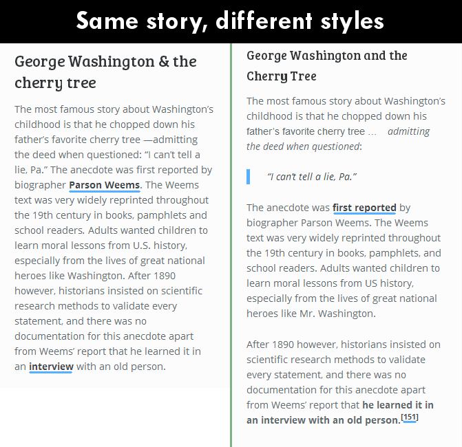
Can you find all the differences?
The headings are different, the capitalization in titles is different, the paragraph styles are different, the link text is different. One version uses blockquotes and italics and bold and footnotes and a serial comma and an em dash, the other doesn’t.
This next example is a little more straightforward. This deals with differences within a single story. See what an effect something as simple as headings can have.
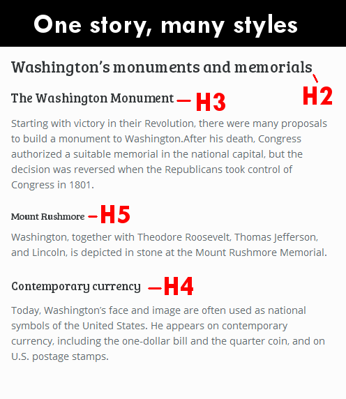
The chaotic results of content without rules make the strongest case for the value of a style guide. If you need more convincing, here are three specific ways in which style guides help.
- Create the perception of quality and professionalism
- Foster consistency in style and tone
- Solve problems and settle disputes
Quality and professionalism. You will not be able to retain readers with a sloppy blog. On the contrary, when readers see that there is structure and organization behind what you write, they feel much safer sticking around. Professionalism has never lost anyone.
Consistency in style and tone. Consistency in blogging can mean many different things. Certainly, consistency is valuable as it relates to an editorial calendar. It is also uber-important with the tiny details—spelling, punctuation, grammar, headings, design. These things will be noticed by loyal readers and either appreciated for being done right or hated for being done wrong.
Problem solving. An editorial style guide is a great problem solver in the writing room. With a style guide, there is no need to wonder what the right way is or how things were done last time. A style guide knows. A style guide remembers. A style guide sets the rules to follow so that everyone is on the same page.
Content style guide blueprint
“Remember that style guides are references, consulted when a question or problem arises, rather than books to be read as a training tool.”
— author Jean Hollis Weber
Jean Hollis Weber’s advice is important to keep this in mind as you are creating your style guide. A War and Peace tome is neither expected nor helpful. In many cases, a good style guide need be no longer than four pages.
(Wikipedia’s is a little longer. OK, a lot longer.)
The key to keeping the length reasonable is to find an existing editorial style guide that covers the basics—a guide like the AP Style Guide or the Chicago Manual of Style. These guides are exhaustive in their coverage of grammar, punctuation, capitalization, and word usage.
Once you have this foundation, your content style guide is free to cover only the additions or changes. There is no need to repeat anything that is in the original guide.
To find out what additions or changes are necessary, it is helpful to involve your writing team. They are the ones with the field experience, and group discussion about this living, breathing document can be healthy for creating the best style guide for everyone.
And remember:
The key to a good style guide is brevity.
Now to the nitty-gritty.
Begin with a Table of Contents. Here is an overview of the sections I’ll cover below.
- Introduction
- Grammar, punctuation, and capitalization
- Style and tone
- Formatting
- Images
- Optional sections
1. Introduction
If for nothing else, the introduction serves as the ideal place to declare what external style guide your blog will use. Here are some major ones:
- AP Stylebook – used in journalism
- The Chicago Manual of Style – used for general publishing
- The Yahoo! Style Guide
When referring to your style guide of choice, it is important to mention how a writer can access the style guide. Is it online? Is it on a bookshelf in the breakroom? If the company has an online shared account, you should include the username and password in the style guide intro.
Other than the necessary mention of an external style guide, the introduction section is a free-for-all. Keep it short (obviously), but feel free to have some fun, too. Here is what WPMU.org does with theirs:
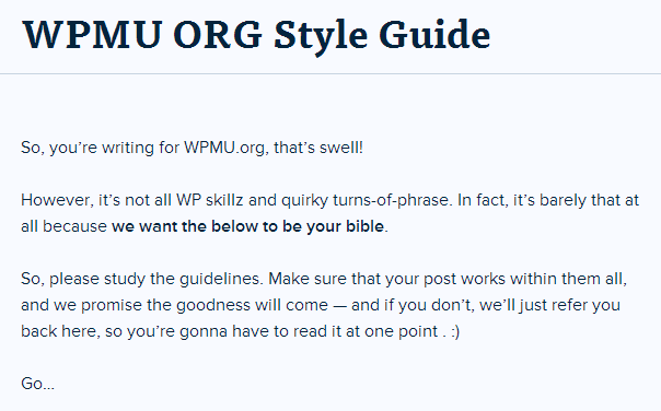
So, you’re writing for WPMU.org, that’s swell!
However, it’s not all WP skillz and quirky turns-of-phrase. In fact, it’s barely that at all because we want the below to be your bible.
So, please study the guidelines. Make sure that your post works within them all, and we promise the goodness will come — and if you don’t, we’ll just refer you back here, so you’re gonna have to read it at one point . ?
Go…
Want something a little more structured? The Economist lists George Orwell’s famous writing rules in its introduction.
2. Grammar, punctuation, and capitalization
Most of the grammar, punctuation, and capitalization instructions will be spelled out in the external style guide you choose. Any differences or additions should go here.
Specifics will be unique for each industry, but there are a few common areas that show up on many blogs. Here are a few quibbles you might want to consider:
The serial comma
How do you punctuate lists of three or more items? Should there be a comma before the coordinating conjunction or no comma at all? Wars have started over less. There are two vying factions on this issue, and it typically comes down to a matter of preference. In some cases, the ambiguity of comma usage could be a determining factor. Take the following example from a newspaper account of a Merle Haggard documentary:
Among those interviewed were his two ex-wives, Kris Kristofferson and Robert Duvall.
Here is how it would read with a serial comma:
Among those interviewed were his two ex-sives, Krist Kristofferson, and Robert Duvall.
In some cases, rewording and reorganizing would remove ambiguity equally as well as an extra comma would. The choice is yours.
Dashes
Do you know the difference between an em dash and an en dash? Your readers might not know either, but chances are they will notice if ems and ens aren’t used consistently. Em dashes are the width of the letter “m,” and en dashes are the width of the letter “n.” Editorial style guides like AP and Chicago typically declare when it is best to use each, but if your style differs, here is where to note it.
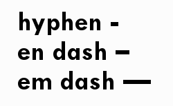
(Tip for WordPress users: Three dashes in a row are automatically converted to an em dash by WordPress.)
Numbers – Schools of thought vary on this one: Do you spell out all single-digit numbers and leave the rest as numerals? Do you spell out everything less than 100?
Abbreviations – Explain what abbreviations can be used, if any. Be specific about how these abbreviations should look. For instance, if you allow the word “continued” to be abbreviated in blog post titles, you will need to specify if it should appear as (Cont.) or cont. or however else you might want it to look.
Acronyms – Decide about use of acronyms, if any are allowed, and how they must appear. Associated Press (AP) format relies on spelling out an acronym title on first reference with the acronym in parentheses (like I did at the start of this sentence); every proceeding reference can be abbreviated.
Capitalization – Which words should be capitalized in blog post titles? If you differ from your style guide, be sure to note that here.
Punctuation – Do you use exclamation points? Some blogs don’t, as a rule. Imagine that!
As rules change and new issues come up, this section would be expected to change as necessary. Ideally, this would be the place where you confer with the writing team to find out what works best and what needs added. The decisions themselves are not most vital, but rather the goal is to have everyone on the same page.
The important thing is that you use the same rules consistently throughout all the content you create.
3. Style and tone
Can you tell a Mashable article when you see it? Do all Buzzfeed stories sound similar? This is a cause of style and tone.
In terms of rigidity, the style and tone section is more guideline than rule. Whereas grammar is black-and-white, style and tone tend toward gray. The main takeaway here is that this section should guide the writer toward achieving the blog’s feel and voice.
Let’s begin with feel. Style, in this sense, refers to how a post looks and reads. In a content style guide for a blog, you will want a reminder that online readers don’t read, they scan. As such, you can use this section to list the many ways you can break up long articles and content.
- Short paragraphs
- Lists
- Headings
- Bold and italic
- Photos
- Blockquotes
The tone of your blog deals with how content is written rather than how it appears. Again, to borrow an example from the Economist, here is what their style guide’s tone establishes:
- Do not be stuffy.
- Use the language of everyday speech.
- Do not be hectoring or arrogant.
- Do not be too pleased with yourself.
- Do not be too chatty.
- Do not be too didactic.
- Do your best to be lucid.
Guidelines for your blog’s tone need not be listed in a rules format like the Economist. Tone can be set by a simple list of adjectives that cover how you want your blog to sound. Here are some options:
- Conversational
- Thorough
- Academic
- Laidback
- Snarky
- Funny
- Controversial
- Irreverent
- Artistic
- Objective
- Educational
- Sophisticated
4. Formatting
In many cases, your blog’s CSS will handle much of the formatting automatically. For instance, you don’t need to include rules about what blockquotes should look like because there is code in place that creates a uniform look for all blockquotes.
The focus instead should be on consistency with the way these coded styles are used. For instance.
- How should you use headings? Do main headings receive an H2 tag or an H3 tag?
- When is bold okay to use?
- When are italics okay to use?
- Is strikethrough allowed?
5. Images
There are many different elements to consider in discussing images, everything from alignment (center, left, right) to alt text to naming to captions to sizes to sourcing, and so much more. Depending on how specific you want to get with the rules for images, this section could be the longest in your style guide. Just look at all there is to consider with image captions alone:
Outline from where writers can source images and how to attribute that source within the content — should they link to it at the bottom of their content, include an image caption, or work in the artist credit within the copy?
Explain what you need in order to have a consistent image style on your blog. If that means a page on images, then so be it.
On a related note, the Images section can include websites where writers can look for approved images. Some common sites to include may be
6. Optional sections
Blog-specific instructions
Every blog is a snowflake, as original as the next. For this reason, it may be necessary to explain unique parts of the publishing process on your blog in particular.
WordPress blogs have a glut of plugins and options when it comes to publishing. Many blogs use post excerpts; you’ll need to explain to writers how to use these. Other blogs have deep SEO settings; again, an explanation is warranted. Thumbnails and categorization and tagging and post formats and … the list goes on. If there is an important element to your publishing process that needs to be consistently completed, the style guide is a great place for it.
Approved and unapproved content
For blogs that reference content from around the web, there may need to be guidelines for which other sites can be used as sources and which can’t. In this case, you can list a series of approved industry sources and a list of taboo competitors or low-quality sites.
Sourcing
How do you give credit to where you found your information? Some sites link to text within paragraphs. Others mention the site by name and link to the site. Still others use footnotes. Whatever you decide, make sure it is consistent.
Personas
Borrowing on a common sales and marketing tactic, HubSpot suggests adding personas to your content style guide in order to help writers envision the audience for which they’re writing. These personas would represent broad descriptions of target individuals who share common desires, questions, and goals.
(Find out) who your target audience is, their pain points, the value your company provides, how they like to be communicated with, and (include) a picture to give writers a visual to keep in mind when creating content.
If your writers understand your target audience, many questions that would normally arise during content creation are easily answered with common sense based on their knowledge of your readers.
Editorial style guide template
Put it all together, and you have a single document that should keep all your writers on the same page. There are many different pieces and parts that go into a successful style guide, and the constant changes and updates to the guide will mean that the document is never complete. Still, you’ll need to start somewhere.
Use this content style guide template as a jumping-off point.
The file includes placeholders for each of the sections listed above as well as some reminder text on what should go where. Feel free to edit and change to your liking.
I built a sample content style guide from the template. Copy and paste as you like.
Links to helpful style guide examples
Style guides exist. In real life. Here are some examples:
What does your style guide look like?
Perhaps you have already created your own in-house style guide for your blog. Perhaps you read some of this post and decided right on the spot that you must have this feature or that feature. Great! We’d love to hear what works for you and what you find essential to your blog publishing process.
Try Buffer for free
190,000+ creators, small businesses, and marketers use Buffer to grow their audiences every month.


