
Notice anything different about your Facebook page?
Facebook is in the process of rolling out a series of changes for all business pages, tweaking the design and layout in a number of small but significant ways, giving opportunity to marketers to make the most of what’s new.
So what is new? And how can you optimize your page to get the most value from what’s changed with the Facebook Page redesign?
I collected the changes and differences from this Facebook page to the last, including all the highlights from Facebook’s most-mentioned changes and even the smaller tweaks that are flying under the radar. I’m happy to pass along some advice, too—much of which I’ve gleaned from our social media archives and best practices. If you find any changes I’ve missed—or have any other helpful advice on what you might do to your page strategy—drop them into the comments. I’d love to hear them!
Here now is an overview of what’s changed on your Facebook page and what you’ll need to act on.
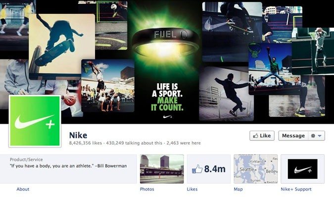
Old vs. New: A complete list of Facebook Page changes
Old:
New:
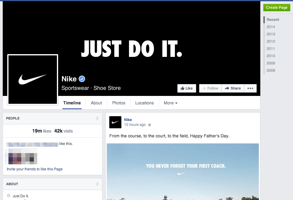
The new Facebook pages were scheduled to go live for everyone as of June 13; you may have even turned your new design over earlier as access has been around for a couple weeks. What are the biggest changes you notice?
Facebook mentioned quite a few changes in its blogpost announcement, and I noticed that there are some other new twists as well. Here’s the complete list.
- A one-column design for your updates
- Left-side column contains your complete page info
- Like, Follow, and Message buttons appear on top of the cover photo
- Easier access to admin tools via top menu and right-side menu
- Analyze competitor pages with a new comparison tool
- Apps and custom tabs have moved to the left column
- The return of Notes
- Liked pages at the bottom
- A Like box appears once a visitor scrolls down the page
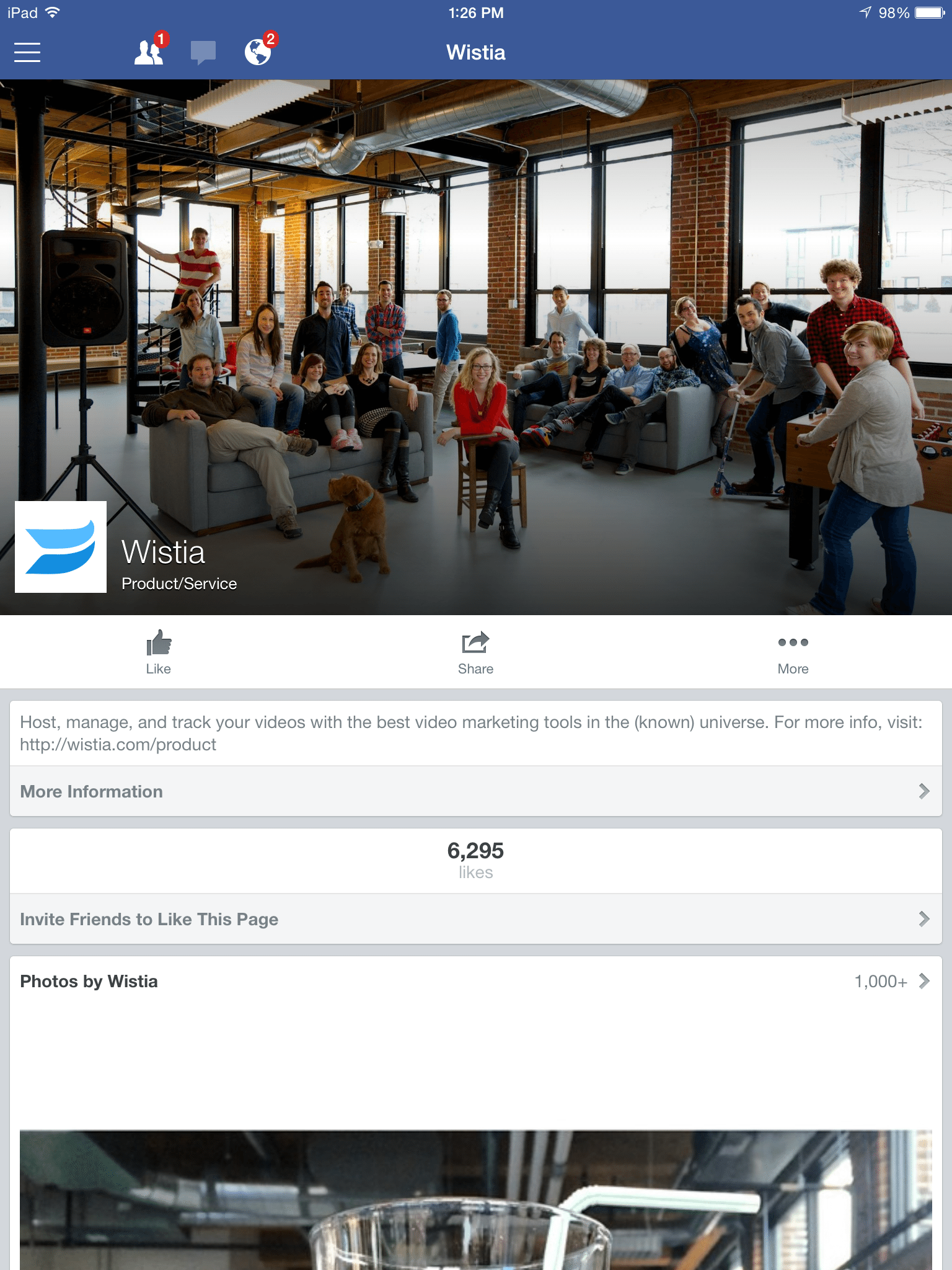
It should be pointed out that the page redesign is desktop-only. The mobile version of Facebook pages will remain the same, so keep in mind how your edits on your desktop will carryover to mobile phones and tablets. Here’s a quick reminder of how a Facebook page looks on mobile.
How a one-column design might change the way you manage your page
Facebook’s former page design mixed up one- and two-column looks to form a mosaic of updates. The redesigned page is far more standard. The feed now matches what you’ve come to expect on other social streams like Twitter (and your personal Facebook feed) as well as fitting the style of traditional blogs. It’s a very bloggy refresh.
In this case, it might be best to treat the Facebook news feed more like a standard Twitter feed or blog. Always be aware of what’s on top, as that will often lead the impression of the content of your page.
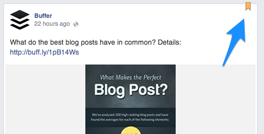
One way to work around this is to pin an update to the top of your page. Pinned posts stick to the top of the news feed column and are the first thing visitors will see.
Think of this like a featured post on your blog. Refresh it often with an up-to-date update, and make the message representative of your company’s voice and tone and in line with your social media marketing strategy.
Pin your best stuff. Pin your most convincing content.
So how might you go about finding your best content?
Where to find reports on your best updates
Analytics have moved around with the new Facebook pages. You can still access all your same reports (and then some), plus view your page’s health and activity at a glance. Page admins who are logged in will see the following admin menus and quick-glance stats on their main page.
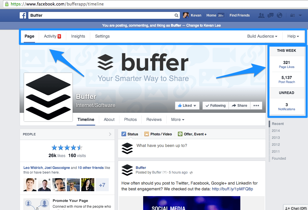
Clicking through the admin menus will show a full range of stats like page reach, post performance, the time of day when your fans are online, and much more.
To figure out which posts perform best (and which ones you may want to pin to the top of your page), click on Insights from the to menu then Posts from the sub menu. Scroll down to see a chronological list of your latest posts.

The blue bars represent how many clicks each of your posts received. The red bars represent the total interactions of a post (likes, comments, and shares). In the example screengrab above, we had a clear winner on our Buffer page—the post with 119 clicks and 22 interactions.
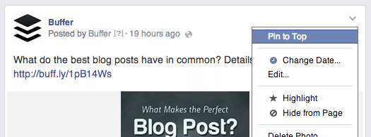
To pin this post to the top, hop back over to your main page, find the post you want to pin, and click the arrow in the upper right corner of the post. “Pin to Top” should appear as the first option.
What will they see first: the cover or the profile picture?
Cover images have been a huge ingredient in branding and messaging since Facebook debuted them with their last page redesign. They’ll remain important in this redesign, too. They’ll just be a little more crowded.
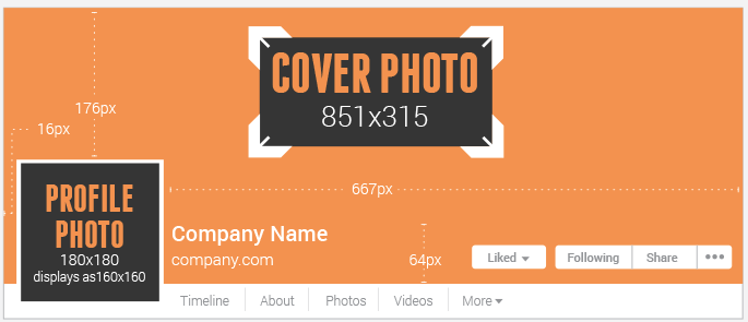
The new design pushes a number of features on top of the cover image. The page name and industry, the Like button, the Follow and Message buttons, and the profile picture itself all cover up parts of the cover photo.
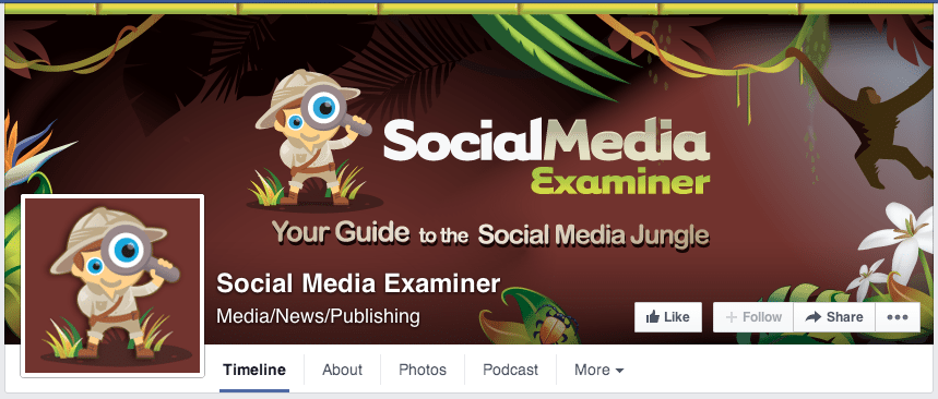
Cover photos are still going to be one of the best ways to make a great first impression on a visitor (especially on mobile devices). So with the new page design, be more aware of how your cover photo—and any CTAs or messages you’ve included in it—will look with superimposed buttons and text on top. Here is a helpful guide from John Loomer about the specific pixels that will be affected.
Get to know the hierarchy of the left-side column
With the move to a one-column feed, Facebook pages now host all the vital information in the left sidebar. Everything from bio and links to apps and reviews run down the left. Here is the hierarchy.
- Likes and visits
- Friends who like this page
- Information about your company
- Link
- Option for others to suggest changes
- Apps
- Photos
- Videos
- Reviews
- Posts to Page
- Liked by this page
Note: If you’re a brick-and-mortar business, the left-side column will show a map, phone number, and hours of business at the top of the left column. The takeaway here: Don’t enter your brick-and-mortar business info (like an address, for instance) if you don’t want that plum top spot used up by a map.
The biggest difference in the hierarchy of the left-side column is likes coming before information. Visitors will see how popular you are before they let you tell them about yourself.
Interestingly enough, Facebook plans to allow you to customize the order of items in your sidebar. Stay tuned.
So what does the hierarchy mean for a page owner? You should keep it all clean and tidy since so much more shows up than before. You should also keep in mind the order of what gets seen.
Here’s a note about your About:
Your info paragraph does not need to contain a link to your website. Previously, the easiest way to promote your website on your FB page was to stick a link in the info paragraph. Now, that link appears automatically underneath the info.
We had yet to update our Buffer page with the latest change, and you can see the duplicate effect.
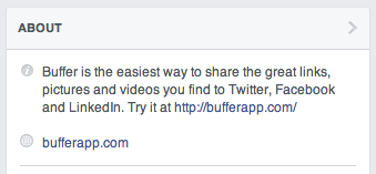
To remedy this, simply edit the About section of your page and make sure that your link is updated in your page settings.
Learn from those who do Facebook pages best
Part of the redesigned analytics section is a bonus feature to track up to five other pages and compare stats alongside your own. Here’s what you get to see in the comparison:
- Total page likes
- New page likes (represented as weekly percentage growth)
- Posts this week
- Engagement this week (likes, comments, and shares)
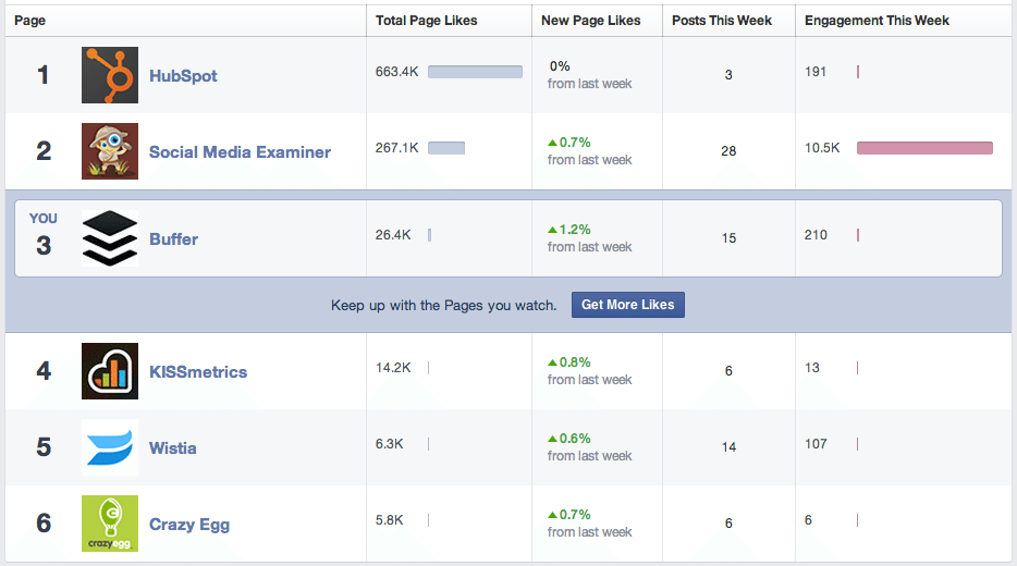
You might be wondering, “Would my competitors know that I’m tracking their Facebook page?” No, not precisely. Admins do receive a notification whenever their page is added to a watch list, but they don’t get to see who added them.
How might you choose which pages to watch?
We’ve grabbed from a few different areas to create our watch list—pages that are far and away rocking the Facebook scene (Social Media Examiner), pages that are run by industry leaders (Hubspot), and pages of some brands we admire (Wistia, Crazy Egg, and KISSmetrics).
Other notable changes
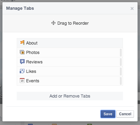
The top menu features About, Photos, and Your Choice. You get a little customization control over your page’s top menu, i.e. the one that appears directly below your cover photo. Logged-in page admins can choose “Manage Tabs” from the menu bar’s drop down list and then drag-and-drop from your available widgets to create a custom menu. The About section is the only one required to stay in its slot.
Updates take precedence over apps. Previously, apps appeared immediately below the cover photo. Now that place is reserved for updates (and apps fall quite far down the page into the left-hand column).
The new design shows all your apps. It used to be that only the top 12 apps would be displayed by Facebook; some pages took advantage of this to install secret apps or practice apps in the 13th, 14th, and 15th slots. If this was you, be warned that every app is now visible.
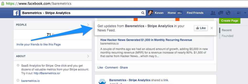
A new call-to-action. When a new visitor (and non-fan) scrolls down your Facebook page, they’ll see a CTA pop up as they scroll. The floating, sticky bar says, “Get updates from [Your Page Name] in your News Feed,” and includes a like button.
What do you think of the new Facebook page redesign?
How do you think you might change your page based on what’s new? What features are you most excited to try out? For those who have already had time to play with the design, what do you love most? I’m looking forward to hearing all about it in the comments.
P.S. If you liked this post, you might enjoy our Buffer Blog newsletter. Receive each new post delivered right to your inbox, plus our can’t-miss weekly email of the Internet’s best reads. Sign up here.
Image credit: Alex Abian, SumAll, Socially Stacked, Social Media Chimps
Try Buffer for free
190,000+ creators, small businesses, and marketers use Buffer to grow their audiences every month.


