This is a guest post by Gregory Ciotti, a contributing Buffer Blog columnist. Read more about Greg at the bottom of the post, or read his latest piece on how relationship marketing drives sustainable growth.
Growing a newsletter for your company blog is tough.
Creating content that drives passerby traffic is always easier than maintaining a company blog that keeps people coming back. It might work for BuzzFeed, but creating list posts with .gifs won’t work for you if you want to build a loyal group of readers.
Since that’s the case, how can you create content that educates + motivates readers to take action, but still has a wide enough appeal?
In growing the Help Scout blog to 41k newsletter subscribers, I’ve tried a lot of tactics to make the admittedly un-sexy topic of “customer service” more appealing. In the process, I’ve found a few elements that seem to work for nearly every post.
Below I’ll outline some techniques we’ve used to add a little rocket fuel to our publishing.
Don’t write it, visualize it
Recently, Rand Fishkin created a great Whiteboard Friday about the importance of visual assets in content in favor of infographics.
I was surprised at the reaction in the comments. Too many people were focused on Rand’s denouncing of infographics over his far more important point: that visual elements can create extra lift for great writing.
Need proof? Here are some examples of blogs with great visual assets.
OKCupid — One of my personal favorite examples of content marketing, the OKCupid blog has become something of legend for its ability to take online dating data and turn it into incredibly memorable, hilarious, and viral visuals.
Take, for instance, their article on How Your Race Affects The Messages You Get. The team tracked data from OKCupid users to see how each race fared in sending and receiving messages.
While the data itself was interesting, this article turned into one of the most popular in the blog’s history thanks to the visualizations they used. Here’s an example chart, which shows the response rates males received according to their race:

This is a great visual asset because it lets readers see a lot of information in an easily approachable format.
James Clear — Frequent Buffer contributor James Clear takes a different approach with his visuals given that his topics revolve around habits and personal productivity.
In articles like The 3 R’s of Habit Change, James breaks down information from books like The Power of Habit by creating visuals that explain key ideas. One example is the 3R’s graphic below:
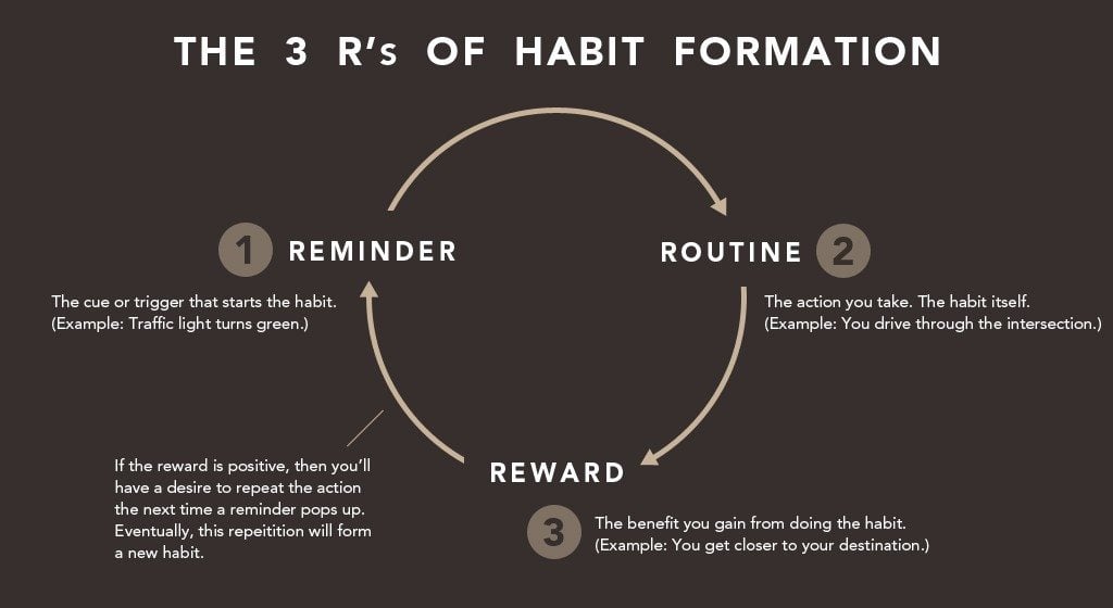
Graphics can succinctly explain systems that might be harder to remember with words alone.
There’s also the “swipe” factor — James has done the grunt work in making a solid visual for the 3R’s, giving other publishers an opportunity to swipe his graphic and link back to him whenever it’s mentioned.
Rafal Tomal — As the lead designer for Copyblogger Media, Rafal knows a thing or two about design. He’s also great at creating useful design content, and one of his strong suits is his ability to take design advice and visualize the outcome.
One of my favorite posts from Rafal is 5 Tips to Improve Any Blog Design, an article I’ve linked to literally dozens of times thanks to super helpful images like the one below:

Rafal could have said “Create more contrast between headlines and body content,” but this graphic shows the reader why that’s important — it’s obvious how much easier it is to read and browse the left side than the right.
Soundbites and key takeaways
Great writers are able to take ‘big’ ideas and concentrated them into insightful prose. Headlines from folks like Paul Graham — such as Do Things That Don’t Scale — are memorable examples, but applying “soundbites” to your writing is a strategy and any publisher can use.
In an article called Customer Service is a Two-Way Street, I summed up the majority of my argument in two concise sentences:

By simply highlighting that passage, I noticed dozens of people began to share the article with that exact quote.
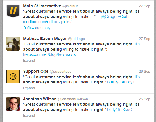
When I re-published the article on Medium, it was selected for the ‘Editor’s Picks’ and again I noticed people sharing the article with the quote as the context.
Too often, content creators forget to focus on how they are presenting their thoughts, ideas, and arguments. Simple writing is important, but writing a single great sentence can have a meaningful impact on how memorable an article is.
People might not remember the full speech, but they certainly remember the soundbite.
Use features the smart way
Using round-up posts is a tried-and-true technique for getting traction. It’s also totally overdone and boring.
Don’t get me wrong, it works with the right people and the right question, but there are a few problems with round-up articles that discourage me from ever using them:
- You have no voice. Especially important if you’re a solo writer. With round-up articles, you get no say on the topic. You’re simply a medium for other people’s opinions.
- Oversaturated. This style of article is becoming stale. They still work (to a point), but it’s lazy content creation: why write an original piece if I can just quote 40 people?
- Shallow. Frankly, most answers in round-up articles are surface-level and contain no real insight. Most people respond just to get the mention/link, and I can’t list a single time I read a round-up post and had an “Aha!” moment.
So what should you do instead?
I like to use something called the drip, which involves “dripping” in quotes from experts in key parts of your original piece.
In other words, snag quotes when you need them, and place them where they make sense in a blog post of your own creation. In a recent article on the New 4Ps of Marketing, I asked a few experts to add their opinion about the flaws of each “P” in the original 4Ps:
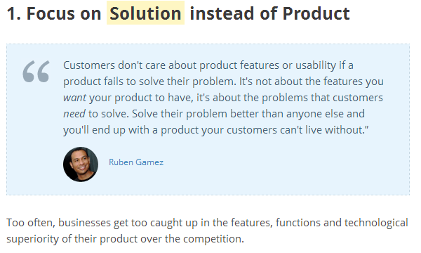
The questions were catered to each person and related closely to a specific section in my article. This allowed me to discuss new research tearing down the old 4Ps, but also let me include smart, influential contributors who went on to share the article.
Win-win really, as you get the benefits of including other experts without sacrificing your control of the article. So add a journalistic approach to your content creation, and start grabbing relevant quotes to include in an original piece.
Don’t be afraid to get interactive
Content marketers commonly stick to blog posts. However, with some extra legwork, creating an interactive piece can really pay off.
Here’s an example: investor and hedge fund manager John Paulson is widely recognized as the person who made the greatest “trade” of all time by short-selling subprime mortgages back in 2007. In that year, Paulson made nearly $3.7 billion, becoming a billionaire overnight.
With so much money coming it in so little time, it might be interesting (and a tad depressing) to see how we stack up to Paulson’s earning potential. While a blog post certainly could have covered this information, forex trading company MahiFX created a visual page called You vs. John Paulson, where users can input their income, and compare it to how much John Paulson makes.
If we take the average salary in the United States (from the National Average Wage index) of $44,321, we get day-ruining bits of information like this:
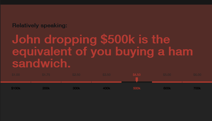
While ego-crushing, this page is definitely interesting, and the interactive element makes it unique and shareable.
This tactic can also be used with simple words instead of data. While doing research on customer service topics, I found that thousands of people were looking for quotes about customer service, each and every month.
The problem was that nobody was providing a useful resource — it was blog posts and eBooks all the way down. Who wants to read an eBook with nothing but quotes? Not I.
Instead, we opted to create the Customer Service Quotes Database, which is a searchable index of over 400+ customer service quotes, all of which are embeddable in a single click.
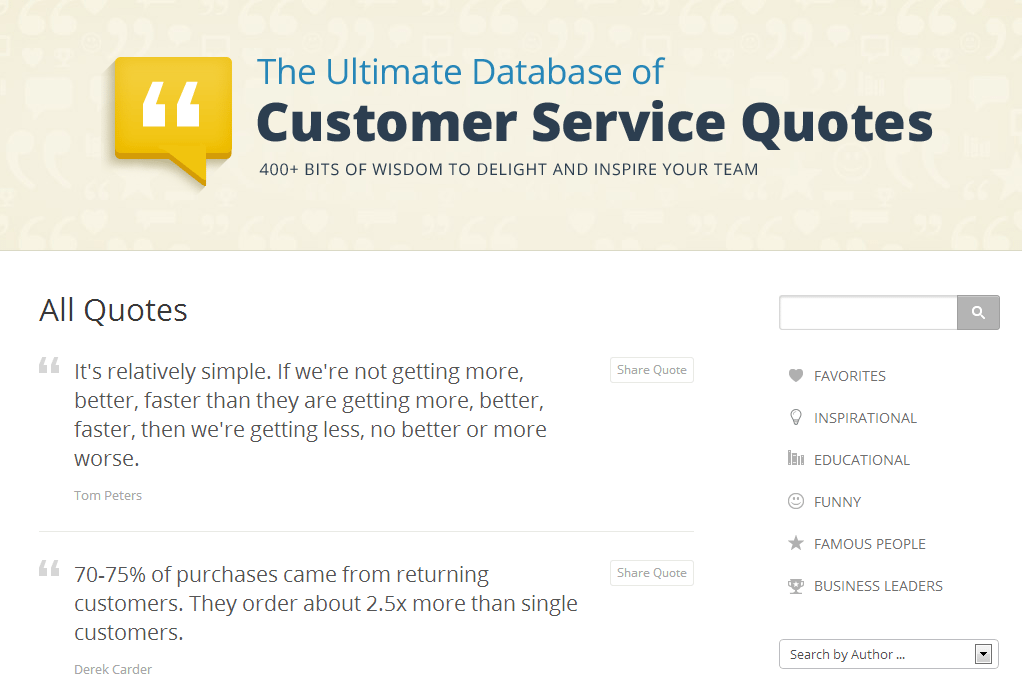
This is why considering intent is important when brainstorming content ideas or doing keyword research; not every topic is best fulfilled by a blog post.
Our resource focuses on what people search for “customer service quotes” actually want, which is an easy way to find and browse different quotes. Also, it won’t insult your income by comparing it to a ham sandwich.
Your turn
I’m sure the marketers out there have a ton of ideas to contribute, so let me know of a few tricks that you keep up your sleeve to make each piece of content interesting. See you in the comments.
Photo-credit: tMartin
PS: We’ve recently launched the new Buffer for Business for a better way to handle your social media in 2014, I hope it might be useful for you!
—
PPS: Want to check out some of Greg’s favorite links on customer acquisition? Check out Customer Acquisition Strategy for Entrepreneurs Hub and fire up those bookmarks.
Try Buffer for free
190,000+ creators, small businesses, and marketers use Buffer to grow their audiences every month.


