Humans are, by nature, very visual beings.
In the brain itself, there are hundreds of millions of neurons devoted to visual processing, nearly 30 percent of the entire cortex, as compared with 8 percent for touch and just 3 percent for hearing.
Each of the two optic nerves, which carry signals from the retina to the brain, consists of a million fibers, compared to the auditory nerve carrying a mere 30,000.
That’s all to say that social media images are a vital part of your content reaching the maximum amount of people, people who are very visual beings!
Marketers that have dabbled in creating engaging images for social media know just how tough and time-consuming it can be. I’m no expert, but I’ve learned a thing or two about creating social media images after lots of practice (and mistakes!), and I’m excited to share with you my favorite social media design tips and principles to help enhance your social media images.
Let’s dive in!
Social Media Design Tips: 11 Principles & Tactics to Enhance Your Images
At Buffer, we create all of the images for our blog posts and social media without much outside help — and there are a ton of images! On average, every Buffer blog post has five custom images, and some have way more.
To create these, we rely on 11 simple design principles to help make the image creation process easy. We’re excited to share those with you in this post and how you may be able to apply it to your own workflow.
Got any favorite social media design tips or principles that we’re missing? I’d love to hear about them in the comments!
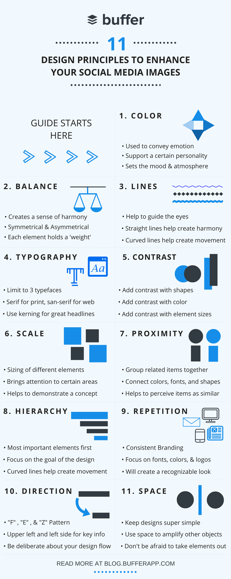
1. Color
90% of snap judgments made about products are based on color alone
Color is one of the most important and complex aspects of any social media design. It helps to set the mood, create an atmosphere, convey emotions, and even evoke strong individual experiences from someone’s past.
In a study on the impact of color on marketing, researchers found that up to 90% of snap judgments made about products can be based on color alone, depending on the product. Other academic studies on colors in marketing have pointed to the fact that it’s more important for colors to support the personality you want to portray instead of trying to align with typical color associations.
For example, this Help Scout graphic highlights the power of color in conveying personality in a piece of content that reflects positively back on the brand. On the Help Scout Blog you’ll see consistent, eye-catching colors that come off as fun, yet insightful.
The second example from the brand Loulou & Tummie highlights the use of color to market to a specific audience. Loulou and Tummie are known for their eye-catching vector work and the use of color to tell a story and evoke emotion.
Use colors in your social media images that guide your audience through a story. Do so by considering which colors help to tell a specific portion of that story. The principles of color theory are a great place to start and can be used to create a sense of harmony within your images.
Here’s a quick rundown of how different colors affect our brain and how they’re often used in storytelling and marketing:

Red = Energy and urgency

Orange = Aggressive

Yellow = Optimistic and youthful

Green = Wealth and relaxation

Blue = Trust and security

Pink = Romantic and feminine

Black = Powerful and sleek

Purple = Soothing and calm
2. Balance
The 4 different types of balance (including the one you’re probably thinking of)
The art of balance in the world of social media image design is a tricky one to get the hang of, but well worth the effort. A great way to think of balance is to imagine that each element of your design has a “weight behind it.”
Put another way: If you were to place the image on a balance scale, would it tip to one side?
It’s also important to remember that different elements carry different weight; balance does not have to be split right down the middle. There are 4 varying types of balance:
- symmetrical
- asymmetrical
- radial (picture a spiral staircase)
- crystallographic (picture a tray of donuts with different toppings)
All of these can make for a beautiful social media design.
Take for example, this stunning graphic from artist and illustrator George Bokhua.
This image demonstrates the beautiful use of symmetrical balance and the feeling of harmony. Symmetrical balance is great for illustrations, drawings, blog graphics, photographs, and much more.
Asymmetrical balance creates tension through contrast and can be visually interesting when done correctly. Because it’s abstract, there is no symmetry; there are no perfect mirror images.
One place we find balance to be important is in choosing stock images. The collection of photos at Unsplash is a great example of a photo collection that excels by taking balance into account.
If you’re creating an image of your own, in order to balance the weight in your image, play around with different things such as size of items, lightness and darkness of items, warm and cool colors, texture, quantity of objects, isolation of objects, and orientation (vertical/horizontal/diagonal) of objects.
3. Lines
Straight lines imply order. Curved lines hint at movement.
Lines are the visual elements of your image that help to guide the eye to where you want it to go. Straight lines work to give the image a sense of order and tidiness while crooked or curved lines may give the image a sense of organized tension and movement.
Paying close attention to the use of lines throughout your image can help guide your audience along a visual journey, stopping at the most important and intentional elements along the way.
Let’s take a peek at this incredible example of the power of lines from Muti.
The use of clean diagonal lines throughout the illustration takes your eyes to different areas in a quick and efficient manner. Almost creating “sections” in the image with different cities as multiple focal points.
Now compare that to the curved lines of this illustration from the same artist, Muti, and how it creates a sense of motion. That motion leading you around the graphic until you land back at the center focal point.
When adding lines to your image, pay close attention to where they draw the reader’s eyes. Aim to create a logical path that the reader can follow along with until they come to the point that you intended them to.
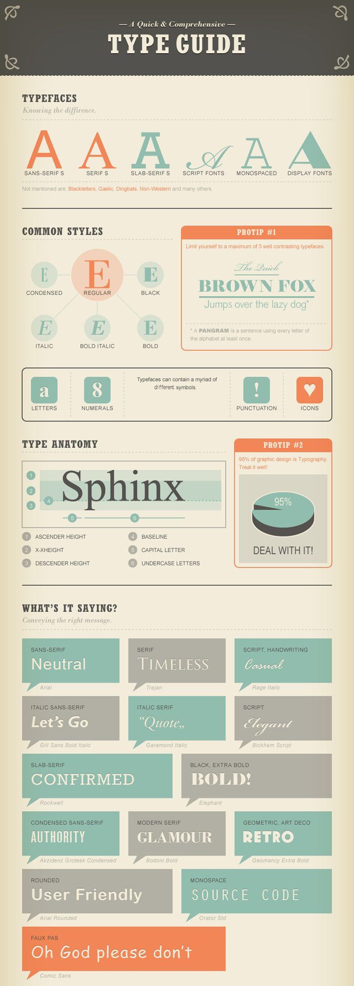
4. Typography
Traditionally, serif fonts are best for print and sans-serif for web
Typography is an art. Selecting the perfect font or set of fonts that work seamlessly together can bring your social media image to life. It also has a big impact on how your design is received by people and, ultimately, the message your brand intentionally (or unintentionally) sends across.
When selecting which font or fonts to use in your design one of the most important aspects to keep in mind is readability.
Graphic designer Paul Rand may have put it best when he said, “Don’t try to be original, just try to be good.”
Whether you choose a sans-serif font or a serif font or any variation in-between, make sure that your audience can read your message. Here are a few pro-tips for using fonts:
- Limit your design to a maximum of 3 typefaces
- Use font sizing that fits well within the medium that you are publishing to
- Traditionally, serif fonts are best for print and sans-serif for web
- Kerning is a great technique to use in your titles
And for those that are curious about other typography terminology, this nifty infographic will help!
5. Contrast
Add contrast with colors, shapes, and sizes
Have you ever heard someone say that an illustration or design “really popped“?
What they may be referring to is the contrast in an image. Contrast provides differentiation between elements, making one stand out or “pop” more than the other elements.
The use of effective contrast is a great way to enhance your social media images. Without contrast, your design runs the risk of being “flat.” But with too much contrast, your design can become cluttered and nothing will stand out.
Here are my 3 favorite ways to add contrast to an image without under or overdoing it.
Add Contrast with Colors
One of the easiest ways to implement contrast into your image designs is through the use of colors. For example, playing light colors off of dark colors, or vice-versa. In this image, I used a white font in contrast to the dark background making the wording both readable and visually appealing.
Add Contrast with Shapes
Another way to easily add contrast to your image is through the use of shapes. This beautiful graphic from Canva helps to highlight just how well the conformity of symmetrical shapes can play alongside the asymmetrical nature of organic shapes.
Add Contrast with Sizes
In its simplest form, contrast can easily be added to enhance your social media images by making certain aspects of the design bigger or smaller than others. It can also mean adding more weight (like bolding a word) to elements.
This restaurant advertisement draws the audience to the name, “1913,” first and then to other areas of the image such as the word “restaurant” and eventually to the picture of the food in the background.
6. Scale
Zoom out on a concept, or zoom in with your font choices
Scale, by definition, refers to the deliberate sizing of various elements within your design. “Scaling” helps to bring certain elements into focus and allows your readers to make sense of a concept.
Think for a second and try to imagine your life in number of months or even days. Can you imagine it?
This wonderful illustration by Tim Urban illustrates the powerful effects of scaling.

In this visual, I’m aiming to draw you towards the quote first with a scaled-up font size. Once I’ve gained your curiosity from the quote, I’m hoping your eyes naturally move right to the balloon. And finally, you’re drawn to the message of the graphic, “Happy Teachers Month.”
Did it work?
7. Proximity
Group similar items together to declutter and organize
Proximity is paramount when creating a sense of organization within your design. Similar or related elements are best grouped together to create a relationship between them. The goal is to group items together to declutter your design and “tidy things up a bit.”
You can put the principle of proximity into action by connecting similar elements together. One easy way is by physical placement of the objects near each other. The other way is to connect them in other visual ways with the use of similar colors, fonts, size, etc.
This simple example shows how proximity can be used to help us perceive objects as being related. The circles are spread out, each being perceived as its own object.
Then, once we bring all of the circles in close to each other, they appear to lose the feeling that they are separate objects. It is perceived to be more of a whole, singular shape.
When put into something like a social media design, proximity can help to bring elements of a product or concept together through spacial relationships.
8. Hierarchy
Place the most important elements in the biggest fonts
It’s quite likely that you’ll be working with multiple elements in your social media design. And chances are each of those elements will be important to your overall message. Hierarchy is a great social media design tip to make sure that you’re getting your most important message across first.
Taking full advantage of the hierarchy design principle starts with an understanding of your goals. Establish the most crucial message as the focal point and then use the other design principles in this article to make it stand out.
Once that’s in place, you can start to build your second or third pieces of information in without taking away from the overall goal.
A great example is here in this travel advertisement. The image draws the reader into “travel” and then leads them to the secondary messages.
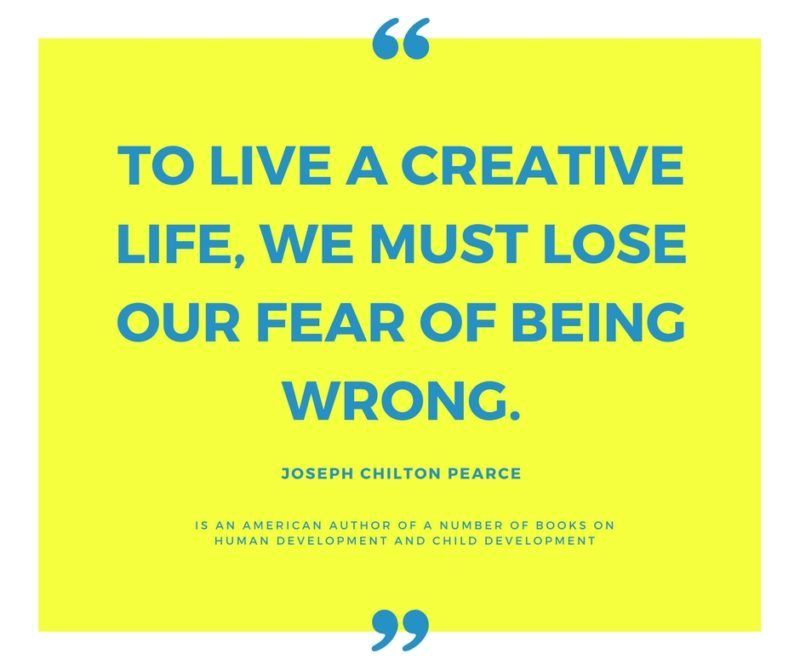
It even works for simple social media designs such as quotes. The main focal point being the quote itself followed by any secondary information such as author or source.
9. Repetition
Always use the same set of fonts, colors, and logos
One of the easier design elements to enhance your social media images is the principle of repetition. Repetition is an important part of the process because it helps to establish and strengthen different elements.
It’s also what people often refer to as “consistent branding.”
Three things to always try and be consistent with in your designs are fonts, colors, and logos. Over time, repetition of these 3 elements will give you or your brand a unique and instantly recognizable look. Let’s check out a few examples to illustrate the simple use of repetition in design.
Remember this Apple advertisement? Catchy for its colorful and playful nature, the use of repetition in this image helps to create consistent association. It also does just what it set out to do and that’s give a sense of movement or dancing in the image.
Repetition is also important when building a personal brand. Take these beautiful business cards from Alan Murphy, for example. Whether you’re a big brand or a one-person shop, repetition helps you become recognizable over time.
10. Direction
People read in an “F” pattern, an “E” pattern, and a “Z” pattern
The way the human eye moves across designs, images, websites, and other visual elements is unique, but often consistent. That’s why it’s important to guide your audience along the “path” that you’d like them to follow in your image. In other words, create a deliberate “flow.”
Website design research has given us an inside look at how people tend to view websites when arriving for the first time. What they found was that we read in an “F” pattern, an “E” pattern, and sometimes a “Z” pattern. So placing important and eye-catching elements on the upper left and left side of your design is key.
Crazy Egg created a great infographic on data found from their eye-tracking experiments along with ways in which you can improve your design. Enjoy!
11. Space
Look for outlines in your images. Advanced tip: Try knolling!
I saved one of my favorite social media design tips for last and that is the use of space. Put simply, negative space or white space is the area surrounds other objects in the image. More often than not, what you choose to leave out from your image is just as important as what you add.
Try not to underestimate the power of simplicity in your design. Space can help bring a certain aesthetic quality to your image while also highlighting the most important elements.
I’d love to show you two examples of the wonderful effects of using space in your designs. The first is from artist, illustrator, and graphic designer Tang Yau Hoong who has seemingly mastered the art of space in design. Tang Yau Hoong intentionally and cleverly carves out shapes in negative space to create a mesmerizing feel.
When adding shapes, fonts, or colors to your design, consider what shapes or outlines are forming around them and use them to your advantage. You may quickly realize that your design is taking shape in ways you hadn’t originally planned.
The second example is from the world of photography. Knolling is a technique that has really come on strong in the last few years. The white space surrounding each element really helps to bring out each piece individually.
Keep your images simple and use the space around objects to bring attention to important elements. I love this graphic from Cinch that really highlights the power of simple design.
“Designers and marketers know they have ‘achieved perfection’ not when there is nothing left to add, but when there is nothing left to take away.”
– Antoine de Saint-Exupery
Over to You
I hope you enjoyed learning a bit about social media design! It is truly amazing how small tweaks to images can have such a huge effect on quality and outcome.
Did I miss any of your favorite social media design tips above? I would love to learn from you!
Please feel free to drop a comment below to keep the conversation going.
More Awesome Design Resources
Design Elements and Principles – Canva
8 Basic Design Principles to Help You Create Better Graphics – Adobe
Why Every Marketer in 2016 Needs to Be a (Part-Time) Designer – Buffer
Try Buffer for free
200,000+ creators, small businesses, and marketers use Buffer to grow their audiences every month.