If you’ve been on social media for any length of time, you may be well aware that images can help boost your online engagement.
But while it’s true that a picture can add some pizazz to your posts, it’s not always easy to determine the best type of image to publish. They can also take a long time to create, especially when you’re not sure what you’re trying to communicate.
Thankfully, deciding which format best suits your posts can be a straightforward process. In this post, I’ll outline a few simple image variations and show you when it might be best to use them.
Ready to dig in? Let’s go!
1. Photos
This is undoubtedly the most popular type of social media image. It’s relatively easy to take a picture with your smartphone and apps like Instagram and VSCO make editing photos to an almost-professional looking standard easier than ever.
While this approach is quick and simple, it’s sometimes limited in its effectiveness precisely because it’s so fast and simple! Anyone and everyone can attach pictures to their updates so standing out is becoming more difficult.
So when do photos work best? When the image is unique, unusual or powerful (i.e. when the image can tell its own story).
Here are a few examples:
Gary Vaynerchuk
Vaynerchuk has an enormous following on social media because he’s an incredible storyteller. This post is a great example of how simply adding a little extra into an image (his foot) inserts an absorbing layer of story into an ordinary photo.
Always dreamed for Knicks season tickets … Not bad for a boy from Belarus … Love u @aj… https://t.co/ucbum29MhH pic.twitter.com/bcLdX2Wl7z
— Gary Vaynerchuk (@garyvee) January 11, 2016
When it comes to sharing any image on social media, especially photos, the accompanying copy is super important. In less than 140 characters, Vaynerchuk manages to paint a portrait of his journey from Belarus to having courtside season tickets at Madison Square Garden.
Mike Escamilla
Escamilla is a legendary BMX rider and stuntman who spends much of his time travelling the world in search of adventure. He takes some truly epic pictures that grab people’s attention, such as this gem while in Whistler, Canada.
He’s built a huge following because these images show him performing unusual and thrilling activities.

Escamilla’s photos stand out because he takes his followers on a journey and shows them something they wouldn’t normally see.
You don’t need to be a global adventurer to take your customers and followers on a journey, though. Simply opening up to a side of your business people would never normally see can be extremely engaging.
We try to take this approach at Buffer with our #weekinthelife series on Instagram, where our team invite followers behind the scenes of life as a remote worker.
Here’s an example of Happiness Hero, Ross, sharing his remote work setup:

Fast Company
Plain images work particularly well for news stories. Fast Company used this picture that captured a memorable moment during President Barack Obama’s State of the Union address.
The U.S. government offers more details on its "moonshot" effort to cure cancer: https://t.co/kx5uIAglsk pic.twitter.com/5Ov7PdHRDa
— Fast Company (@FastCompany) January 15, 2016
2. Collages
Collages allow you to use a collection of images to tell a story or showcase items. They are no hard and fast rules for creating collages, but they’re particularly useful in situations where:
- The images can establish a timeline of events.
- The images show contrasting perspectives.
- The images can highlight interesting details about a product or story.
John David Glaude
Before/after images like this are powerful because they demonstrate a journey. Glaude has built a massive Youtube and Instagram following by using these types of contrasting images. Even though he posts these types of pictures quite regularly, they remain incredibly inspiring because they capture a phenomenal story.

Quartz
At first glance, this collage is a little baffling. What’s the connection between Steven’s Universe, Orange is the New Black, Jimmy McNulty and Mad Max? That’s the whole point! For some (like me), this collages will pique their interest enough to click the link and read the story. Presenting contrasting images is a clever way to draw the inquisitive.
How is it possible that we're still telling diverse stories through the white male lens? https://t.co/qSJSpTXFFR pic.twitter.com/fplhfw4ko7
— Quartz (@qz) January 14, 2016
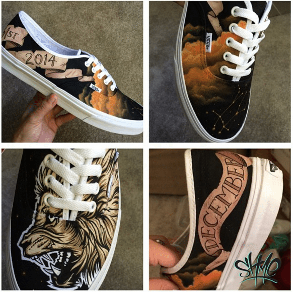
Shme Custom Kicks
Collages are fantastic for showcasing products such as apparel and cuisine. This example from Shme displays intricate details from all around the shoe, something that would be impossible with a single shot.
3. Text over a plain background
If pictures are all about telling a visual story, text-heavy images are focused on quickly communicating a very specific message. Words are less captivating than photos, so the phrasing in plain text images should be carefully crafted if you want it to stand out. Text-heavy variations are especially useful when they feature:
- Inspirational quotes
- Attractive headlines
- Intriguing excerpts (e.g. from a blog article, book)
Marie Forleo
This first example illustrates the power of words and the importance of design. The quote is short and profound, which makes it more likely to be read. The text also takes up a very small area within the image, a design that places even more emphasis on the quote.
Don't ever forget it. pic.twitter.com/XlbEqRQKL4
— Marie Forleo (@marieforleo) January 9, 2016
Amy Porterfield
Porterfield is well-known in the online business world, and this social image is a catchy headline designed to attract her target persona. Once you have the perfect title or sub-headings, these can easily be pulled into a social image to engage your audience.

Wall Street Journal
Excerpts are an easy way to pique interest in an article or publication. The WSJ uses this approach for many of its stories, and I often find myself pausing to read these snippets as I scroll through my timeline. It’s best to select the most appealing snippets for these types of images, such anything that sounds especially contrarian, insightful or funny.
The 10-Point: @gerardtbaker on Jakarta attacks, a deepening stock-market rout and more https://t.co/Q2UmK6XJSf pic.twitter.com/hT8gUFU93g
— Wall Street Journal (@WSJ) January 14, 2016
4. Text with a photo
The text-photo combination is my favourite social media image variation. This doesn’t mean that it’s the best approach for every situation, but it often works because it facilitates the fusion of visual storytelling and compelling copy.
Jay Baer
Adding text on top of a picture is particularly useful when using stock photography. Many publicly-available images are repeatedly used, so posting the photo by itself is often not catchy enough. This example from Jay Baer shows how easy it is to make a generic photo stand out by adding a headline and splash of colour.
Why B2Bs Have It All Wrong About #SocialMedia https://t.co/h6wdw3uyRF @JonathanWich @convince pic.twitter.com/kLIx9FEpUw
— Jay Baer (@jaybaer) January 14, 2016
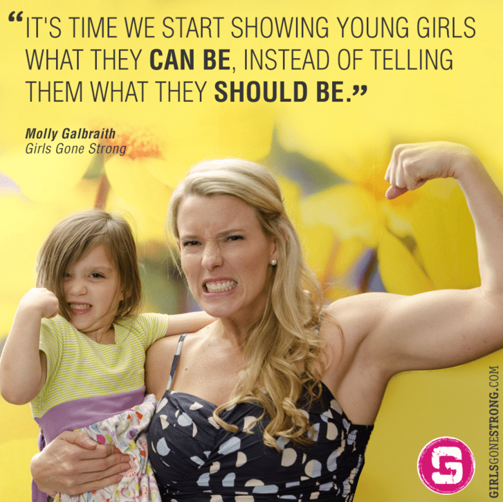
Molly Galbraith
This image from Galbraith is a perfect example of how a compelling photo and gripping text can work extremely well together. The quote could be great on its own, but the combination with the picture makes it stand out.
Shriya Nevatia
Calls-to-action also work particularly well in this format, such as this great example from Shriya Nevatia.
Are you a female technology professional or startup founder? Sign up for #TenXList Mentors! https://t.co/AX16WP0yKh pic.twitter.com/fhuRwfORJE
— Shriya Nevatia (@shriyanevatia) January 8, 2016
5. Icons and illustrations
Icons and illustrations are great tools for drawing people into your content. They’re great to use as an alternative to photos because they’re a visual form of communication, and they can easily be added into images. Often less is more when it comes to these elements. The goal is to clearly communicate with your audience, not to make an image look fancy.
Help Scout
The content team at Help Scout has fully embraced the power and simplicity of icons. From blog images to social media posts, their frequently use of this feature has become somewhat….iconic! ?
Why you should cherish the first three hours of your day: https://t.co/U11s9VFz2Y pic.twitter.com/SgMia4FDOB
— Help Scout (@helpscout) January 13, 2016
General Assembly
Adding icons to a photo is a simple way to make it unique and noteworthy. This post from General Assembly shows the Denver skyline, which isn’t particularly interesting without the icons.
Nice to meet you, Denver! We’re excited for the opening of @GA_Denver. Come say, “Hello!” https://t.co/fDTsYQS0fP pic.twitter.com/fBrmWYF27l
— General Assembly (@GA) January 11, 2016
6. Screenshots
This final variation is, without doubt, also the easiest one. Screenshots can be taken in seconds and are really useful when calling attention to a section of text or imagery.
Chris Dixon
Chris Dixon is an uber-smart venture capitalist who shares a lot of great snippets. His Twitter timeline is full of interesting quotes and images pulled from a variety of online articles.
"The proportion of the world’s population living in extreme poverty has fallen below 10%." https://t.co/Oin9AgINpr pic.twitter.com/Sa5dqN7WAd
— Chris Dixon (@cdixon) January 16, 2016
Jay Yarow
This example from Jay Yarow shows the versatility of screenshots. The highlighted area is particularly intriguing, but he’s not limited to sharing only that section of text.
Probably the most impressive, most taken for granted, aspect of Amazon. http://t.co/091MAqbPlk pic.twitter.com/RtHCFhQE9c
— Jay Yarow (@jyarow) August 22, 2015
What’s your favourite type of image?
Most of these images can be created within a few minutes using tools such as Canva and PicMonkey. Of course, there’s lots of room for creativity and I’d love to hear about what’s worked for you!
What types of images do you use on social media and which have been the most successful?

Try Buffer for free
190,000+ creators, small businesses, and marketers use Buffer to grow their audiences every month.


