If you want to share scroll-stopping content on your social media profiles, you need eye-catching images that display well in the feed.
Awkwardly cropped photos and pixelated images are a sure way to put potential followers off. But figuring out image sizes for each social network is tricky, especially considering how many different image options each platform offers.
Which is where this guide comes in. Keep this handy, and you won’t have to store all those fiddly numbers in your brain — or google “what’s the best image size for [insert platform here]” with every post.
In this article, you’ll find the ideal social media image sizes for nine popular platforms, focusing on the images you share with your updates, cover photos, and profile pictures.
Social media image size basics
There are two terms you’ll see frequently in this post — aspect ratio and pixels.
Aspect ratio means the ratio of the width and height of the photo, written as width:height. This means:
- 1:1 is a square image, where both the width and the height have the same dimensions
- 9:16 is a rectangular, vertically oriented image that often covers the whole phone screen
- 16:9 is a rectangular, horizontally oriented image
You don’t need to memorize the different recommended aspect ratios, but it’s good to understand how to read them so you know what images should be square, and what should be vertical or horizontal.
Pixels measure image resolution or the level of detail in an image, written as width x height. An image that has dimensions of 1080 x 1350 pixels will be vertical — 1080 pixels wide by 1350 pixels tall.
A good rule of thumb is that the higher the number, the higher the level of detail — a square image with 1080 x 1080 pixels will be clearer than one that is 200 x 200 pixels.
JPG or PNG files are the most common file types for uploading images on the different social media platforms. Some platforms also support animated GIF files.
Jump to a section:
Here's a quick look at the recommended image sizes for each social media platform.
Facebook image sizes
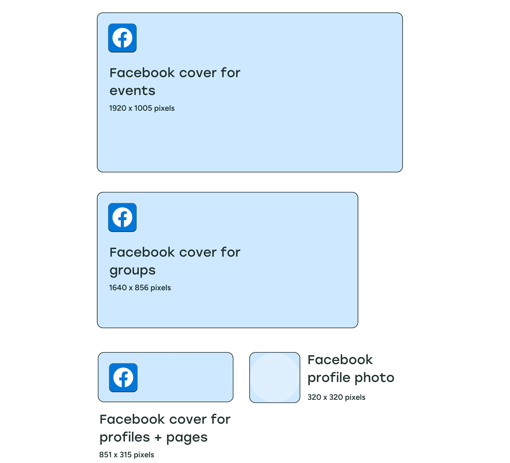
- Profile photo: 320 x 320 pixels
- Cover photo:
- Profiles and Pages: 851 x 315 pixels (2.7:1 aspect ratio)
- Groups: 1640 x 856 pixels (1.92:1 aspect ratio)
- Events: 1920 x 1005 pixels (1.91:1 aspect ratio)
- Post images:
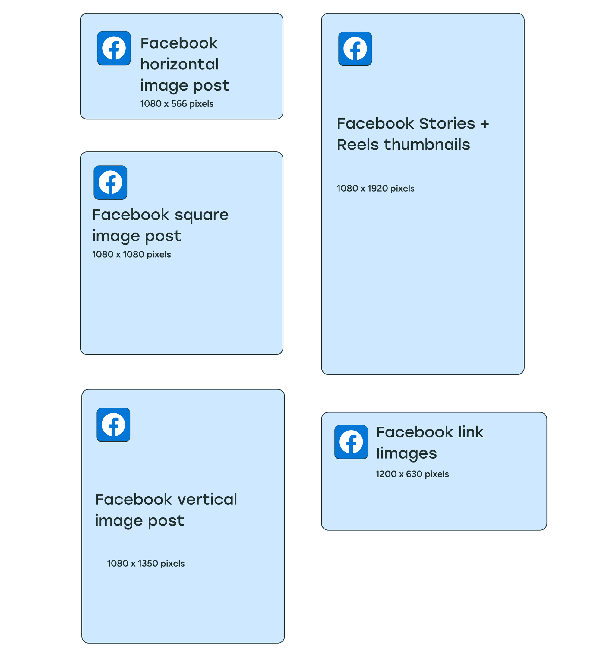
- Square: 1080 x 1080 pixels
- Vertical: 1080 x 1350 pixels
- Facebook Stories: 1080 x 1920 pixels
- Link image: 1200 x 630 pixels
Facebook profile picture size
Facebook recommends a profile picture size of at least 320 x 320 pixels for the best quality. Your image can be larger, but it shouldn’t be smaller than this, or it’ll appear pixelated.
Keep in mind that your Facebook profile picture will be cropped into a circle, so don’t keep any important information near the corners.
Facebook cover photo size
The ideal size for a cover photo for Facebook profiles and pages is 851 x 315 pixels. According to Facebook, your profile cover photo should be at least 720 pixels wide.
Your cover photo will look slightly different on mobile — Facebook shows your cover photo at 640 pixels wide by 360 pixels tall.
Your Facebook profile picture overlaps the bottom left of the cover photo for profiles and pages, so try not to include any important information there as it’ll get obscured.
Facebook cover photos for profiles and pages have different dimensions and aspect ratios from those for groups and events. For groups, the recommended cover image size is 1640 x 856 pixels. For events, the recommended cover image size is 1920 x 1005 pixels.
There’s no profile photo overlapping the cover images for groups and events.
Facebook post image size
The recommended size for Facebook image posts is 1080 x 1350 pixels for vertical images and 1080 x 1080 pixels for square images.
Facebook Stories image size
Because Facebook Stories take up the entire mobile screen, the recommended Facebook Story image size is 1080 x 1920 pixels. Your profile photo, page or profile name, play/pause button, mute/unmute button, and settings menu icon will appear at the top of your Stories, so be sure to leave space for those when designing your images.
Facebook image size when shared with a link
Now this one is a little more technical, but really important if you’re sharing a link on Facebook.
When you share a link to Facebook, people will see an accompanying image in the link preview. Facebook looks at the Open Graph tags for this link image — specifically the og:image tag, which specifies which image Facebook should use when sharing in the News Feed.
You can add the og:image tag manually into the <head> section on every page of your website, or you can try out a plugin like Yoast SEO for WordPress, which handles the code and implementation for you.
Facebook recommends using images at 1200 x 630 pixels to display well on high-resolution devices, with a maximum file size of 8MB.
Instagram image sizes
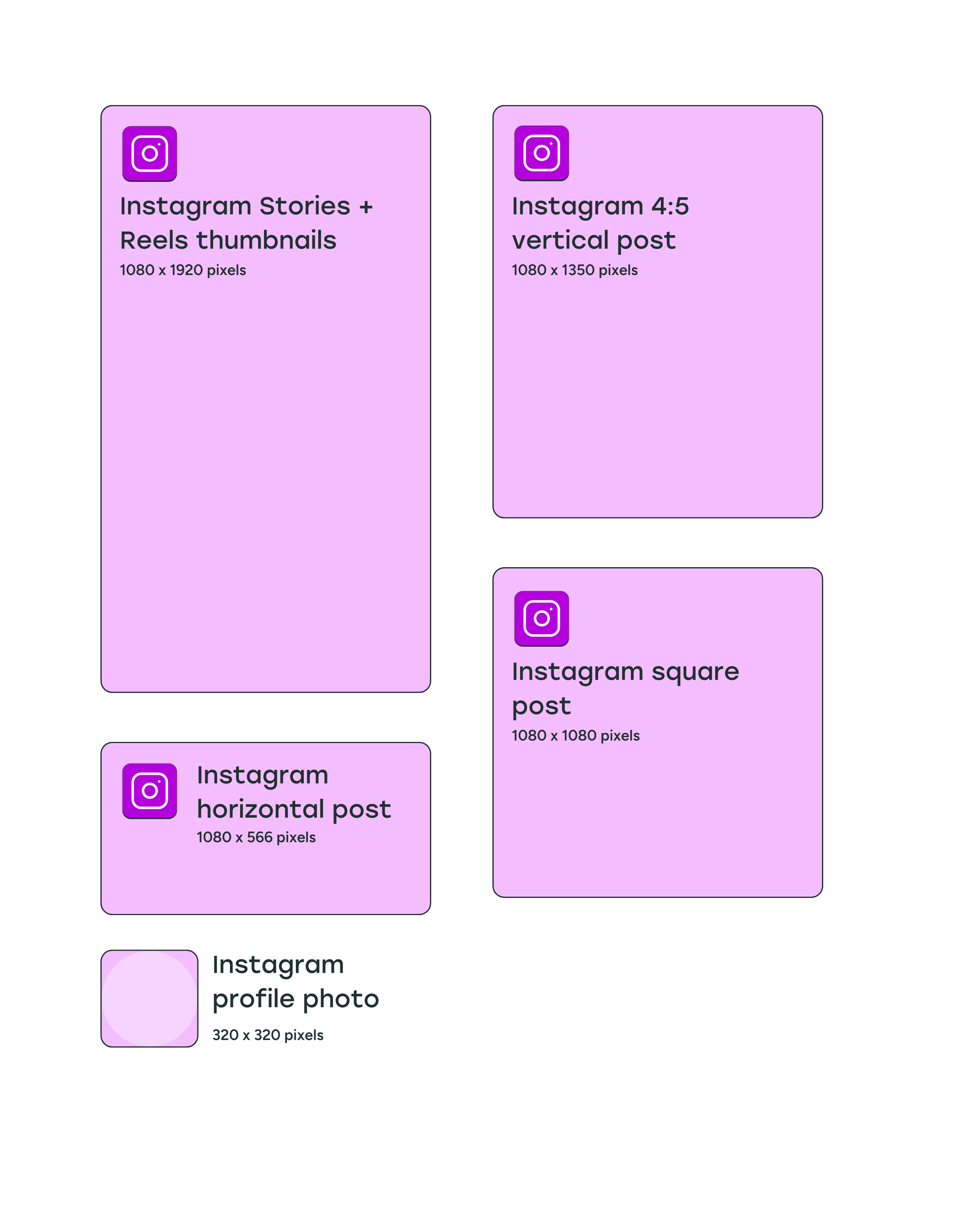
- Profile photo: 320 x 320 pixels
- Post images:
- Square: 1080 x 1080 pixels (1:1 aspect ratio)
- Vertical: 1080 x 1350 pixels (4:5 aspect ratio) or 1080 x 1440 px (3:4 aspect ratio)
- Horizontal: 1080 x 566 pixels (1.91:1 aspect ratio)
- Instagram Stories: 1080 x 1920 pixels
- Reels thumbnails: 1080 x 1920 pixels
Instagram profile picture size
Instagram profile images are displayed at 110 x 110 pixels, but the app stores the image files at 320 x 320 pixels, so we recommend uploading an image with these dimensions or larger. Similar to Facebook, your profile picture will be cropped into a circle.
Instagram post image size
The recommended image aspect ratio for Instagram feed posts is between 1.91:1 for horizontal images and 4:5 or 3:4 for vertical images.
With these aspect ratios in mind, square photos (1:1) should be 1080 x 1080 pixels in size, horizontal (1.91:1) should be 1080 x 566 pixels, and vertical (4:5) should be 1080 x 1350 pixels (4:5) or 1080 x 1440 pixels (3:4).
The Instagram profile grid — how all your posted images appear in your profile — used to display square thumbnails automatically from images and reels.
As of January 2025, Instagram has started rolling out a “tall grid” with a 3:4 aspect ratio, since most people are sharing vertical images and videos. Instagram is designed for visual content, so if your Instagram strategy involves both individual posts and a carefully curated grid, this new grid might be worth keeping in mind when sharing posts.
Instagram Stories image size
Since Instagram Stories take up the full phone screen, the ideal image size is 1080 x 1920 pixels (aspect ratio of 9:16).
When designing your Instagram Stories, remember to keep 310 pixels each from the top and bottom of the image free of text and logos, because that's where your profile photo, name, and Instagram buttons will be.
Instagram Reels thumbnail size
Instagram Reels are videos when they appear in users’ feeds, and you can choose a frame from the reel or add a custom thumbnail to display in your grid.
We recommend adding a thumbnail that’s 1080 x 1920 pixels. Make sure you keep 480 pixels each from the top and bottom free of any text and logos so it displays well in the new 3:4 grid.
X/Twitter image sizes
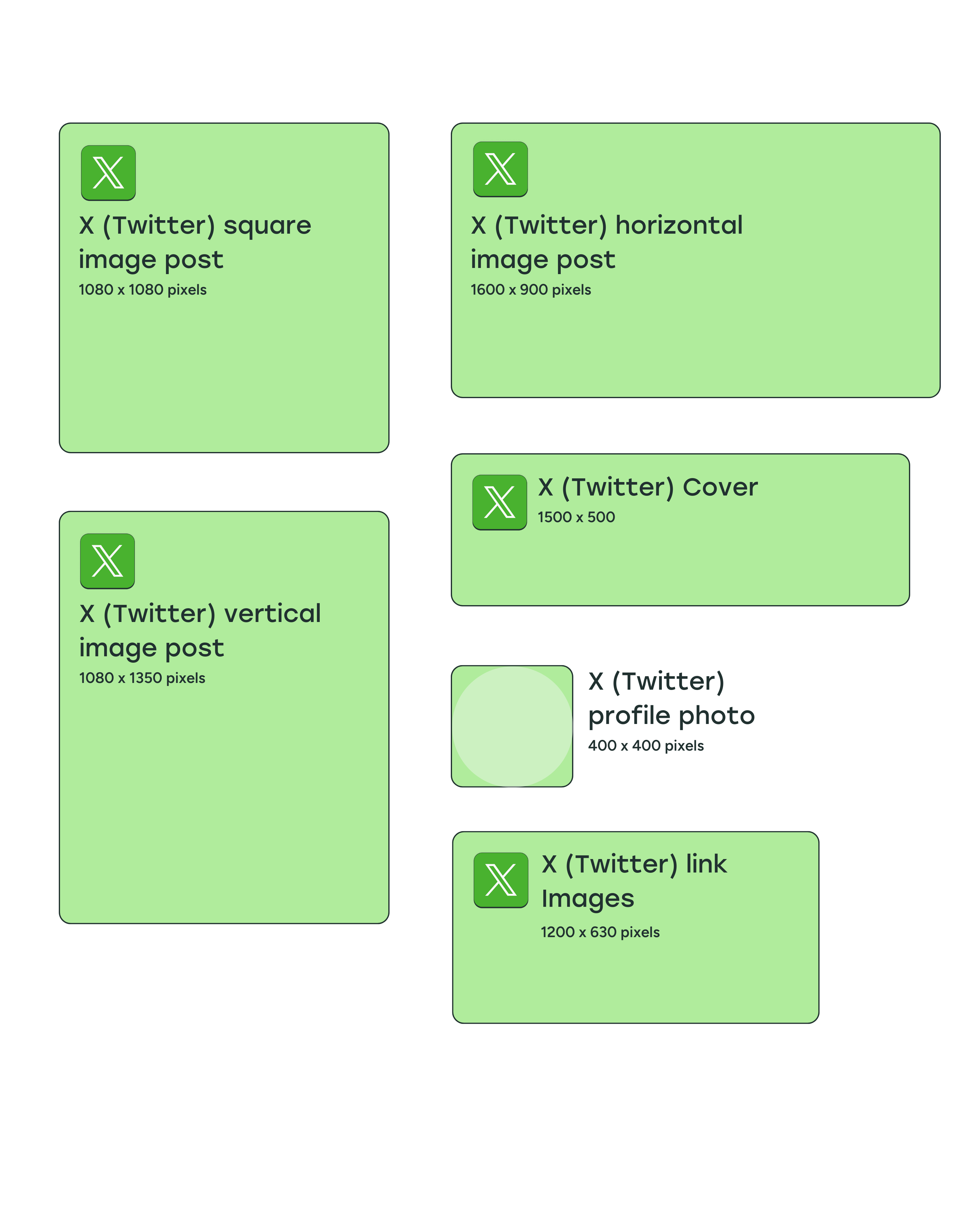
- Profile picture: 400 x 400 pixels
- Cover photo: 1500 x 500 pixels
- Post image:
- Vertical: 1080 x 1350 pixels
- Horizontal: 1600 x 900 pixels
- Link image: 1200 x 630 pixels
X/Twitter profile photo size
The recommended profile image size for X/Twitter is 400 x 400 pixels, and the maximum file size is 2MB. Profile photos for people and most brand or business accounts will be cropped into a circle. For Verified Organizations that have the gold check mark, profile photos will display as square images.
X/Twitter cover photo size
X/Twitter recommends that your header photo size be 1500 x 500 pixels — much wider than it is tall, especially when compared to most cover images. It'll be great to use an image that is wide enough to prevent X/Twitter from stretching the image and making it blurry.
X/Twitter post image size
The ideal X/Twitter image sizes are 1080 x 1080 pixels for square images, 1080 x 1350 pixels for vertical images, and 1600 x 900 pixels for horizontal images. The minimum required width is 600 pixels, but larger images will look better when your followers click to expand the image.
Since May 2021, tweets containing images with 2:1 and 3:4 aspect ratios will show in full within a timeline.
In October 2022, X/Twitter rolled out a feature where you can add up to four photos, videos, and GIFs in a single tweet. They don’t need to have the same dimensions — you can add both horizontal images and vertical images in the same tweet.
The display will automatically be stacked to show all images in the tweet on timelines, but people will be able to see the full images when they click on them.
X/Twitter image size when shared with a link
For images that preview when you share a link (also known as website image cards), the ideal card image size is 1200 x 631 pixels.
The card shows a photo, headline, and link when you share a URL from a site that contains the appropriate X/Twitter Cards code. All this information is pulled via HTML tags, often the same ones that are used by Facebook to display links.
You can use the Yoast SEO WordPress plugin to add images to X/Twitter cards. If you run a Squarespace Commerce website, it’s automatically optimized for X/Twitter cards.
LinkedIn image sizes
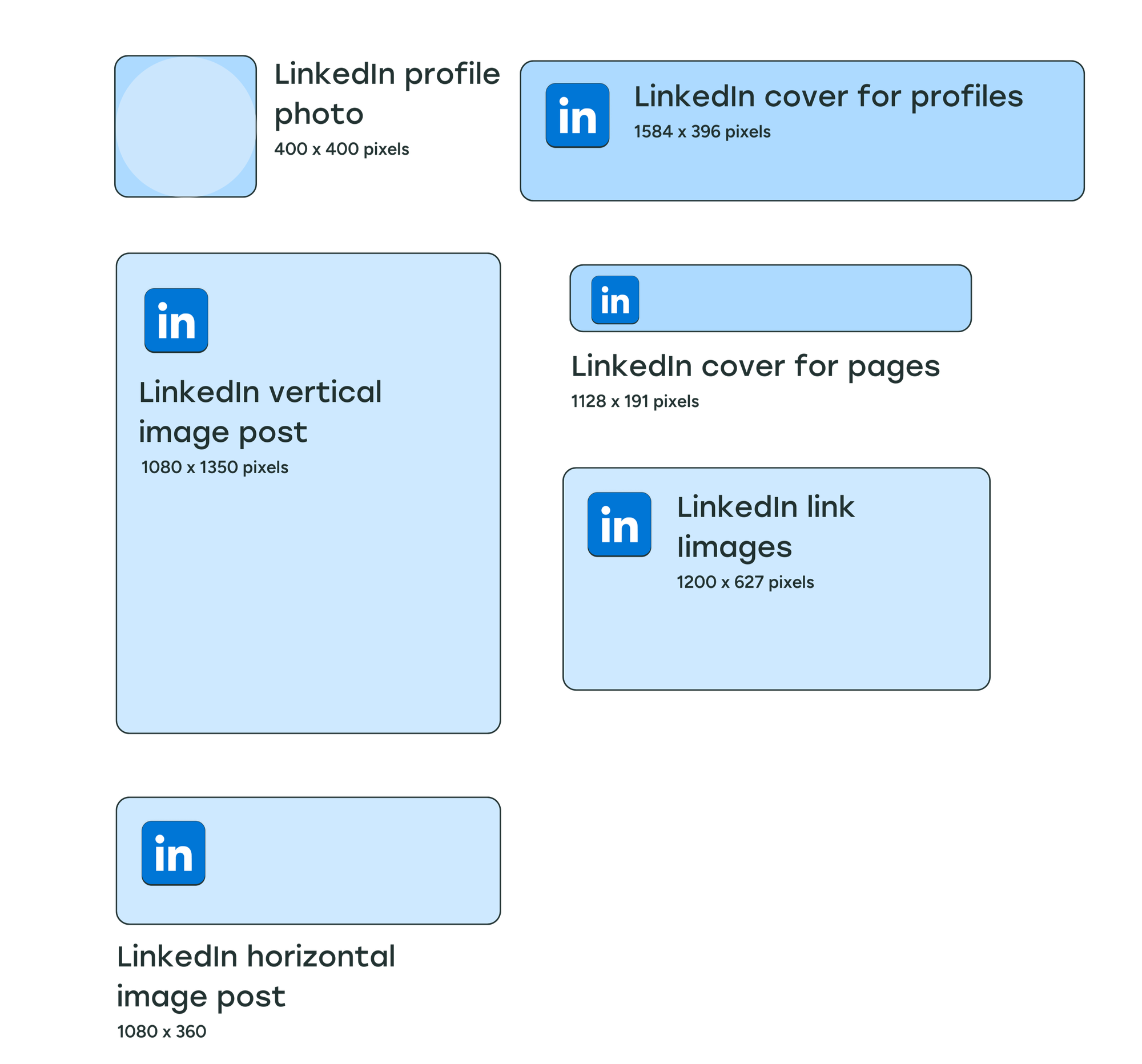
- Profile photo: 400 x 400 pixels
- Cover photo:
- Profiles: 1584 x 396 pixels
- Company Pages: 1128 x 191 pixels
- Post images:
- Vertical: 1080 x 1350 pixels
- Horizontal: 1080 x 360 pixels
- Link image: 1200 x 627 pixels
LinkedIn profile photo size
The recommended image size for LinkedIn profile photos is 400 x 400 pixels, which will be cropped into a circle on personal profiles. LinkedIn profiles images — for your brand’s or business’s logo — on LinkedIn Company Pages are square.
The maximum file size for LinkedIn profile photos on personal profiles is 8MB. For company pages, the maximum file size for logos is 3MB.
LinkedIn personal profile cover photo size
LinkedIn profile header photos are displayed at a 4:1 aspect ratio. LinkedIn recommends using photos with dimensions of 1584 x 396 pixels. The maximum file size for LinkedIn cover photos on personal profiles is 8MB.
LinkedIn Company Page cover photo size
While LinkedIn recommends dimensions of 1128 x 191 pixels for company page cover photos, the profile photo or logo covers a small section on the left, so it might be best to keep the important aspects of your photo to the middle of the image if possible. The maximum file size for LinkedIn cover photos on company pages is 3MB.
LinkedIn post image size
Images shared with LinkedIn posts can have an aspect ratio between 3:1 and 4:5. LinkedIn recommends a minimum width of 1080 pixels, meaning horizontal images should be at least 1080 x 360 pixels and vertical images should be at least 1080 x 1350 pixels.
LinkedIn automatically crops and centers photos that go beyond the recommended aspect ratios, but LinkedIn is more vague about how that cropping happens. We've found that as long as your text is centered, many different image sizes will display well in the LinkedIn feed.
LinkedIn image size when shared with a link
If you're sharing a link that has an image preview, the recommended image size is 1200 x 627 pixels.
Threads image sizes
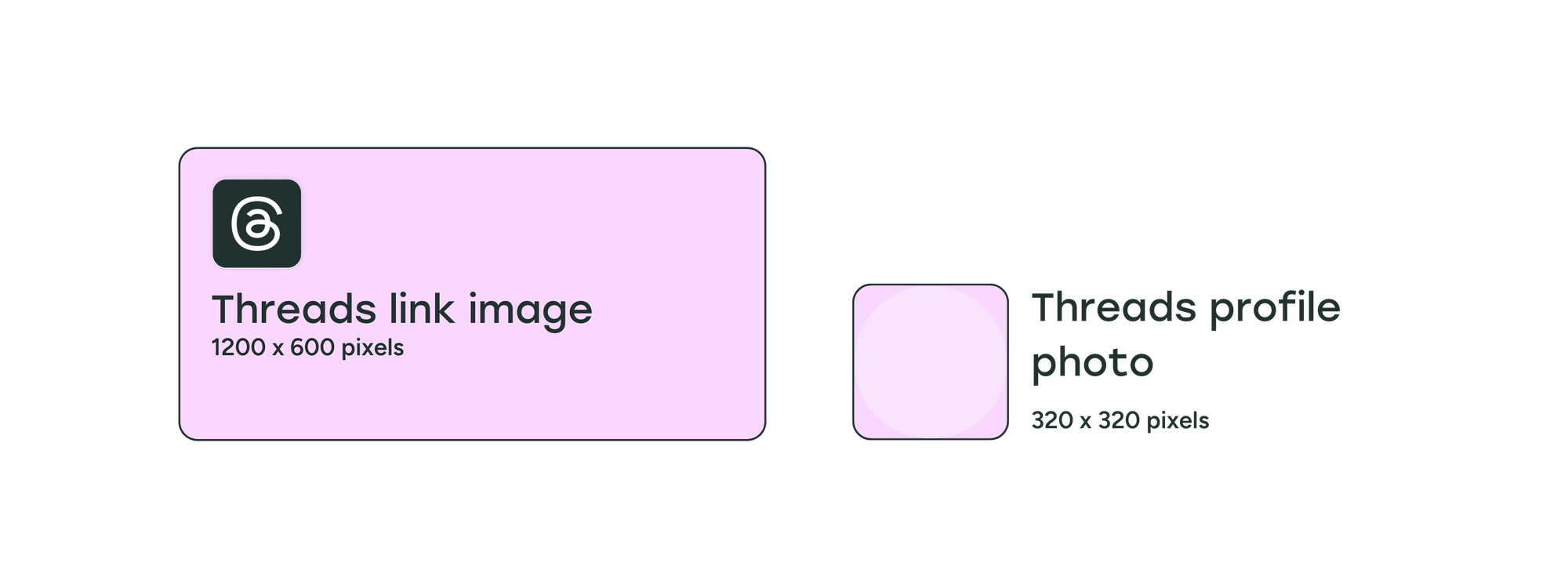
- Profile photo: 320 x 320 pixels
- Post images: Any size and combination of images
- Link image: 1200 x 600 pixels
Threads profile photo size
Threads profile photos are the same as Instagram at 320 x 320 pixels. You can sync your Threads profile photo with your Instagram profile photo so you don't have to upload a new image.
Threads post image size
So far, Threads hasn’t added any restrictions for photo resolutions or aspect ratios. Even when sharing multiple images of different sizes, the preview doesn’t crop any of the images, and keeps the original dimensions. You can share up to 20 photos, videos, or a combination in a single thread.
Threads has a unique feature on its mobile apps that lets people “pinch” two adjacent photos together to join them. You can slice panoramas into multiple images and upload them in a single thread. When the separate images are pinched together, they’ll join to look like one panoramic image.
Threads image size when shared with a link
Threads hasn’t specified an image size for photos that preview with links shared on posts. We recommend using an image with at least 1200 pixels width, which is the same minimum width that Facebook, X/Twitter, and LinkedIn use.
Images that preview along with links shared on Threads use a 2:1 aspect ratio, which would make the image size 1200 x 600 pixels.
Pinterest image sizes
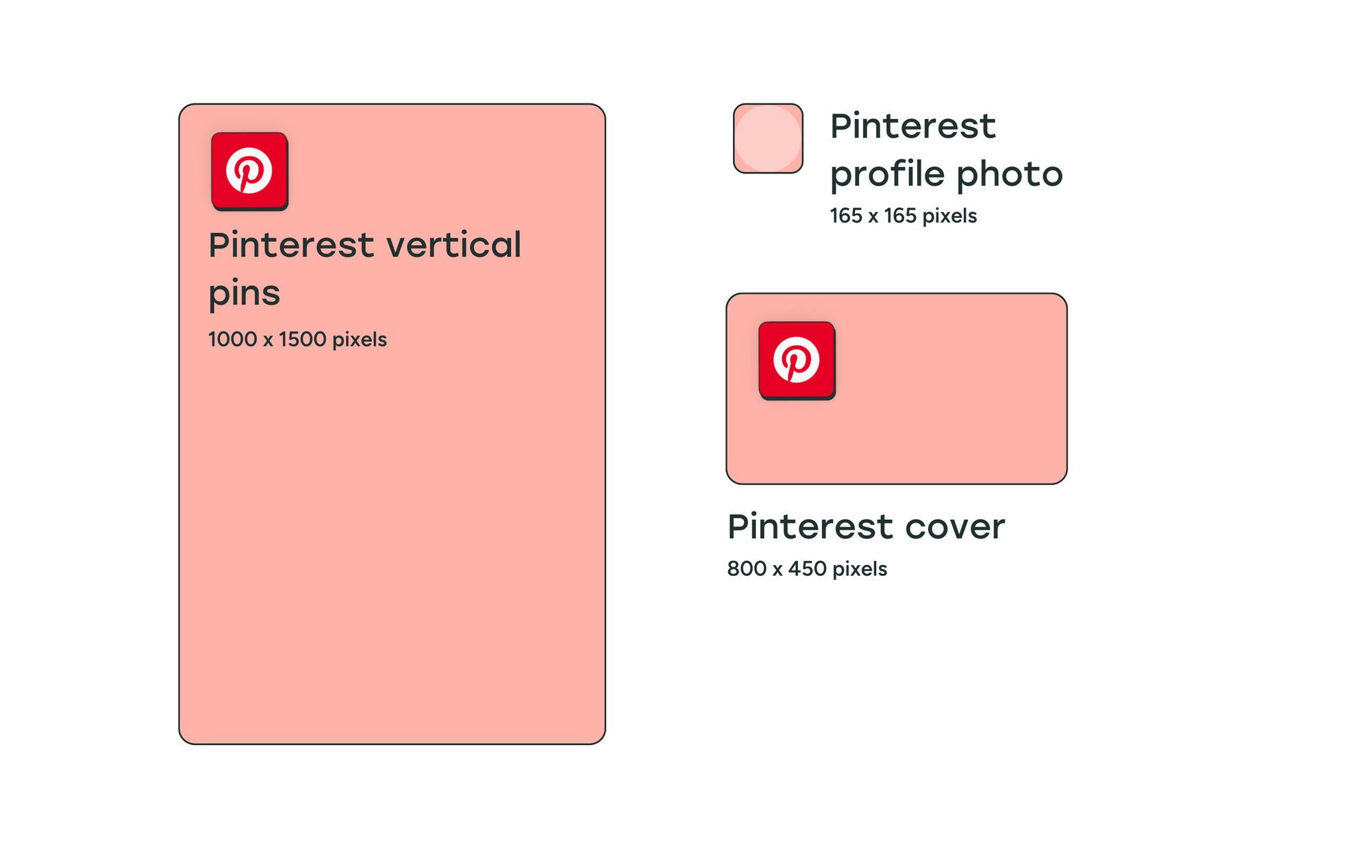
- Profile photo: 165 x 165 pixels
- Cover photo: 800 x 450 pixels
- Post or pins images: 1000 x 1500 pixels
Pinterest profile photo size
The recommended Pinterest profile photo size is 165 x 165 pixels. Like the other social media platforms we’ve seen so far, the profile image will be cropped into a circle when displayed on your Pinterest profile.
Pinterest cover photo size
Pinterest requires your cover photo to have a minimum size of 800 x 450 pixels. They recommend that you use a horizontal image with a 16:9 aspect ratio.
Pinterest pins image size
Pinterest is unique in that it heavily favors long, vertical images and recommends 1000 x 1500 pixels, which is a 2:3 aspect ratio.
Staying within the 2:3 aspect ratio is key. Pinterest told Buffer that the Pinterest algorithm will limit distribution for both low-resolution images and images longer than 1500 pixels.
YouTube image sizes
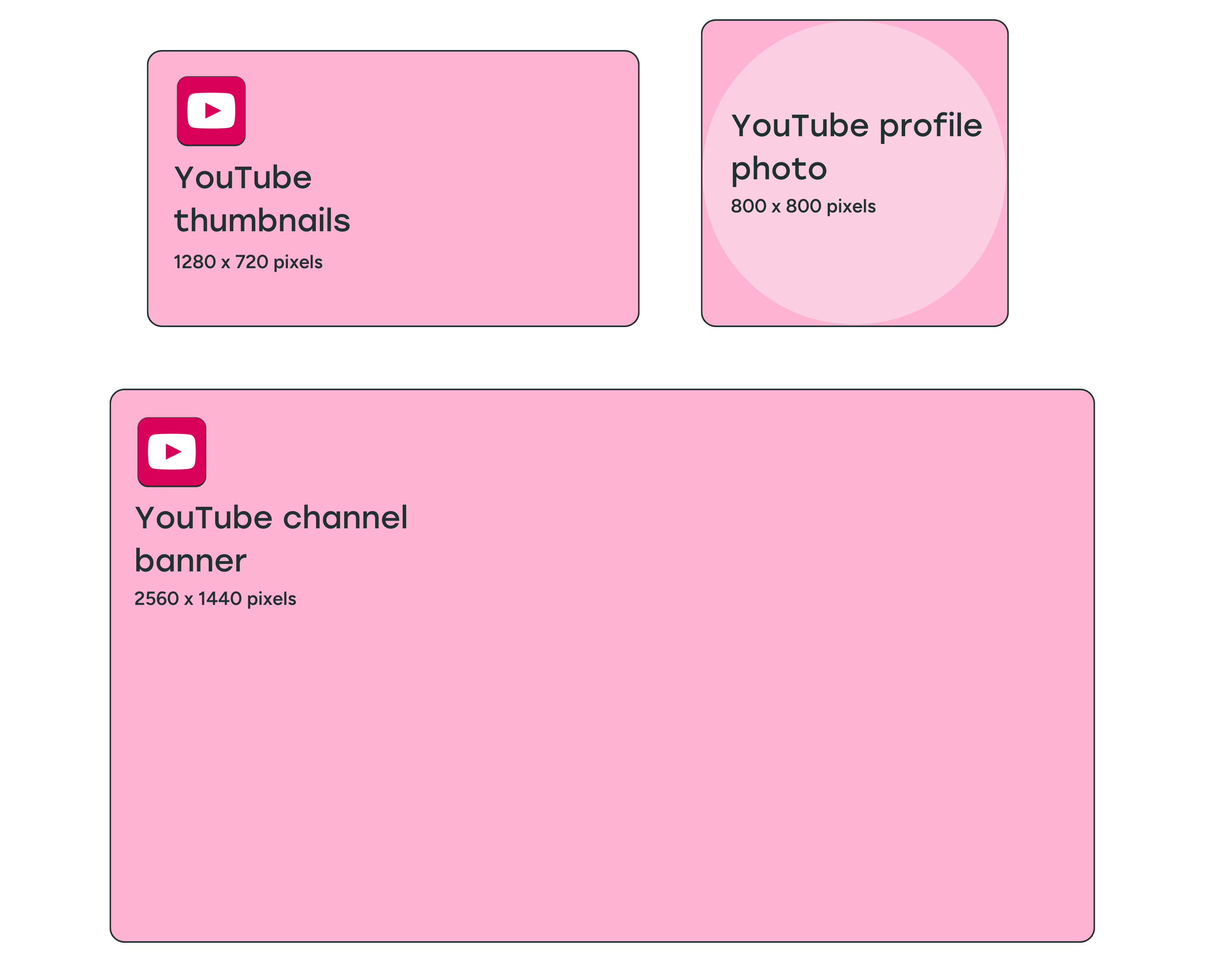
- Profile photo: 800 x 800 pixels
- Cover photo: 2560 x 1440 pixels
Video thumbnail: 1280 x 720 pixels
YouTube profile photo size
It's recommended to use an image that is 800 x 800 pixels for your YouTube profile image. The display size for your profile photo is 98 x 98 pixels, and it will be cropped into a circle on your YouTube channel. The maximum file size for YouTube profile pictures is 15MB.
YouTube banner image size
The minimum size for YouTube banner images — what other social media platforms call cover photos — is 2048 x 1152 pixels.
YouTube videos can be viewed on a desktop, mobile, and even TV, and YouTube recommends uploading an image that is 2560 x 1440 pixels (16:9 aspect ratio) so that it looks good on larger screens.
YouTube banner images will be displayed differently on different devices, and the sides of the image may be cropped depending on where you’re viewing the channel.
When designing your banner image, keep a safe area of 1546 x 423 pixels towards the center of the image to place text and logos.
The maximum file size for YouTube banner images is 6MB.
YouTube video thumbnail size
YouTube thumbnails should be 1280 x 720 pixels, but keep in mind there is a 2MB maximum file size limit, and you want the thumbnail to be high-quality so it grabs people's attention.
For YouTube podcasts, the maximum file size for thumbnails is 10MB.
TikTok image sizes
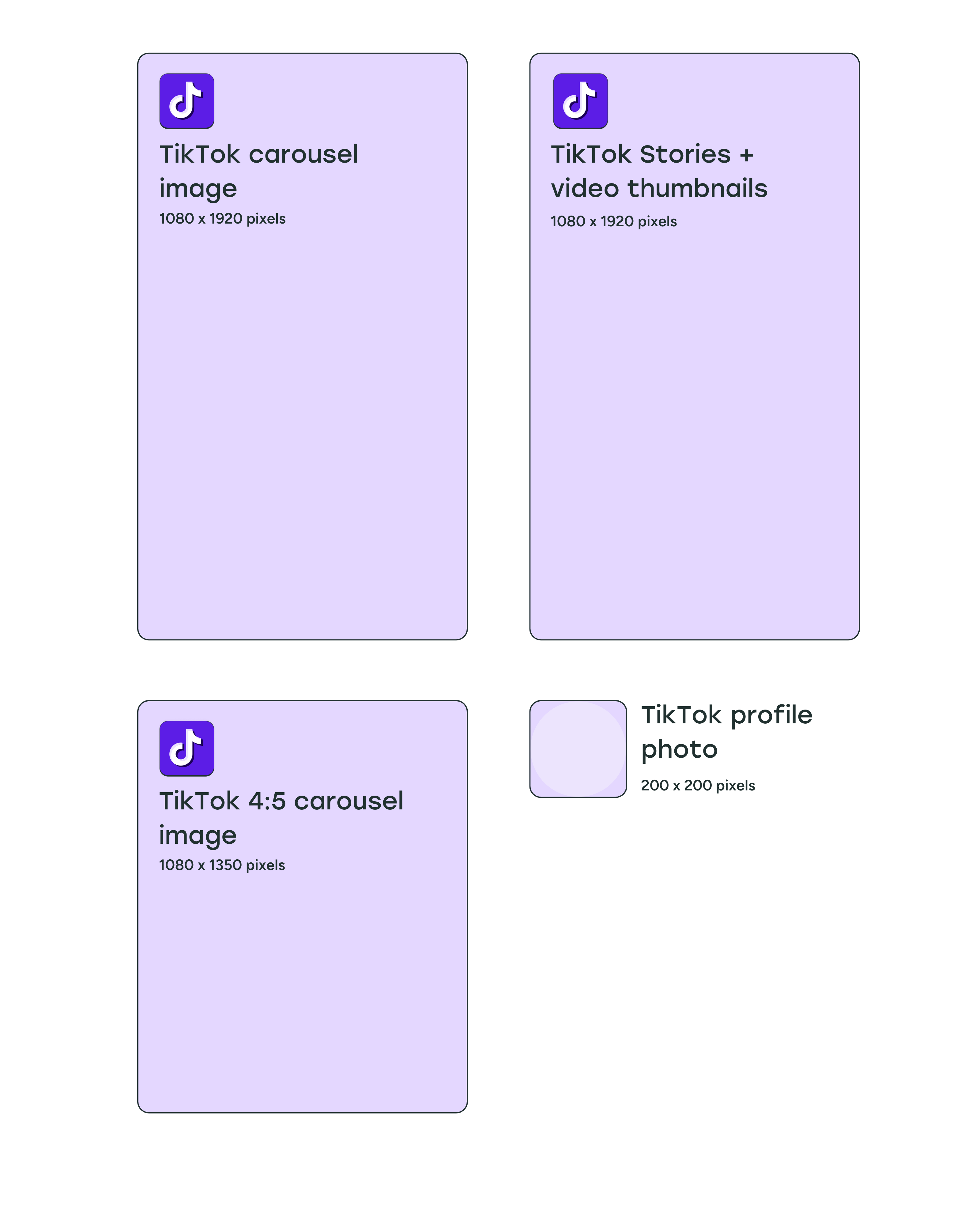
- Profile photo: 200 x 200 pixels
- Post images: 1080 x 1920 pixels (though a 4:5 ratio will work)
- TikTok Stories: 1080 x 1920 pixels
TikTok profile photo size
The minimum image size for TikTok profile photos is tiny — 20 x 20 pixels. We recommend using an image that’s at least 200 x 200 pixels so that it looks sharp on larger screens.
TikTok post image size
TikTok is mostly a video platform, but you can post photos as well. Vertical photos work best on TikTok, with an image size of 1080 x 1920 pixels. That said, images in a 4:5 aspect ratio will also work. You can create carousels with up to 35 photos in a single TikTok post.
TikTok Stories image size
Like Facebook and Instagram Stories, TikTok Stories are available for 24 hours before they disappear from your profile. We recommend using the TikTok video size for stories as well — 1080 x 1920 pixels.
Bluesky image sizes
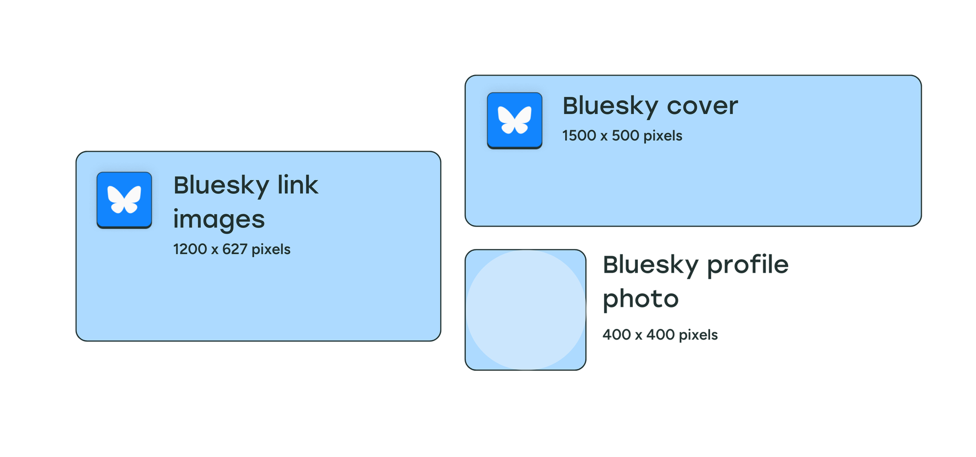
- Profile image: 400 x 400 pixels
- Cover photo: 1500 x 500 pixels
- Post images: Any size and combination of images
- Link image: 1200 x 627 pixels
Bluesky profile photo size
There’s no official documentation for Bluesky images. Since the photo displays as a circle, we recommend using a 1:1 aspect ratio and image size of 400 x 400 pixels.
Bluesky cover photo size
Cover photos on Bluesky use a 3:1 aspect ratio on desktop devices, and we recommend using an image size of 1500 x 500 pixels. The header photo gets cropped on mobile devices to a 4:1 aspect ratio, so make sure there’s no important information on the left or right of the image.
Bluesky post image size
So far, Bluesky has not added any restrictions for image sizes.
Individual photos you post will appear in their original dimensions in timelines and your profile. This means that your square photos of 1080 x 1080 pixels and vertical images of 1080 x 1920 pixels will appear uncropped if they’re the only image in a post.
If you’re sharing multiple images — of the same size or different sizes — the image preview is cropped in timelines and your profile. Users can see the full image in its original resolution if they click on it to expand. You can share up to four images in a single post on Bluesky.
Bluesky image size when shared with a link
Links shared on Bluesky use a 1.91:1 aspect ratio for the accompanying image preview, which is the same as LinkedIn. We recommend using an image size of 1200 x 627 pixels for Bluesky as well.
Why do social media image sizes matter?
You only get a second to grab people's attention on social media, and creating eye-catching visual content in the proper size for each platform can make all the difference with your social media marketing. After all, what's the point of making and sharing a nice image if it shows up cropped or pixelated in people's feeds?
You can use these image size guidelines to create perfect posts, then crosspost easily across all networks with Buffer. Get started with Buffer for free today
Try Buffer for free
190,000+ creators, small businesses, and marketers use Buffer to grow their audiences every month.

