
Header Photo by Pearse O’Halloran on Unsplash
For our Android clients we have a small component library which is used to shared common visual elements across the different Android applications that we work on. We recently updated our applications to the Material Components library, meaning that our component library itself needed to go through the same transition.
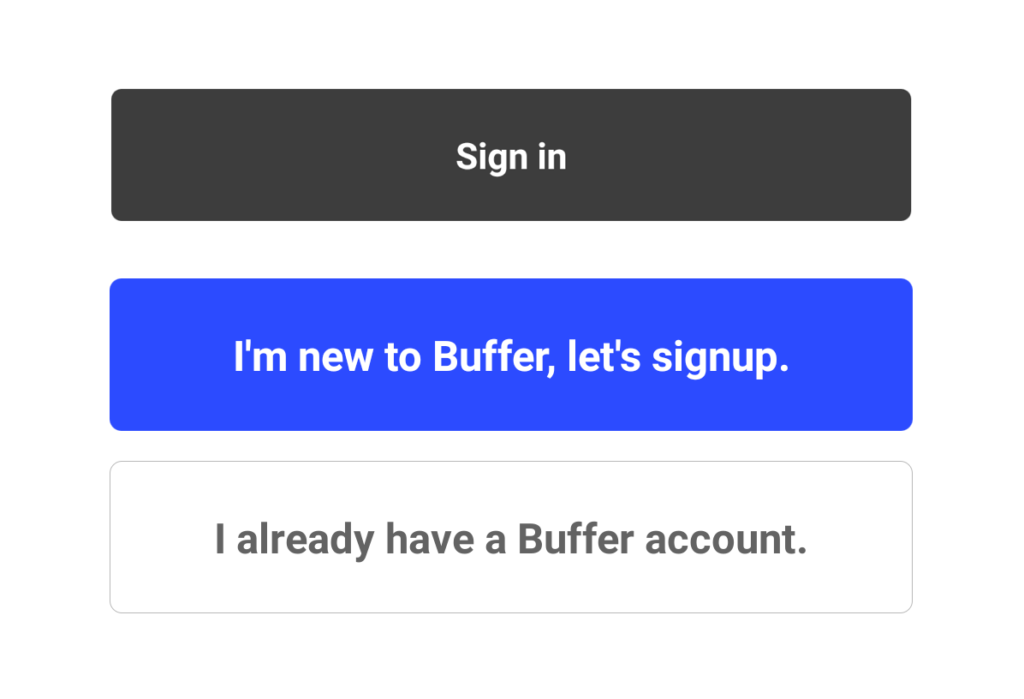
Within this component library we have a custom button component – the button is styled to suit the design system at buffer and having this as a custom component allows us to easily toggle between the different custom attributes that it provides. The button comes in three different states:
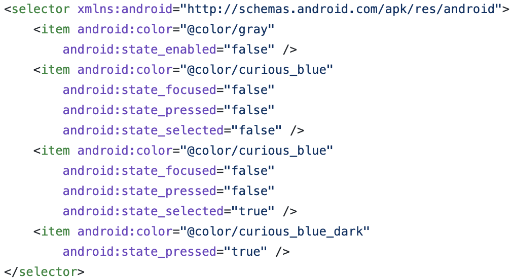
In order to achieve these states there was actually quite a bit of code – each button has it’s own selector state for both the text color and background, meaning that we ended up with something like this in our resources:
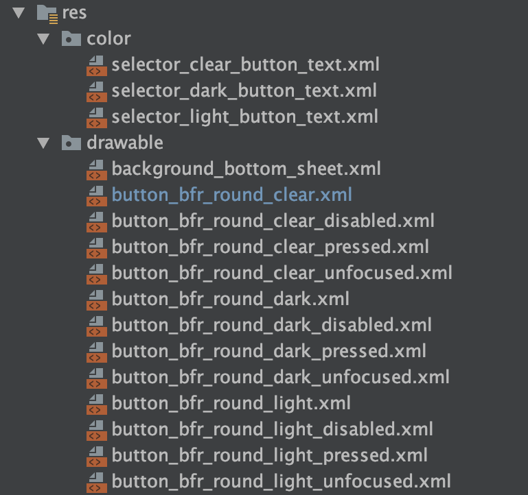
When it comes to these buttons and their corresponding files, each text selector defines the text color states for each button type:
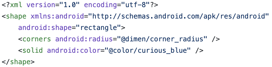
We then have a similar selector but for the background of each button type. Finally, each of these button states then has a shape drawable to create the rounded corner background for the button.
Whilst this works… a) there’s a lot of code here for something that in appearance doesn’t look so complex and b) this isn’t quite going to work when we migrate to use the MaterialButton component.
When it comes to the MaterialButton component, the way we style the button can become a little different. Where we previously had all of the different background selectors that defined not only the background color but the shape, we can now achieve this in a centralised style.
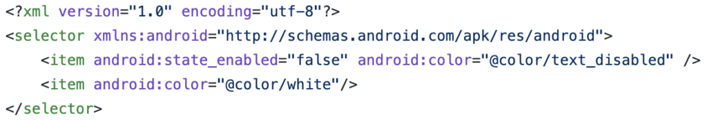
To begin with, this means that we can begin by changing our background selector so that some simple color references are used. If we want to do this in XML, then we can do this the following way:
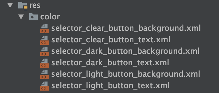
This selector works the same way as the previous, however now we’re not dealing with the different shapes within our xml file – meaning that we end up with a lot less files to represent how our button looks:
For each of these color / background selectors we can then set them within our custom MaterialButton component. We set these depending on the custom attribute passed:
setTextColor(ContextCompat.getColorStateList(context,
        R.color.selector_light_button_text))
backgroundTintList = ContextCompat.getColorStateList(context,
        R.color.selector_light_button_background)
So that’s the text color and background color sorted, but what about the styling of the button? We previously had all of those different background selectors so that we could modify the shape, however, the styling for the MaterialButton allows us to achieve this directly through the Widget.MaterialComponents.Button style.
To make use of this we’re going to create our own style, RoundedButtonStyle, and define some properties for the shapeAppearance attribute:
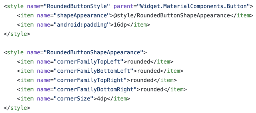
You’ll notice here that for each corner we are defining a cornerFamily attribute, this defines how the corner of the button is rendered – currently this can be either cut or rounded. We won’t get too much into this here, but rounded gives us the same rounded corner effect that we previously had in place – just with much less code. We then use the cornerSize attribute to define the radius used for the rounded corner.
Once we set the style for our button, our button has the intended look and feel, now with the consistency of the rest of our application with the use of the material component library.
In this post we’ve taken a quick look at how we can take our existing Button styling and convert it to a Material Button component. Now with this in place, we have greater consistency throughout our app when it comes to buttons ? Have you worked with something similar recently or looking to make the jump to material components also? Feel free to reach out in the comments below if so ?
Try Buffer for free
200,000+ creators, small businesses, and marketers use Buffer to grow their audiences every month.
