
Recently I managed to get my hands on a Pixelbook. If you haven’t got one, or even read to much into them, then you’ll be excited to know that they have the ability to run Android applications on them. That means that if you have an application in the Play Store, anyone on Chrome OS can download that app, install it and run it on their device.
Whilst in most cases the applications will work out of the box, there are a bunch of things which you can do to improve the experience of your applications whilst they are being used on a Chrome OS device.
In this article, I want to take a look at how we can optimise the input forms of our applications to make them navigable and intractable in a natural manner when it comes to desktop style form factor devices.
Naturally, I was pretty excited to try out the Buffer android apps on the Pixelbook to see how they both looked and felt on these devices. I installed our second app, Reply (we will be adding the same optimisations to Publish), and decided to take note of the changes that were required to improve on the User Experience throughout the app. I’ll admit at first I was a bit naive — I thought that (or at least hoped) that using our applications out-of-the-box would be an OK experience at least, but it proved that whilst the apps worked there were a bunch of things which could really help to improve the UX.
Directional Pad Navigation
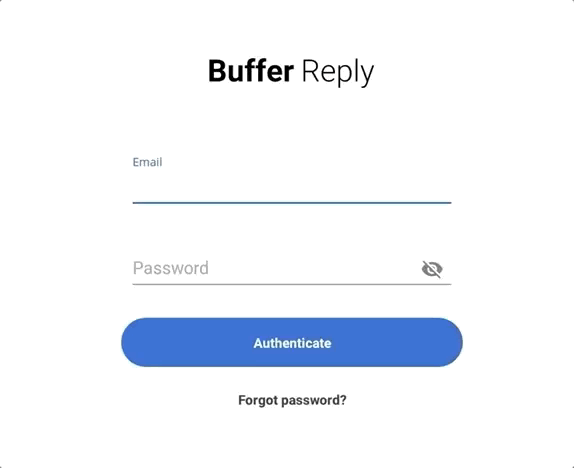
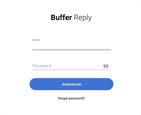
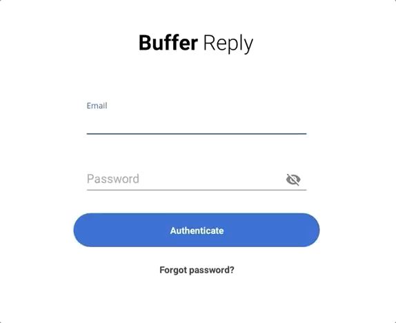
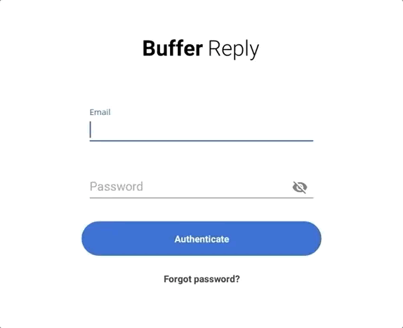
So when you first open the application you are presented with a from to perform authentication. First impressions matter and if your user finds your app difficult to use from the get go then that isn’t a great way to kick things off. In Reply, the first screen you are shown is an Authentication screen with an input form. Now, when we’re using computer form factor devices, our main point of interaction with the hardware is going to be the keyboard / track-pad — even thought the Pixelbook is touch screen, we can’t rely on all of our users defaulting to the behaviour (and I personally don’t really use the touch screen on it). When we’re navigating input forms on the web or within desktop applications, a common way to navigate through these is by using the navigational pad, here’s what happened when I pressed the Down navigation button several times in a row:
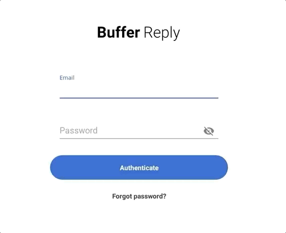
Starting from the Email input field, you can see the first press takes me to the Password input field, I was then I was required to press the Right directional pad and had to press Left followed by Up to navigate back to the Email input field. Whilst this works and might be OK to navigate around, there are some issues which instantly come to mind here:
- To begin with when pressing the Down direction I would expect to iterate through the focus of all the view components in this form. The focus stops in this direction at the password input field. This means the I can’t focus on the buttons — whilst the Return key could be used to submit the form, how do I reach the Forgot Password button?
- When pressing the down direction, I would expect the start of the form (in this case) to regain focus once I reach the end. So here without any optimizations in place, pressing the Down direction when the Password input field is in focus should cause the Email input field to regain focus. This means that the user can easily navigate back to the start of the form without needed to hit the Up key several times.
- Navigating to the Password visibility toggle requires you to press the Right direction key from the Password input field — whilst this itself makes sense to me (I wouldn’t want it to block me Down focus flow), again no focus changes at this point when you hit the Down key.
However, there isn’t much work that is needed to improve on this, so let’s tackle these issues:
- To begin with we want out Buttons to be focusable:
android:focusable=trueThis means that now these Buttons have the ability to gain focus, meaning that they can now be interacted with via the hardware keyboard.
- Now that we’ve added this, our Buttons automatically become the next focus points when navigating down from the password input field. However, things are still a little funky here as navigating up from the authentication button causes the password toggle component to become focused. We can fix this by adding the nextFocusUp attribute to our Authentication button:
android:nextFocusUp="@+id/input_password"- The last thing that we can fix here is that when we get to the Forgot Password button and we hit the Down navigation key, nothing happens. Naturally here we would expect this to return to the start of the form, so we can add this behaviour in by using the nextFocusDown attribute:
android:nextFocusDown="@+id/input_email"With these in place, our form feels a little bit more natural to navigate and some of the behaviours that we’ve implemented make our form easier to use.
Tabbed Navigation
Another common way in which we are used to navigating applications and websites using hardware keyboards is the tab key. Personally I use the Tab key a lot (more than the directional pad) as it allows my little finger to quickly tap the key to move through the view components on the screen. In some cases you want to optimise this also so that the navigation through the view components is as frictionless as it can be.
For example, when pressing the tab key you may want to skip some view component that you may feel is blocking to the navigation flow here. For example, without any change this is what the tabbed navigation looked like:
So you can see here that the password visibility toggle is getting focus when we’re tabbing through the view components. If we wish to change the order in which elements are focused via tabbed navigation then we can do so by using the nextFocusForward attribute on our view. This means that when this view is in focus then the given view ID will be the next one to navigate to when the tab key is pressed.
android:nextFocusForward="@+id/some_view_id"Here as an example I placed this attribute on the Password Input field so that the Authenticate button would become focused when the tab key was pressed. I was also required to add that attribute to each view to avoid the password toggle becoming focused when the tab key is used. As you can see, if a view component may not be a primary part of your navigation flow then removing it from this tab flow can help to smoothen out the process for the user. After all, these views will still be accessible using the directional pads.
Visual Focus States
Now whilst our navigation has been improved when it comes to keyboard usage, there was something that was bothering me when it came to the visual side of things. When navigating through the view components you can see the focus changes on each of the elements — when the Authenticate button came into focus it was incredibly hard to tell that it was actually in this state.
Whilst this might be OK on mobile devices for users interacting with the touch screen, and for users with talk back enabled who will have the view highlight, difficulties may arise when it comes to navigation via hardware keyboards. I found that this meant that:
- When navigating through the form, it was hard to tell that this button was actually in focus. Had focus been lost whilst I was pressing the D-pad buttons? At first I had to go Up and then back Down to double check that the focus was actually still there
- If I was navigating through the form and looked away from the screen for a moment, when turning my attention back to the application I found it hard to spot exactly where I had left off. This again meant I had to press another direction key just to see where I had left off.
Depending on your design, there are probably many things that you can do here and it will really depend on your application — but let’s take a look at a couple of examples of things that we could implement here to make this clearer:
- We could begin by adding a darker focus color to the button. This means that when the Authenticate button is in focus then it’s state here will be much more prominent, as previously the color didn’t really change to much so the view didn’t look too different as to when it was previously not in focus.
- However, I feel like the color alone might not be enough in some cases. Whilst some users may rely on the contrast levels to change for accessibility reasons, we also have to remember that some people just might not be too familiar with what the expected color here actually is for each state. And whilst the Forgot password button color change is already quite different between these states, it’s focus state other than this still isn’t too clear. Another thing we could add here is elevation — even a slight amount of elevation, along with the color change we made, helps to make the focused button pop out a lot more on screen
Whilst these changes are only little, you can already see that the focus state of the buttons has become a lot clearer. That means whether we’re just navigating through the form or coming back into context from a distraction, the usability of our form will be a much smoother flow.
Form submission
Now that we can easily navigate our form and populate its content, we need to actually be able to submit the form! The expected behaviour here would be to press the Return key and your form be submitted — however, this is not the case here out-of-the box. Pressing the Return key in a lot of cases may do nothing —you may be required to manually hit the Authenticate button. We can improve the UX here greatly and provide an expected behaviour for the user by adding a key listener to our button:
input_password.setOnKeyListener { _, keyCode, keyEvent  ->
    if (keyEvent.action == KeyEvent.ACTION_UP && keyCode == KeyEvent.KEYCODE_ENTER) {
        performAuthentication()
        true
    } else false
}
That way whenever the Return key is pressed whilst the Password Input field is in focus then the authentication flow will be triggered. Now, whilst this may help in some cases we didn’t actually need to add anything here. Why? Well, we have imeOptions set on our input fields so that they can be easily navigated when using a software keyboard. Luckily, the Editor Action Listener picked up the Return key press to allow the authentication flow to be triggered:
input_password.setOnEditorActionListener { v, actionId, event ->
    if (actionId == EditorInfoIME_ACTION_DONE) {
        performAuthentication()
        true
    } else false
}
I hope the insights within this article show some small, yet effective, tweaks we can make to really improve the User Experience when it comes to using our Android applications on Chrome OS. Do you have any questions about handling navigation on Chrome OS or any suggestions to build on the above? Please feel free to reach out if so ?
Try Buffer for free
200,000+ creators, small businesses, and marketers use Buffer to grow their audiences every month.


