Have you ever pulled a social network’s logo from Google and thought, “I hope this is the right one?”
Staying up to date with the latest social media logos can be a challenge. Even once you’ve found the correct logo, it can take time to understand the finer details within the brand guidelines:
- How much spacing should be around the logo?
- What colors should I use?
- What size should it be? etc,
We put together this resource to keep you updated on the most popular social media logos, saving you the time and effort it would normally take to stay up-to-date.
Alongside the most recent logos for Facebook, Twitter, YouTube, Mastodon, and more, we’ve also included the key guidelines for the usage of each logo.
Let’s get started!
Social Media Logos
Below, you’ll find a guide to the logos and brand guidelines for many of the most popular social media platforms. We’ll do our best to keep this post updated and ensure it always contains the most current version of each social network’s logo
General guidance for the use of social network logos
- A vector (.svg) logo will help your designs in two key ways: scalability and flexibility. Neither .jpg nor .png images are too scalable, but a vector image can be resized to fit your specific needs.
- Social networks prohibit the use of their logos or branding in a way that implies a partnership, sponsorship, or endorsement.
- Ensure that a social network’s logo is smaller than your own branding.
- Don’t alter any logos and leave space around each logo to ensure it’s individual of any elements around it. Pro tip if you’d like to resize a logo: Hold the “Shift” key in most software programs to maintain the proportions while scaling up or down.
- It’s prohibited to use a social network’s branding or name (such as Pinterest Guru, LLC) in your own brand name or products.
Now that we’re warmed up, let’s talk about each brand individually.
Facebook Logo & Guidelines
The “f” logo is one of Facebook’s most important visual and identity assets. It has changed slightly over the years, but it remains as the way for people and brands to represent Facebook, as use of the full “Facebook” wordmark logo isn’t permitted. The current logo features the trademark ‘f’ in white on a blue circular tile.
Facebook logo

Facebook logo guidelines
Only use the ‘f’ logo to refer to:
- Your presence on Facebook, such as your Page, timeline, group, app, or event
- Your implementation of Facebook on your website
- Your product’s integration with Facebook, such as ‘For use with Facebook’
- Content that originates from Facebook
Incorrect Use
The “f” logo should never be altered for any reason including enhancing, redesigning, animating, or fabricating into another object, like these examples:
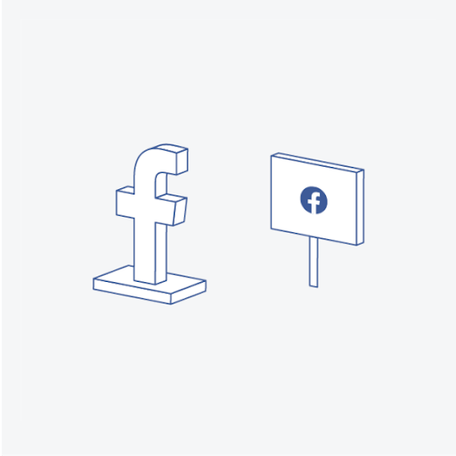
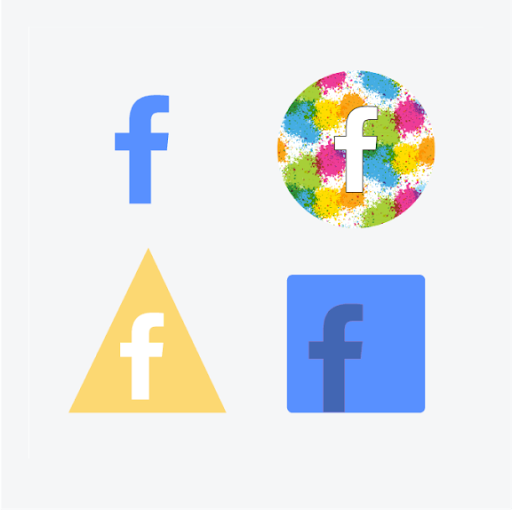
True for any social network, it’s important to be wary of implying partnership by including your brand’s offerings too close to Facebook’s logo, or by embellishing Facebook’s logo by making it more prominent on the page than your own branding.

Download Facebook’s logo and F checkout their brand guidelines >>
Instagram Logos & Guidelines
Instagram is widely known as a visual platform full of images and videos. Although the design has changed over time, their long-lasting camera-inspired logo really points to that symbolism!
Instagram logo
Instagram has two logo variations, the black and white logo (shown below in both black and white) and the gradient logo.

*Never heard of “glyph”? It’s just a fancy word for a symbol or character.
Instagram logo guidelines
A few things to remember when using the Instagram logo:
- The gradient logo shouldn’t be altered in any way. However, the black and white Instagram logo can be used in any color as long as all other aspects of its design stay the same. Unless the glyph or camera logo is intended to appear in a list of other social media logos, a clear call to action (e.g. “Follow us on Instagram”) should accompany it.

- The Instagram logo should never be smaller than 29x29 pixels, and proportions should always remain the same.
- The minimum clear space around the logo should be one-half the size of the glyph itself, like this:

Download Instagram’s logo and checkout their brand guidelines >>
TikTok Logos & Guidelines
Often the source of trending and even viral content, TikTok has ballooned in its influence since inception in 2017.
While many business owners weren’t initially sure how they’d use the platform’s strengths to amplify their brand, it’s no surprise that they jumped onboard, one-by-one, to at least give it a try.
TikTok is now a platform where ambitious individuals and brands, alike, can consume and create vibrant content.
Let’s take a minute to learn more about TikTok branding.
TikTok logo
TikTok has three different logos to use in different environments.

Let’s talk about each one, from left to right:
- The note with the TikTok wordmark is their primary logo. It should be used when the TikTok brand hasn’t already been established (see the leftmost logo above).
- The solo note logo can be used when the TikTok brand has already been established (see the center logo above).
- The note above the TikTok wordmark should be used in rare circumstances when the TikTok brand hasn’t yet been established, but space is limited (see the rightmost logo above).
TikTok logo guidelines
Do:
- Maintain enough clear space around the logo to fit the width of the logo on all sides
- Ensure both “T”s in “TikTok” are capitalized.
- Use the correct logo to complement the background color. Their primary logo on black backgrounds, their all-white logo on darker backgrounds or imagery, and their all-black logo on light backgrounds or imagery. All logos can be found here.
Don’t:
- Add a space between “Tik” and “Tok”
- Use “TikTok” as a noun or verb, such as, “Checkout my latest TikTok for more.” Instead, use, “Checkout the latest video on my TikTok profile.”
- Translate the word “TikTok” into any other language.
- Use the likeness of TikTok to infer a business connection, endorsement, partnership, or any other relationship that doesn’t exist.
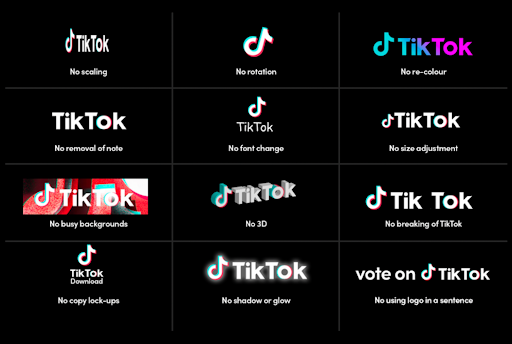
This image shows several ways the TikTok logo is not permitted to be used:
Download the TikTok logo and checkout the full TikTok brand guidelines >>
Twitter Logos & Guidelines
The Twitter bird is instantly recognizable, and like the other social networks, Twitter takes pride in their brand assets. In fact, we think you’ll find Twitter’s brand assets to be some of the most comprehensive, with not only downloads of their logos, but also other graphics you can use to represent your presence on Twitter.
The Twitter logo has been through quite a few transitions since Twitter first launched in 2006. The current Twitter logo is either white or blue and it features the bird with its head angled upward.
Twitter logo
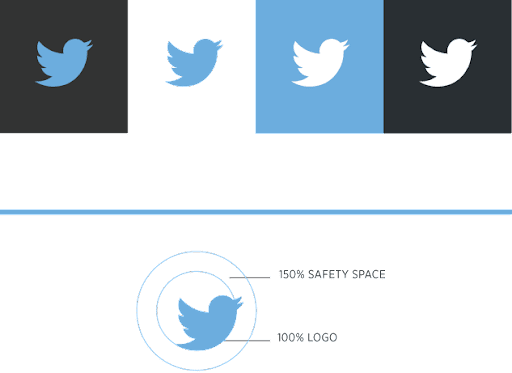
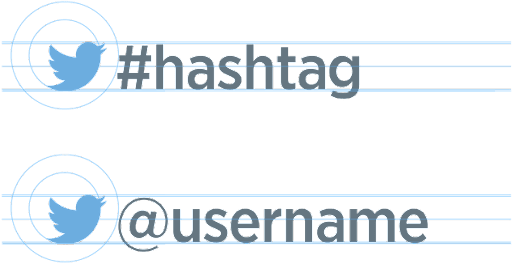
The minimum size of the logo should be 16 pixels, and the empty space around the logo should be at least 150% the size of the logo itself. For example, if you’re adding the Twitter logo to a hashtag or username, it should have the correct 150% spacing between the logo mark and the next letter, number, or symbol:
Twitter logo guidelines
Twitter shares a few more guidelines when it comes to the use of their branding:
Don’t:
- Create the logo in any color other than blue or white. Black can be used if special permission is granted.
- Use speech bubbles or other icons around the logo
- Alter, modify, stretch, or rotate the logo
- Animate the logo
- Surround the logo with other birds or creatures
- Anthropomorphize the logo
- Use older versions of the logo or any marks that may be confused with the brand
To support its logo mark, note that Twitter uses the Helvetica Neue Regular font for the @handle, the Tweet, and the timestamp. Use Helvetica Neue Bold for the username.
Download the Twitter logo and checkout the full Twitter brand guidelines >
Pinterest Logo & Guidelines
Like many other social network icons, the Pinterest logo is representative of the brand, even without the full wordmark. In fact, Pinterest doesn’t approve the use of the full wordmark at all.
The Pinterest badge is a red circle with a P in the center that allows the background color to peek through.
Pinterest logo
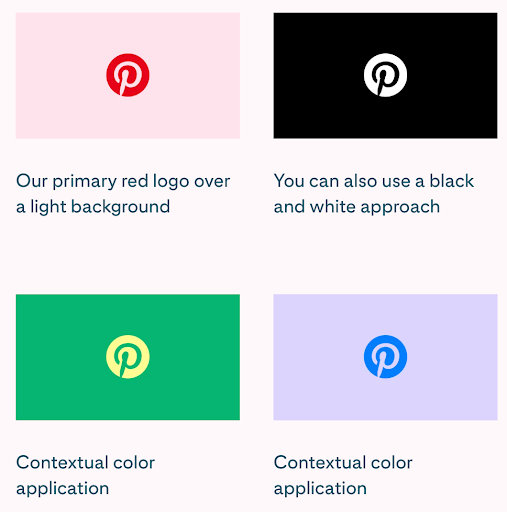
While the main logo is red, Pinterest provides a number of other colors within their brand assets to complement any background color.
Pinterest logo guidelines
There are also a few don’ts for us to be aware of.
Pinterest doesn’t approve of:
- Adding a white border around their circular logo
- Using colors that lack sufficient contrast against the background
- Adding filters to the logo
- Filling the P with white
- Using a shape other than the circle around the P
Other good-to-knows about the Pinterest logo
- While it’s acceptable to use phrases such as “Follow on Pinterest,” “Find us on Pinterest,” “Follow us on Pinterest,” there are some unacceptable phrases.
- It’s unacceptable to use the phrases, “Trending on Pinterest,” “Trending pins,” or any use of “pin” as a verb (use “save” instead).
- “Popular on Pinterest” should refer to only your account. It can be used if that pin registered higher than average impressions, clicks, or saves and should be followed with your Pinterest URL.
- Don’t use “Pin,” “Pinterest,” or any variations in your name or domain name (such as pintasticstrategy.com or Pinterest Gal, LLC).
Download the Pinterest logo and checkout their brand guidelines >>
LinkedIn Logo & Guidelines
LinkedIn’s branding decisions have a strong leaning toward accessibility - it’s their guidepost when deciding to pivot right or left. Over time, they’ve simplified their branding guidelines. Let’s get into what’s current!
LinkedIn’s logo
The logo comes in one color, and the download they provide includes just that: one icon and one wordmark logo.

LinkedIn also says that an all-black or all-white version of their logo is permitted if the background is black or white, or if the white variation on any dark background makes it more accessible.
LinkedIn logo Guidelines
The LinkedIn logo should be surrounded by clear space 2x the side of the width of the ‘i’ in the logo. For example:

The minimum size of the LinkedIn logo and “in” icon is 21px on screen, or 0.25in (6.35mm) in print, measured by the height of the “in” icon. The ® and ™ symbols should be clearly visible.

LinkedIn brand colors
We have a few other branding notes from LinkedIn:
- They use the “Community” font
- They use rectangles and circles, representative of the “i”
- Although not to be used to craft new logos, LinkedIn’s brand colors complement the iconic LinkedIn blue with the intention to not allow the blue to overpower the rest of the palette

Download the LinkedIn logo and checkout their full brand guidelines >>
Mastodon Logo & Guidelines
Mastodon is the newest of the social channels, but the passion behind their branding is clear.
Mastodon logo
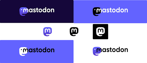
There are several slight-variations of the Mastodon logo.
Let’s talk through a few specifics regarding their logo:
- Mastodon prefers the use of their white or black wordmark logos with the purple icon under the “m.”
- In cases where the contrast isn’t great enough to make their main wordmark logo fully visible, they recommend a full black and white alternative.
- The Mastodon logo icon without the wordmark can be used in two situations: when the brand has been clearly established and/or when space is limited.
Mastodon logo guidelines
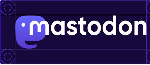
Mastodon requires at least 36px on every side of their logo for the best representation.
Mastodon brand colors
Mastodon keeps a few secrets. As you can see below, they’ve shared all of their brand color HEX codes with us.
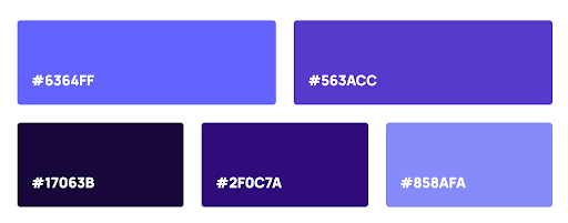
Download the Mastodon logo and checkout their brand guidelines >>
YouTube Logo & Guidelines
The YouTube logo has changed a bit over time, and it’s important to ensure you’re using the most up-to-date branding. Let’s see what that is.
YouTube logo
YouTube has two full-color logos and two monochrome logos in their branding kit. Each has a preferred use.

A few important notes about the YouTube logo:
- The full-color logo must always have a white triangle.
- The monochrome logos should have a transparent triangle, reflecting the background color through it.
- The full-color logo is acceptable on any background where it’s visible. Don’t use it on red backgrounds.
- The white monochrome logo should be used only on almost black backgrounds or dark imagery. The black monochrome logo should be used only on white backgrounds or light imagery.
- Use the logo icon instead of the full logo wordmark when the area is not large enough to allow for proper spacing or when it’s necessary to ensure it matches the logo size of other social networks it appears next to.
YouTube logo guidelines
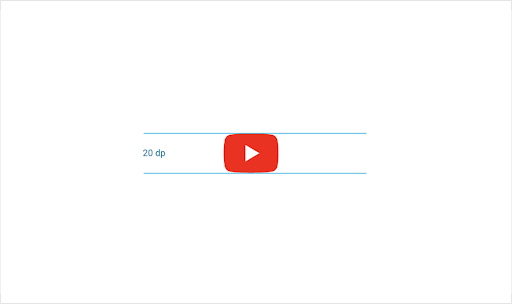
The YouTube logo and logo icon should never appear smaller than 20px in height.
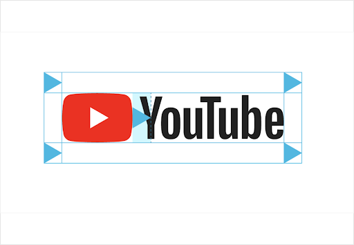
The logo and logo icon should always have the minimum area of clear space around it. The clear space should be equal to or greater than the size of the logo’s white triangle.
YouTube brand colors
The YouTube full-color logo is made with:

Download YouTube’s logo and checkout their brand guidelines >>
Snapchat Logo & Guidelines
Snapchat’s ‘Ghostface Chillah’ logo is still alive and well, extremely famous and instantly recognizable. Let’s learn more about it.
Snapchat logo
When we think of Snapchat, we often visualize bright yellow behind their ghost logo, but we thought it was interesting to discover that yellow isn’t actually part of the logo itself.
Let’s learn more!
Ghost logo
Snapchat’s Ghost Logo stands on its own to represent the brand. Snapchat provides two Ghost Logo options: a black one appropriate for light backgrounds and a white one appropriate for dark backgrounds.


Guidelines
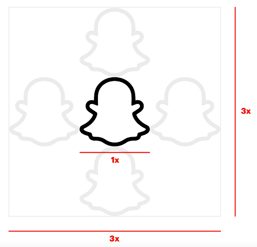
When using Snapchat’s branding it’s important that no other logos or elements infringe the space around it. Clear space around the logomark should always be equivalent to the full width of the logo. The minimum size the logomark may be used for print applications is .4” (10mm) wide and for digital applications, the minimum size is 45 pixels wide.
Snapchat’s brand color
Snapchat’s logotype should always contrast with the background. The official yellow colors used by Snapchat is:
- Hex: #FFFC00
- CMYK: 0/0/95/0
- RGB: 255/252/0
- PMS: Snap Yellow #SNA001
Use of Snapchat’s Snapcode
Something unique to Snapchat is their branded Snapcode– a bright yellow, ghost-marked, dotted QR code that takes your followers straight to your Snapchat profile.

If you’re looking for the Snapcode usage guidelines, checkout this resource.
Otherwise, Download Snapchat’s Ghost Logo and checkout their brand guidelines >>
Medium Logos & Guidelines
The standard version of the Medium logo, which should be used in most instances, is made up of two parts: the symbol and the wordmark.
Medium allows the use of the symbol and the wordmark independently or together.
Logo
Standard version
Just the Symbol
Just the Wordmark
Other logo uses
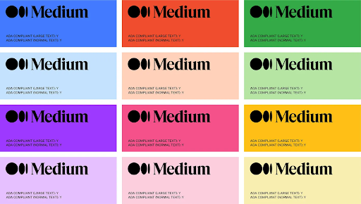
Medium promotes the use of any background color for their black logo, and asks that the white logo only be used on bright backgrounds.
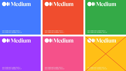
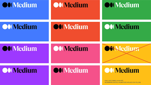
You can even mix and match the colors, using white for either the symbol or the wordmark and black for the other.
Guidelines
Don’t:
- Use an old logo.
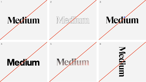
- Outline, reflect, apply a gradient, or add any other effects to the wordmark or symbol.
- Apply colors to the black or white versions of the logo.
- Crop, stretch, squeeze, modify, or rotate the logo.
- Use the white wordmark on a yellow background.
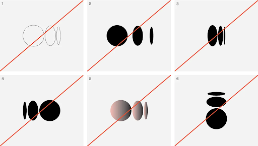
Download Medium’s logo and checkout their brand guideline >>
Over to you
We’d love to continue growing this resource as long as it’s helpful for you. What brands are we missing?
Try Buffer for free
200,000+ creators, small businesses, and marketers use Buffer to grow their audiences every month.
