Today, we are thrilled to announce the newest version of Buffer’s iOS app, which represents a major upgrade in design, code, and features. We’ve gone through many iterations, and we’re hoping you like what we’ve come up with. The end product was more than five months in the making, and we thought it might be neat to give you a behind-the-scenes look at the development process.
Design
The first thing you’ll notice with most iOS 7 app updates is the new design. We’ve simplified the design within our iOS 7 update, making use of a flatter UI to match that of iOS 7, gone are the gradients throughout the app. We’ve continued to use some shadows to add contrast to various elements—more so than some other apps have. We hope we’ve found a good balance.
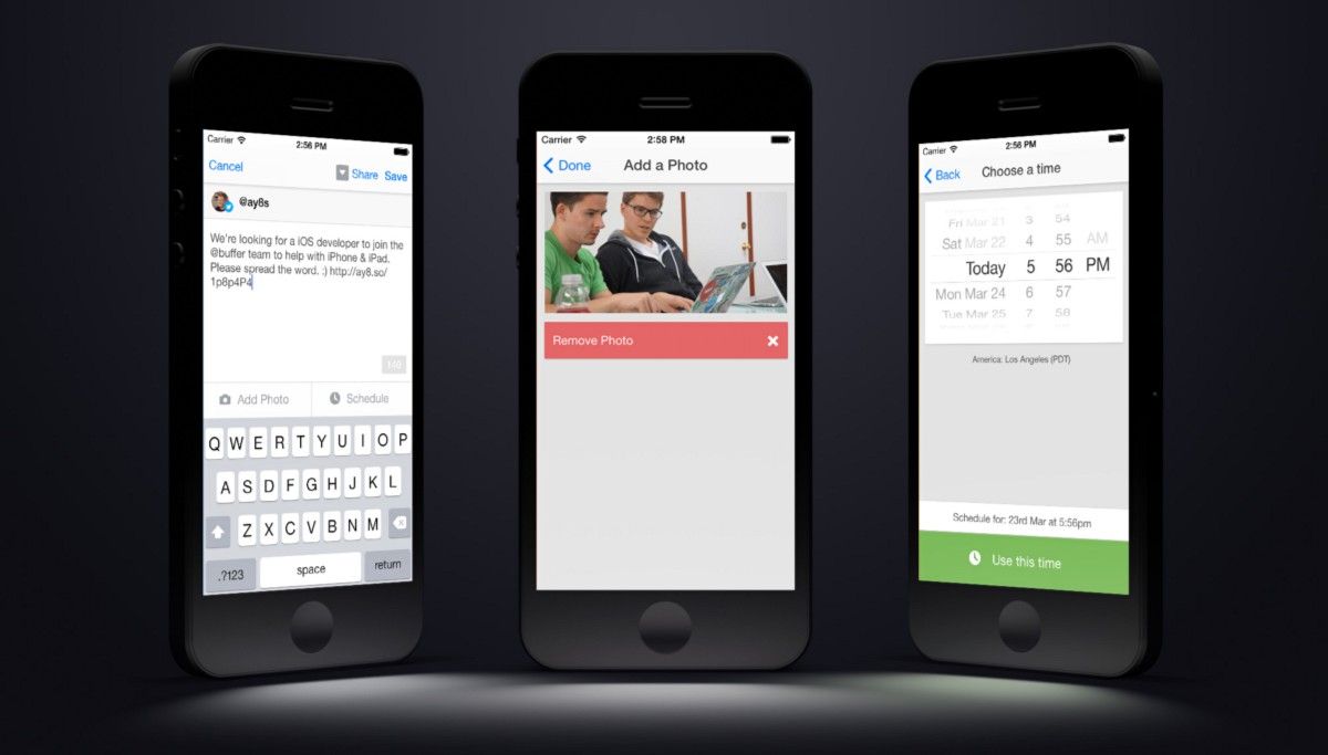
We spent a good chunk of time working on updating our composer within v3.0. We’re no longer hiding options below the keyboard; instead we are making use of new full screen views to allow you to choose which accounts to post to, which photos to attach, and what custom times to post.

(Composer layout, thanks to Anton Kudin for the side by side iPhone layout.)
We’ve improved the display of retweets as well as updates that have been added by content contributors. We’ll be sure to blog more about the design once it’s out in the wild.
New Features in Buffer for iOS 7
We’ve added some new features within the app with version 3.0. We’ve added content suggestions to the app, a feature that we’ve had on the web app for a couple of months. So if your Buffer is looking a little bare, you can always add a few of our suggestions to post to your Buffer queue.
Background fetch has been added to keep the accounts as up to date as possible when you’re not using Buffer on your iPhone. This should keep the count of how many posts are in each of your Buffers more up to date.
You can also now manage your team members right from your iPhone, allowing you to invite new managers or contributors to your Buffer accounts along with editing roles, etc.
You can also now set how you want the composer to act when selecting accounts by default. You can have it select the current account you are viewing or the default accounts you have set within the dashboard using the ticks alongside each account.
We’re planning to add even more features to the app over the coming months, allowing you to manage everything you can on web right from your iPhone.Rewritten & Refactored
Along with the visual changes throughout the app we’ve completely rewritten many of the views within the app, including Buffer, Analytics, and the Composer.
Version 2 of the app, although very different than version 1, contained quite a lot of code from the first version of our iPhone app. Plus with the addition of Objective-C literals and many other updates it was time to revisit and refactor those.
Along with the rewrites, we’ve refactored a lot of the existing code in the app to improve performance and to resolve some bugs. Most noticeably we’ve removed the custom date/time picker to make use of Apple’s, which has improved support for various international date/time formats which were causing some issues in v2.0.
What’s next?
Our next big project is updating the app to be universal for iPhone and iPad. We’re hoping we can get this out in the next couple of months.
If you want to help make our app universal, we’re on the look out for iOS developers to join Buffer. If you’re interested, then join our small team!
This post originally appeared on Medium. You can find more posts from our team in Buffer’s Medium collection.
Try Buffer for free
200,000+ creators, small businesses, and marketers use Buffer to grow their audiences every month.


