Grow your audience on social and beyond
Buffer helps you build an audience organically. We’re a values-driven company that provides affordable, intuitive marketing tools for ambitious people and teams.
269%
Increase in engagement
2x
More followers
115k
Grew following
12%
Increase in engagement
2,000
New followers in two months
4x
Increase in traffic
10%
Monthly growth in followers
15%
Increase in followers
50%
Increase in impressions
400%
Increase in followers
999%
Increase in engagement
251%
Increase in engagement
40%
New leads
200,000
New followers
269%
Increase in engagement2x
Increase in engagement
100
New followers a day
20 hrs
Saved a day
100%
Increase in engagement
35%
Increase in engagement
269%
Increase in engagement2x
Increase in following
200%
Increase in following
386x
Boost in engagement rate
60 hrs
Saved per month
2.5 million
Followers
1.2 million
Followers
6.9 million
Followers
200k
Followers
269%
Increase in engagement2x
More followers115k
Grew following12%
Increase in engagement2,000
New followers in two months4x
Increase in traffic10%
Monthly growth in followers15%
Increase in followers50%
Increase in impressions400%
Increase in followers999%
Increase in engagement251%
Increase in engagement40%
New leads200,000
New followers269%
Increase in engagement2x
Increase in engagement100
New followers a day20 hrs
Saved a day100%
Increase in engagement35%
Increase in engagement269%
Increase in engagement2x
Increase in following200%
Increase in following386x
Boost in engagement rate60 hrs
Saved per month2.5 million
Followers1.2 million
Followers6.9 million
Followers200k
FollowersBuild a following without draining your time
Creating content is hard enough. Let alone distributing it to all the different marketing channels. Here are four ways Buffer can help.
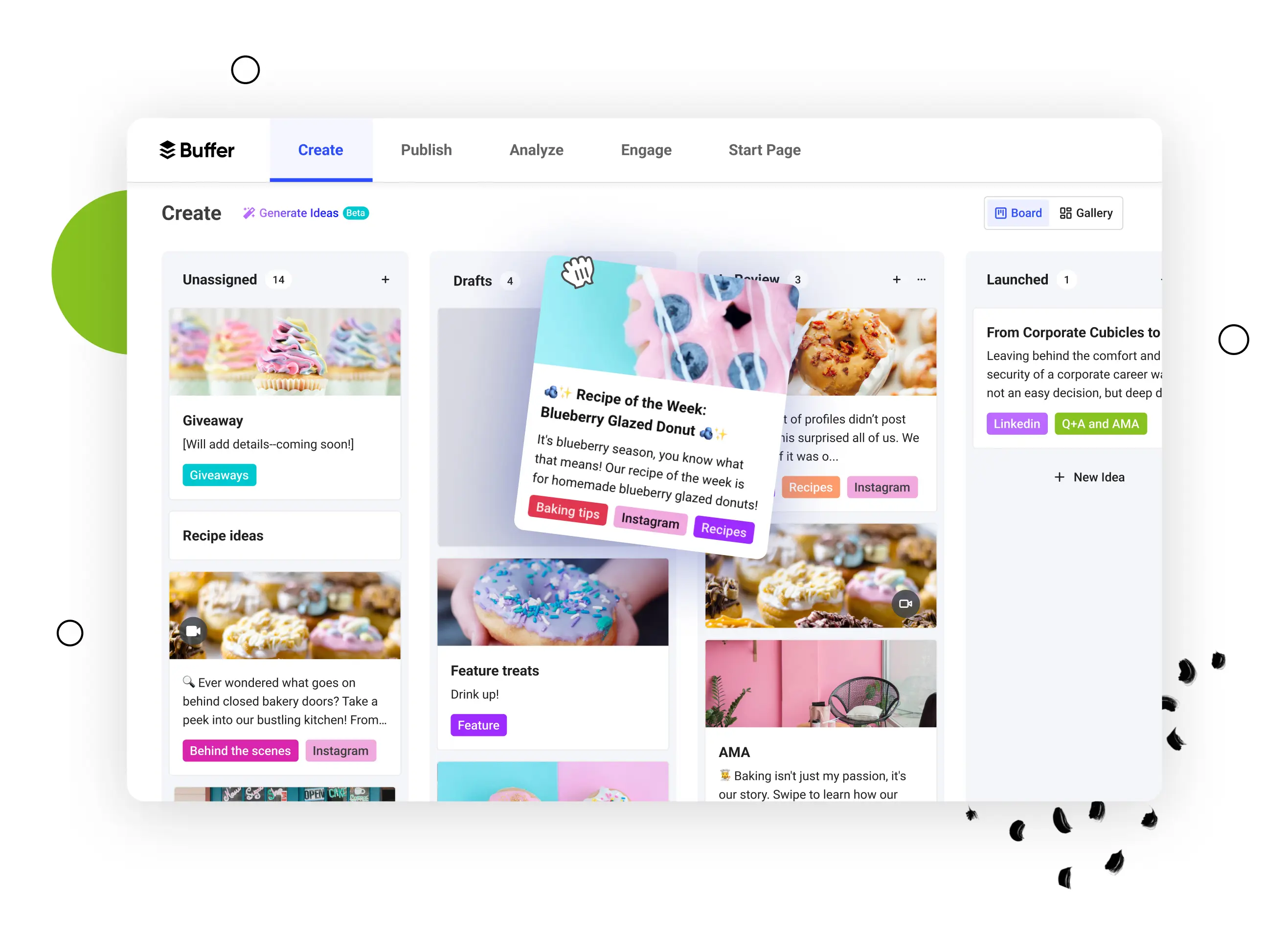
1. Create click-worthy content
Build a library of content ideas
Buffer will help you turn your ideas into captivating posts for each platform.
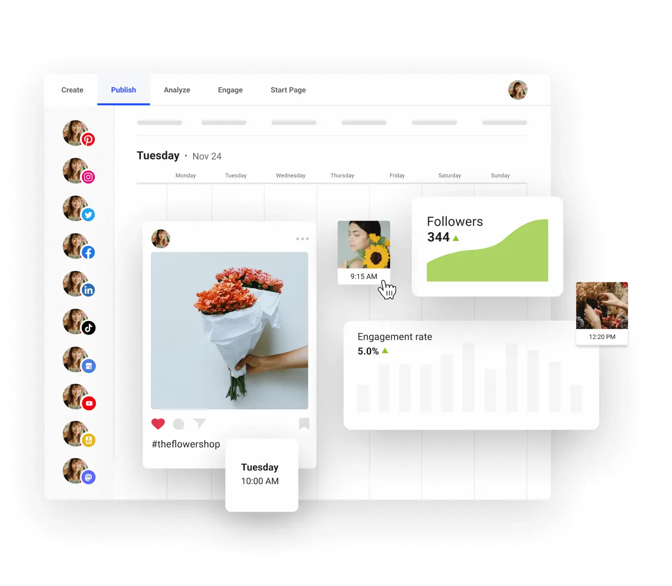
2. Build an engaged audience
Grow your following
Buffer will share your content on the right channels, with suggested hashtags to help you grow.
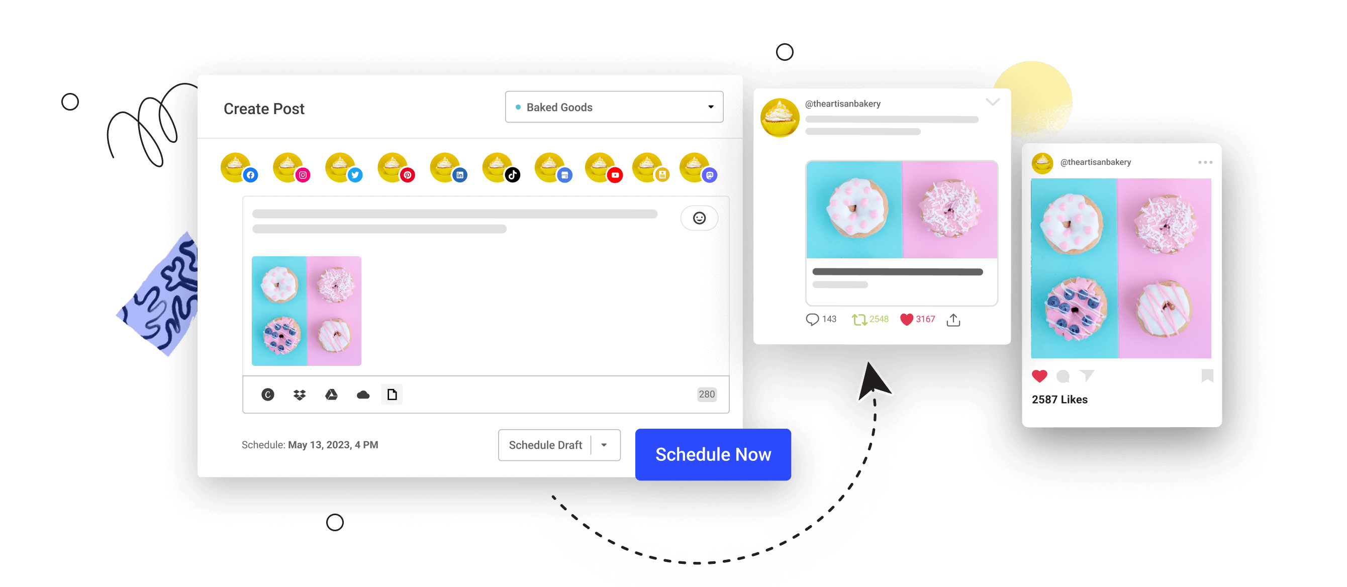
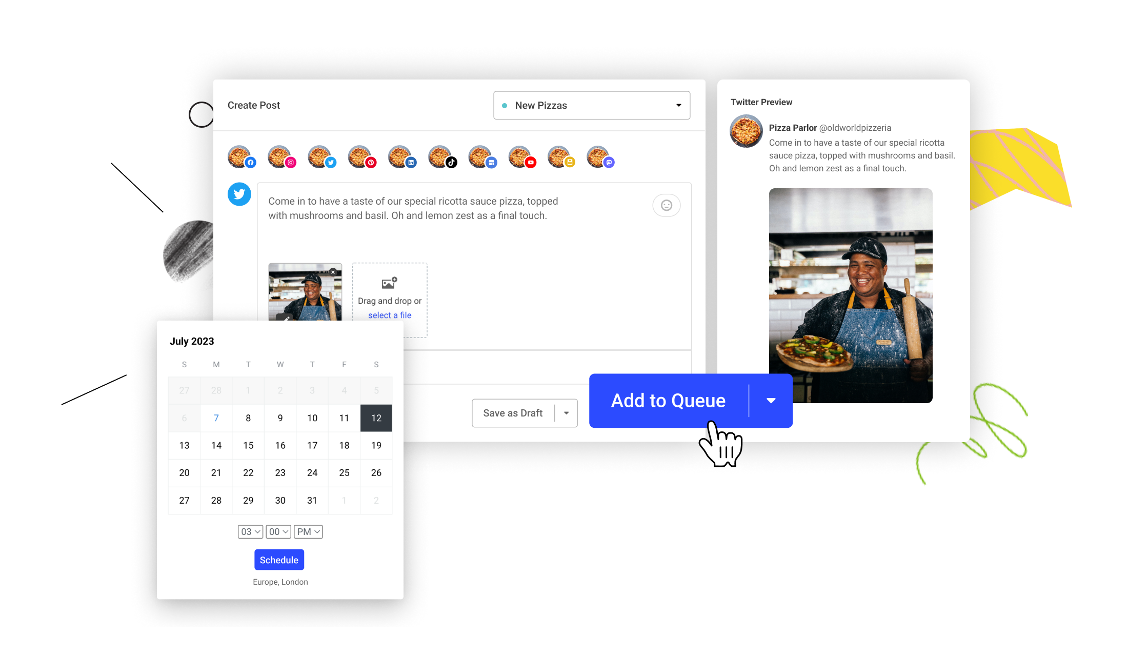
3. Save tons of time
Halve your workload
Buffer will publish everything for you to save time and it’ll showcase your work with automated reports.
4. Coordinate with ease
Collaboration has never been easier
With Buffer’s permissions levels and approval flows, your team can work freely without any micro-management.

Buffer has made sharing our story and building our brand on social media so much easier.
Luis Cancel, Managing Editor

On social, we need to be fast, efficient, and intentional. Buffer allows us to be exactly that.
Liz Gillis, Digital Marketer

For a marketing team with a lot on our plates, Buffer is a crucial tool in our brand-building efforts.
Troy Petrunoff, Marketing Manager

Buffer makes it easy for us to monitor all of our engagement and strengthen the connection with our audience.
Rodrigo Hyago, Social Media Content Manager

Buffer saves us, literally, hours and in turn helps us spread our message even further.
Joe Loria, Content Manager
Buffer has made sharing our story and building our brand on social media so much easier.
Luis Cancel, Managing Editor
On social, we need to be fast, efficient, and intentional. Buffer allows us to be exactly that.
Liz Gillis, Digital Marketer
For a marketing team with a lot on our plates, Buffer is a crucial tool in our brand-building efforts.
Troy Petrunoff, Marketing Manager
Buffer makes it easy for us to monitor all of our engagement and strengthen the connection with our audience.
Rodrigo Hyago, Social Media Content Manager
Buffer saves us, literally, hours and in turn helps us spread our message even further.
Joe Loria, Content Manager
10 years
in business
140,000
users
100k+
monthly blog readers
1.2m+
social followers
And we are here to help
Our customer advocates are standing by 24/7 to support you via email and social media. We also have a comprehensive, regularly updated help center for those who prefer to find help themselves.

An official marketing partner of the industry leaders