Design Tips for Non-Designers: A #Bufferchat Recap
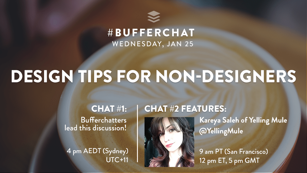
This week in #bufferchat, we shared our best design tips and tricks for the non-designers among us. We were joined by Kareya Saleh from Yelling Mule as our guest (in our 2nd chat time) and together, we discussed the elements of great design, the biggest design mistakes people make, the best easy-to-use tools for creating marketing images, and much more!
Read on to discover all of the awesome knowledge and insights that were shared during the chat!
Catch our weekly Twitter chat, #bufferchat, at TWO times every Wednesday for valuable industry insights and to meet hundreds of other smart marketers and social media enthusiasts. Same topic, same place, just at different times – feel free to join in to whichever chat time works best for you!
For our community in Asia and Australia (or anyone else!): 4 pm AEDT (Sydney time)
For our community in North/South America, Europe and Africa (or others!): 9 am PT (San Francisco time)

This week’s stats:
1st Bufferchat: 38 participants; 244 tweets; reach of 899,379
2nd Bufferchat: 261 participants; 1,787 tweets; reach of 2,271,794
Q1: What are the key elements of great design?
From Kareya:
- The ultimate key to great design is simplicity. Take it from Leonardo da Vinci, “Simplicity is the ultimate sophistication.”
From the community:
- “It needs to be simple yet effective, attractive and – as any piece of good art – must make people feel something.” @romikid
- “A great design needs to be clean without any clutter. People should be able to easily find what they’re looking for.” @ExpWriters
- “The best designs also keep the brand in mind. Keep everything consistent like the color scheme, logo and size, style, etc.” @steph_yoon
- “Design does its job when it leads to an action the designer wants the audience to take. Pretty + no action = fail.” @JackieMJensen
- “Key elements of design include layout, shape of elements, spacing, balance, proportion, color, typography & PASSION.” @bharatpc
See all the great answers to question 1 here!
Q2: What are examples of common design mistakes people make?
From Kareya:
- Common mistakes we’ve seen: Clutter, chaos creates confusion; Poorly chosen colors; Blinding contrast; Comic Sans.
From the community:
- “Not reviewing the guideline for ADA making it difficult for color blind and the visually impaired persons.” @innonurse
- “Trying to do too many things all at once. It’s confusing to the reader/viewer and makes your brand look unfocused.” @CelesteSrz
- “Common design mistake for
#socialmedia graphics is not tailoring the sizing to each platform’s optimal sizing.” @bekah_lillian - “Lack of balance with space. Not all spaces are there to be filled. Give your design room to breathe…” @joeallam
- “Conflicting lines. It’s important to have a focal point.” @chelsey_puza
See all the great answers to question 2 here!
Q3: Are there any “design hacks” you’d share with folks who are newer to design?
From Kareya:
- We recommend scouring
@instagram +@behance for inspiration. Try taking your concepts to paper for better planning. - Uniqueness paired with consistency always makes for better design!
From the community:
- “Create a template that works for your message, it can help the audience identify your content more easily.” @FatherFoodFun
- “I use
@colourlovers to get the right combination of colors.” @70mq - “Create a PSD file of branded layers. Can drop new photos in for quick social posts.” @cmbutler
- “A font pairings guide for those who struggle with typography. Google for more!” @Lynnstin
- “Use grids and guides always! Our brains automatically see bad alignment because it breaks natural reading flow.” @firstfound
See all the great answers to question 3 here!
Q4: Where are your favorite places to find stock imagery, photos, icons and graphics?
From Kareya:
- We love finding stock photography on
@unsplash! And@behance is an awesome source for design templates + inspiration.
From the community:
- Stock images:
- Vector and graphic images:
- Fonts:
- Videos and GIFs:
See all the great answers to question 4 here!
Q5: What easy-to-use tools are the best for non-designers to use when creating marketing graphics?
From Kareya:
@AdobeSpark,@canva + (of course)@PabloByBuffer! Utilize their templates for quick, easy marketing designs.
From the community:
- Adobe Spark
- BeFunky
- Canva
- Desygner
- Gimp
- OverApp
- Pablo by Buffer
- Photoshop
- PicMonkey
- Piktochart
- pixlr
- Prisma
- Relay
- Snapseed
- Stencil
- WordSwag
See all the great answers to question 5 here!
Q6: Where can someone get great online tutorials or advice for improving their design skills?
From Kareya:
@YouTube is a great source for anyone starting out +@Adobe has awesome step-by-step tutorials for learning their programs.- We’ve learned some of our best tips and tricks from fellow designers! Utilize your connections, forever and always.
From the community:
- “The guys over at
@phlearn have an AWESOME YouTube channel with tutorials for Photoshop!” @TMCSocialMedia - “I’ve used
@tutsplus or@YouTube or even if you have a membership or access to it and they are all great!!!” @EBcreativity - “
@Canva blog is great place for design learning & inspiration. So is@CreativeBloq@LogoDesignGuru@HOWDesignU.” @thinkdesignvis - “@CreativeMarket is a great resource for designers + they give away 6 FREE goodies every week.” @indigoevstudio
- “Instrucables is a good source for tutorials and design hacks. Other than that Google is your friend.” @ForresterHinds
Other suggestions: Skillshare, Coursera, Udemy
See all the great answers to question 6 here!
Q7: In your opinion, what brands rock it with design (in terms of their brand or social media presence) and why?
From Kareya:
- In terms of marketing + design, we’re big fans of
@Starbucks,@Apple,@MOO,@netflix,@toms +@Burberry. We love minimalism.
From the community:
- “
@GoPro does a fantastic job designing campaigns and content around UGC.#goals” @TheAshleyDale - “
@nuts does a really nice job with their branding, packaging, and social media. They’re always making me smile.” @PassageHill - “Not surprisingly,
@Houzz wins it in this category for me. Their site is intuitive, accessible, and just downright gorgeous!” @ideabloke - “
@MailChimp has an incredibly unique brand – it’s fun and different while remaining clean and crisp.” @RivalIQ - “
@katespadeny has such a distinct voice. You can always tell when you’re looking at their products or collateral.” @pamelahughes
See all the great answers to question 7 here!
Thank you so much to Kareya and to everyone who participated and helped each other in this chat!
Do you have any comments or answers to these questions? Leave your thoughts in the comments! We’d love to hear from you!
Image sources: UnSplash
Try Buffer for free
140,000+ small businesses like yours use Buffer to build their brand on social media every month
Get started nowRelated Articles

We’ve decided to retire #bufferchat after four years and had a celebration with our community, Read on to discover all of the memories and fun shared during the chat! This week’s stats: Bufferchat (9 am PT): 118 participants; reach of 1,655,682 Q1: What’s been your favorite #bufferchat topic? From the community: A1: There’s been so many great #bufferchat that resonated with me. Standouts include: ✅Email Marketing with @p

This week on #bufferchat our community shared all the best tips and tricks to avoid social media burnout. Read on to discover all of the awesome insights shared during the chat! Catch our weekly Twitter chat , #bufferchat, at TWO times every Wednesday for valuable industry insights and to meet hundreds of other smart marketers and social media enthusiasts. Same topic, same place, just at different times – feel free t

This week on #bufferchat our community discussed the ins and outs of marketing on Pinterest. Read on to discover all of the awesome insights shared during the chat! Catch our weekly Twitter chat , #bufferchat, at TWO times every Wednesday for valuable industry insights and to meet hundreds of other smart marketers and social media enthusiasts. Same topic, same place, just at different times – feel free to join